‘Let’s end the blandemic and rehumanise the world’
In the final part of our serial of his game-changing new book, Thomas Heatherwick argues that if we all do our ‘bit’, and refuse to allow our world and the world of our children to be smothered by cheap, deadening buildings, we can truly transform where and how we live
Whenever I talk to people about humanising buildings, the same points tend to come up. Some wonder if the only way to achieve what we want is to go back to the past. Others worry it means smothering buildings in decorations, like Christmas trees. But most commonly they’re convinced the mission is not realistically possible with modern materials or budgets.
Here in Britain, you sometimes hear it said that the public doesn’t like anything new – that, if it was left up to them, they’d reject anything modern and just want the world filled with Georgian-style houses and Tower Bridges. But these assumptions underestimate the diversity of people’s interests and tastes. But actually, the top 10 most-loved buildings in the world include Burj Khalifa, Hallgrímskirkja and The Shard.
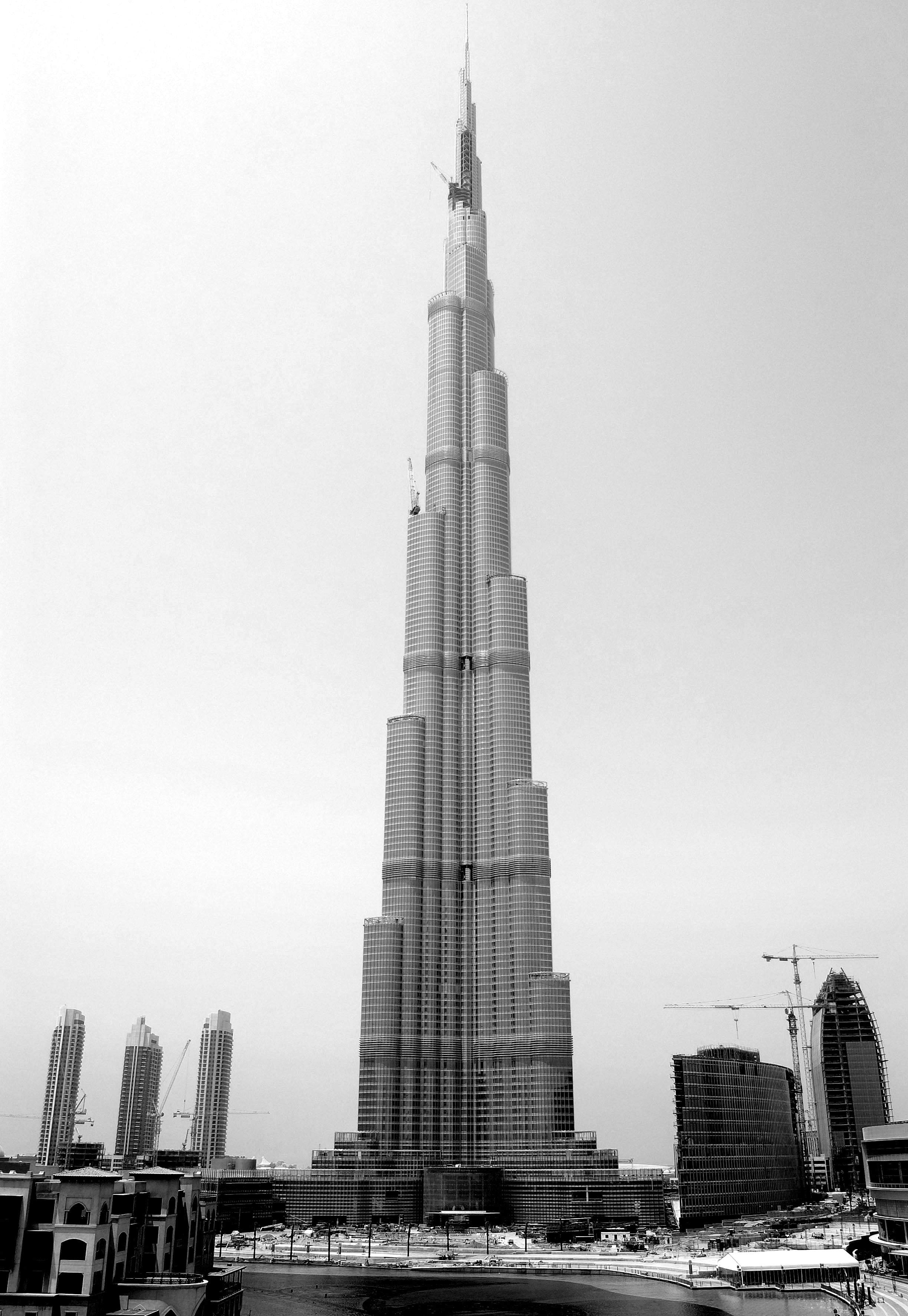
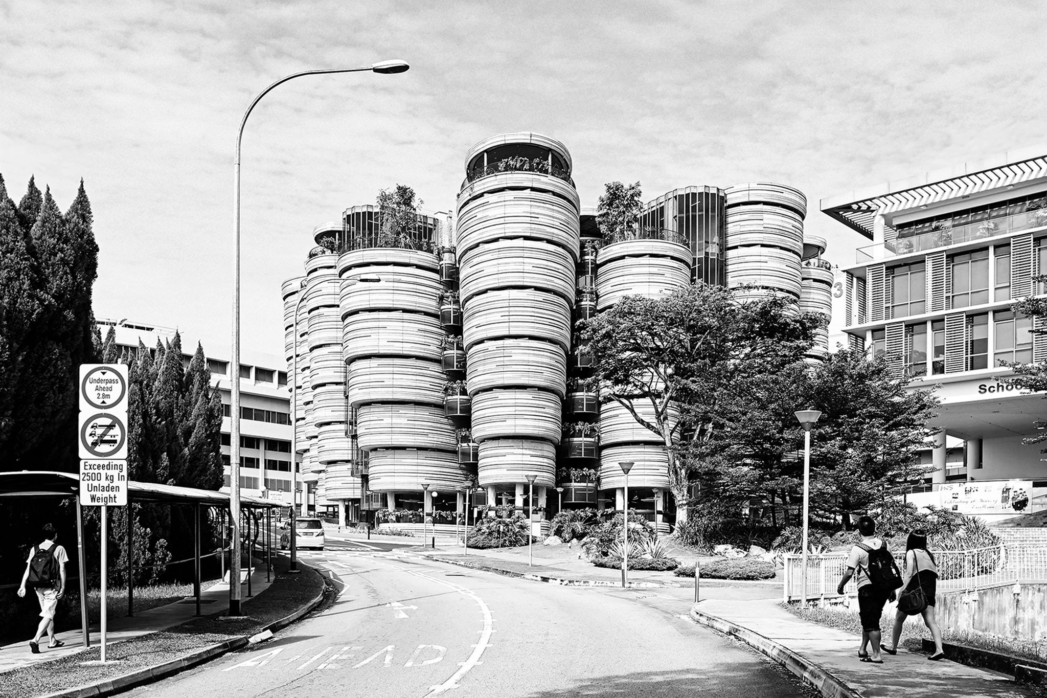
Burj Khalifa doesn’t reflect much about the history of its place in the desert of Dubai. It’s popular because it’s interesting enough from a city distance to create its own sense of place. The Parkroyal Collection hotel in Singapore also doesn’t reflect much about the history of its place. It succeeds because it’s interesting enough from three distances – city, street and door distance – to create its own sense of place.
Many of the great building designers in history have pulled off a similar trick. Georges-Eugène Haussmann’s buildings in Paris are often assumed to reflect an essential Parisian sense of place, but in fact, they created it. They were a derivative version of a classical style built with a whole-hearted conviction.
What do the old and new human buildings have in common?
Necessary visual complexity.

The London houses designed by Thomas Cubitt in 19th-century London have necessary visual complexity. These buildings might not be to your taste. To some, they appear pompous and fusty. But they have three-dimensionality and simple decorative details, and sometimes even curves.

The Pompidou Centre, built in Paris in the 1970s, also has necessary visual complexity. Again, this building might not be to your taste: to some, it appears harshly industrial and chaotic. But when you look at it, you keep seeing more and more details.

The Pompidou Centre has necessary visual complexity.
Thomas Cubitt’s houses have necessary visual complexity.
They are human.
The ‘D’ word
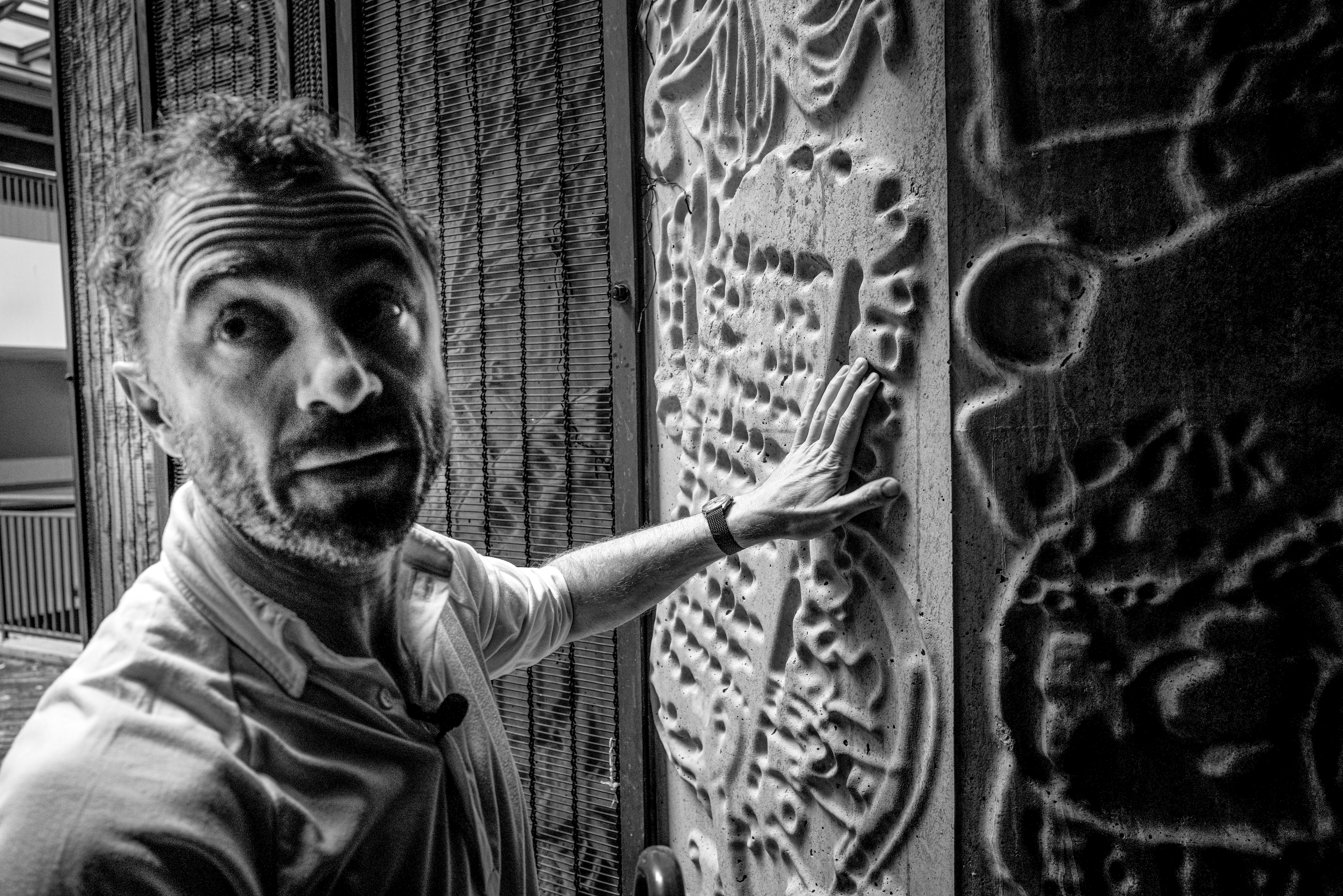
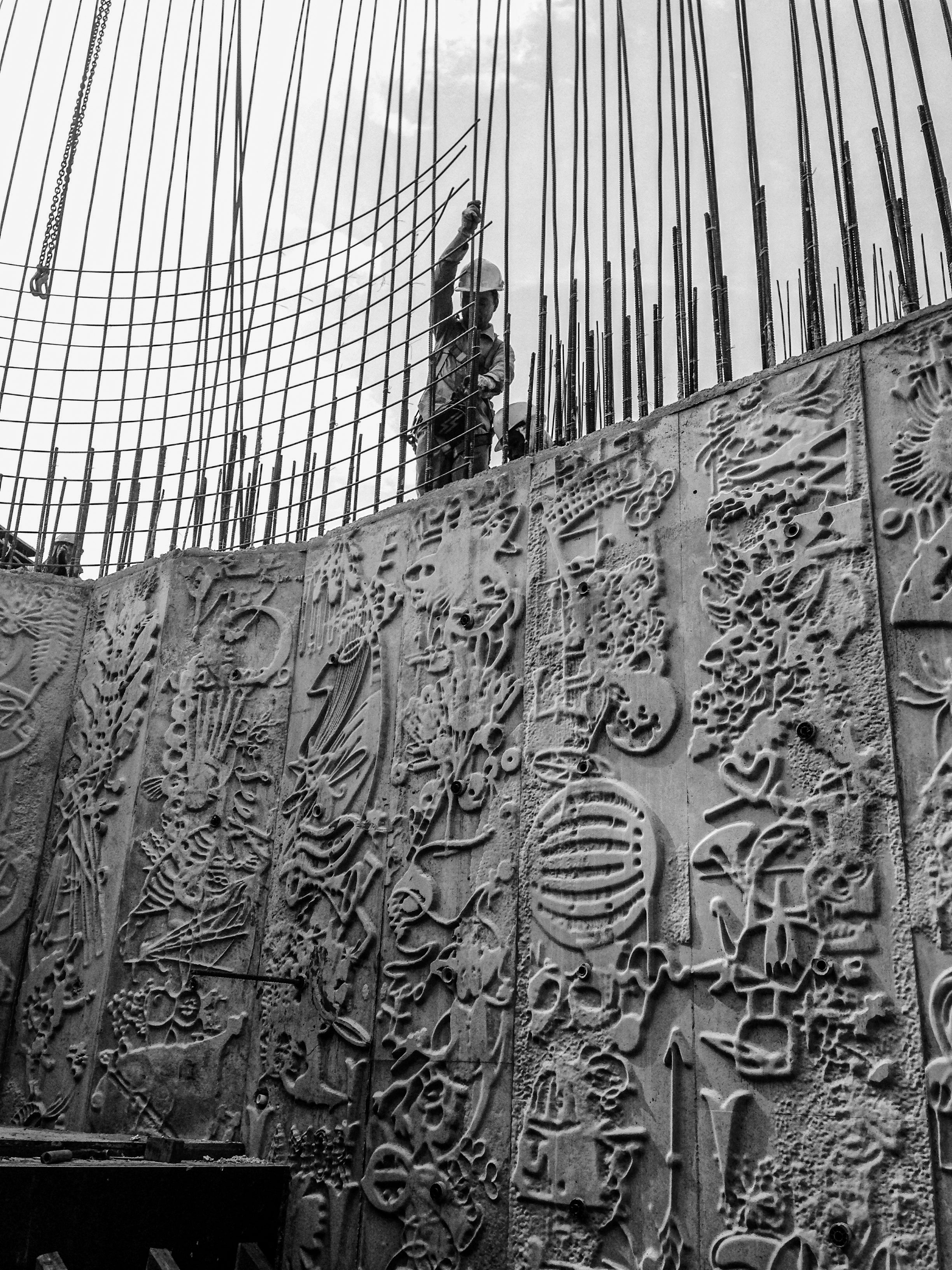
An all-too-easy way to add necessary visual complexity is by using decoration. But complexity doesn’t need to be a layer that’s added onto a building like “lipstick on a gorilla”. In my work with my studio, we don’t want to make buildings that are decorated. Instead, we take the mindset of taking what we need to build anyway and trying to make it sufficiently complex. You could say this means being decorative rather than decorated. Wherever possible, complexity isn’t mindlessly added onto the surface of the building but expressed in the structure itself. Interestingness can be generated by how you frame a window or door, in how you join surfaces together, and by showing rather than hiding craftsmanship. We don’t strive to eliminate details on the outsides of buildings, but rather to amplify and augment them.
The Human Premium
It’s undoubtedly true that making human buildings is harder than making boring ones. Achieving necessary visual complexity was much easier for the designers of the past because complexity was already naturally present in the ingredients of their buildings. When making new structures, we’ll always be nudged towards the most inexpensive and efficient surfacing materials such as glass, thin aluminium sheeting and silicone sealant. These modern, mass-produced materials typically have a sterile appearance. They’re bland and empty and make a poor canvas for time to write its message.
As the materials themselves are so characterless, we need to work harder to amplify character and the potential for interestingness. If we’re going to use aluminium, can we make panels that are interestingly un-flat? If we’re going to use mass-produced bricks, can we insist they’re not all of a uniform tone or colour? Can we put them together to create three-dimensional patterns that engage the eye and grow more visually complex with the decades-long onslaught of weather and dirt? Or maybe we could do something interesting with the mortar instead? And if we’re not going to use older types of materials such as brick, which automatically look better as they get older, whatever we replace them with needs to do the same job. But the worry is that human materials and techniques cost too much.
Tight budgets are an inevitability. But we can’t let ourselves use them as an excuse to make yet more boring buildings. People sometimes imagine that, in my own studio, we spend our time dreaming up exciting ideas and then clients immediately say “yes” and pay for whatever we want. This is not true, of course. Most of our design time is spent going round and round, redesigning and redesigning and trying to be as resourceful, focused and ingenious as possible with the limited amount of money we’ve been given.
When we finished the UK pavilion in Shanghai for the 2010 World Expo, an architect from another country came in and remarked on how lucky I was because he didn’t get the budget that we had. But I’d been told that, in reality, he’d had almost twice our financial resources.

If we’re serious about re-humanising our world, we have to talk about spending a little bit more on our buildings, and accept that it matters. We have to change how we think. Whether you’re a city planner, a property developer, a politician, a critic, an educator or an ordinary citizen who refuses to allow their world and the world of their children to be smothered by deadening buildings, we must demand from each other the extra effort and budget that human buildings take.
Re-humanisation means nothing less than a shift in values.
Does this sound impossible? It shouldn’t. Our shared values are constantly in flux: we’re not the same people today as we were 100 years ago. When I was little and brought dried bananas into school, I was considered a freak (my mum ate macrobiotic food and my father wore Birkenstock sandals 15 years before Kate Moss made them fashionable). Now all of this has changed.
We’re not the same people as we were even half a generation ago. On a massive range of issues – everything from race to gender to our ideas about sustainability and the environment – we have evolved. We smoke less, use seatbelts more and a greater number of us eat a vegan diet. Following outrage over the Port Arthur massacre in Australia in 1996, legislation and public attitudes towards guns changed radically – with the result that fewer Australians than ever are killed with firearms. And in the UK there’s been a major shift in values over the last couple of decades in how we think about food. In 2005 we banned the industrialised food product Turkey Twizzlers from school meals following a campaign by the television cook Jamie Oliver.
We decided cheapness wasn’t the most important value.
We decided the food our children eat shouldn’t taste like efficiency.
It’s time we insist that our buildings are “nutritious” too, and nourish us as we encounter them.
We should confidently reject the tired old argument that property developers can’t be expected to make human places because they’re hard-nosed capitalists with a bottom line to worry about. One hundred and fifty years ago, property developers were also hard-nosed capitalists with a bottom line to worry about. They wanted profit too. But they made the effort to use curves, eaves, mouldings, cornice work, and stained glass above their front doors. If they could do it at scale when average income and quality of life were so much lower, why can’t we?
It’s also not true that interesting buildings were cheaper to build back then. As the US architect, Michael Benedikt, writes: “The pre-World War Two buildings that people prize today – buildings with high ceilings, operable windows, well-defined rooms, clarifying mouldings, solid walls, and pleasing decoration, the ones we sigh we can no longer build today ‘because they would cost too much’ – were not cheaper to build back then. Indeed, they were relatively more expensive to build back then, and they absorbed proportionately more of our then-wealth, time, and income.” Society has chosen to spend less on each individual building we now build. It’s not surprising they aren’t emotionally nutritious enough.
And then comes the next excuse: “But we’re in a time of crisis today! Look at all the things that are going wrong. Human buildings are a low priority in the face of all this urgency.”
We must counter the endlessly delaying mindset that always says the sky is falling on our heads and therefore we can’t afford to make good buildings. When will the time come when there’s no crisis to justify cheapness?
It’s true that we’re going through a terrible climate crisis, which matters immensely. But the simultaneous reality is we’re richer than we’ve ever been at any point in history. We also spend more money on building than at any point in history. The amount we threw at construction globally grew from $9.5 trillion in 2014 to $11.4 trillion in 2019.
But how do we figure out how much is the right amount extra to spend?
One technique we’ve used in my studio is to create two options to discuss with a client. The first represents the most affordable way to complete their project so it fulfils its basic functions and meets necessary regulations. This minimum version is invariably non-human but establishes a base. We then study truly human versions that cost perhaps 5–10 per cent more than the base solution. From there, we begin deep and honest discussions with the client about the additional values of the more human design, without seeming naive about money. These are the most interesting conversations.
And remember that even with their extra initial expense, human buildings are likely to end up being far cheaper in the long run because there’s less chance they’ll be demolished, avoiding the need for yet more expensive new buildings. The global waste cost from the construction industry is projected to reach $34.4bn (£27.97bn) annually by 2026. In the US, around 90 per cent of this waste is from demolition. That’s a lot of money wasted on buildings that aren’t loved enough to be saved. By re-humanising the world, we can save billions of dollars and dramatically reduce the amount of carbon that’s released into the atmosphere as a result of demolition.
As an industry, we’ve started to become used to the idea of a “green premium” that ensures our buildings are more sustainable by applying an accepted ecological standard. A growing number of clients for new buildings accept this premium. Sometimes they do more than accept it – they’re proud of it. The green premium reflects a broad societal shift in values over recent decades, towards prioritising the protection of our planet. But to be truly sustainable, this is not the full picture.
It’s time to insist on a human premium.
It’s time to open our eyes and make a noise.
It’s time to demand a world that is less boring.
It’s time to Humanise.
Read the first two parts of our exclusive serialisation here: ‘Gaudí’s Casa Milà is a joyous festival of curves – it’s almost as if the building is breathing’
And here: ‘The global 100-year catastrophe that still grips our towns and cities’
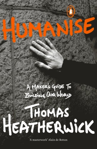
Extracted from ‘Humanise: A Maker’s Guide to Building Our World’ by Thomas Heatherwick, published by Viking on 19 October at £15.99. © Thomas Heatherwick 2023


Join our commenting forum
Join thought-provoking conversations, follow other Independent readers and see their replies
Comments