Independent TV
Showing now | Climate
01:09
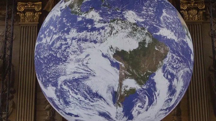
Cop26: Five graphs that show reality of climate change
The Conference of the Parties - known as Cop26 - is a set of climate talks that will bring together heads of state, climate experts and campaigners to agree on coordinated action to tackle climate change.
As Cop26 approaches, the stark warning over climate change gets louder.
Here are five graphs that show the data behind the trends of climate change.
Global carbon emissions from burning fossil fuels have almost quadrupled since 1960.
The UK's warmest years on records - measured by mean temperature - saw 2014 hit 9.88C.
The difference in the average global temperature from 1850 to 1900 increased by more than 1.2C.
Up next


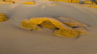
01:51
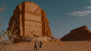
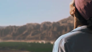
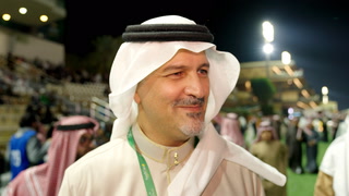
Gérard Mestrallet on the challenges of bringing infrastructure to the region of AlUla

02:07
Sir George Iacobescu, chairman of the Canary Wharf Group on the investment into the historic region of AlUla
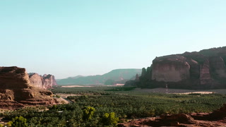
02:00
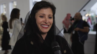
Oliver Ripley of sustainable hotel group Habitas talks about how AlUla challenged his preconceptions of Saudi Arabia
02:09