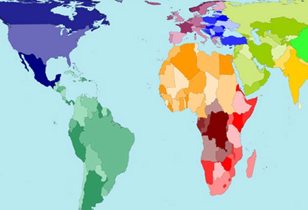
New map draws on population

Your support helps us to tell the story
From reproductive rights to climate change to Big Tech, The Independent is on the ground when the story is developing. Whether it's investigating the financials of Elon Musk's pro-Trump PAC or producing our latest documentary, 'The A Word', which shines a light on the American women fighting for reproductive rights, we know how important it is to parse out the facts from the messaging.
At such a critical moment in US history, we need reporters on the ground. Your donation allows us to keep sending journalists to speak to both sides of the story.
The Independent is trusted by Americans across the entire political spectrum. And unlike many other quality news outlets, we choose not to lock Americans out of our reporting and analysis with paywalls. We believe quality journalism should be available to everyone, paid for by those who can afford it.
Your support makes all the difference.A new world atlas which concentrates on population rather than land mass has been published today.
Researchers from the University of Sheffield created the online atlas of 200 maps that have been redrawn to show, at a glance, which cities are the largest, how all urban areas compare, and whether many or few people live in the countryside.
The images, which were created as part of a Leverhulme Trust project to remap the world and extend the Worldmapper project, have been created using population distribution data so viewers can understand how many people make up each nation.
The new world guides break with the 500-year tradition of conventional cartography which shows compass directions as straight lines.
Benjamin Hennig, a postgraduate researcher at the University's Department of Geography, was part of the team that created the maps by using the gridded population of the world database of the Global Rural-Urban Mapping Project.
Mr Hennig said the new projections give an "interesting insight into different countries".
He added: "The map of Afghanistan, for example, shows a country dominated by Kabul and a few other urban centres.
"The UK on this new global projection is a tale of London and the other cities.
"The United States, on the other hand, has much more variety to its human geography, while the new projection of China shows a sea of humanity bubbled up into a thousand cities in the Eastern part of the country."
The maps can be viewed at www.worldmapper.org/countrycartograms/
Join our commenting forum
Join thought-provoking conversations, follow other Independent readers and see their replies
Comments