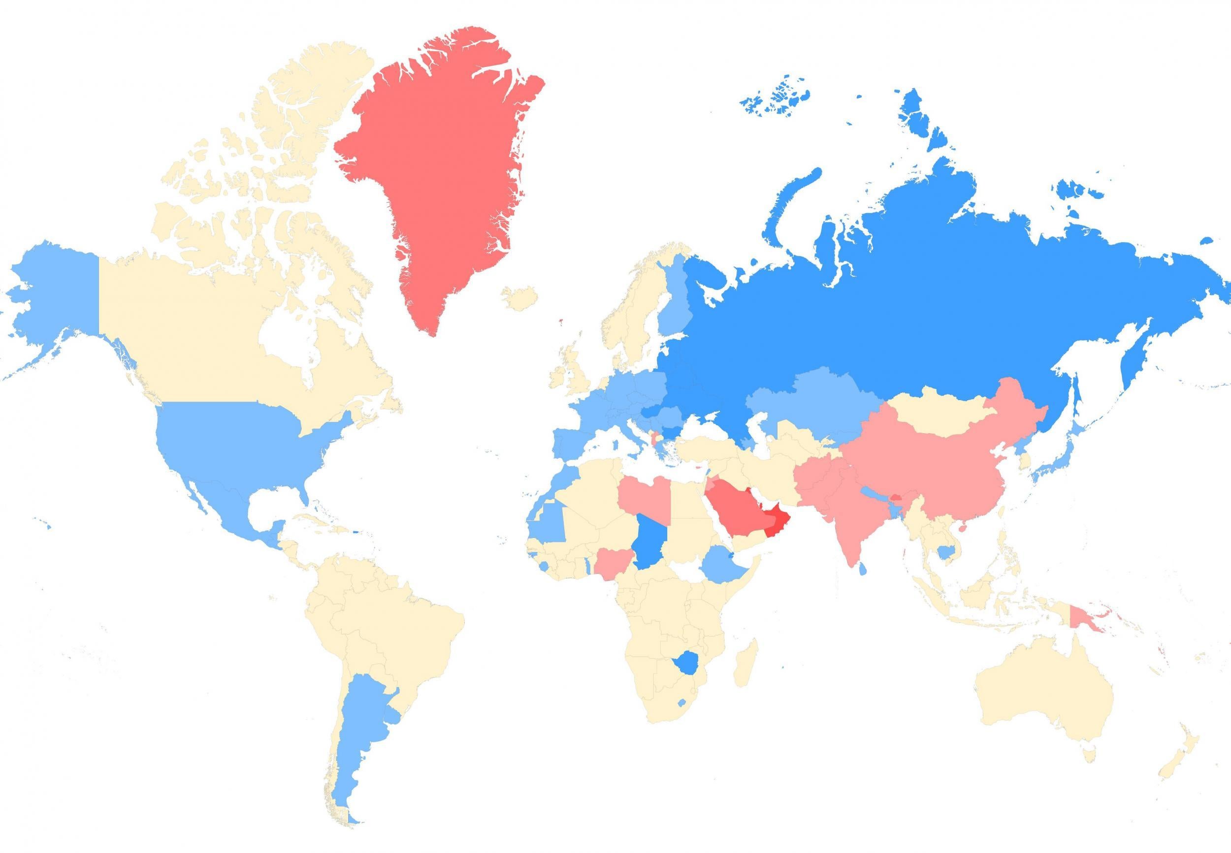
The sex map of the world

Your support helps us to tell the story
From reproductive rights to climate change to Big Tech, The Independent is on the ground when the story is developing. Whether it's investigating the financials of Elon Musk's pro-Trump PAC or producing our latest documentary, 'The A Word', which shines a light on the American women fighting for reproductive rights, we know how important it is to parse out the facts from the messaging.
At such a critical moment in US history, we need reporters on the ground. Your donation allows us to keep sending journalists to speak to both sides of the story.
The Independent is trusted by Americans across the entire political spectrum. And unlike many other quality news outlets, we choose not to lock Americans out of our reporting and analysis with paywalls. We believe quality journalism should be available to everyone, paid for by those who can afford it.
Your support makes all the difference.Which countries have the most women and the most men?
We've answered this question before using UN Population Division data, however a new visualisation has been made popular in a subreddit.
The data, from the CIA World Factbook, comes in the form of a ratio for male to female.
Blue is predominately female, red is predominately male, yellow is about the same.
View the interactive map, below:
People commented about focal points on the map, such as Russia's ongoing shortage of men as a result of the Second World War losses and a high mortality rate, Mongolia sitting in between the country and China, which has an excess of men due to the one child policy.
People also commented on how policies about a child's gender has influenced figures.
Redditaccountplease wrote:
India has improved vastly since it became policy that doctors cannot disclose the sex of a fetus (now they just do it in a more subtle way).
Practices of aborting female fetuses, female infanticide, and wife-burning have lessened, and hopefully continue to do so.