Twitter redesign hopes to reel in extra users before an IPO
New look to the microblogging service simplifies the layout and allows users to more easily follow content and conversations

Your support helps us to tell the story
From reproductive rights to climate change to Big Tech, The Independent is on the ground when the story is developing. Whether it's investigating the financials of Elon Musk's pro-Trump PAC or producing our latest documentary, 'The A Word', which shines a light on the American women fighting for reproductive rights, we know how important it is to parse out the facts from the messaging.
At such a critical moment in US history, we need reporters on the ground. Your donation allows us to keep sending journalists to speak to both sides of the story.
The Independent is trusted by Americans across the entire political spectrum. And unlike many other quality news outlets, we choose not to lock Americans out of our reporting and analysis with paywalls. We believe quality journalism should be available to everyone, paid for by those who can afford it.
Your support makes all the difference.Twitter is planning a visual overhaul of its mobile apps in a bid to attract more mainstream users in the run up to its IPO, according to All Things D.
The four navigation buttons at the bottom of the iPhone version will be replaced by swiping through different streams such as the current reverse-chronological timeline as well as one for interactions with other users and one dedicated to tweets which contain images.
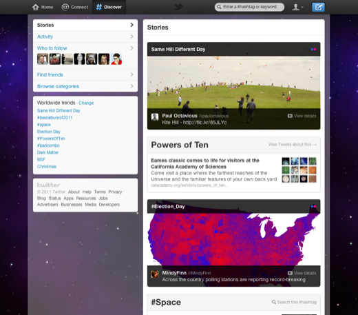
In a move away from Twitter’s text-based roots, the visually richer revamp will see content such as images and videos embedded within the user’s timeline with no need to expand a tweet to view it, much like the current Discover stream which will not make it into the new version.
The new user interface marks Twitter’s third major revamp in its seven-year history but is significant in its divergence from the social network’s previous policy of consistency across its mobile apps.
Alongside a graphically more intense app, Twitter’s recent introduction of blue lines to group conversations, abandoning strict chronology, suggest a convergence between Twitter and Facebook as the two social networking giants thrash it out for the advertising dollars.
Facebook made a move in Twitter’s direction in June when it introduced hashtags for grouping related content.
It has also been suggested that Twitter is experimenting with a dedicated television stream devoted to discussions of what a user’s followers are watching.
The social network has already capitalised on the phenomenon of tweeting during television programmes in the US with its Twitter Amplify service which uses synchronised in-tweet promotions to boost the impact of traditional broadcast advertising.
A small update to the iPhone app is expected shortly after Apple’s iOS 7 launch this Wednesday with a more significant one following it.
A redesigned Android app has already been released to those who have signed up for beta testing.
Twitter users on Google’s mobile operating system have been swiping between columns for some time, but the number of columns has been increased from four to seven. In addition to Home, Notifications, Messages and Profile are Activity, Trending, and finding new people to follow on the service.
The same options are also navigable via a left-hand sliding panel which uses the user’s blurred header image as a background.
Previous reactions to changes to the Twitter website suggest that users may not react favourably to the redesign. The introduction of blue lines to group conversations in August garnered mass criticism on the social network.
Join our commenting forum
Join thought-provoking conversations, follow other Independent readers and see their replies
Comments