Netflix secretly redesigns app to make it easier to use
The company has ditched the "hamburger" menu and built a new panel at the bottom of the screen

Your support helps us to tell the story
From reproductive rights to climate change to Big Tech, The Independent is on the ground when the story is developing. Whether it's investigating the financials of Elon Musk's pro-Trump PAC or producing our latest documentary, 'The A Word', which shines a light on the American women fighting for reproductive rights, we know how important it is to parse out the facts from the messaging.
At such a critical moment in US history, we need reporters on the ground. Your donation allows us to keep sending journalists to speak to both sides of the story.
The Independent is trusted by Americans across the entire political spectrum. And unlike many other quality news outlets, we choose not to lock Americans out of our reporting and analysis with paywalls. We believe quality journalism should be available to everyone, paid for by those who can afford it.
Your support makes all the difference.Netflix has redesigned its Android app, but not for everyone.
The company has quietly overhauled the main menu, in a move that should improve the user experience, especially for people with big phones.
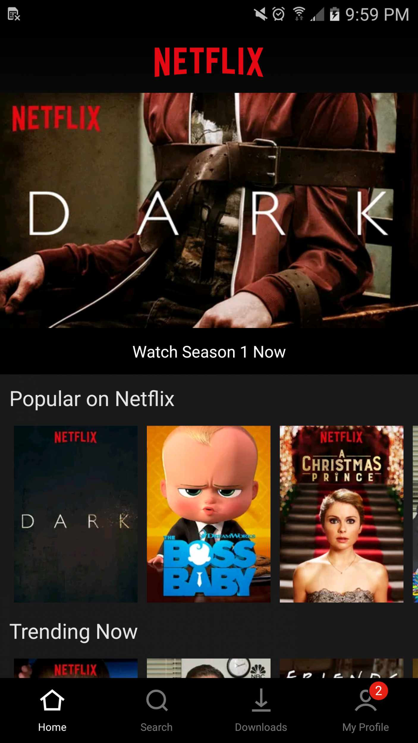
The “hamburger” menu button has been ditched, and its main options are now permanently on display at the bottom of the screen.
The redesign was first spotted by Reddit user MyFishDrownedItself, a Samsung Galaxy S6 owner, who posted a screenshot of the new user interface online.
“Just got a major Netflix app redesign!” he wrote this week, describing it as, “So nice, so clean.”
The biggest change is the disappearance of the hamburger menu. It usually sits in the top-left corner of the screen, which can be tough to reach for people with large-screened mobiles.
What's more, it's somewhat messy, containing a long and slightly confusing list of different options.

The search button, which usually lives in the top-right corner, has also vanished.
Netflix has decided to move it to a new panel at the bottom of the screen, where it should be a lot easier to reach. It sits alongside the Home, Downloads and My Profile options.
On the search screen, categories are listed directly under the search bar, says MyFishDrownedItself, who adds that the redesigned app offers “skip intro” and “skip recap” options too.
The My Profile page, meanwhile, is a central hub for notifications, and also contains My List.
“This design seems to be final, only thing missing are tap animations when you switch between tabs but it may stay the way it is,” MyFishDrownedItself said.
“Overall it feels much better and accessible than before. The app seems less intimidating and I imagine that's going to be a great thing for new members.”
The redesigned version of the app isn't rolling out officially yet, and it isn't clear if it ever will.
Unusually, the changes haven't even made their way to beta testers. Instead, Netflix appears to be testing the tweaks on a select few users at the moment, and will only release the update to everyone else if it proves a hit.
Join our commenting forum
Join thought-provoking conversations, follow other Independent readers and see their replies
Comments