Meet Comic Sans' successor: Comic Neue
Re-imagining hopes to make the much-derided font acceptable once more

Your support helps us to tell the story
From reproductive rights to climate change to Big Tech, The Independent is on the ground when the story is developing. Whether it's investigating the financials of Elon Musk's pro-Trump PAC or producing our latest documentary, 'The A Word', which shines a light on the American women fighting for reproductive rights, we know how important it is to parse out the facts from the messaging.
At such a critical moment in US history, we need reporters on the ground. Your donation allows us to keep sending journalists to speak to both sides of the story.
The Independent is trusted by Americans across the entire political spectrum. And unlike many other quality news outlets, we choose not to lock Americans out of our reporting and analysis with paywalls. We believe quality journalism should be available to everyone, paid for by those who can afford it.
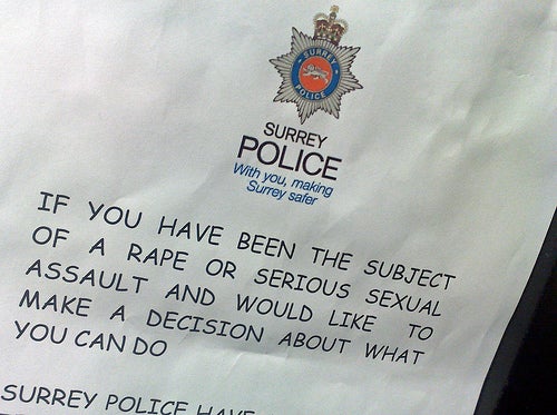
Your support makes all the difference.Long ago Comic Sans went from being just another slightly cartoonish font to a literal punch line for would-be typography snobs: “Comic Sans walks into a bar, the bartender turns him away and says ‘We don’t serve your type’”
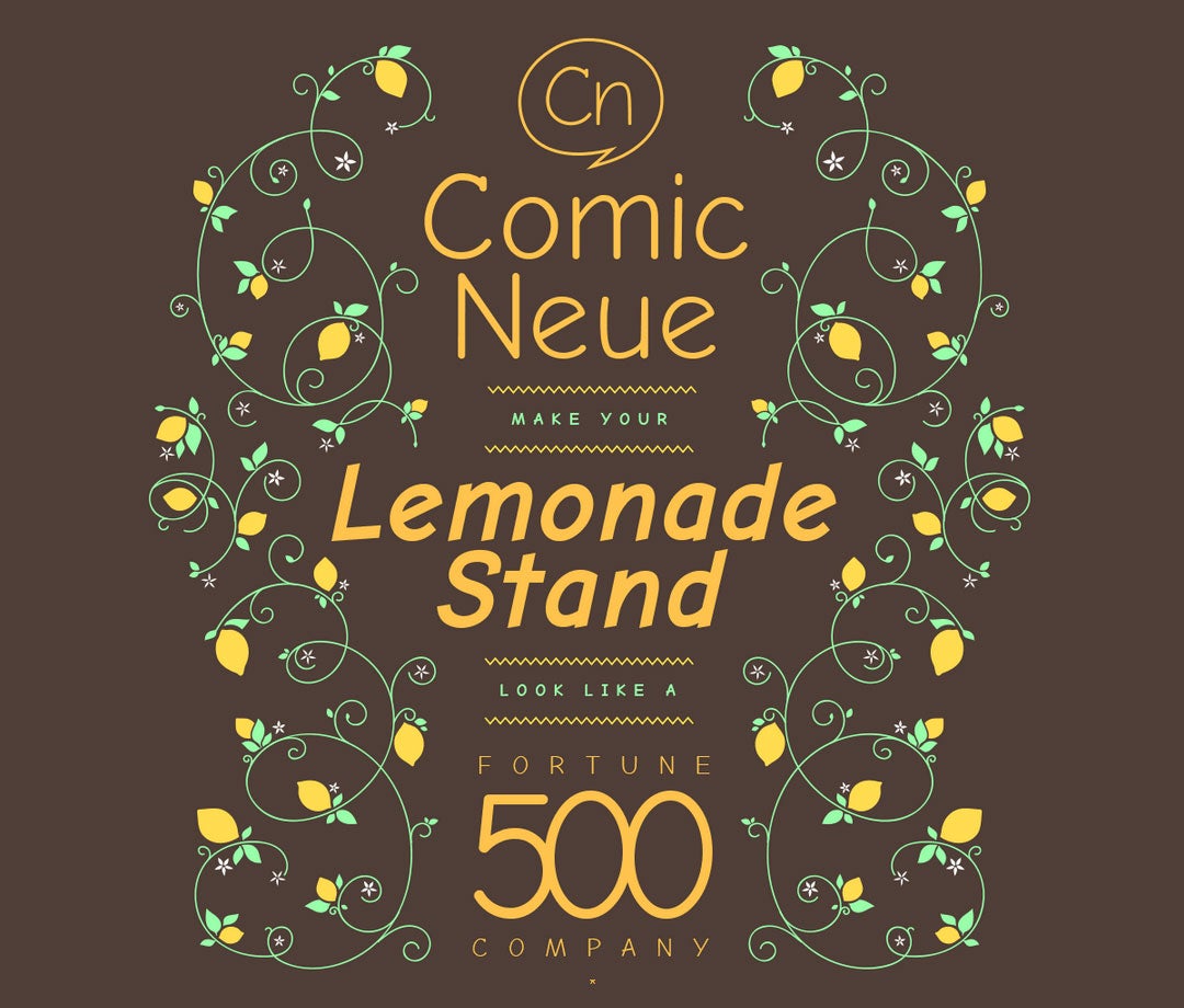
Now, Craig Rozynski, an Australian graphic designer based in Japan, is trying to single-handedly revive the fortunes of the much-maligned font by giving it a makeover fit for the 2010s. Internet, meet Comic Neue.
“Comic Neue aspires to be the casual script choice for everyone including the typographically savvy,” writes Rozynski on comicneue.com, where the font can be downloaded for free.
“The squashed, wonky, and weird glyphs of Comic Sans have been beaten into shape while maintaining the honesty that made Comic Sans so popular. It's perfect as a display face, for marking up comments, and writing passive aggressive office memos."
The original Comic Sans font was created in just a week by designer Vincent Connare for a Microsoft project in the mid-90s. Connare has said that he was inspired by the bubbly look of comic-book lettering and designed the font using two comics that were lying about his office – The Dark Knight Returns and Watchmen – as inspiration.

After its inclusion as a standard font in Microsoft’s Windows operating system it became popular quickly, although its ubiquity provided the perfect platform for misuse. One movement dedicated to stamping out Comic Sans compared a badly-judged deployment of the font to "showing up for a black-tie event in a clown costume.”
Connare himself has a more balanced attitude, saying in 2009: "If you love it, you don't know much about typography [but] if you hate it, you really don't know much about typography, either, and you should get another hobby."
While it's unlikely that Comic Neue could ever fully displace a cultural force like Comic Sans (after all it was still 'relevant' enough to be used in the doge meme), Connare has offered up his own thoughts regarding Rozynski’s re-imagining. His criticism? Comic Neue “should be more casual”. There's no pleasing some people.
Join our commenting forum
Join thought-provoking conversations, follow other Independent readers and see their replies
Comments