YotaPhone review: the dual-screen smartphone is coming to the UK
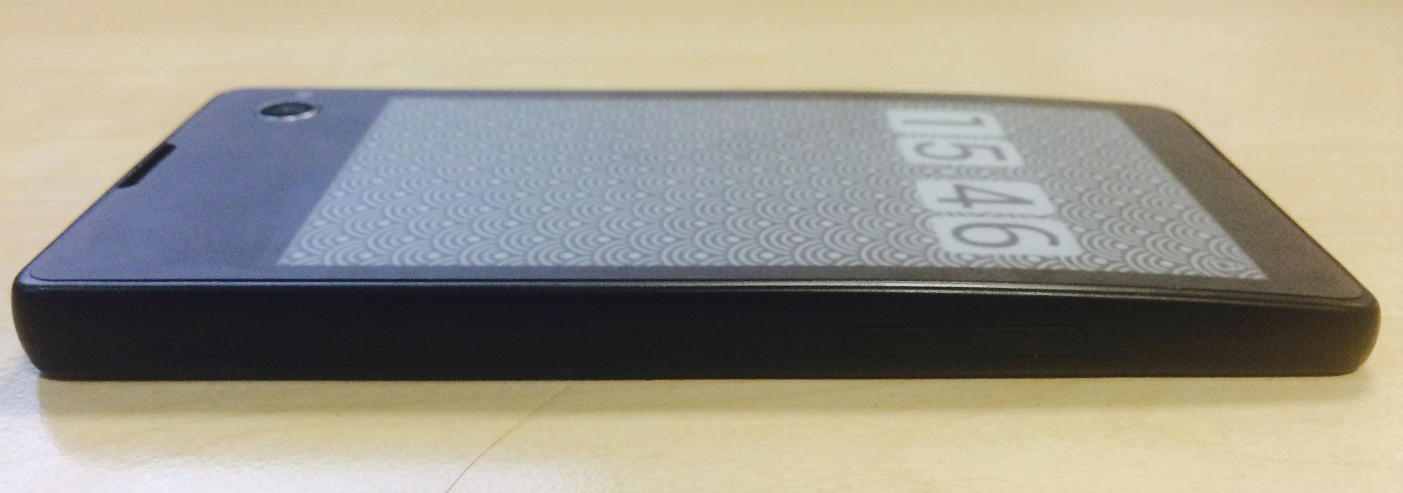
It's got and LCD screen on the front and an E Ink display (above) on the back - but does it make any sense when you're using it?

The YotaPhone has been turning heads ever since it first appeared during last year’s CES show, but now the dual-screen smartphone from Russia has finally been given a price (€499) and a launch date for European markets.
Although select carriers in Germany and Russia will be offering the phone before Christmas, it'll only be available in the UK from next year on Yota’s own online store. The question is: can the YotaPhone be anything more than a gimmick?
I’ve spent a couple of days using the phone and honestly I’m still not sure. The handset has a nice build quality and feels solid (though at 146g it’s a good 30 grams heavier than flagship handsets from Apple and Samsung) and the actual integration of the E Ink display is pretty flawless.
Unfortunately the possibilities of the display are let down by mostly unintuitive software and glitchy hardware. Instead of the usual trio of Android buttons at the bottom of the handset there is a touch strip on the front and back. You swipe left to go back, swipe right to go home and double tap to see recent apps.

You get used to it pretty quickly, and it’s not a terrible system but unfortunately the touch strip itself isn’t as responsive as it should be, and you often feel like you’re trying to strike a difficult match across it – pushing down harder with your finger whilst knowing that this is as constructive as clicking your mouse super hard when you’re mad at your computer.
This isn’t such a problem on the main LCD screen (4.3-inches across with a solid, but not exceptional, 720x1280 display) but for the E Ink screen it’s just painful. Trying to navigate the E-ink specific apps (these include a dictionary and phrasebook – exactly the sort that would be useful to have on hand for long periods of time without worrying about battery) proved near impossible for me.
This is a real shame, because the secondary screen definitely has some potential. The big sell from Yota is that it allows your phone to be ‘always on’ – you place the phone E Ink screen up on the desk, and then you have the time, the weather, and any other calendar events or notifications you want at a glance.
.JPG)
Yota are claiming that this will mean you spend less time being distracted by your phone, but that seems dubious. Sure, you spend less time turning your phone on and off, but you still have to check it to find out what it is isn't distracting you out. Fomo won’t die so easily.
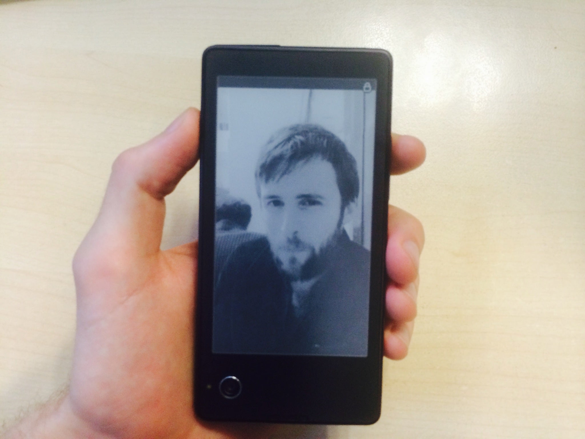
Nevertheless, simply by dint of being new the E Ink display was a blast, it actually made the phone feel fun. Changes to the rear screen are confirmed by a tiny vibration, and each little ‘buzz’ starts to feel like a special delivery, like something has jumped into your hand. The screen was even better when photos were sent over, with the resulting low res, black and white images strongly reminiscent of the old camera peripheral for the Game Boy.

This seems to be part of Yota’s intent, and there’s a whole range of oddities (like E Ink landscape wallpapers that change to suit local weather) that back this up. I especially like the example ‘novel’ proffered to users in the tutorial:
“The sun was shining. He was lying on a sunlounger and reading a book on his new YotaPhone. He was happy because the back screen display allowed him to read even on the beach.”
Never stop selling guys.
Unfortunately, nostalgia and oddity will only take you so far and though the rest of the phone is a just a fairly normal Android hand set (2GB of RAM, 32GB memory, 1.7GHz processor) the current price of the YotaPhone is too steep for an addition that might become more of a nuisance than a feature.
This being said, Yota have already explained that the high price is partly due to their inability to negotiate with big manufacturers (this is their first phone after all) and future handsets are expected to come down in price. The YotaPhone and its ilk are going to have to work hard to be more than curios, but they’re not the ridiculous proposition you might expect.

Join our commenting forum
Join thought-provoking conversations, follow other Independent readers and see their replies
Comments
Bookmark popover
Removed from bookmarks