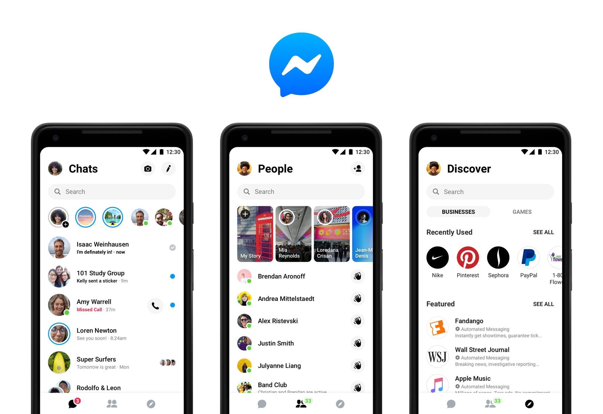
Facebook Messenger completely redesigned as company aims to simplify chat app
A confusing mass of tabs has been slimmed down to just three – and everything is much brighter

Your support helps us to tell the story
From reproductive rights to climate change to Big Tech, The Independent is on the ground when the story is developing. Whether it's investigating the financials of Elon Musk's pro-Trump PAC or producing our latest documentary, 'The A Word', which shines a light on the American women fighting for reproductive rights, we know how important it is to parse out the facts from the messaging.
At such a critical moment in US history, we need reporters on the ground. Your donation allows us to keep sending journalists to speak to both sides of the story.
The Independent is trusted by Americans across the entire political spectrum. And unlike many other quality news outlets, we choose not to lock Americans out of our reporting and analysis with paywalls. We believe quality journalism should be available to everyone, paid for by those who can afford it.
Your support makes all the difference.Facebook has completely redesigned its Messenger app, taking away its old mass of features and aiming to make it more simple.
The company has got rid of the nine tabs and variety of options that greeted users who opened up its chat app and has instead swapped them for just three tabs.
It hasn't done so by removing features. Instead, those have been moved into an easier follow format that Facebook hopes will make the app easier to navigate around.
And new features have arrived too. Chief among those are a new dark mode that turns the screen black and so makes the app easier to look at.
People will also be able to add custom nicknames, emoji and colours to each of their chats, which the site says will make it easier to follow individual chats.
The central part of the new app is three tabs: Chats, People and Discover. The app opens on Chats, which contains all of the messages you have sent to normal people; People will include friends, stories and a list of people who are online at that moment; and Discover will feature everything else, such as businesses, games and ways of following the news.

The redesign has included re-writing the Messenger app from the bottom up to make its code more simple. That has made it easier to add new features – like dark mode, which will arrive in the "near future" – and Facebook says that more will be coming in the future, too.
Facebook Messenger on the desktop – which, unlike the app, is accessible from within the main Facebook website – will not be changed for now and so will keep the current look.
The new design will be rolled out gradually to users around the world, in part to ensure that the changes are not too sudden. "It can take time to get used to a new way to use an app you rely on every day, which is why we're rolling out Messenger 4 in phases," the company said in a blog post.
Join our commenting forum
Join thought-provoking conversations, follow other Independent readers and see their replies
Comments