Tokyo 2020 Olympics logo unveiled following plagiarism row
Emblem was selected from 14,000 candidates

Your support helps us to tell the story
From reproductive rights to climate change to Big Tech, The Independent is on the ground when the story is developing. Whether it's investigating the financials of Elon Musk's pro-Trump PAC or producing our latest documentary, 'The A Word', which shines a light on the American women fighting for reproductive rights, we know how important it is to parse out the facts from the messaging.
At such a critical moment in US history, we need reporters on the ground. Your donation allows us to keep sending journalists to speak to both sides of the story.
The Independent is trusted by Americans across the entire political spectrum. And unlike many other quality news outlets, we choose not to lock Americans out of our reporting and analysis with paywalls. We believe quality journalism should be available to everyone, paid for by those who can afford it.
Your support makes all the difference.A new logo for the 2020 Olympics in Tokyo has been unveiled, seven months after the original was scrapped over accusations of plagiarism.
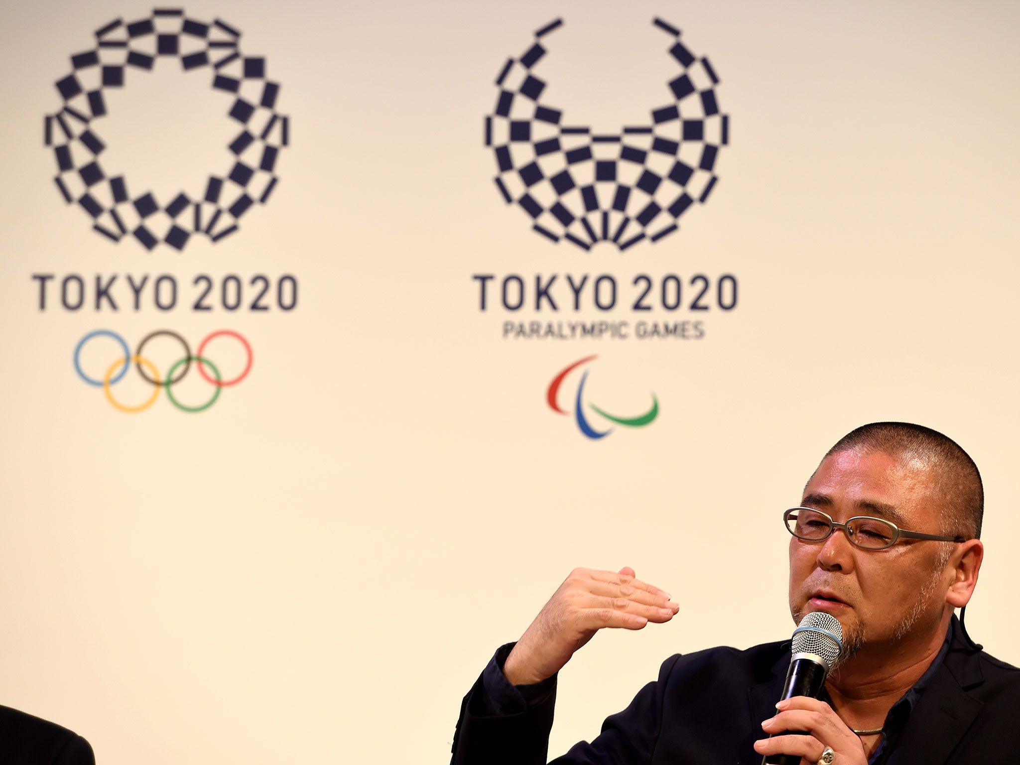
The fresh emblem was chosen from 14,000 candidates and adopts a traditional indigo-blue chequered pattern called "ichimatsu moyo" that dates back to the Edo period (1603-1868).
"It took me a long time to create this logo - it's like my own child," Tokyo-based artist Asao Tokoro, who designed the winning emblem, told a packed news conference after his design was picked from the the first open competition in the history of the Games.
"I can't be an athlete but I have felt a longing towards the Olympics since I was a child, and thought I can be involved through design," he added.
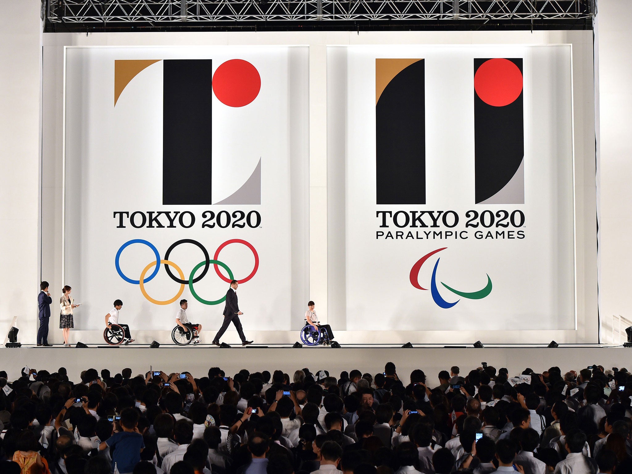
A dispute over the original logo erupted soon after it was unveiled last July, when a Belgian-based designer said it was too similar to his emblem for a theatre, demanding its use be halted and filing a lawsuit in local court.

The logo's designer Kenjiro Sano and Tokyo 2020 Olympics organisers denied the pattern had been copied but eventually scrapped it, saying its reputation was too damaged to be used.
Join our commenting forum
Join thought-provoking conversations, follow other Independent readers and see their replies
Comments