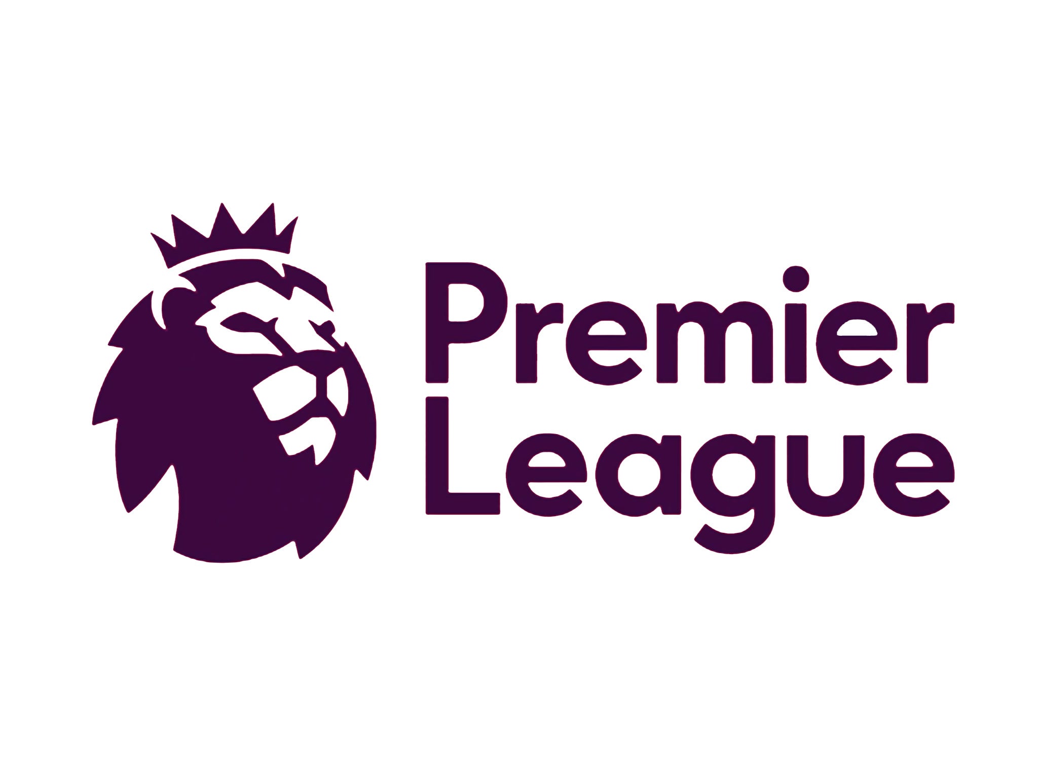
Premier League new logo unveiled for sponsor-free 2016/17 season
The re-design retains the 'lion' icon despite previous reports suggesting it would be dropped

Your support helps us to tell the story
From reproductive rights to climate change to Big Tech, The Independent is on the ground when the story is developing. Whether it's investigating the financials of Elon Musk's pro-Trump PAC or producing our latest documentary, 'The A Word', which shines a light on the American women fighting for reproductive rights, we know how important it is to parse out the facts from the messaging.
At such a critical moment in US history, we need reporters on the ground. Your donation allows us to keep sending journalists to speak to both sides of the story.
The Independent is trusted by Americans across the entire political spectrum. And unlike many other quality news outlets, we choose not to lock Americans out of our reporting and analysis with paywalls. We believe quality journalism should be available to everyone, paid for by those who can afford it.
Your support makes all the difference.The Premier League has revealed a new “visual identity”, including a logo which will come into use for the 2016/17 season.
The re-design retains the ‘lion’ icon from the current logo, which has featured in all of the league’s branding since its inception in 1992, despite reports previously suggesting that the ‘lion’ would be dropped.
The 2016/17 season will be the first time in the top flight’s history that it has not carried a title sponsor. Currently known as the Barclays Premier League, no prefix will be carried next season and alternative sponsorship methods will be used.
“From next season we will move away from title sponsorship and the competition will be known simply as the Premier League, a decision which provided the opportunity to consider how we wanted to present ourselves as an organisation and competition,” said Richard Masters, the Premier League’s managing director.
“We are very pleased with the outcome: a visual identity which is relevant, modern and flexible that will help us celebrate everyone that makes the Premier League.
“We look forward to sharing more details of our new positioning in the coming months.”
The new logo design received a mixed reception on social media.
Here’s some of the best reaction from Twitter:
Bookmakers Bwin have launched a market following suggestions from some fans that the logos should be amended. An amendment to the existing design is priced at 19/4, while the current design to remain is at 1/10.
"With the unveiling of the new Premier League logo today we've already seen a split in opinion over the design and have received requests for a market to be opened specifically on whether it will be scrapped," Bwin's Glenn Woodage said.
"We'll keep quiet about our opinion but fans now have the chance to have their say and we've already taken hundreds of bets on the subject."
What are your thoughts on the re-design? Let us know in the comments...
Join our commenting forum
Join thought-provoking conversations, follow other Independent readers and see their replies
Comments