Inter Milan issue completely bizarre press release to announce new club logo
Club's new corporate identity is barely indistinguishable from their old one
Your support helps us to tell the story
This election is still a dead heat, according to most polls. In a fight with such wafer-thin margins, we need reporters on the ground talking to the people Trump and Harris are courting. Your support allows us to keep sending journalists to the story.
The Independent is trusted by 27 million Americans from across the entire political spectrum every month. Unlike many other quality news outlets, we choose not to lock you out of our reporting and analysis with paywalls. But quality journalism must still be paid for.
Help us keep bring these critical stories to light. Your support makes all the difference.
With modern football growing ever-more corporate, it stands to reason that the amount of nonsensical press-releases issued by clubs has increased dramatically.
Manchester United's 2012/13 kit was released with a statement claiming it "blends cutting-edge technology with a design inspired by the club’s rich history and close bond with the heritage of Manchester." - perhaps laying it on a little bit thick for what was essentially a football shirt that looked like a picnic rug.
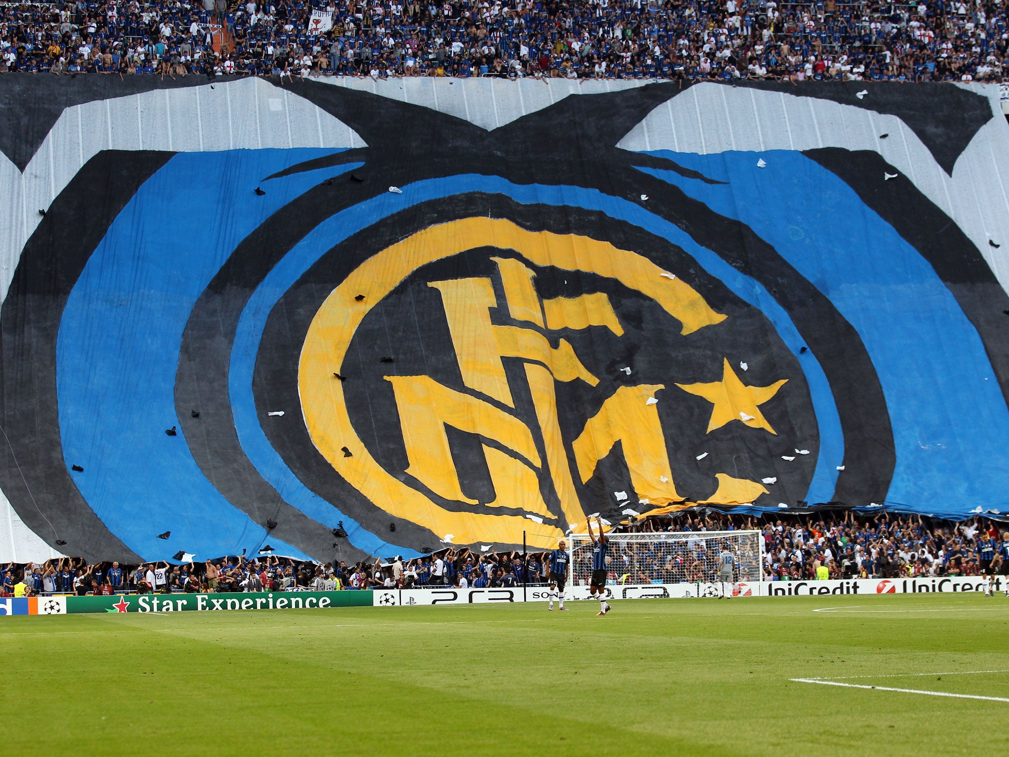
However Inter Milan have now blown away all the competition with their press release to announce their new logo and corporate identity.
It is part Alan Partridge, part Don Draper on a really bad day, with just a hint of clunky translating work thrown in for good measure and has to be read fully to be believed.
"Try and picture the scene. Your wife smiling at you, or your husband hugging you. A friend you can count on, a dinner in a special place. Imagine music, art. Imagine the best goal Inter have ever scored, the game that gave you the biggest thrill. Imagine it. The best ever. Now that those sounds, tastes and colours are dancing in your head, now that you're thinking about the best thing ever, think of it in terms of the Nerazzurri. In terms of Inter. The team that makes your heart beat faster.
A picture is gradually filling your mind, right? First a few simple lines, then circles come together and finally a star. It is starting to take shape. "It" is our new logo, now part of our team. Our "corporate identity" to use the appropriate jargon. An image which will be used everywhere: in our communications, on the team bus, at the academy. One voice for a special team. A team that will be Milanese and international. Fair and surprising. It will be legendary just as it always has been. Imagine it. Then look at the new logo. You'll notice they're much the same."
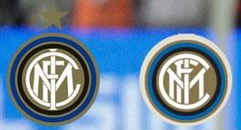
What makes the press release even more amusing is that at first glance the old logo (left) and the new logo (right) are almost entirely identical, making the whole thing seem even more pointless.
Join our commenting forum
Join thought-provoking conversations, follow other Independent readers and see their replies
Comments