Uranus and Neptune are not the colour you think they are, scientists say
Both planets are actually a similar shade of pale, greenish blue, new research suggests

Your support helps us to tell the story
From reproductive rights to climate change to Big Tech, The Independent is on the ground when the story is developing. Whether it's investigating the financials of Elon Musk's pro-Trump PAC or producing our latest documentary, 'The A Word', which shines a light on the American women fighting for reproductive rights, we know how important it is to parse out the facts from the messaging.
At such a critical moment in US history, we need reporters on the ground. Your donation allows us to keep sending journalists to speak to both sides of the story.
The Independent is trusted by Americans across the entire political spectrum. And unlike many other quality news outlets, we choose not to lock Americans out of our reporting and analysis with paywalls. We believe quality journalism should be available to everyone, paid for by those who can afford it.
Your support makes all the difference.Uranus and Neptune are not the colour we tend to think they are, scientist have said.
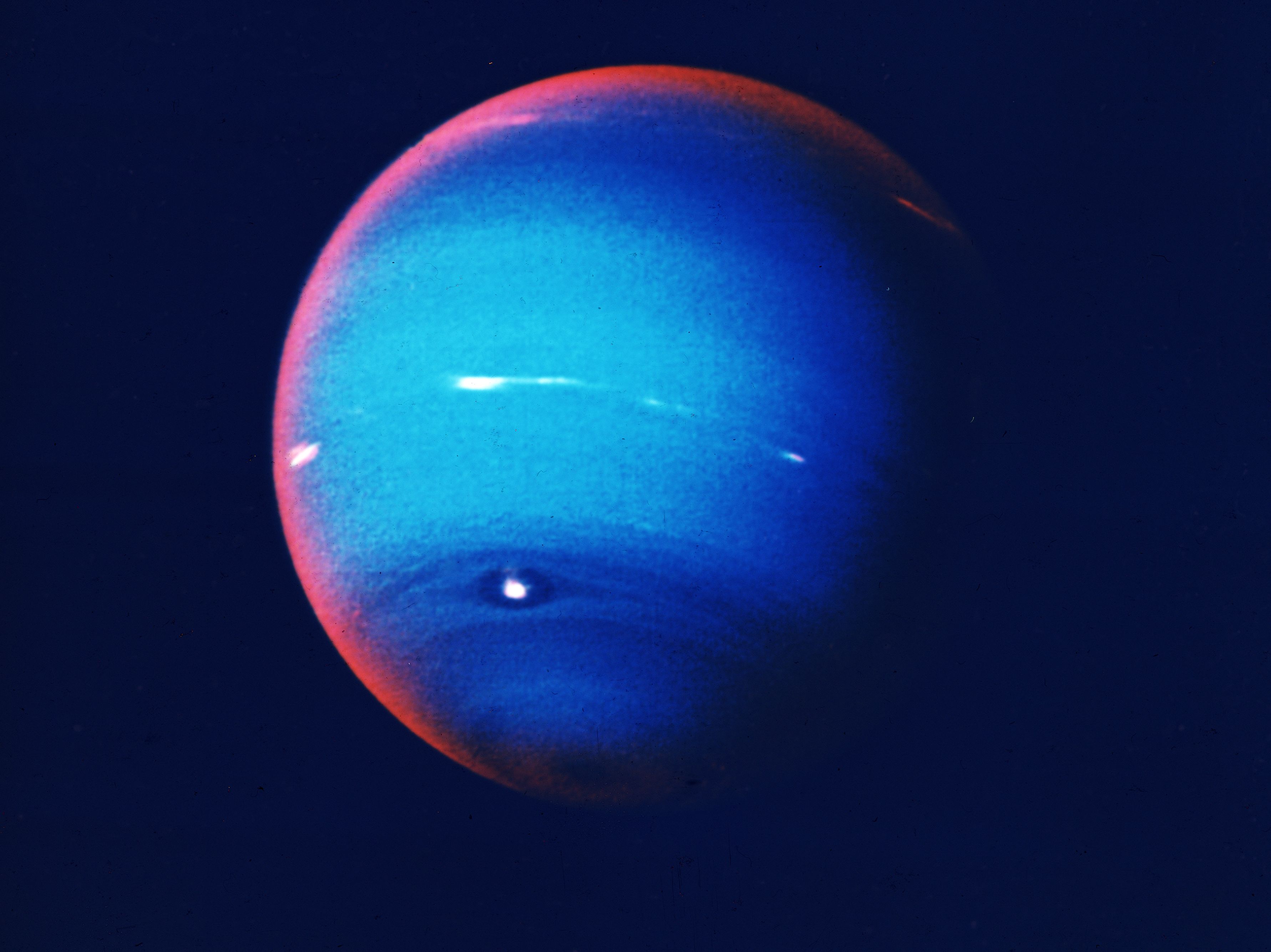
Generally, Neptune is depicted as a rich, deep blue. Uranus is usually seen as a pale green or cyan.
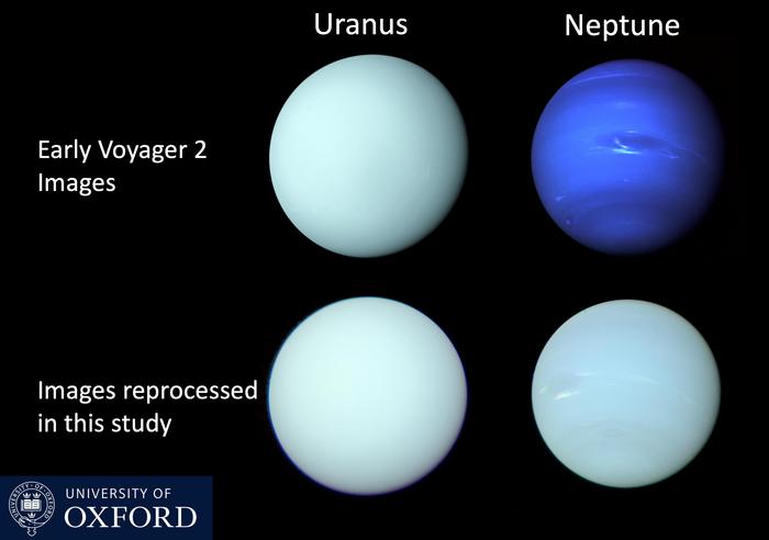
In fact, however, they are much more similar than we thought. Both planets are a particular shade of pale, greenish blue, according to new research.
Astronomers have finally confirmed the shade of the planets and published updated images as part of a new study.

Researchers have long known that the two planets look different from how they are depicted in most modern images. The new images look to correct that mistake.
The error came about because of images that came from 20th century missions to capture pictures of the planet. They were sent back in separate colours, which were them combined together to get a “true” image of how the planets might look.
Researchers also added more contrast to the image so that the clouds, bands and winds of Neptune could be better seen.
That process made the planets, especially Neptune, look too much of a rich blue, however.
“Although the familiar Voyager 2 images of Uranus were published in a form closer to ‘true’ colour, those of Neptune were, in fact, stretched and enhanced, and therefore made artificially too blue,” said Patrick Irwin from Oxford University, who led the research.
“Even though the artificially-saturated colour was known at the time amongst planetary scientists – and the images were released with captions explaining it – that distinction had become lost over time.
“Applying our model to the original data, we have been able to reconstitute the most accurate representation yet of the colour of both Neptune and Uranus.”
To build the new pictures, scientists used data from the Hubble Space Telescope and the European Southern Observatory’s Very Large Telescope. Those capture the full spectrum of colours and let scientists assemble images that are much closer to how they would really look.
The new images are reported in a paper, ‘‘Modelling the seasonal cycle of Uranus’s colour and magnitude, and comparison with Neptune’, published in Monthly Notices of the Royal Astronomical Society.
Join our commenting forum
Join thought-provoking conversations, follow other Independent readers and see their replies
Comments