The Independent's journalism is supported by our readers. When you purchase through links on our site, we may earn commission.
Interiors insider: James Lohan of Mr & Mrs Smith
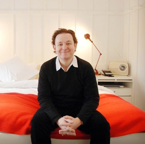
Since co-founding the travel website Mr & Mrs Smith (with his wife Tam), James Lohan has become a connoisseur in interior design. Last month, the father-of-two launched Smithandfamily.co.uk, a collection of parent-approved hotels for families who want style – and happy children. He talks to Annie Deakin about unusual interiors and common decorating mistakes.

Your support helps us to tell the story
From reproductive rights to climate change to Big Tech, The Independent is on the ground when the story is developing. Whether it's investigating the financials of Elon Musk's pro-Trump PAC or producing our latest documentary, 'The A Word', which shines a light on the American women fighting for reproductive rights, we know how important it is to parse out the facts from the messaging.
At such a critical moment in US history, we need reporters on the ground. Your donation allows us to keep sending journalists to speak to both sides of the story.
The Independent is trusted by Americans across the entire political spectrum. And unlike many other quality news outlets, we choose not to lock Americans out of our reporting and analysis with paywalls. We believe quality journalism should be available to everyone, paid for by those who can afford it.
Your support makes all the difference.My wife and I live in… a Victorian townhouse in Chiswick in West London. It’s homely and comfortable, full of pieces we’ve picked up on our travels – and it’s well worn-in, thanks to the combined efforts of our kids (three and six).
The decor is… a charmingly uneven blend of classic and contemporary; I like warm colours and patterned furnishings, and prefer my home not to be too polished. I can’t stand ‘feature walls’ and other design statements that have no substance behind them.
A home needs to be… lived in to have real character. We have an open-plan kitchen and dining room, which, for me, is an essential.
The last hotel I stayed in was… Finca Cortesin near Marbella: I’m generally wary of resorts attached to golf courses (they have a tendency to blandness), but this was outstanding; a destination hotel that balances glamour and comfort.
I have daydreams about… Wolgan Valley in the Blue Mountains, west of Sydney. The interiors are charming and immaculate, but it’s the outdoors that really sets the place apart. There are more than 4,000 acres of eucalyptus and acacia, mist rolling off the mountains, sunsets that make you wish you’d taken a photography course.
A home is something that should… evolve, whereas most hotels tend to stay with their original look. A home is somewhere very personal, the reflection of its owner: their whims, travels and family hand-me-downs.
A good hotel design scheme does… the opposite. A hotel showcases a complete and unchanging design ethos, but you’ll never finish your home.
My favourite city for buying furniture is… Paris. The city is packed full of boutiques and markets where you can stumble upon some fantastic pieces.
My motto is…If it were easy, everyone would be doing it.
The design hotel I am most in awe of is… Alila Villas Uluwatu in Bali: it’s perched spectacularly on a cliff edge with dramatic geometric architecture that makes it resemble a matchstick house built by a modernist – it’s also eco friendly.
The most unusual interior I have discovered is… Jade Mountain in St Lucia. It is architecturally incredible: a mad layer-cake on top of a mountain. The interiors don’t necessarily live up to the building, but the overall impact is fantastically unusual. The suites have private pools steps from the bed, and one wall is completely open to the air. It’s a real James Bond villain’s lair.
My advice for a hotel interior designer is… ‘Don’t neglect practicality in favour of flair’. Work on the intimate areas of a hotel and make sure the seating works for two.
The most common decorating mistake in hotels is… Art. Buying great art – and then positioning it in a context that works – takes great skill. Often, it’s an afterthought.
I admire… Olga Polizzi who has wonderfully good taste and I love Ilse Crawford – her style is a bit more disruptive, but very elegant and comfortable. She designed the original Babington House – definitely a trendsetter.
You can’t copy… Kit Kemp of Firmdale Hotels. She has done fantastic things on the hotel design front.
I love foraging for curiosities in places like… Alfies Antiques in Marylebone or the Old Cinema in Chiswick. Retrouvius is a terrific source of salvaged bits and bobs and, for modern pieces, I enjoy browsing in B&B Italia on Brompton Road.
For interiors inspiration, I look to… Elle Decoration. It is still the monthly bible and I’m a fan of the Fancy [http://www.thefancy.com/] – it’s a surprise every day.
My favourite interior trend is... cosy and tactile. Minimalism is on the way out. I like rooms with interiors I want to be in, not just ones that look good in magazines.
A great hotel interior needs to be… somewhere you feel you could live in, but something more than you have at home. It needs to feel effortless, but special. I like classic rather than crazy – if it’s too much of a statement you tend not to want to go again.
My pet hate is… design for design’s sake. I don’t want to have to guess which is the hot or cold tap, or need a map and a torch to find a plug socket. It needs to be simple. Essentially, I just like things to work.
Annie Deakin is interiors writer for sofa and interior design website mydeco.com.
Join our commenting forum
Join thought-provoking conversations, follow other Independent readers and see their replies
Comments