Design: That's so last century
It's the style statement that's an investment, too – Kate Watson-Smyth on the lure of original modern furniture

Your support helps us to tell the story
From reproductive rights to climate change to Big Tech, The Independent is on the ground when the story is developing. Whether it's investigating the financials of Elon Musk's pro-Trump PAC or producing our latest documentary, 'The A Word', which shines a light on the American women fighting for reproductive rights, we know how important it is to parse out the facts from the messaging.
At such a critical moment in US history, we need reporters on the ground. Your donation allows us to keep sending journalists to speak to both sides of the story.
The Independent is trusted by Americans across the entire political spectrum. And unlike many other quality news outlets, we choose not to lock Americans out of our reporting and analysis with paywalls. We believe quality journalism should be available to everyone, paid for by those who can afford it.
Your support makes all the difference.Just as fashion works in cycles, so it is with furniture. The brown domesticity of the Victorian era, beloved by generations of upwardly mobile urbanites, is falling from favour – in recent years, the lighter woods and moulded plastics of the mid-century modern movement have increasingly set the design agenda. At the end of this month comes the perfect opportunity for modern movement fans to pick up a classic by Jacobsen, Aalto or Eames – and for newcomers to get to know what all the fuss is about.
Now in its fifth year, the Midcentury. Modern exhibition celebrates these continental designers along with their British contemporaries, such as Robin and Lucienne Day, John and Sylvia Reid and Ernest Race. For many of us who grew up in the Seventies, that orange-coloured teak and pale birch favoured by these designers is too reminiscent of our parents' houses, but those with a discerning eye have realised that, as tastes change, pieces from this era are proving to be a canny investment.
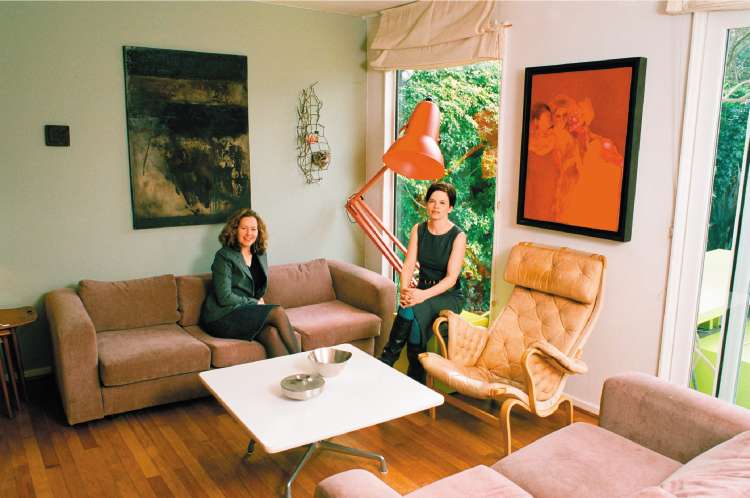
The exhibition is run by Petra Curtis, 42, and Lucy Ryder Richardson, 40. Both are married to architects, and both live in houses built in the Sixties. Together, they also run the online design shop Ourshowhome.com.
"Getting to know these designers has been a learning curve for us too," says Curtis. "Around 15 years ago when I moved to a Midcentury house in Dulwich, south London, from a flat in Hong Kong, I realised that the old Chinese furniture, or pieces from Habitat, wouldn't work in such an environment, so I had to start looking at furniture that fitted the house."
"Then, six years ago, I moved to Dulwich, to a similar kind of house," adds Ryder Richardson. "We realised that more people of our generation were attracted to these buildings, and that they needed the furniture. So, for a while, we turned my home into a kind of shop, and that's how Showhome started."
Curtis explains: "During the Sixties, architects began designing houses that were easier for modern families to live in – with large square rooms filled with light from big windows. It was a direct change from the Victorian era, with lots of small, dark rooms, where the current occupants now spend thousands knocking down walls to open them up."
Consequently, the furniture no longer had to line the edges of a narrow rooms, so designers started paying more attention to the backs of sofas and chairs, to creating different shapes, and to different materials, as the furniture was often required to "float" in the middle of a living space.
The mid-century modern period describes the post-war developments in design from about 1945 to the late Sixties. It was the first architect-designed furniture and was later followed, in Britain, by the mass-produced style of G-plan and Ercol, which referenced their Scandinavian counterparts.
David Tatham, owner of The Modern Warehouse ( www.themodern warehouse.com and www.davidtatham. com) is a passionate collector of mid-century modern, but he doesn't buy into the current G-plan revival.
"G-plan just isn't the same quality. It was mass-produced not hand-made, although it wasn't cheap even then. People who can afford to shop at Heal's would have bought G-plan or Ercol.
"I don't think it's an investment for that reason. The quality just isn't there. You can buy a G-plan sideboard for £250. It will cost you £2,500 for the Scandinavian equivalent, but at least that will hold its value, or even become more valuable. That's partly because there just isn't that much of it around. G-plan is for those who like the look but can't afford the real thing."
So how do you spot a collector's item from a cheaper, mass-produced copy? Tathum insists you don't have to be an expert in the field.
"In the same way that some rich people can't dress well and some people on a budget always look amazing, you have to have a good eye," he says. "Look at the details – like the edging. Is it solid or veneer? Is there a label? It's the little things that can tell you. Some of the British stuff just wasn't as well made."
Midcentury.Modern is at Dulwich College, Dulwich Common, London, SE21, 020-8761 3405 on 30 March from 10am to 4pm. Prices range from £10 to £5,000. Admission £5. For more information visit www.ourshowhome.com
Join our commenting forum
Join thought-provoking conversations, follow other Independent readers and see their replies
Comments