Trump's quotes mapped onto a coronavirus graph shows president 'downplaying the threat'
President's overly optimistic statements about Covid-19 outbreak don't match rates of infections
Your support helps us to tell the story
From reproductive rights to climate change to Big Tech, The Independent is on the ground when the story is developing. Whether it's investigating the financials of Elon Musk's pro-Trump PAC or producing our latest documentary, 'The A Word', which shines a light on the American women fighting for reproductive rights, we know how important it is to parse out the facts from the messaging.
At such a critical moment in US history, we need reporters on the ground. Your donation allows us to keep sending journalists to speak to both sides of the story.
The Independent is trusted by Americans across the entire political spectrum. And unlike many other quality news outlets, we choose not to lock Americans out of our reporting and analysis with paywalls. We believe quality journalism should be available to everyone, paid for by those who can afford it.
Your support makes all the difference.Donald Trump's optimistic and often misleading statements about his administration's response to the coronavirus pandemic stand in sharp contrast to the measures that first responders are seeing in hospitals across the US.
While he's now under scrutiny for overplaying the assistance and relief that the federal government plans to make available, the president's early efforts to diminish the viral outbreak came as confirmed cases of Covid-19 continued to surge.
His statements were met by waves of criticism from his political rivals and public health officials, including members of his own administration leading the response.
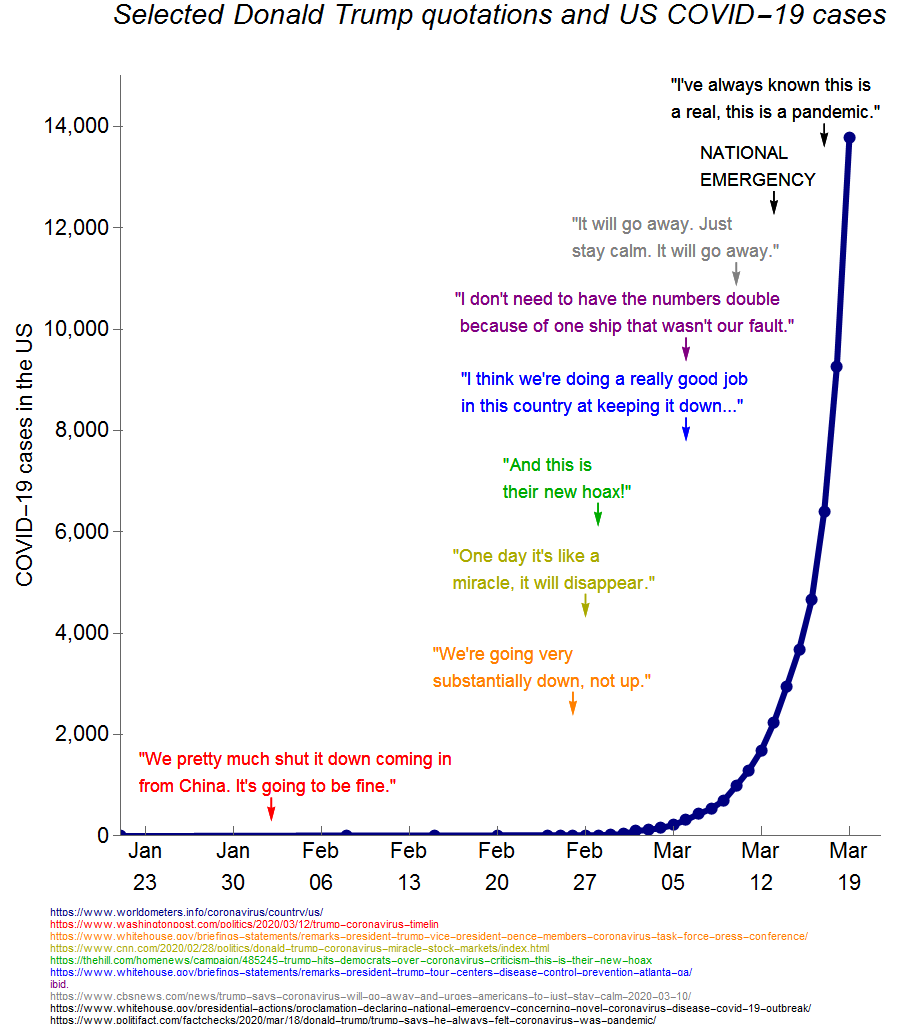
A Reddit user matched the president's public statements over the last several weeks to a graph that charts the growing number of coronavirus cases in the US up to this week, showing how the outbreak's impact contradicted the president's own confident claims about his administration's response.
Andy Balk, who made the image, said it appeared that the president has been "downplaying what was a real threat."
He told The Independent: "But could it be that he was just trying to stop people from overreacting to something that he had control over? How did the data that he had at the time inform his public statements? I made this plot to answer these questions."
"It is clear that he was downplaying something that he should have known was going to be devastating in the US. The fact that we had plenty of data from other countries makes this case even stronger."
The graph superimposes some of the president's statements over a graph of the number of cases from January through 18 March.

After the first cases appeared in Washington in January, the president insisted that the US had "pretty much shut [coronavirus] down" and said "it's going to be fine".
Nearly a month later, he claimed that cases were "going substantially down, not up" just days before he number of confirmed infections reached 1,000.
In late February, he claimed the virus "would disappear" as US infections reached 4,000, then slammed reports of the outbreak as part of a "hoax".
By the time the Covid-19 spread had been declared a pandemic by the World Health Organization, with nearly 14,000 cases confirmed in the US, forcing the president to declare a national emergency, he said he had "always known" about the threat.

Join our commenting forum
Join thought-provoking conversations, follow other Independent readers and see their replies
Comments