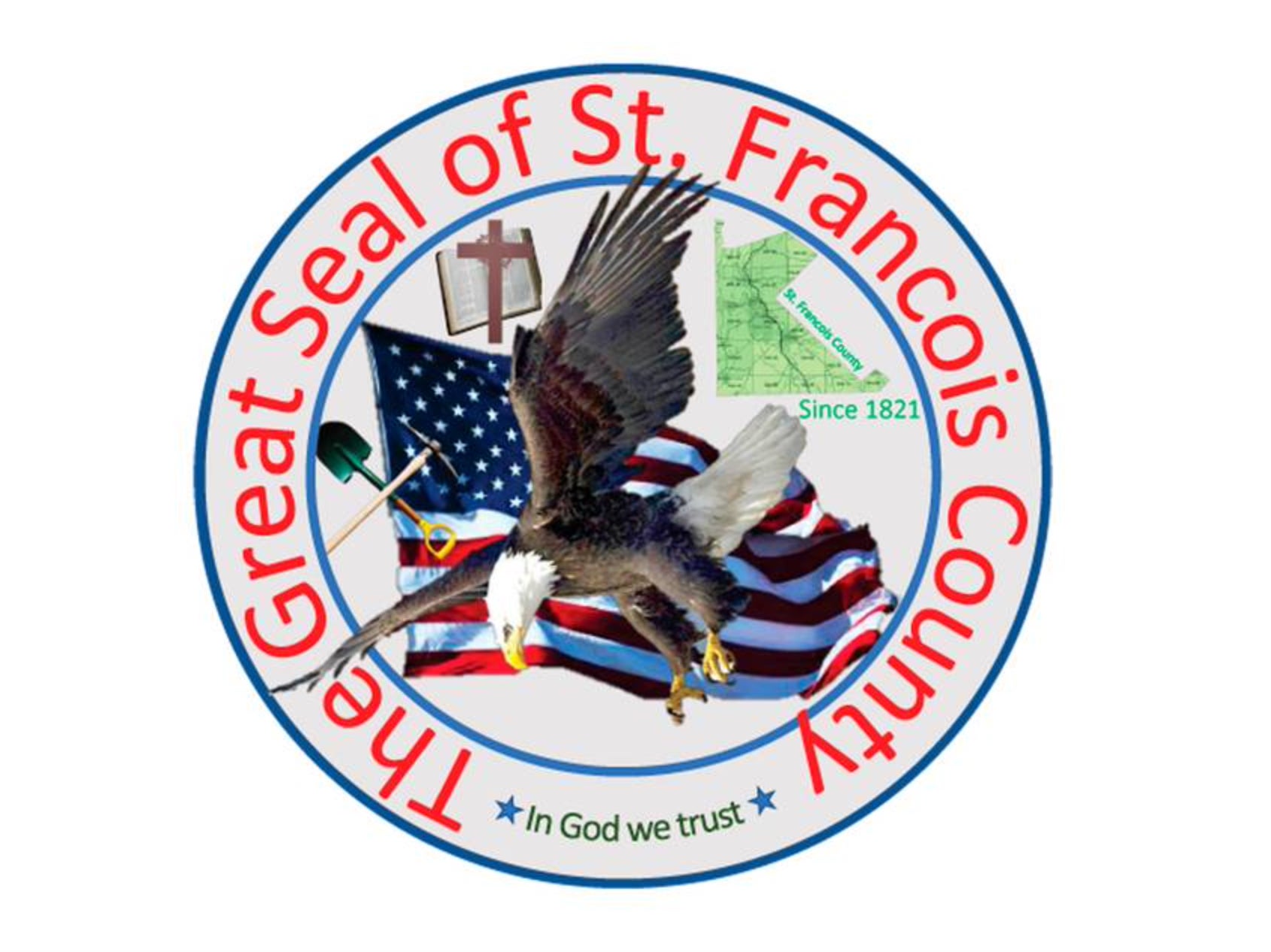
Missouri county seal goes viral for all the wrong reasons
Commissioner suggests competition to improve emblem, ‘which would be a slam dunk’

Your support helps us to tell the story
From reproductive rights to climate change to Big Tech, The Independent is on the ground when the story is developing. Whether it's investigating the financials of Elon Musk's pro-Trump PAC or producing our latest documentary, 'The A Word', which shines a light on the American women fighting for reproductive rights, we know how important it is to parse out the facts from the messaging.
At such a critical moment in US history, we need reporters on the ground. Your donation allows us to keep sending journalists to speak to both sides of the story.
The Independent is trusted by Americans across the entire political spectrum. And unlike many other quality news outlets, we choose not to lock Americans out of our reporting and analysis with paywalls. We believe quality journalism should be available to everyone, paid for by those who can afford it.
Your support makes all the difference.A county in the Lead Belt region of Missouri has admitted that its seal was ‘poorly designed’ amid online ridicule of an emblem introduced four years ago.
St Francois County commissioner Harold Gallaher told reporters on Wednesday that his design was “a piece of junk” and a “rush deal”, and that it was right to consider a redesign of the badge.
“I had two days for the public to come up with a seal and my design is proof positive that I am not artistically inclined,” Mr Gallaher, 74, said to Kansas City Star.
The commissioner, who repeated those comments at a public meeting on Tuesday, said he designed his county’s seal in 2018 with some “simple software” instead of hiring a designer.
It shows a bible, American eagle, American flag and the outline of St Francis County enclosed in a circular badge surrounded by red text saying “The Great Seal of St Francois County” and “In God We Trust”.
Mr Gallaher acknowledged that there had been “fever pitch on social media about the county seal” and said he was looking at redesigning the badge. It was unclear when a competition would be held.
“I would like it to be better than the seal we have now, which would be a slam dunk,” he was reported saying.
On Reddit, a number of St Francois County residents and social media users mocked the existing design with one person writing: “I truly cannot STAND the hillbilly scrapbook BS they have right now.”
“Having visited St Francois county several times, I can attest that the original logo is quite apropos,” added another. “Small Missouri towns and bad graphic design seem to go hand in hand, so this is great,” wrote another Reddit user.
“And who can blame them?”, wrote the Riverfront Times, a local news site, of critics on Wednesday. “There’s the jumble of images hilariously oriented to fit (mostly) within the blue border; above it, the formatting for the text of ‘The Great Seal of St Francois County’ appears to be trying to liftoff and escape from the rest of the seal”.
“Just looking at the thing for more than a few seconds produces a kind of seasick nausea, because this seal is an ‘experience’ and that experience is chaos,” the paper added.
Join our commenting forum
Join thought-provoking conversations, follow other Independent readers and see their replies
Comments