Coronavirus: Four maps and charts that show how serious the deadly virus is
Health experts have warned 'disruption to everyday life may be severe' when virus hits US
Your support helps us to tell the story
From reproductive rights to climate change to Big Tech, The Independent is on the ground when the story is developing. Whether it's investigating the financials of Elon Musk's pro-Trump PAC or producing our latest documentary, 'The A Word', which shines a light on the American women fighting for reproductive rights, we know how important it is to parse out the facts from the messaging.
At such a critical moment in US history, we need reporters on the ground. Your donation allows us to keep sending journalists to speak to both sides of the story.
The Independent is trusted by Americans across the entire political spectrum. And unlike many other quality news outlets, we choose not to lock Americans out of our reporting and analysis with paywalls. We believe quality journalism should be available to everyone, paid for by those who can afford it.
Your support makes all the difference.As coronavirus continues to spread to countries across the globe, health organisations are urging governments to prepare for the worst.
Currently, there are 81,191 confirmed cases of coronavirus and 2,768 people have died from the new respiratory virus.
This week, federal health experts have warned America that it is only a matter of time before the country is hit with the virus. "It's not so much a question of if this will happen anymore, but more really a question of when it will happen - and how many people in this country will have severe illness," Dr Nancy Messonnier of the Centres for Disease Control and Prevention (CDC) said.
As of Tuesday, 14 people have been diagnosed in the US, “in addition to 39 cases among repatriated persons from high-risk settings,” bringing the total to 53 cases, according to the CDC.
Although the current risk remains low, Americans have been urged to prepare “with the expectation that this could be bad,” Messonnier said, adding that “disruption to everyday life may be severe”.
To help the public understand the seriousness of new coronavirus, health organisations have released graphs that illustrate the global spread of the disease.
Here are four maps and charts that explain how bad new coronavirus is:
This graph, which has gone viral on social media, shows how new coronavirus compares to H1N1, MERS, Ebola, and SARS in terms of confirmed cases and numbers of deaths.
In the graph, you can track how coronavirus started off slower than Ebola, before outnumbering all of the other diseases.
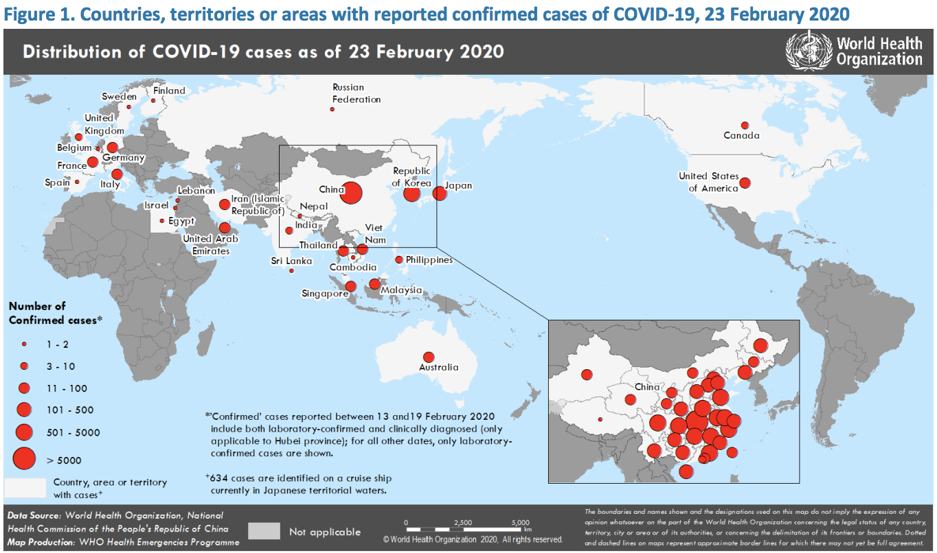
In this map distributed by the World Health Organisation (WHO), confirmed cases of the virus in countries, terroritories or areas as of 23 February are illustrated with red dots of varying sizes.
The graph shows both how the virus has spread to multiple countries, and the number of cases in each country.
This map from the China Global Television Network (CGTN) shows the number of confirmed cases and deaths in Europe as the virus spreads.
Currently, Italy has the most confirmed cases of the virus with 323, followed by Germany with 18.
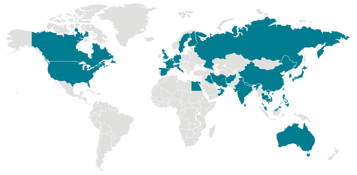
A map from the CDC shows all of the locations around the globe with confirmed cases of coronavirus. So far, the virus as spread throughout China and to 31 other countries.
For a live tracker of the spread of the virus, you can check Johns Hopkins dashboard here, where it displays the number of people infected, the number of deaths, and the number of people recovered from the virus.
Join our commenting forum
Join thought-provoking conversations, follow other Independent readers and see their replies
Comments