What is the point of political symbols?
The timing was bad, but there’s merit in Matt Hancock’s much-mocked idea of a national logo for social care, writes John Rentoul. After all, it worked for the NHS...


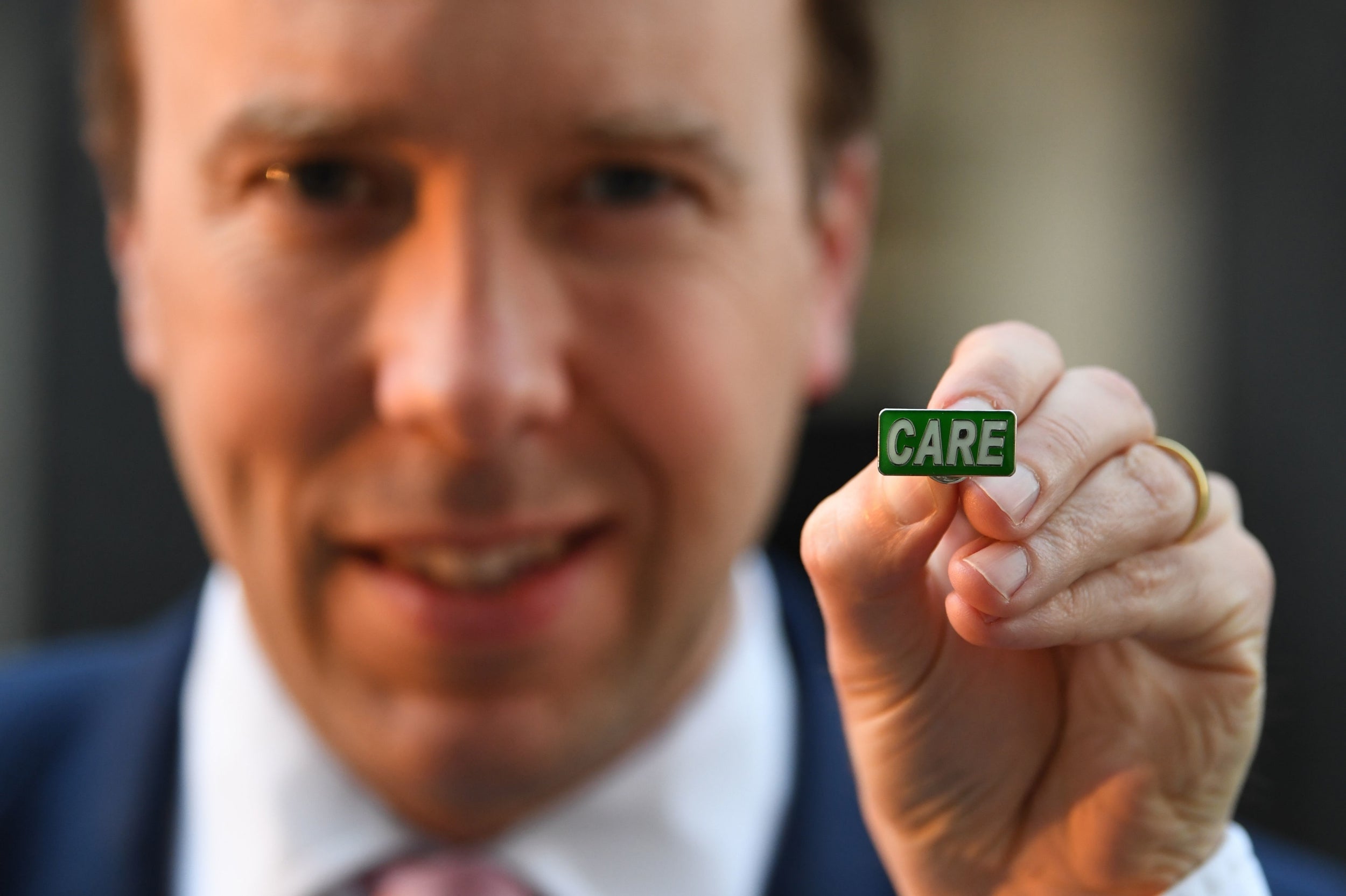
Matt Hancock, the health and social care secretary, had a rough time this week when he spoke about creating a “single brand” for social care, and a literal “badge of honour”: a green enamel badge with the word “CARE” in capital letters.
It would allow “social care staff proudly and publicly to identify themselves, just like NHS staff do with that famous blue and white logo,” he said at the daily news briefing on Wednesday.
Cue much mockery of a “gesture”, when social care workers need face masks, gloves and gowns – and coronavirus tests. But, while the timing may have been clumsy, and the suppliers of the badges were bound to run out of stock immediately, the idea of a national logo for social care is not a bad one.
Some logos for public services, such as for the NHS or Transport for London’s roundel, are well known as symbols of quality, signposts for consumers and sources of pride for workers.
A logo is not a substitute for other ways of raising the esteem in which social care is held, but it could help spread awareness. Theresa May had tried to do something similar when she renamed the department of health, adding “and social care” in 2018.
That was the cabinet reshuffle when Jeremy Hunt went into No 10 without wearing his usual NHS badge, prompting speculation that he was to be moved, before emerging two hours later, with badge, and with an enlarged department.
It seemed at the time to be a small step in the right direction, namely to raise the status of social care and to integrate it with the NHS.
Early last year Hancock’s department launched a recruitment drive, the “Every Day Is Different” campaign, that sought to improve the image of social care as a rewarding career. Since then, though, there has been little follow-through in delivering the substance. At the time of last year’s election, Boris Johnson’s “clear plan we have prepared” for social care failed to materialise.
The history of the NHS logo on Hunt’s lapel is nevertheless instructive. It was under John Major’s Conservative government in the 1990s that the logo – the white letters “NHS” in Frutiger Bold Italic on a blue background – was devised. Health service managers wanted a way of mobilising the huge public goodwill towards the NHS at a time when many people didn’t realise that some services were part of it.
It could be argued that the NHS logo was originally a way of compensating staff for the underfunding of the service, but under the Labour government it became a nationally recognised badge of quality and pride.
It could be that the CARE logo could achieve something similar – but only if, as happened to the NHS under Labour, it receives a sustained level of higher funding in return for reform.
Join our commenting forum
Join thought-provoking conversations, follow other Independent readers and see their replies
Comments