The best graphics to make sense of the general election
Elections can be hard to get your head around. Thankfully, the Independent on Sunday's graphics team are here to help
Your support helps us to tell the story
From reproductive rights to climate change to Big Tech, The Independent is on the ground when the story is developing. Whether it's investigating the financials of Elon Musk's pro-Trump PAC or producing our latest documentary, 'The A Word', which shines a light on the American women fighting for reproductive rights, we know how important it is to parse out the facts from the messaging.
At such a critical moment in US history, we need reporters on the ground. Your donation allows us to keep sending journalists to speak to both sides of the story.
The Independent is trusted by Americans across the entire political spectrum. And unlike many other quality news outlets, we choose not to lock Americans out of our reporting and analysis with paywalls. We believe quality journalism should be available to everyone, paid for by those who can afford it.
Your support makes all the difference.Not only the best writing, best photography and best illustration, but also the best graphics. The Independent on Sunday has brought you the best election coverage, with stunning graphics to try to make the complexities of seven-party politics readily intelligible.
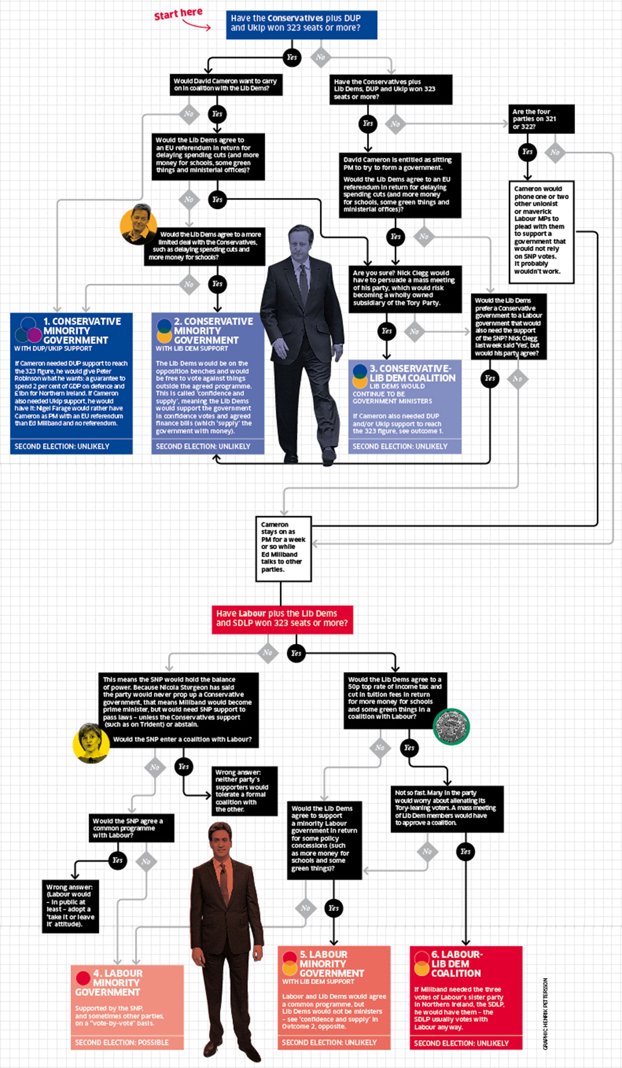
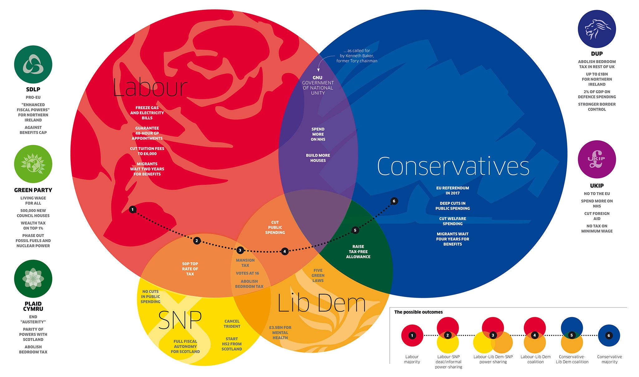
Our Playmobil figures for the demographic groups that will decide how the electorate divides. Our super-Venn, full-colour diagram showing the possible combinations of parties and policies in a hung parliament. And John Rentoul’s extraordinary flowchart to guide the reader through the arithmetic and politics of an inconclusive election result.

Click here for an enlarged version of the above graphic

Click here for an enlarged version of the above graphic
The Independent has got together with May2015.com to produce a poll of polls that produces the most up-to-date data in as close to real time as is possible.
Click the buttons below to explore how the main parties' fortunes have changed:
All data, polls and graphics are courtesy of May2015.com. Click through for daily analysis, in-depth features and all the data you need. (All historical data used is provided by UK Polling Report)
Join our commenting forum
Join thought-provoking conversations, follow other Independent readers and see their replies
Comments