Election posters: The Battle of the billboards
Big Ben had barely chimed in the new year when the political parties launched their campaigns. Kunal Dutta asked five advertising agencies to imagine what the hoardings might look like in 116 days’ time, while Westminster-watcher John Rentoul gives his verdict

Your support helps us to tell the story
From reproductive rights to climate change to Big Tech, The Independent is on the ground when the story is developing. Whether it's investigating the financials of Elon Musk's pro-Trump PAC or producing our latest documentary, 'The A Word', which shines a light on the American women fighting for reproductive rights, we know how important it is to parse out the facts from the messaging.
At such a critical moment in US history, we need reporters on the ground. Your donation allows us to keep sending journalists to speak to both sides of the story.
The Independent is trusted by Americans across the entire political spectrum. And unlike many other quality news outlets, we choose not to lock Americans out of our reporting and analysis with paywalls. We believe quality journalism should be available to everyone, paid for by those who can afford it.
Your support makes all the difference.Mocked up for LABOUR
Title
‘Don’t kill the NHS’Agency Droga5 Europe
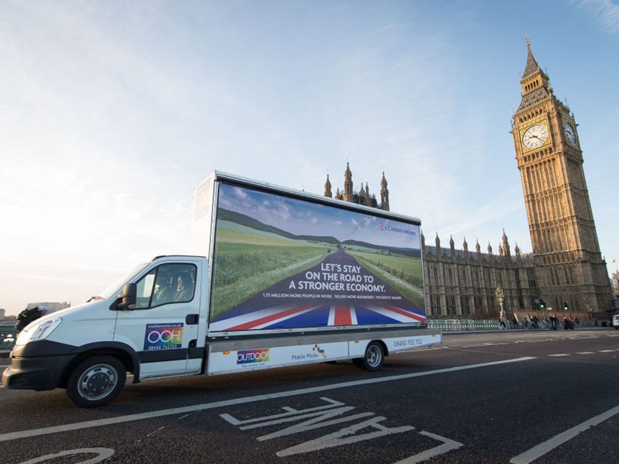
“The economy, the health service, Europe and immigration will obviously be key themes for all parties. So it was no great surprise to see the Conservative Party kick things off with a poster urging voters to stick with them on the road to economic recovery.
“Yet it felt a fairly bland start, with the stock photograph of a German road only serving to prove the point of how much scrutiny these ads will be under.
“Hopefully, we’ll see work with a little more conviction, a little more passion, a stronger point of view. Like this one. If not, I might vote for Russell [Brand].”
Nik Studzinski, executive creative director, Droga 5 Europe
John Rentoul’s verdict: I think it’s wrong to pretend that the Tories want to abolish the NHS when they have promised to protect NHS spending, but I fear it’s effective.
Mocked up for the LIBERAL DEMOCRATS
Title ‘Iron fist, velvet glove’
Agency Whistlejacket London
“Unlike the negative advertising that will dominate the campaign, we believe that the final message to a voter should ultimately be positive. The Lib Dems have campaigned consistently as the one party that will deliver robust fiscal probity (hence the iron fist) while protecting the vulnerable (the velvet glove). It’s a strong image that combines the strength of a party of government with the history of a party of protest.”
Richard Morris, founder, Whistlejacket London
John Rentoul’s verdict: A big problem for a centre party is that it seems wishy-washy and weak. I think this is a clever counter-punch.
Mocked up for the GREEN PARTY
Title ‘The shoots of recovery’
Agency Madwomen
“The Green Party is the only one that has strategies to end austerity and close the gap between rich and poor.
“It is no longer a one-issue party – its members care about people as well as the planet. Our poster sets out the policies the Greens are committed to.
“We went for this all-encompassing approach because we are not ‘selling’ a personality – we want to make sure people know that the Green Party will take action to improve the lives of the many, not just the few.”
Gail Parminter, creative director, Madwomen
John Rentoul’s verdict Deliberately dull, with lots of “-ing” words – this makes the point that the party is not going for a single-issue, gimmick campaign. But it doesn’t begin to deal with the “how?”.
Mocked up for the CONSERVATIVES
Title ‘Vote Ukip’
Agency Big Al’s Creative Emporium
“The task in the final throes of the campaign will be to minimise the Ukip ‘protest’ vote. Attacking Nigel Farage is tempting, but the wrong tactic. Protest voters love him, and firing broadsides is water (or something stronger) off a duck’s back. You need to point to the consequences of a protest vote. The Tories won’t prevent a protest, but Miliband might.”
Stef Jones, creative partner, Big Al’s Creative Emporium
John Rentoul’s verdict Direct, simple. It is not clear how many voters tempted by Ukip can be won back with this argument but, if they can, this does the job.
Mocked up for UKIP
Title ‘Dad’s Army’
Agency Surgery Creations
“While not representative of the agency’s views, we thought it interesting to focus on how Ukip plays to fears of EU freedom of movement laws and a political elite too weak to take a stand on immigration.
“Taking our lead from Dad’s Army, the much-loved BBC sitcom centred around the ramshackle Home Guard protecting our interests during the Second World War, this ad is designed to appeal to a certain demographic of older voters in the Eurosceptic heartlands up and down the country. Dad’s Army will experience a resurgence later this year, with a cinema adaptation set for release in 2016 – so we felt this was an ideal opportunity to get in there first.”
David Woods, creative director, Surgery Creations
John Rentoul’s verdict Not sure the Second World War analogy works, and the Dad’s Army reference suggests that Ukip is a bunch of bumbling Home Guard comedians.
Join our commenting forum
Join thought-provoking conversations, follow other Independent readers and see their replies
Comments