Save the Children stops using font designed by paedophile artist
The charity’s new Oswald and Lato font will be rolled out this year

Your support helps us to tell the story
From reproductive rights to climate change to Big Tech, The Independent is on the ground when the story is developing. Whether it's investigating the financials of Elon Musk's pro-Trump PAC or producing our latest documentary, 'The A Word', which shines a light on the American women fighting for reproductive rights, we know how important it is to parse out the facts from the messaging.
At such a critical moment in US history, we need reporters on the ground. Your donation allows us to keep sending journalists to speak to both sides of the story.
The Independent is trusted by Americans across the entire political spectrum. And unlike many other quality news outlets, we choose not to lock Americans out of our reporting and analysis with paywalls. We believe quality journalism should be available to everyone, paid for by those who can afford it.
Your support makes all the difference.Save the Children is to stop using a font designed by a disgraced artist and paedophile who abused his young daughters.
The children’s charity is to drop the Gill Sans typeface created by Eric Gill in 1928 which features in the Save the Children logo.
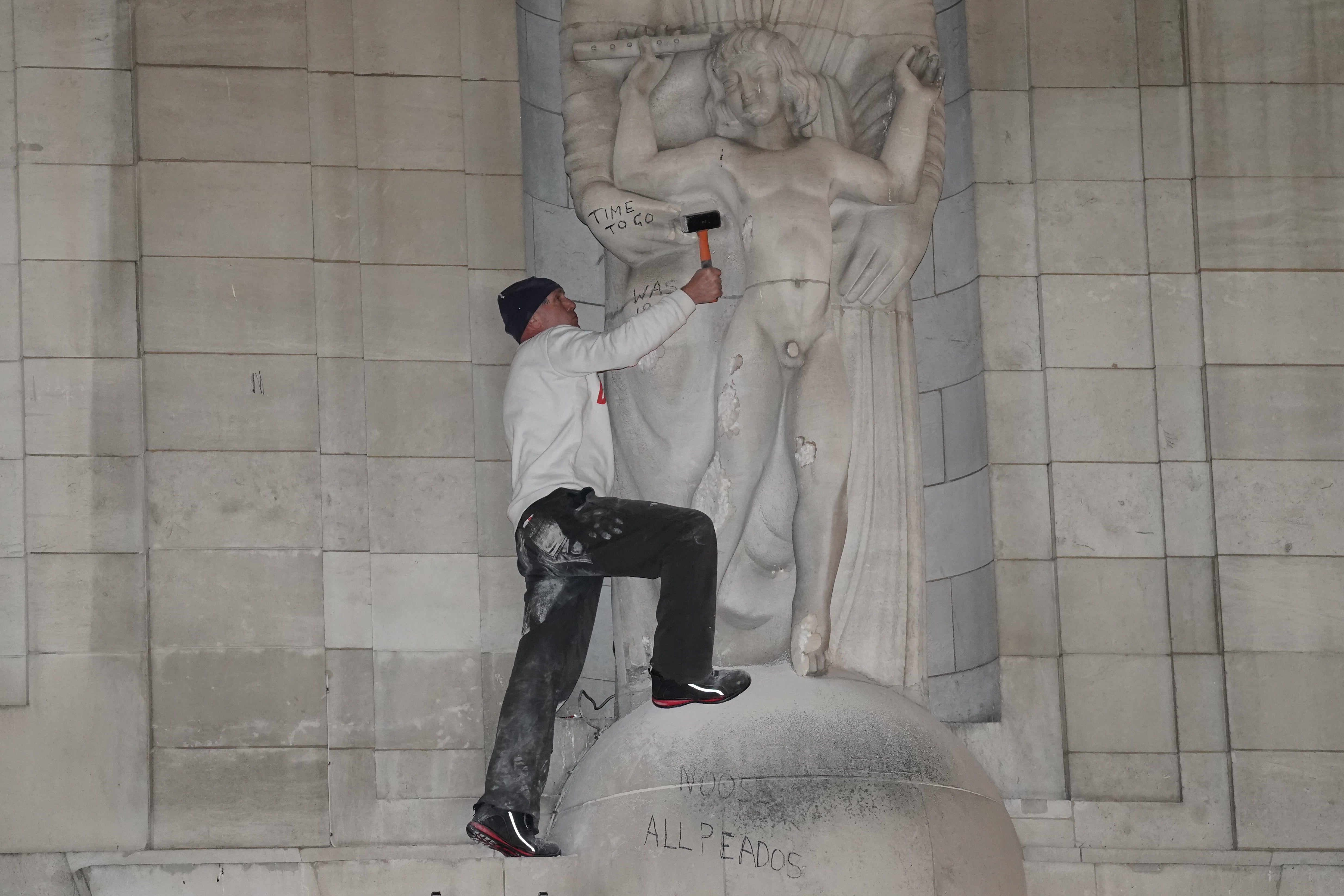
The organisation said the decision was made last year and was unrelated to an incident this week in which one of Gill’s most prominent works, a statue outside BBC Broadcasting House, was damaged by a protester chipping away at it with a hammer.
Charity staff had reportedly previously warned managers about the link to a known child abuser, particularly since one of Save the Children’s stated aims is to protect young people from abuse.
Extracts from Gill’s private diaries, published in 1989 by biographer Fiona MacCarthy half a century after his death, revealed he sexually assaulted his teenage daughters.
“His religious views and subject matter contrast with his sexual behaviour, including his erotic art, and (as mentioned in his own diaries) his extramarital affairs and sexual abuse of his daughters, sisters and dog,” a biography on the Tate galleries website said.
The charity’s most recent brand guidelines, published in 2016, outlines that Gill Sans Infant Standard should be used across the majority of its literature and online site. But this will change in 2022.
The charity said: “Following a global branding review last year, we are moving away from using the Gill Sans font. Our new typeface is being rolled out this year.”
The BBC also ditched Gill Sans last October after audiences said it looked “old-fashioned” but the broadcaster has resisted calls to remove Gill’s Prospero and Ariel statue outside Broadcasting House in Portland Place, London.
The Gill sculpture, depicting the characters from Shakespeare's play The Tempest, was installed in 1933.
Nearly 2,500 people have signed a petition demanding the removal of the sculpture on the website of online campaign platform, 38 Degrees.
A spokesperson from Save the Children said: “After months of research into fonts we could use across all formats, our new fonts, Oswald and Lato, will be rolled out this year. We are pleased to have found new typefaces that align with our values and are also free of charge, which minimises our costs.”
Join our commenting forum
Join thought-provoking conversations, follow other Independent readers and see their replies
Comments