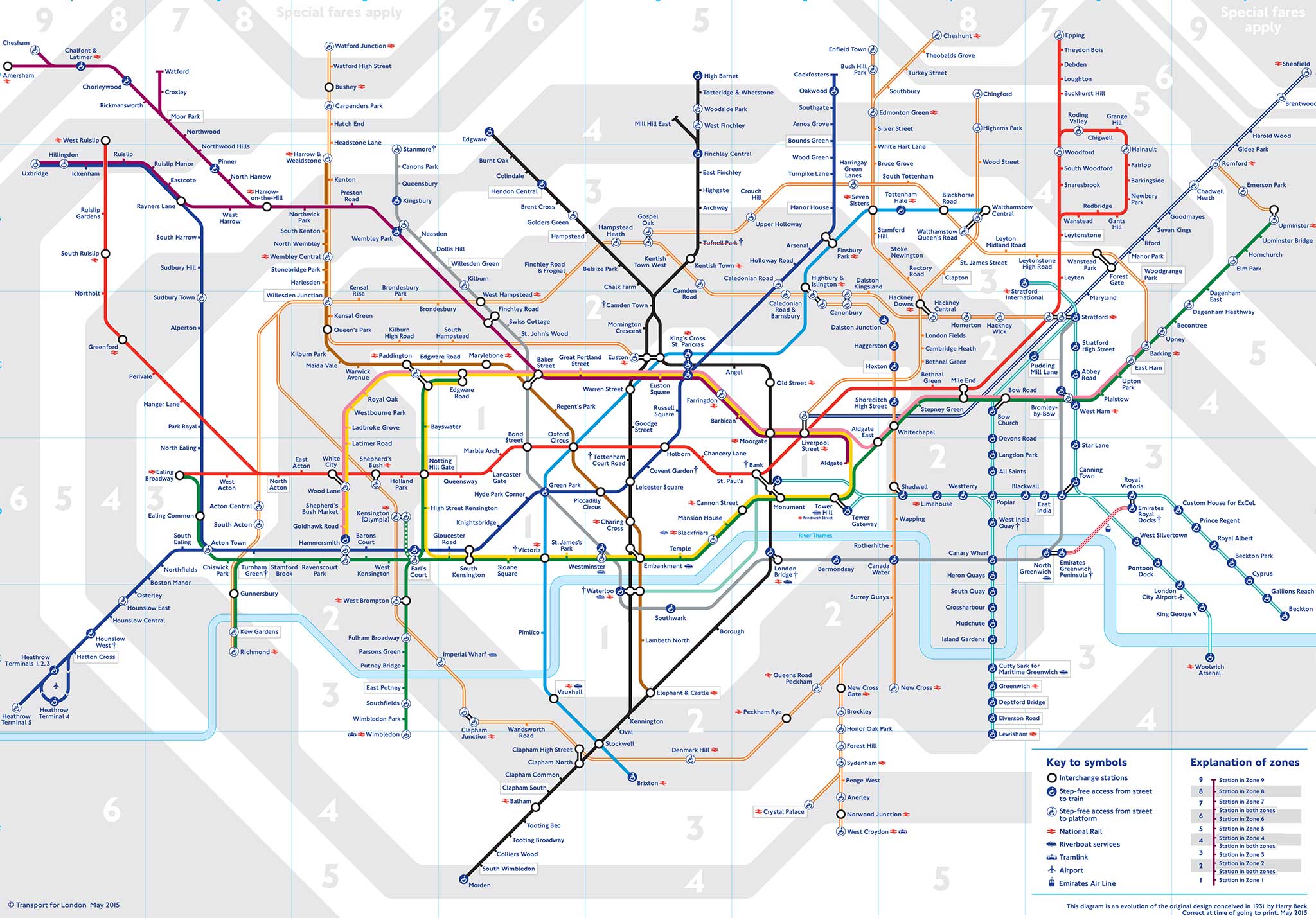
A Tube map of the London Underground that's far more useful than the 'official' one
The updated tube map, created by Wikipedia user 'Sameboat', has been praised for being easier to understand and more geographically accurate than the official version
A new, improved London Underground map that irons out the faults of the official version has been posted on Wikipedia - by a user from Hong Kong.
The new map, by a user called Sameboat, has been praised for being clearer than the old, 80-year old template.
Unlike in the official version, different branches of the fast-expanding London Overground Network are now in different colours, handy interchanges are highlighted and the correct geographical relationship between the two stations in Bethnal Green, east London, is shown.
Planned line extensions are also highlighted, meaning that the map is more likely to be 'future proof' compared to the version used by Transport for London.

And the 'Emirates Air Line', the cable car which runs over the River Thames between Greenwich Peninsula and the Royal Docks, is also lacking from the maps.
Urban geography website CityMetric has praised the new map as an improvement on the 84-year-old template designed by Harry Beck, which it says is outdated, cramped, unclear and "just isn't very pretty".
All that is known about Sameboat is the sketchy information that can be gleaned from their Wikipedia profile page. The page says that Sameboat is a 32-year-old Chinese who was born in Hong Kong and speaks Cantonese, English and Mandarin.
One of CityMetric's biggest bugbears about the official map is that it shows "TfL's increasingly cumbersome Overground empire in a single shade of orange", while Sameboat's version corrects that by dividing that network into different coloured branches.
And, while the TfL version does not show stations close to each other where the ticketing system allows passengers to make interchanges - Ickenham to West Ruislip, for example - Sameboat's groups them together.
Sadly, TfL has just launched the latest version of its tube map, so it looks unlikely that Sameboat's amendments will be adopted any time soon.
Sameboat's map can be viewed on Wikipedia here.
Join our commenting forum
Join thought-provoking conversations, follow other Independent readers and see their replies
0Comments