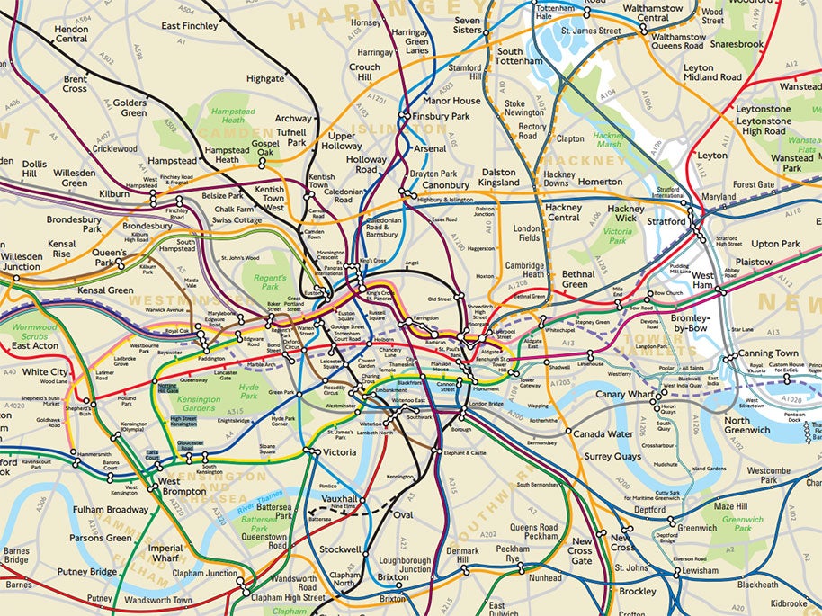
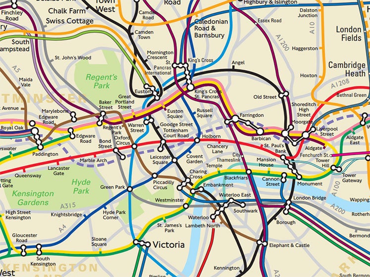
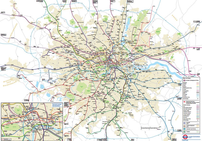
TfL forced to reveal secret geographically accurate London Tube and rail map

Your support helps us to tell the story
From reproductive rights to climate change to Big Tech, The Independent is on the ground when the story is developing. Whether it's investigating the financials of Elon Musk's pro-Trump PAC or producing our latest documentary, 'The A Word', which shines a light on the American women fighting for reproductive rights, we know how important it is to parse out the facts from the messaging.
At such a critical moment in US history, we need reporters on the ground. Your donation allows us to keep sending journalists to speak to both sides of the story.
The Independent is trusted by Americans across the entire political spectrum. And unlike many other quality news outlets, we choose not to lock Americans out of our reporting and analysis with paywalls. We believe quality journalism should be available to everyone, paid for by those who can afford it.
Your support makes all the difference.A secret London Underground map that accurately depicts the distances and locations of stations in and around the capital has been revealed by transport bosses.
Transport for London (TfL) had kept the map under wraps until being forced to unveil it following a Freedom of Information (FOI) request.
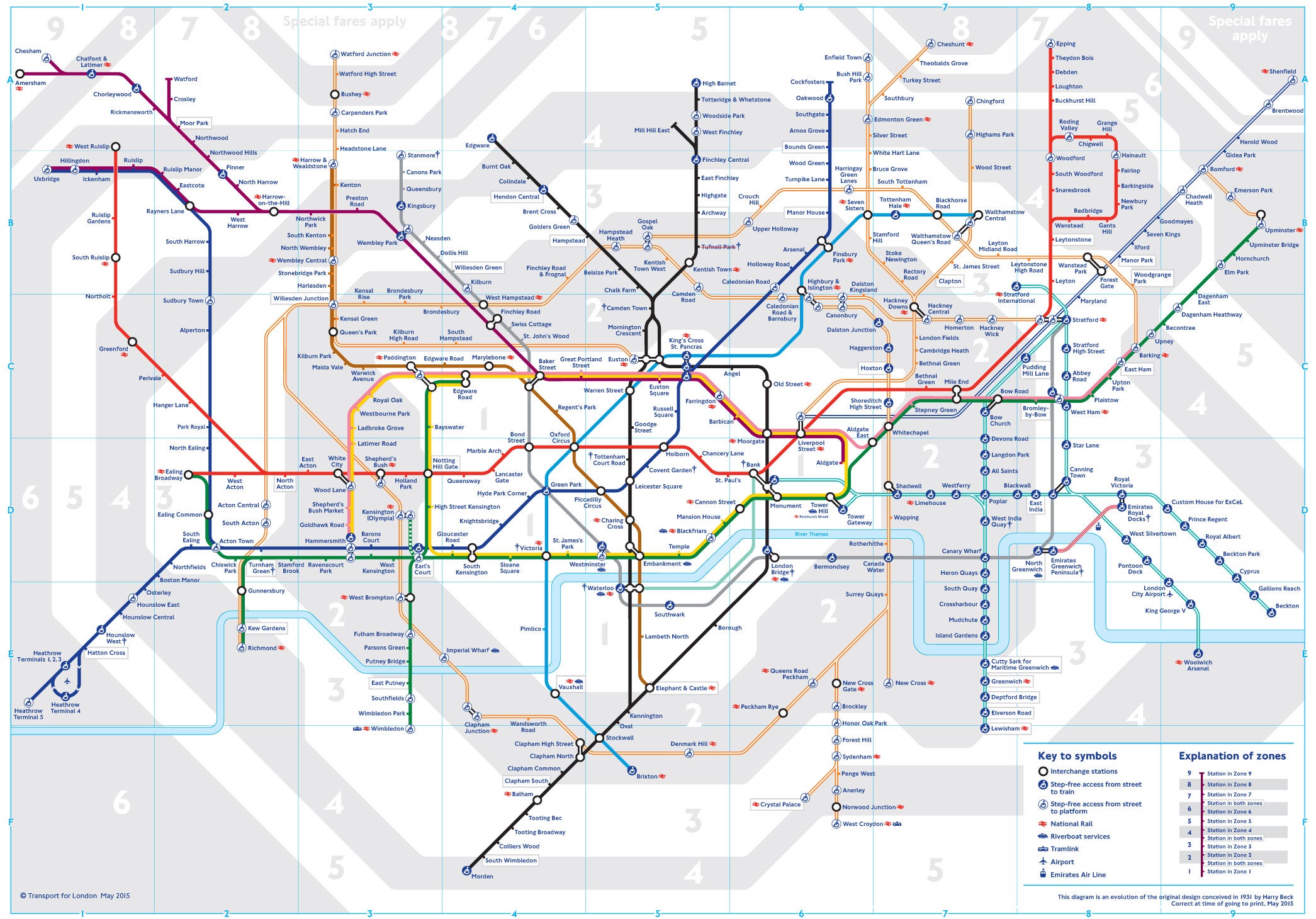
With its sprawling mass of wobbly lines, the previously unseen map is a vastly different from the grid of neat routes set out in the traditional tube map. It also shows the Docklands Light Railway and National Rail routes.
In August 2014, James Burbage asked TfL to “supply a geographically accurate map of all the stations, platforms, lines and tracks that form the London Underground, London Overground, Docklands Light Railway and National Rail service”.
He added that information which could pose health and safety concerns should be omiited.
Mr Burbage's request was answered a month later. "I can confirm we hold the information you require," Jasmine Howard, a FOI case officer, said in the letter.
The full map and FOI can now be viewed on the whatdotheyknow.com website.


The new map, which was last updated in May 2014, covers urban areas on the outskirts of London such as Slough, Enfield, Sutton and Essex.
The dotted lines show where new services will be placed.
The original Tube map was created by Harry Beck in 1933. Although it was initially considered too radical, it is now seen as an iconic design.

Join our commenting forum
Join thought-provoking conversations, follow other Independent readers and see their replies
Comments