Bring on the drama with the correct staging
Whether perking it up a bit or going for a complete overhaul, some careful staging will bring a whole new dimension to your home
Your support helps us to tell the story
From reproductive rights to climate change to Big Tech, The Independent is on the ground when the story is developing. Whether it's investigating the financials of Elon Musk's pro-Trump PAC or producing our latest documentary, 'The A Word', which shines a light on the American women fighting for reproductive rights, we know how important it is to parse out the facts from the messaging.
At such a critical moment in US history, we need reporters on the ground. Your donation allows us to keep sending journalists to speak to both sides of the story.
The Independent is trusted by Americans across the entire political spectrum. And unlike many other quality news outlets, we choose not to lock Americans out of our reporting and analysis with paywalls. We believe quality journalism should be available to everyone, paid for by those who can afford it.
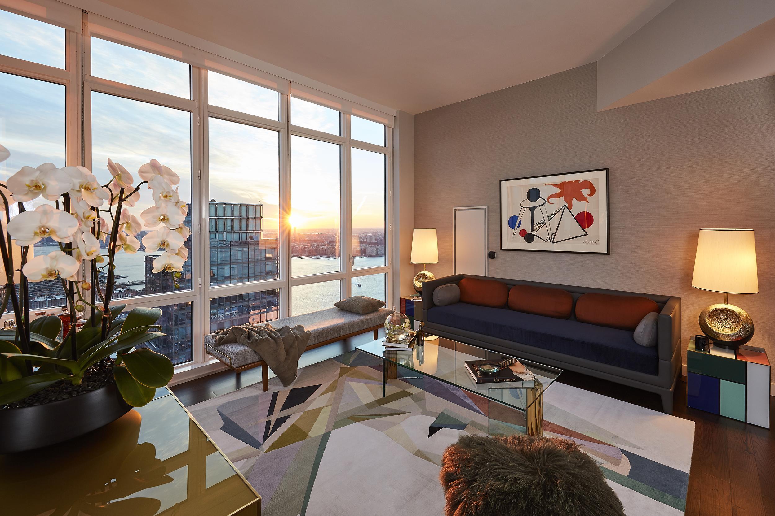
Your support makes all the difference.Staging is one of the most underrated and necessary element of interior design. Of course, specifying the best flooring, surfaces and soft furnishings to achieve your desired look is important. But, it’s surprising how bare and unconsidered a home can look without some basic staging. Whether your home needs perking up for a dinner party, or requires a little lift for real estate sales photography, staging adds another dimension to the original design of your home.
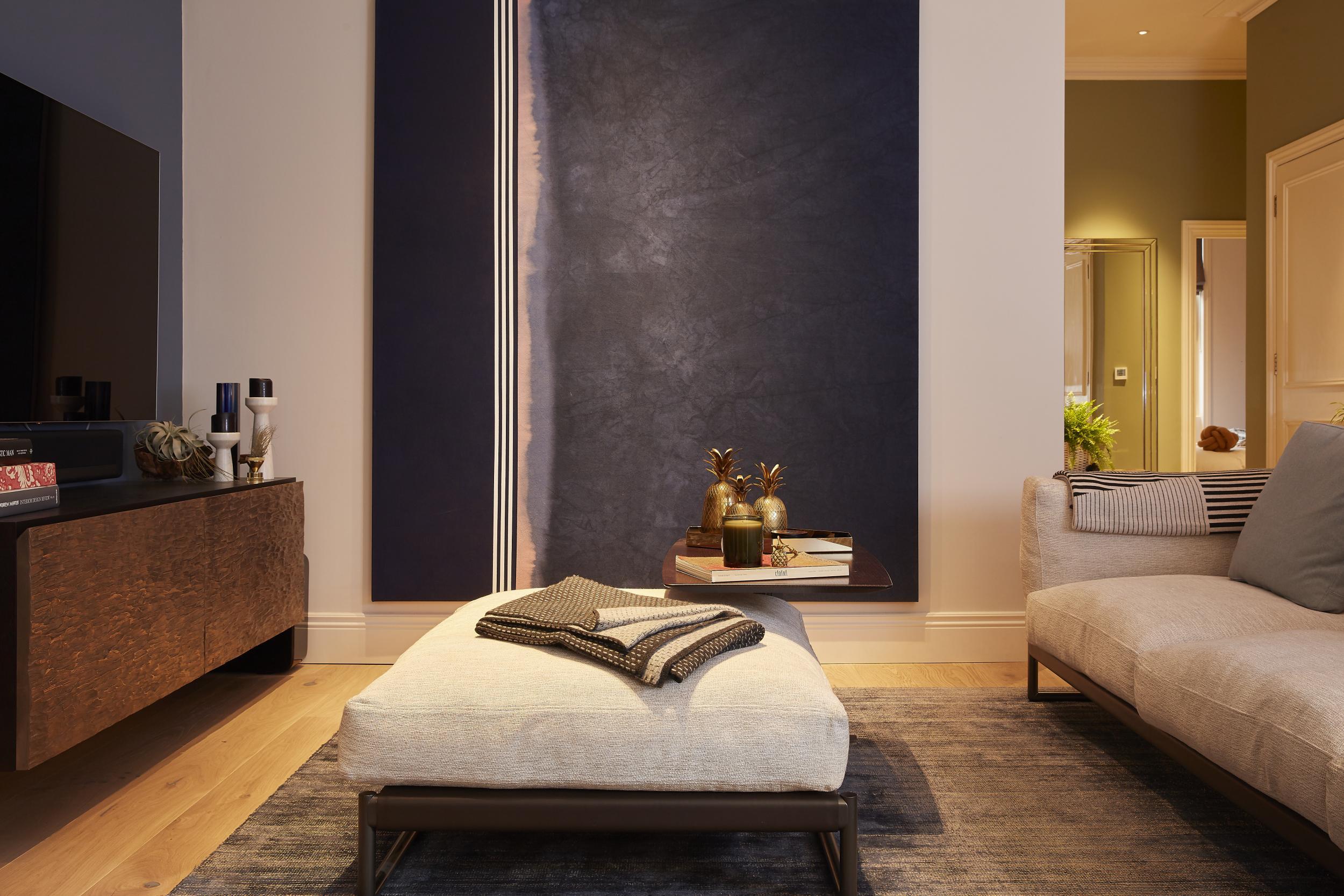
The most obvious place to start is sourcing some artwork that either echoes or informs the overall aesthetic of a room. However, there is an art to hanging art – mounting framed artwork or canvases on the wall is tricky business, but with the right advice, your collection will pop. As a general rule, always hang art slightly lower than you think. Above a sofa, bed or console table, ensure that the bottom of the piece falls no higher than a foot above the frame.
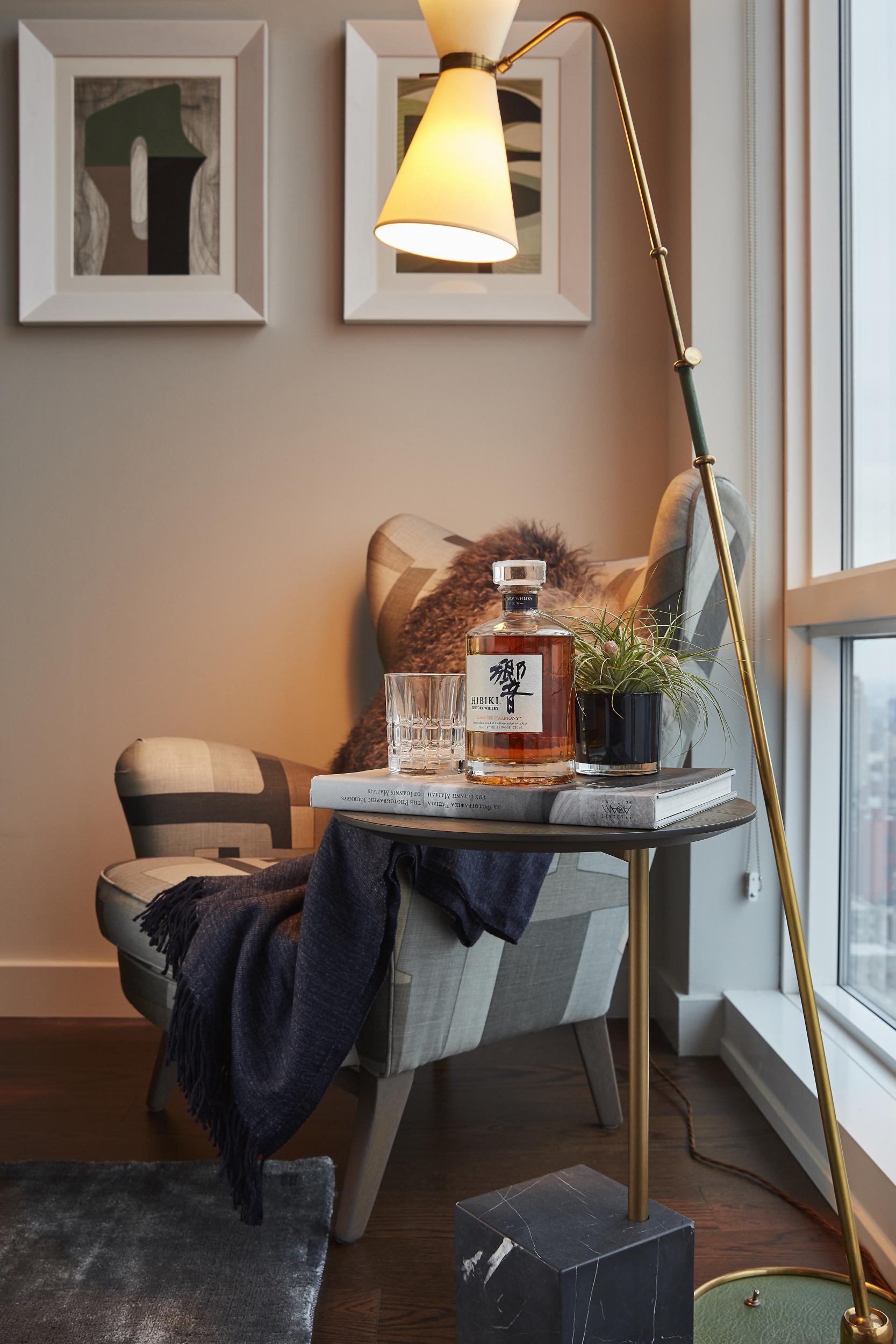
If you prefer a salon hang (a gallery wall or collaged frames), decide one way or the other the format that you want your selection artwork to take. If you want to curate your pieces in an ordered grid, try to be as accurate as possible and use pieces of the same size. Alternatively, go wild with size, shape, colour and placement. Scatter the work across the wall with no discernible pattern or format – just go wild! There’s nothing worse than a gallery wall half way between the two.
If you’re looking to sell your house, however, there is no need to invest in art at full cost. There are brilliant rental services that provide a range of beautiful work at all price points. These kinds of sites provide art to imbue your home with a sense of personality that will appeal to potential buyers. Rental services are also a great platform you can use to explore what kind of artwork might work for your home. Think of it like a ‘try before you buy’ system that can help you decide what style you want to incorporate. However, rentals can extend beyond artwork. When styling a client’s home for a sale or photography, I often loan furniture such as beautiful armchairs or barstools.
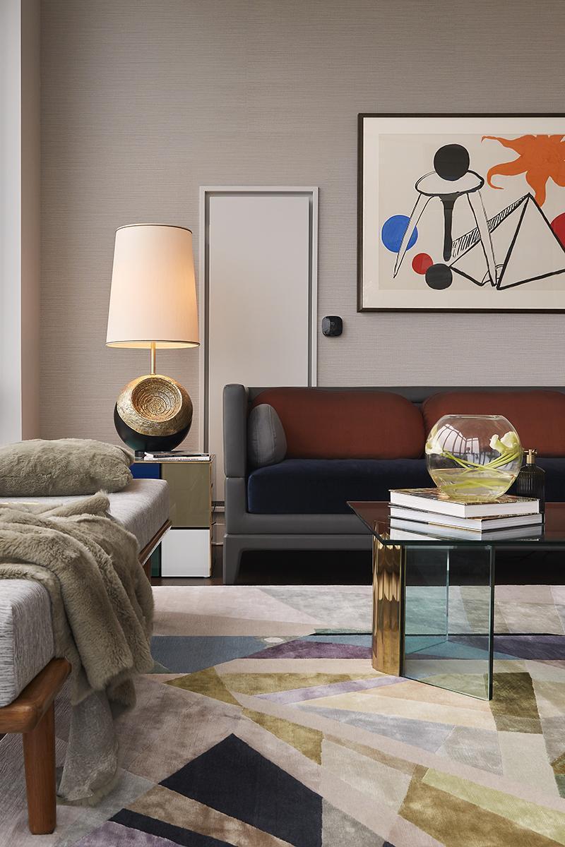
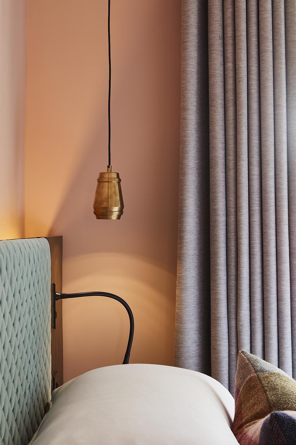
Lighting can make or break an interior scheme. It is one of the most important things to get right for a relaxing and inviting atmosphere at home. Don’t use downlights if at all possible when lighting a space. If you do, ensure they don’t create glare by installing dimmer switches so that you can control the level of light in the room. Table and floor lamps are your best friend when staging a living space or bedroom and will help you achieve a cosy, intimate setting. When styling a space, I often decide on lamp shades last, as regardless of the lamp itself, a good shade can make even the simplest of lamps look luxurious. Creating a lighting scheme is all about making your accent lighting (such as table and wall lamps) work with the space to light areas of the room that you want to draw attention to.
A great way to give your space an immediate lift is to introduce some greenery to the lesser noticed corners of the room. A striking potted yucca adds a dynamic, stimulating sense of shape into the space. The leaves are shard-like, and cut through more neutral interior schemes to enliven the overall look.
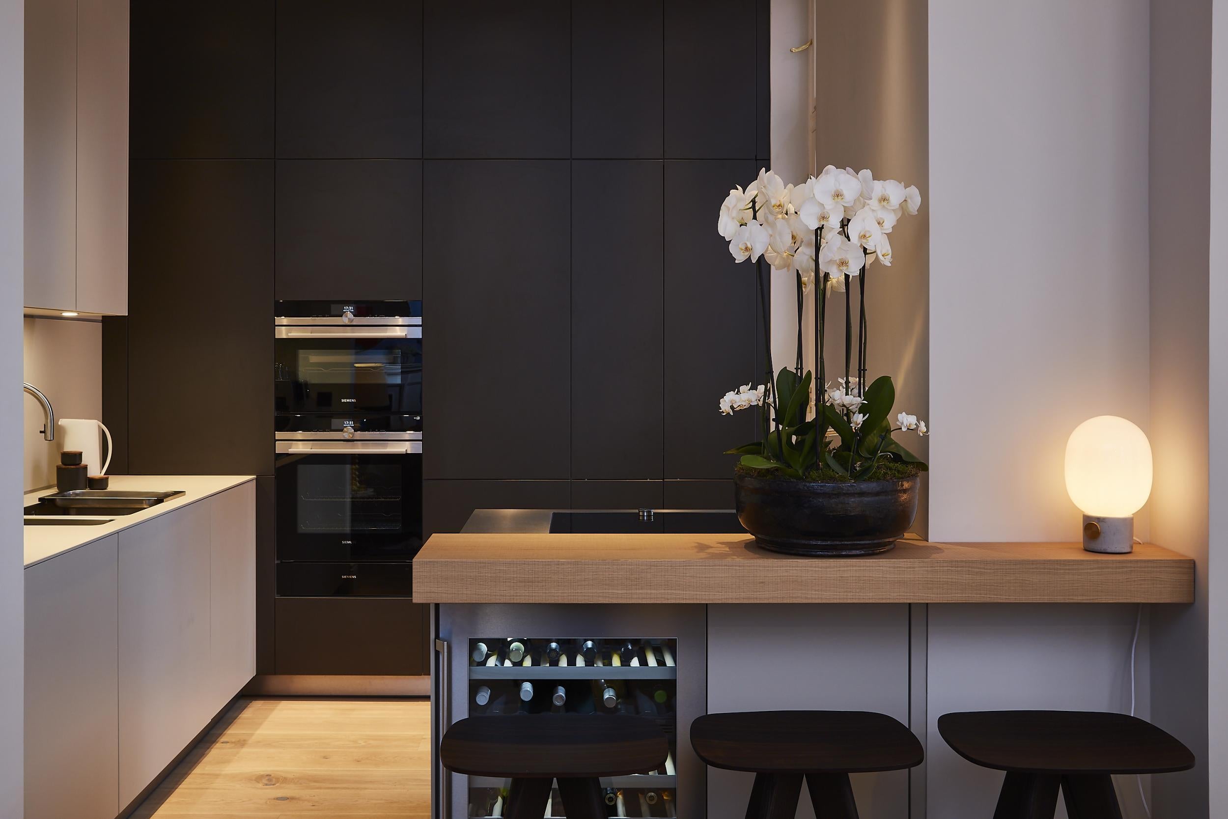
As a general rule, I suggest avoiding garishly colourful floral arrangements. Stick to leafage over bright florals in a mix of forest and lime greens. However, a personal favourite in terms of more floral based greenery is potted white orchids. These make the perfect dining table centrepiece or console table adornment.
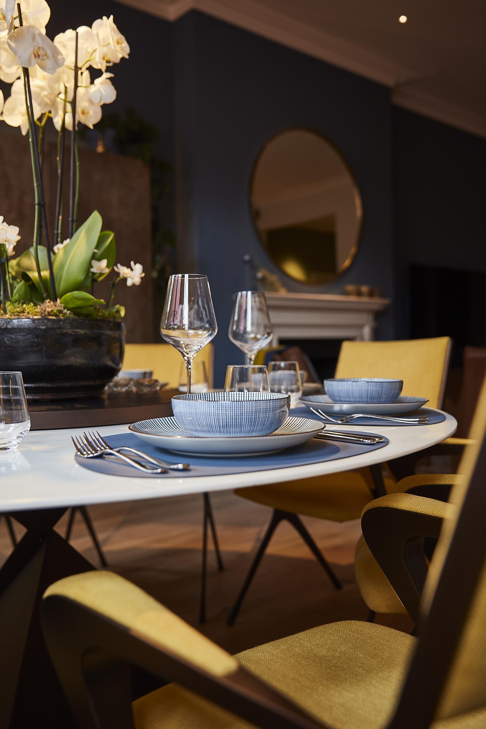
Dining tables are another platform for some exciting experimentation with staging in your home. Investing in beautiful glass or crystal ware for dinner parties gives you the opportunity to style a stunning table for your guests. I love coloured crystal ware in complementary tones such as deep, petroleum blue and yolkish orange dotted around the table. Paired with low-level lighting and candle light, these will twinkle and shine to the delight of your friends and family.
Ultimately, staging your home involves thinking about your interior scheme in innovative ways that show it in its best form. You can work with what you have and love to give your interiors a new lease of life. A new piece of art hung on a long-forgotten about swathe of wall space, or forgetting about your ‘main light’ for the evening can change the entire feel of your space. So channel your inner interior stylist and have some fun in the New Year.
Top tips from the above:
* Staging with art – Make sure you hang your work lower than you think. One foot above sofas, console tables or bed is your maximum!
* When hanging a gallery wall, decide on the look and stick with it. Going for messy? Go messy. Going for ordered? Then get your ruler out!
* Rent art or furniture for sales shots. Show your space in its best light.
* Staging with lighting – Lamps and dimmer switches are your best friends. Downlights don’t give the intimate evening lighting that brings your home to life in the darker hours.
* Stick to pared back colour when choosing floral arrangements.
Brian Woulfe is managing director and founder of Designed by Woulfe
Join our commenting forum
Join thought-provoking conversations, follow other Independent readers and see their replies
Comments