The countries most likely to survive climate change in one infographic

Your support helps us to tell the story
From reproductive rights to climate change to Big Tech, The Independent is on the ground when the story is developing. Whether it's investigating the financials of Elon Musk's pro-Trump PAC or producing our latest documentary, 'The A Word', which shines a light on the American women fighting for reproductive rights, we know how important it is to parse out the facts from the messaging.
At such a critical moment in US history, we need reporters on the ground. Your donation allows us to keep sending journalists to speak to both sides of the story.
The Independent is trusted by Americans across the entire political spectrum. And unlike many other quality news outlets, we choose not to lock Americans out of our reporting and analysis with paywalls. We believe quality journalism should be available to everyone, paid for by those who can afford it.
Your support makes all the difference.Climate change is real, and it's coming.
The leaders of 150 nations, along with thousands of representatives of nearly 200 countries, meet today in Paris for the 20th time to try and come up with a master plan to stave off the global catastrophe ahead.
Scientists have known for decades that the problem on our generation's hands is serious, but recent reports find that even those dire warnings likely underestimated the scope of the issue.
Of course, all of us will be affected in different ways. How will your country fare?
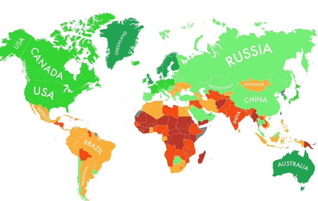
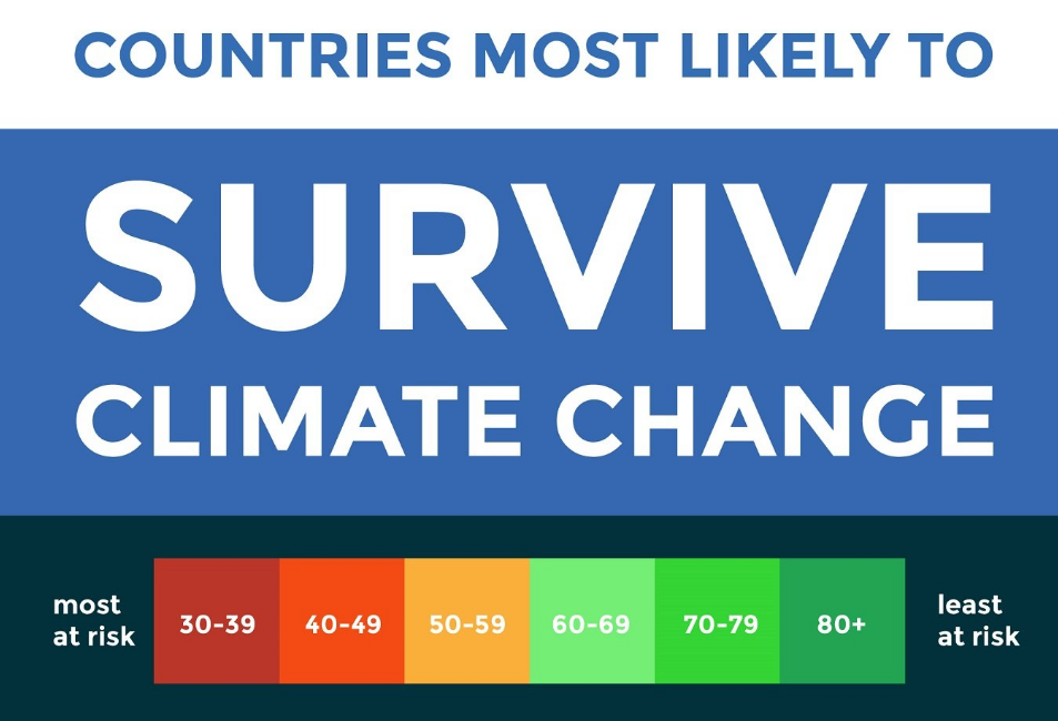
The folks at Eco Experts put together a great infographic in June based on data from the Notre Dame Global Adaptation (ND-Gain) Index, an annual ranking of which countries are best poised to adapt to a warming world.
While the maps provide a great zoomed-out perspective of what will happen globally as the earth warms, there are a few caveats to keep in mind when checking it out:
The map is based on rankings, not comprehensive evaluations of each country. In other words, the best-ranked countries are only as great as they seem compared against the countries that aren't performing so well.
The map looks only at the country-level. All of the state-specific, region-specific, or city-specific data is somewhat lost in this zoomed-out perspective. While the US gets a green light on this map, for example, specific parts of the country are far less equipped to handle climate change, including Miami and New York City.
Developed countries as a whole have far more infrastructure to adapt to a warming planet. The government can force people in coastal cities such as Miami Beach to move inland; we can also build new airports and transit hubs closer to the center of the country. The map reflects countries' abilities to do just that.

Join our commenting forum
Join thought-provoking conversations, follow other Independent readers and see their replies
Comments