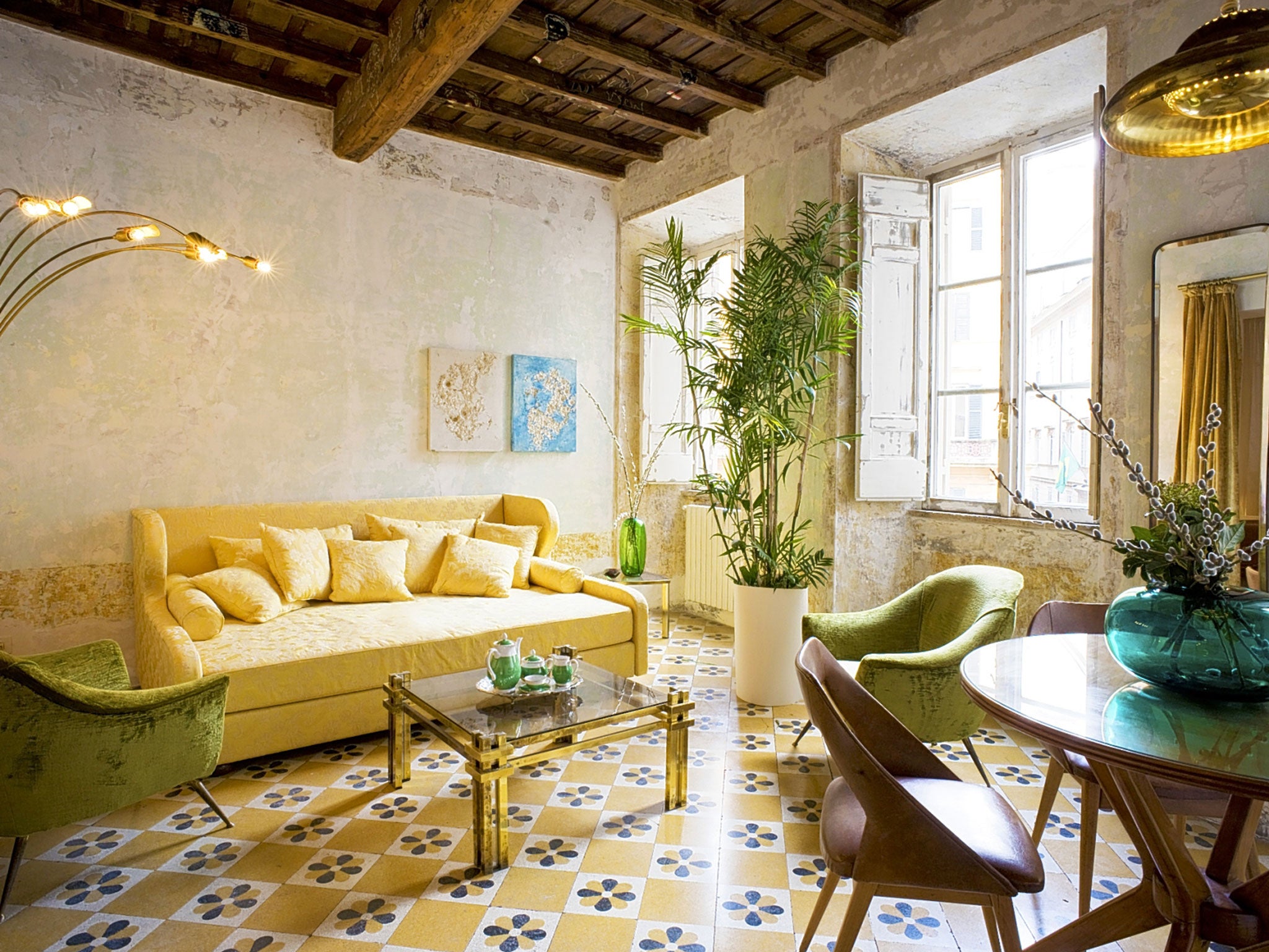
Rough luxe is the latest trend for boutique hotel designs, but you can take it home too
The rough-luxe movement rejects extravagance and minimalism and celebrates raw imperfection – letting objects and spaces from different eras tell their own stories

Your support helps us to tell the story
From reproductive rights to climate change to Big Tech, The Independent is on the ground when the story is developing. Whether it's investigating the financials of Elon Musk's pro-Trump PAC or producing our latest documentary, 'The A Word', which shines a light on the American women fighting for reproductive rights, we know how important it is to parse out the facts from the messaging.
At such a critical moment in US history, we need reporters on the ground. Your donation allows us to keep sending journalists to speak to both sides of the story.
The Independent is trusted by Americans across the entire political spectrum. And unlike many other quality news outlets, we choose not to lock Americans out of our reporting and analysis with paywalls. We believe quality journalism should be available to everyone, paid for by those who can afford it.
Your support makes all the difference.The rough-luxe trend for boutique hotel design gathers pace with the newly opened G-Rough hotel in Rome (sister to the glam Palazzina G in Venice).
The movement sees luxury hotels borrow from domestic interiors as they try a different take on homely, aiming for a guest experience that is more like going on holiday in an eccentric friend’s townhouse than checking in to the Hilton. It’s shabby chic, with a bigger budget, a sense of place, and more in tune with its masculine, industrial side.
The G-Rough’s ‘‘rough’’ authenticity comes across in the 17th-century building’s heavy wood-beamed ceilings, meandering floor plans and scraped patina walls that whisper stories of its past. This becomes a stage for iconic pieces of mid-20th-century Italian design, so guests can read the paper on a 1960s Giò Ponti chair or snooze on a 1930s Guglielmo Ulrich bed. Bold, contemporary murals spill out across the walls and the bathrooms are suitably glamorous, with two-tone cast iron bathtubs and dazzling mirror tiles. The result is billed as ‘‘a Fellini-esque visual landscape that meshes fantasy and baroque’’ that will have design aficionados weeping with joy into their Campari and sodas.
Owner Gabriele Salini, a seventh-generation Roman, says the emphasis at the G-Rough is on experience rather than flashiness, and this extends to arranging visits to his favourite trattoria as well as private aristocratic palaces. He says: “Paradoxically Italy, the chosen homeland of design, has remained a little bit outmoded in the hospitality sector and – especially in Rome – luxury has always been translated into something extremely rich and ‘show off’. We’re offering our guests a different kind of luxury.”
Giving the Airbnb generation a home-from-home hotel experience is something rough-luxe pioneer the Ace Hotel Group has been on to for years. Its low-tech, design-savvy punk aesthetic is masterfully staged in the lobby of the Ace NY, with its machine-age architectural salvage, sprawling canvas sofas, wooden bookcases and graffiti-tag staircase. The boundaries between hotel, home and office are blurred as carefully chosen design elements link the space with the local neighbourhood.
The late Ace Hotel co-founder Alex Calderwood once proudly recounted how Spike Lee said that Ace looks like someone real made it, not some ‘‘corporate cookie cutter’’. The architect /interior designer behind Ace NY, Roman and Williams, is a key proponent of the rough- luxe style. Last year they fitted out New York’s Monarch Room restaurant in a jaw-dropping style mash-up that channels heyday-of-cruise-ship-glamour within the rough concrete walls of a 1930s industrial-era warehouse in West Chelsea.
The rough-luxe mindset treats luxury as a moment in time rather than a thing to be mindlessly consumed. It rejects both extravagance and minimalism: a cold, pared-back look is not the answer to excess and opulence; rather it’s in celebrating raw imperfection and letting objects and spaces tell their old stories as they set the scene for new ones. So, worn and washed surfaces abound, rich textiles bring warmth and styles from different eras clash joyfully along with surprising artworks, pristine fittings and vintage pieces.
Meanwhile, London’s own Rough Luxe Hotel peddles the philosophy at a Georgian townhouse in a dodgy street in King’s Cross with a potent design cocktail of distressed walls, bare floorboards, quirky contemporary art and rare objects. Elements from different periods are all coveted equally – from 1980s televisions to modern trompe l’oeil murals and decadent day beds. This design movement is too much fun to leave to hoteliers, so we’ve selected a few inspiring piecesto bring it back home.
How to bring rough luxe home Duperz wallpaper by Blackpop, £138, blackpop.co.uk
Duperz wallpaper by Blackpop, £138
If you’ve got a period property, then get busy with the wallpaper scraper. Failing that, try this wallcovering for instantly distressed walls. blackpop.co.uk
Bristol Armchair by Heal’s, £1,275 (on sale)
Industrial style goes glam in this beautifully engineered buffalo leather chair on an angular steel base. healssofas.co.uk
Leather rug by Zara Home, £349
Made from cream leather panels embossed with a foliage pattern in gold. Nice and raw in texture and fancy on top, this is a little bit rough, a little bit luxury. zarahome.com
Rough Edges tiles by Rough Old Glass, £20 each
Get faded grandeur with bling via these elegant reproduction antiqued mirror glass tiles. They’re hand silvered in a North Devon Workshop to look just like originals. rougholdglass.co.uk
Contemporary art print from Counter Editions, £400
Express your unique taste with bold art prints that bring your space bang up to date. Phosphorescence, the Pure, Again (2015), screen print with puff paint by Ida Ekblad. countereditions.com
Join our commenting forum
Join thought-provoking conversations, follow other Independent readers and see their replies
Comments