Remembering Robert Venturi, the US architect who said: 'Less is a bore'
Venturi advocated a people-first architecture drawn from local customs and popular taste – including bad taste
Your support helps us to tell the story
From reproductive rights to climate change to Big Tech, The Independent is on the ground when the story is developing. Whether it's investigating the financials of Elon Musk's pro-Trump PAC or producing our latest documentary, 'The A Word', which shines a light on the American women fighting for reproductive rights, we know how important it is to parse out the facts from the messaging.
At such a critical moment in US history, we need reporters on the ground. Your donation allows us to keep sending journalists to speak to both sides of the story.
The Independent is trusted by Americans across the entire political spectrum. And unlike many other quality news outlets, we choose not to lock Americans out of our reporting and analysis with paywalls. We believe quality journalism should be available to everyone, paid for by those who can afford it.
Your support makes all the difference.Robert Venturi was an iconoclastic architect often considered the father of postmodernism who rejected sterile, glass-cube structures in favour of an inclusive, eclectic style that embraced community values and a touch of vulgarity.
Venturi, who died earlier this month aged 93, first gained acclaim as a theoretician and writer with his 1966 book Complexity and Contradiction in Architecture, in which he turned Mies van der Rohe’s famous dictum about simplicity in design – “Less is more” – upside down, cheekily declaring: “Less is a bore.”
Over time, Venturi went from renegade to revered master and in 1991 received the Pritzker Architecture Prize, often equated to the Nobel Prize.
“He has shaped a generation of architects, and more than any other figure has brought architecture to its present moment,” New York Times architecture critic Paul Goldberger wrote at the time. “It is impossible to imagine the world of architecture in the last 20 years without Robert Venturi.”
Venturi’s manifesto, Complexity and Contradiction, was practically a declaration of war against the prevailing modernist notion that architecture should aspire to a cold, glassy perfection with cold, glassy buildings. He argued instead that architecture should reflect changing times and social needs. The world of design, he said, had too long been in the grip of the dogma that architects were godlike creators who could impose their vision on the landscape.
Venturi advocated a people-first architecture drawn from local customs, history, vernacular buildings and popular taste – including bad taste.
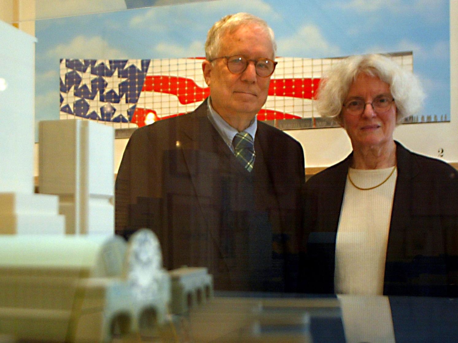
“Architects can no longer afford to be intimidated by the puritanically moral language of orthodox modern architecture,” he wrote. “I like elements which are hybrid rather than ‘pure,’ compromising rather than ‘clear,’ distorted rather than ‘straightforward’ ... I am for messy vitality over obvious unity ... I am for richness of meaning rather than clarity of meaning.”
His views, which echoed the Pop Art concepts of Jasper Johns and Robert Rauschenberg, were seen as radical and incited rage among the architectural establishment. “The profession is split right down the middle – 90 per cent against,” NYT critic Ada Louise Huxtable wrote.
But to many, including Yale University professor Vincent Scully, Venturi was a visionary whose book constituted “probably the most important writing on the making of architecture” since Le Corbusier in the 1920s.
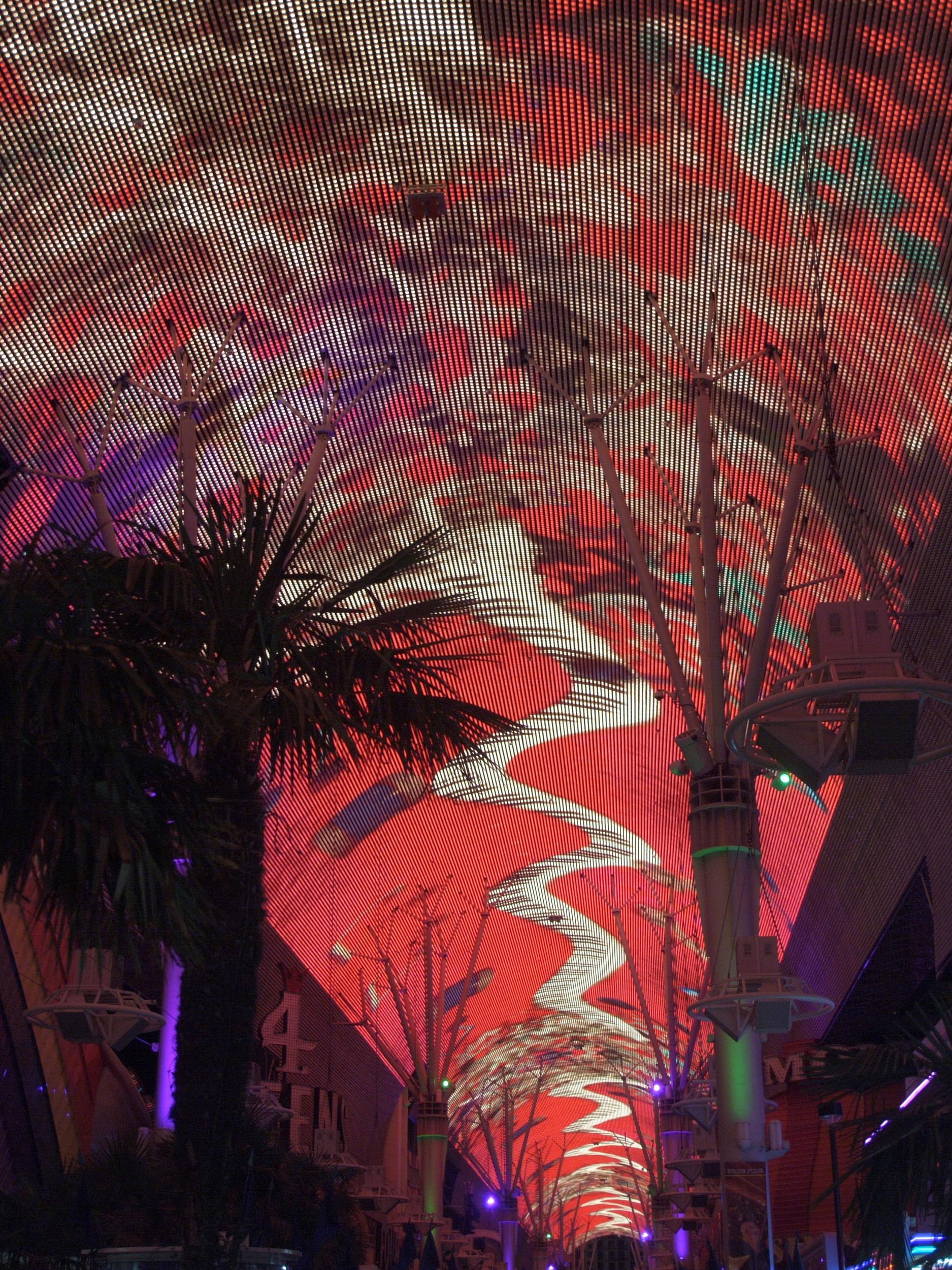
As an unexpected encore to Complexity and Contradiction, Venturi journeyed to Las Vegas, where he and his wife invited several of their Yale students to take the measure of the place. He wasn’t interested in gambling – he spent a total of $1.05 on slot machines – but went there to study the buildings, signs and roads in what may be America’s most garishly self-indulgent city.
In their 1972 book Learning From Las Vegas, written with architect Steven Izenou, Venturi and Scott Brown analysed the physical layout of the city, as if conducting an archaeological reconstruction of a Roman ruin.
They mapped the scale and distribution of stores, car rental offices and wedding chapels and even calculated the intensity of lighting in the city’s ubiquitous flashing signs. Las Vegas wasn’t just a neon-lit den of vulgarity, they concluded. It was a prime example of a city built to accommodate the automobile. As a result, signs were often more important than the buildings they loomed over.
“In the landscape of the automobile, the architecture becomes insignificant, a pimple on the landscape of parking lots,” Venturi said in 1971. “The lesson of Las Vegas is that in order to be read in that context architecture cannot be a refined, detailed form to be savoured as you walk by it at 3mph. It must be symbolic, not pure, if it is to be read at 70mph.”
Some of his fellow architects thought Venturi was joking or – as one colleague put it – had become in thrall to “the most barren, mindless examples of mid-cult America”.
Undaunated, Venturi began put his ideas into his practice. His first important building, completed in the early 1960s, was the Vanna Venturi House, which he designed for his mother in Philadelphia.
It is recognisable as a traditional house, but instead of connecting the roof above the front door, Venturi left the gable open at the top. He painted the exterior a pale green because he was told no house should be painted green. An interior staircase is wide at the bottom, then narrows towards the top, as the public living space is left behind for the private bedrooms above. The house was featured on a US postage stamp in 2005.
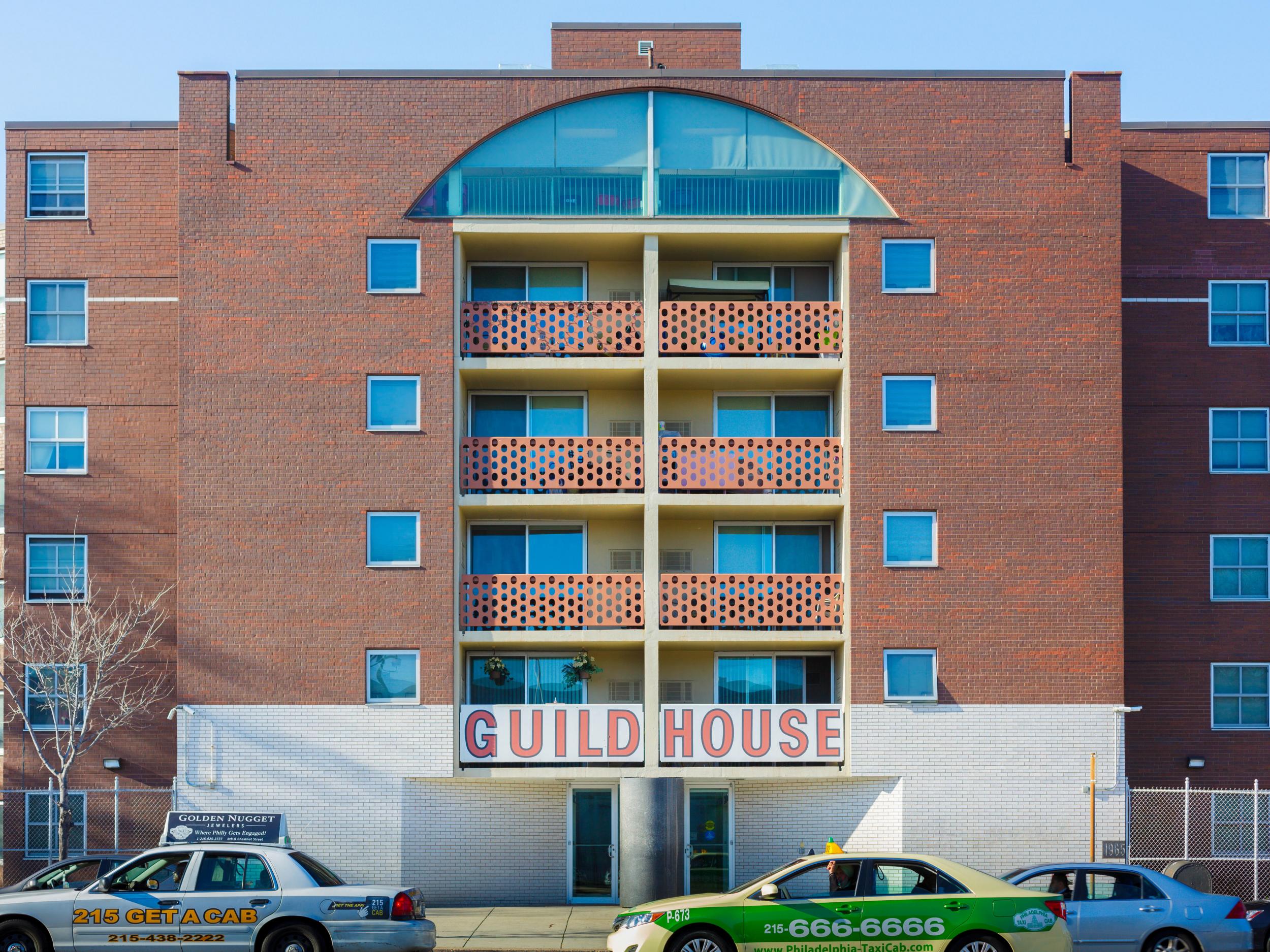
Venturi was hardly snobbish about his work and often took on humble assignments, designing fire houses, retirement homes and warehouses. “Ugly and ordinary is better than heroic and original,” he said.
As his reputation grew and his views became more mainstream, his commissions became more prestigious. In the 1970s, he designed Freedom Plaza, a raised granite and marble surface on Pennsylvania Avenue NW in Washington.
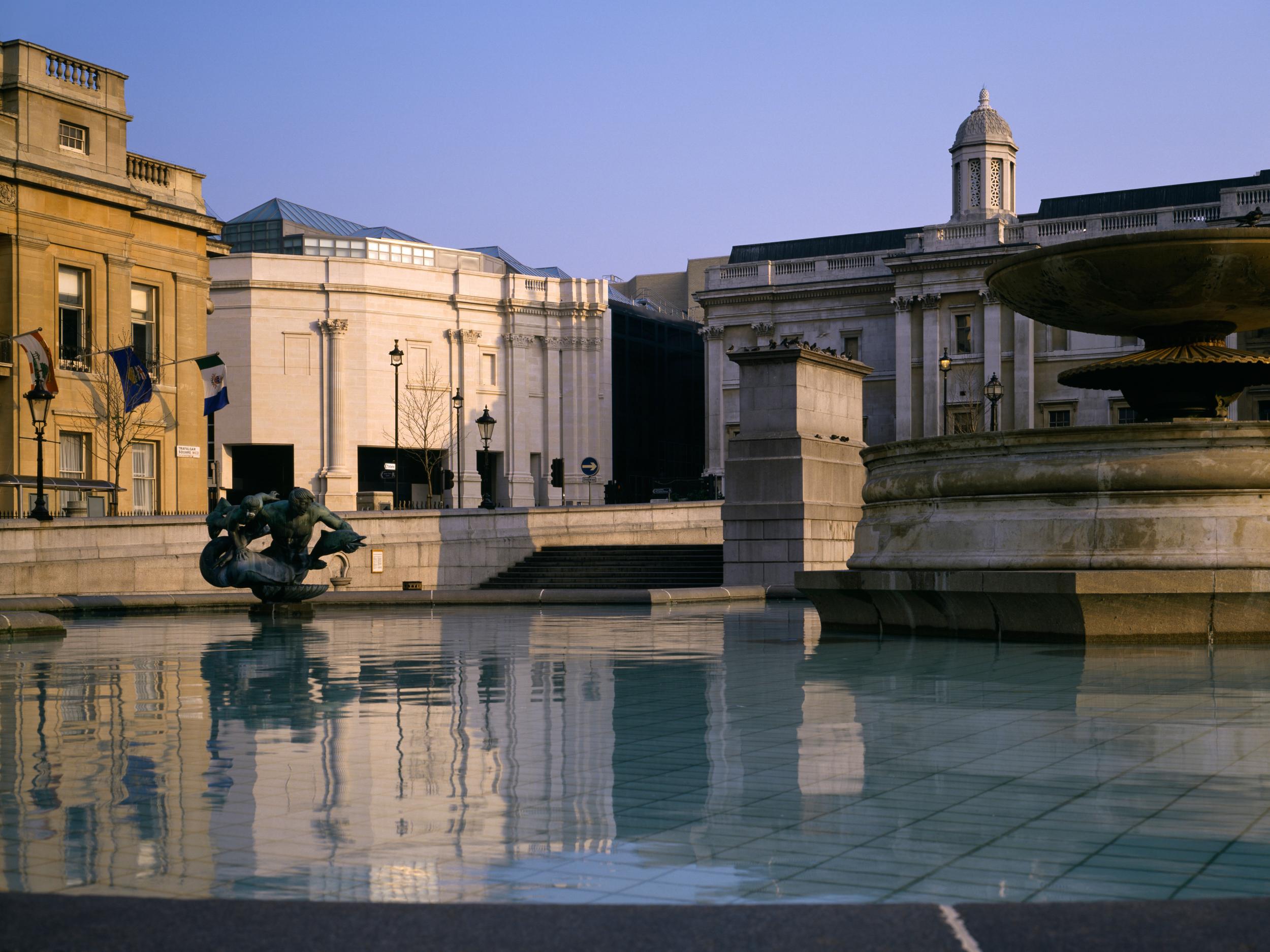
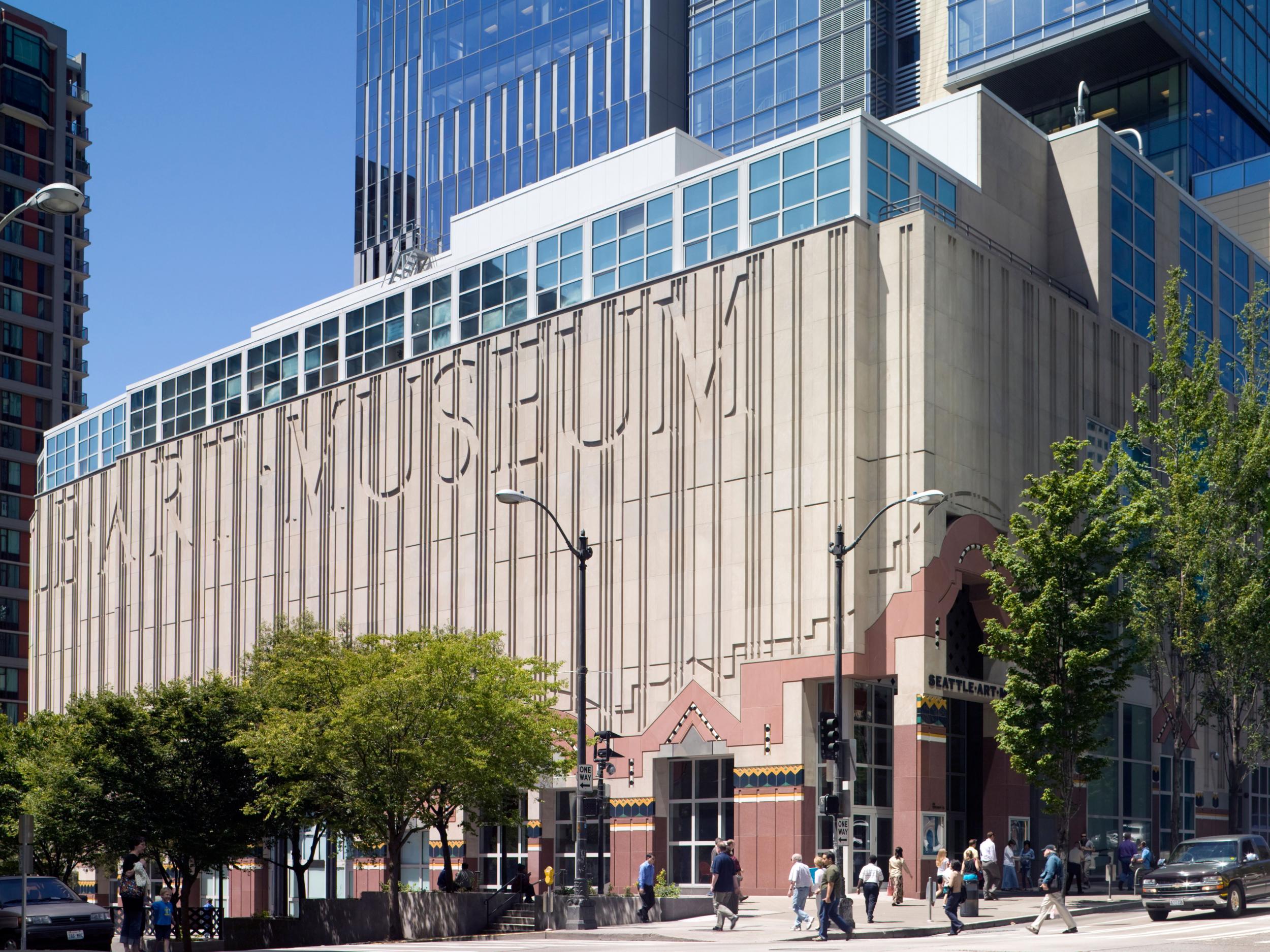
He later designed campus buildings for Harvard, Yale and his alma mater, Princeton University, and created a celebrated addition to the Oberlin College art museum in Ohio. In 1991, he completed two ambitious projects – an addition to the National Gallery in London, known as the Sainsbury Wing, and a new art museum in Seattle.
His eclectic approach made it difficult for critics to identify a signature style, but in general Venturi preferred stone and masonry to glass and designed with a consciousness of the past, if only to depart from it. He liked billboard-sized signs and often had giant letters carved into his facades, including at the Seattle Art Museum. He used colours and patterns in unexpected ways and saw no reason the back of a building should look the same as the front.
In matching a structure to its surroundings, he incorporated a sense of rhythm in its visual elements, which he likened to jazz. He placed windows at irregular intervals, creating dramatic interior lighting.
Venturi often referred to his work as creating “decorated sheds”, or basic structures enlivened with ornamentation and symbols. His influence came to be seen in hundreds of new buildings, as younger architects freely adopted historical references and other postmodern elements that Venturi had introduced.
But he steadfastly refused to take up the crown as the progenitor of an architectural movement. “I am not now and never have been a postmodernist,” he said in 2001.
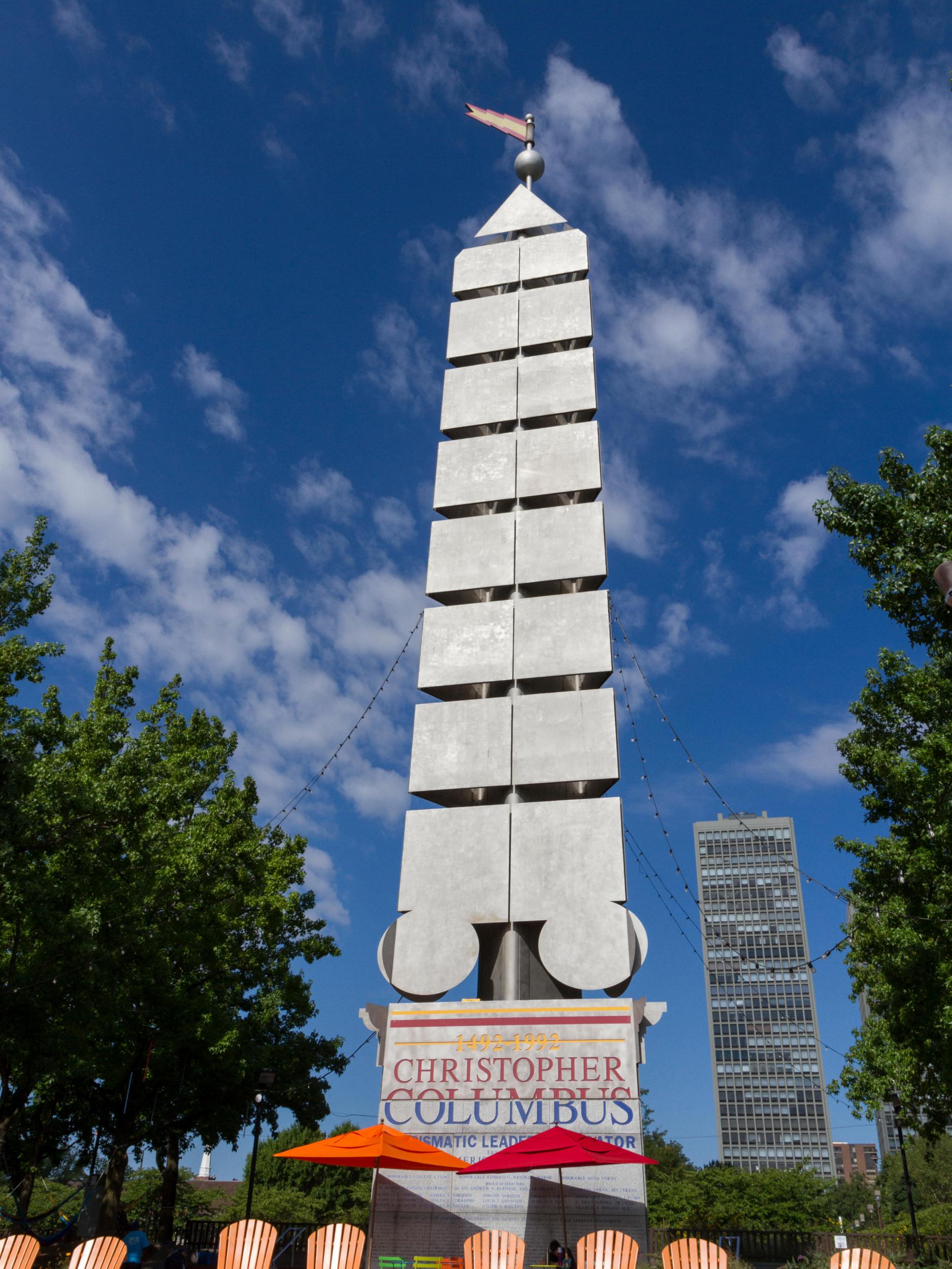
In addition to buildings and public spaces, Venturi designed furniture and table ware and remained active well into his eighties. He never lost his disdain for what he considered the soulless buildings of his modernist predecessors, who often designed glass buildings with walls of windows, “but you would never have a wall with a window in it”.
Instead, Venturi wrote in Complexity and Contradiction in Architecture, he drew inspiration from the “everyday landscape, vulgar and disdained”, which was “valid and vital for our architecture as a whole”.
© Washington Post
Join our commenting forum
Join thought-provoking conversations, follow other Independent readers and see their replies
Comments