Channel 4 ditches signature '4' logo in 'brave and bizarre' rebrand
Broadcaster unveils new on-screen identity which dispenses with its focal point of the last 33 years

Your support helps us to tell the story
From reproductive rights to climate change to Big Tech, The Independent is on the ground when the story is developing. Whether it's investigating the financials of Elon Musk's pro-Trump PAC or producing our latest documentary, 'The A Word', which shines a light on the American women fighting for reproductive rights, we know how important it is to parse out the facts from the messaging.
At such a critical moment in US history, we need reporters on the ground. Your donation allows us to keep sending journalists to speak to both sides of the story.
The Independent is trusted by Americans across the entire political spectrum. And unlike many other quality news outlets, we choose not to lock Americans out of our reporting and analysis with paywalls. We believe quality journalism should be available to everyone, paid for by those who can afford it.
Your support makes all the difference.It’s either a bold reinvention of a middle-aged brand, or a marketing brainstorm too far.
Channel 4 has unveiled a new on-screen identity which dispenses with the signature “4” logo that has provided the broadcaster’s focal point for 33 years.
Described as “brave, bizarre, and striking”, Channel 4, which is currently facing the threat of privatisation, revealed a radical overhaul of its screen presentation.
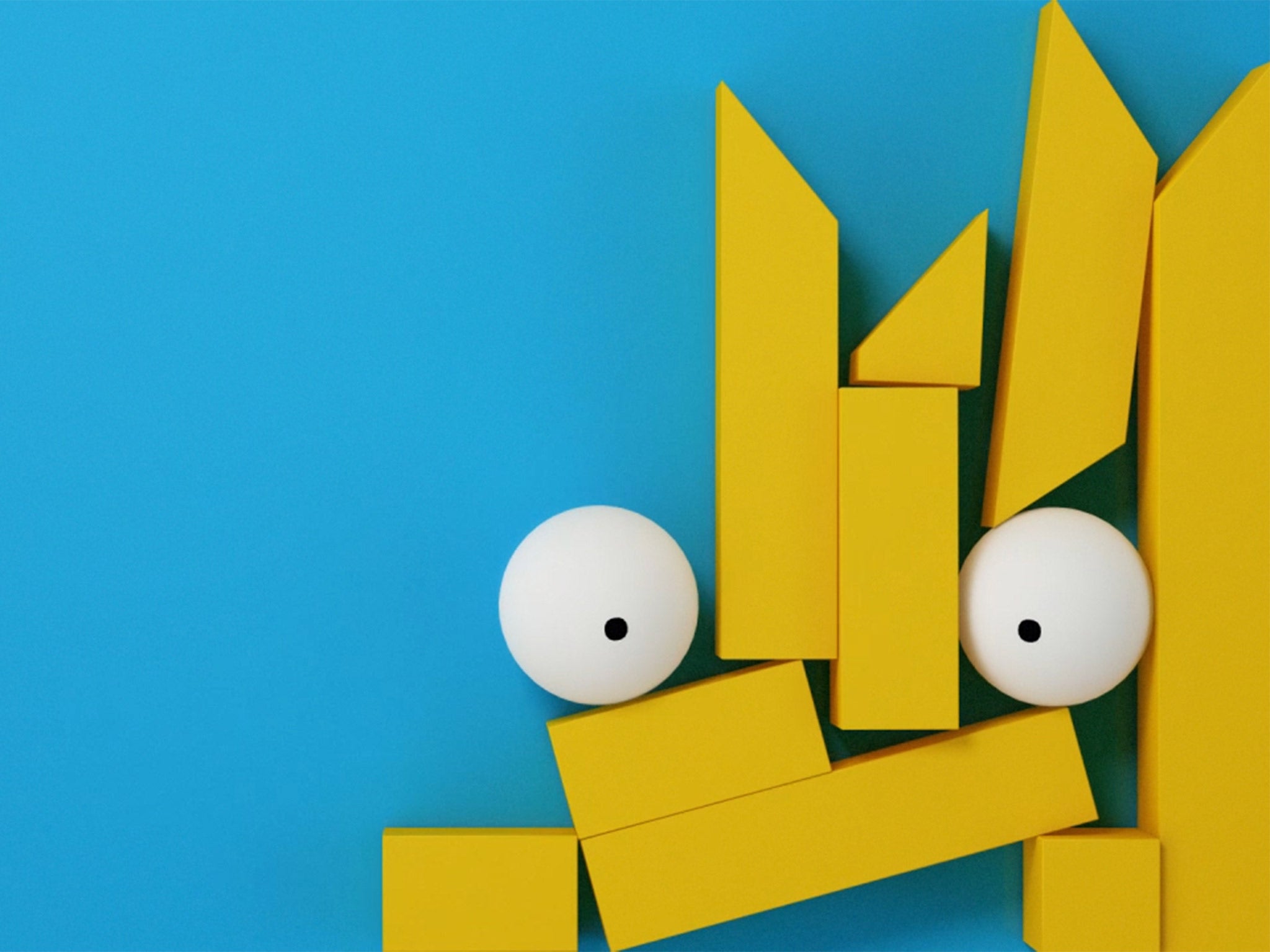
Introduced a decade after its last major rebrand, the new design smashes the channel’s famous 4 symbol into pieces and includes a series of short narrative film “idents” created by Jonathan Glazer, director of the arthouse sci-fi film Under The Skin.
The initial reaction from viewers was one of confusion – where was the familiar 4 logo, created in its distinctive colourful nine blocks by designer Martin Lambie-Nairn for the channel’s launch in 1982 and which has survived various reinventions ever since?
The 4 numeral no longer appears. Instead echoes of the numeral’s blocks can be identified, for those who look for hard enough, buried in the new “idents” or rearranged in a playful manner behind individual programme promotions.
Chris Bovill, joint head of 4Creative, Channel 4’s in-house agency, described the decision to break apart the 4 as “incredibly liberating.” He said: “Most TV branding these days is like watching wallpaper. It’s pleasant but gets boring very quickly. However, Channel 4 is much more than just a big shiny number and some nice vibes.
“We didn’t want to tell people what channel they’re watching. We wanted to tell them why they’re watching it the first place.
Bovill added: “We started with the original, iconic Lambie Nairn 4 logo and broke it down into its constituent parts; the nine blocks. The blocks represent Channel 4’s incredibly diverse qualities. The blocks are free to demonstrate our remit; to be irreverent, innovative, alternative and challenging.
“They are free to flow through everything on the channel: our typeface, on-screen menus, on-screen graphics, off-air logo, Channel 4 News, Channel 4 Racing, all the way through to the idents.”
Glazer crafted four abstract films, featuring monkeys and giant bugs, imagining the original 4’s blocks as elemental forms, found within the earth.
The rebrand split viewers. “Are they taking the piss? How does smashing the iconic 4 into little bits give the channel a stronger identity?,” asked one on a Digital Spy forum. “This must be the only TV channel which doesn't want to include its logo on idents/promos,” wrote another. A keen-eyed viewer identified “tiny fragments of the logo visible in the ident sequences.”

Bovill said: “The idents present the blocks as kryptonite-like. They tell the story of their origin and how they have a powerful impact on the world around them. Just as Channel 4 does. It is a story that we shall build on. It’s been an incredible honour to work on such a loved brand, a brand very close to our hearts. Hopefully we haven’t let the viewers down.”
Creative Review said Glazer’s idents were “abstract enough to potentially leave viewers, especially those more used to the obvious approach of most TV channel branding, scratching their heads and wondering what on earth is going on.” But the journal welcomed a “bold and exciting” rebranding exercise which was “dynamic and at times a little bit bonkers.”
The result of three year’s work by its brightest creative brains, Channel 4 said its refreshed identity reflected a “public service remit focussed on innovation, diversity and taking creative risks.”
The full 4 will be retained for Channel 4’s off-air promotion, which will incorporate a new typeface created by the graphic designer Neville Brody.
Join our commenting forum
Join thought-provoking conversations, follow other Independent readers and see their replies
Comments