Inspiring home of the week: Victorian townhouse reimagined in London
It's not easy maximising space and light in London, but a small extension and clever use of colour transformed this cramped terrace into a stylish family home

Your support helps us to tell the story
From reproductive rights to climate change to Big Tech, The Independent is on the ground when the story is developing. Whether it's investigating the financials of Elon Musk's pro-Trump PAC or producing our latest documentary, 'The A Word', which shines a light on the American women fighting for reproductive rights, we know how important it is to parse out the facts from the messaging.
At such a critical moment in US history, we need reporters on the ground. Your donation allows us to keep sending journalists to speak to both sides of the story.
The Independent is trusted by Americans across the entire political spectrum. And unlike many other quality news outlets, we choose not to lock Americans out of our reporting and analysis with paywalls. We believe quality journalism should be available to everyone, paid for by those who can afford it.
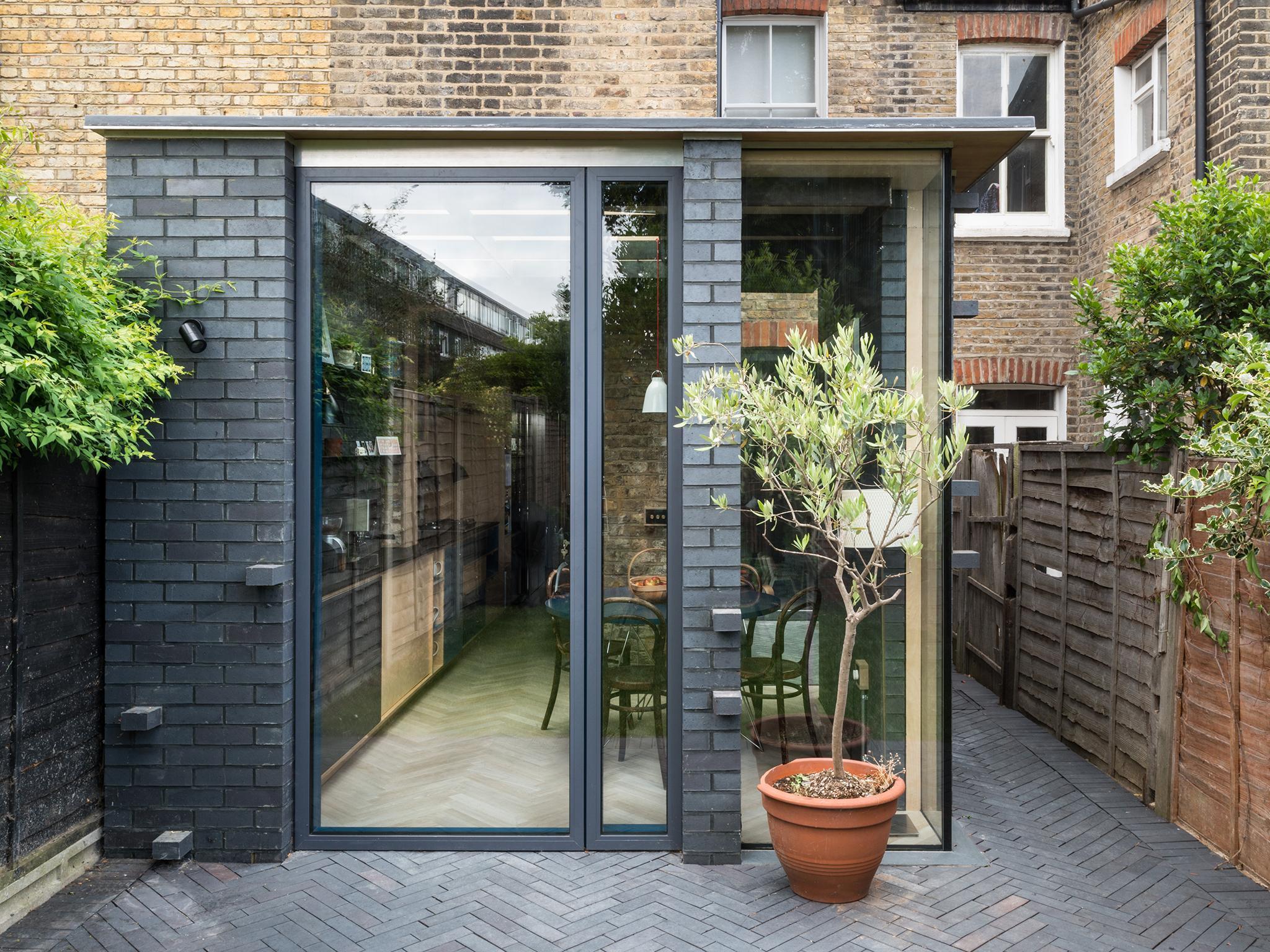
Your support makes all the difference.Maximising space in old terraced homes can be difficult, but architect Matthew Wood only needed an extra 7sq m to make his small Victorian home in London feel a lot bigger.
The extension is built out of weather-resistant Staffordshire black-blue engineering bricks, which stand in juxtaposition to the original red. This contrast is continued inside, with caramel wood surfaces against the dark colours of the walls and window frames.
The architect was inspired to create the space after realising how cramped the dining room was, originally in the central area of the house and used as a “dumping ground” for family members passing through.
We spoke to Melissa Robinson from the practice about the challenge of carrying out developments on existing properties.
Please tell us a little about your practice
Since 2009, MW Architects has built a reputation through good design with a back-to-basics approach that prioritises maximising space and natural light. We’ve furnished cultural, residential and commercial clients with new-builds and refurbishments of up to £2m. The team has now expanded to 6 full-time design staff working across multiple projects and sectors.
What is your practice known for?
Our practice is well established with design-led developers for small scale developments, with Essex Mews in Crystal Palace having won a RIBA award in 2013 and also numerous high-end residential projects, both new build and development of existing properties. We have a keen interest in materiality and quality of space in all projects and like to work with our clients to achieve new and exciting proposals.
How would you sum up the project in five words?
Tactile. Refined. Raw. Rich. Small.
What was the brief for this project?
The main aim of the project was to unlock the existing floor plan to create a functional kitchen, dining area and family space. The budget meant we had to minimise the extension so there was not too much structural work or unnecessary floor area to apply finishes to, which would mean that the spaces were highly designed to provide the right things in the right places.
What did you hope to solve as you designed this home?
The existing house layout had a small kitchen with a cramped corridor dining space which was a “walk-through dumping route” for the entire family and there was no real defined space in the centre/back of the house.
What makes this space unique?
The exposing of almost all of the materials in the extension in their raw, unfinished forms is key to the unique feel of the space. The use of rigorous space planning meant that we didn’t add more floor area than necessary to ensure all of the space was being utilised.
What was your inspiration for this project?
Really this is a development of many ideas over my time as a working architect, displaying experimental ideas that have been developing through other build projects and outside influences have combined into a space that I can live in.
What was the toughest issue you encountered when this building was being designed and built?
The honest answer to this is the selection of the rear doors. There were endless circles of design/cost/materials and we looked at almost every possible combination of these, but every option had a downside. We help people buy and justify door decisions on all our projects, but on your own house it is much harder.
What do you wish you could change in hindsight?
I don’t think we would change anything. We are very pleased with the final result.
What sort of experience do you hope people using this space have?
The extension has proved a hit with friends and family. We enjoy it as an everyday relaxed yet formal seating area. Friends visit for dinner and find it a tactile space of joyful discovery and frequently touch the brickwork elements. We also hope that it changes, as the materials will gain a patina over time that will further extend the enjoyment.
Join our commenting forum
Join thought-provoking conversations, follow other Independent readers and see their replies
Comments