The Importance of the Reception Area
A hallway should never be overlooked

Your support helps us to tell the story
From reproductive rights to climate change to Big Tech, The Independent is on the ground when the story is developing. Whether it's investigating the financials of Elon Musk's pro-Trump PAC or producing our latest documentary, 'The A Word', which shines a light on the American women fighting for reproductive rights, we know how important it is to parse out the facts from the messaging.
At such a critical moment in US history, we need reporters on the ground. Your donation allows us to keep sending journalists to speak to both sides of the story.
The Independent is trusted by Americans across the entire political spectrum. And unlike many other quality news outlets, we choose not to lock Americans out of our reporting and analysis with paywalls. We believe quality journalism should be available to everyone, paid for by those who can afford it.
Your support makes all the difference.Designing a great entrance way to fit the mood of a property, be it a hotel or a home, is crucial for guests and buyers alike. In a survey conducted by Strutt & Parker earlier this year, results showed that property purchasers are determined almost entirely by their first impression of a house. According to the report, 84 per cent of the 2,000 UK respondents agree that the most important element of property purchase is getting a good feeling when you walk through the front door, while 76 per cent believe first impressions are everything.
The reception areas, hallways and entrance ways of buildings, both commercial and residential, are tone setters. Number 10, for example, with its sombre, dark front door emits a sense of seriousness, accompanied by the rare glimpses of an understated entrance hall with its chequered floor and antique furniture. At the other end of the spectrum, The London EDITION, a luxury hotel in Soho, has one of the most architecturally and artistically striking entrance ways in London, finding its feet somewhere between stately and edgy. The Ian Schrager-designed hotel fuses contemporary, structural artworks with Mad Men-style deco sofas and marble, Corinthian pillars to set the atmosphere for the rest of the hotel.
In the same study, it was disclosed that 35 per cent decide to view a property five minutes or less after seeing it online. Leading with shots of the communal entrance, the agents believe this will persuade browsers to be tempted to make an enquiry.

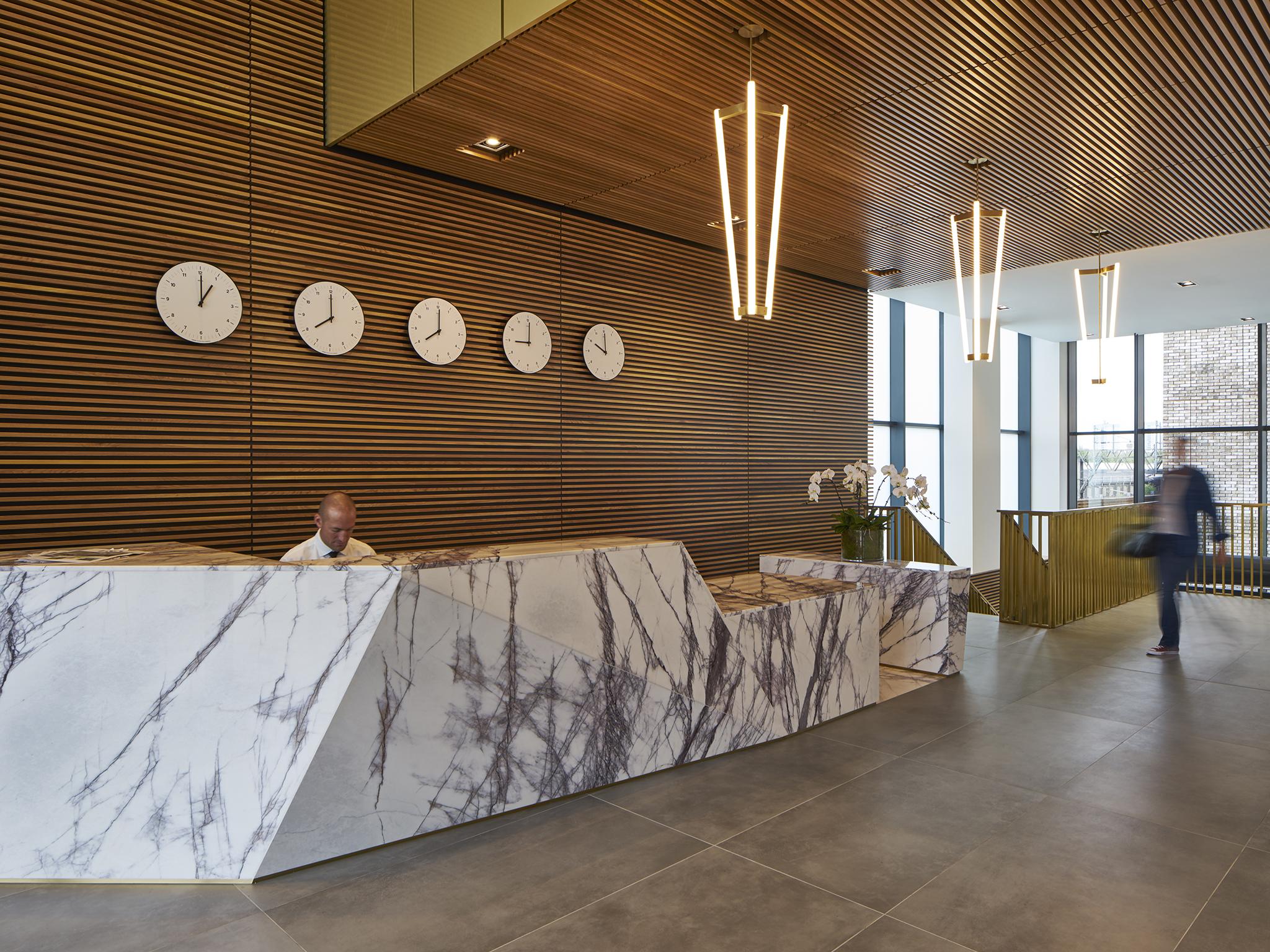
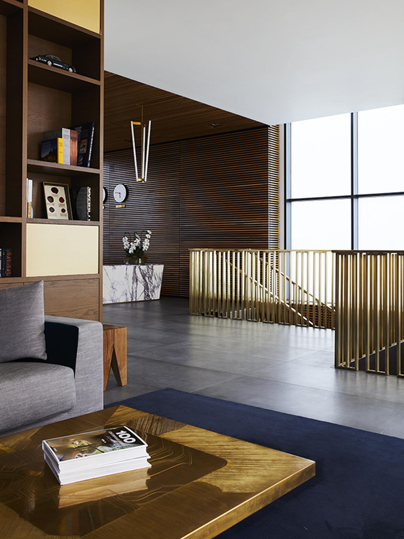
A recently completed Londonewcastle development, Queen’s Park Place in NW6, is a perfect example of how reception areas set the tone for the rest of the building. Double height ceilings, marble and brass detailing, along with a contemporary yet inviting lounge area were purposefully selected to emanate a hotel-style and metropolitan ambience, in line with the character of the apartments. Rob Soning, COO of Londonewcastle articulates: “I wanted the lobby to be an extension of the apartments in the building, so that residents could have another place to relax, wait for a taxi, read a book and still feel at home.”
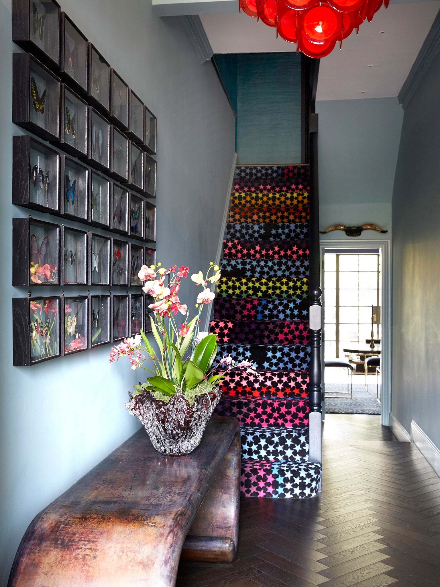
The first thing to consider is artwork. As in every space in your home, artwork provides an instant hit of individualism and personality. In your hallway, art contributes to the tone-setting atmosphere for your guests. When choosing art, Trilbey Gordon, Head of Interior Design at Londonewcastle, suggests “taking risks, and don’t be afraid to mix things up.” From sculptures to paintings, Gordon believes that, “each piece should have a story to tell.”
Gordon adds that the hallway should never be overlooked: “Everything happens in the reception area of a building. You arrive there, you meet up there and you leave there. It’s not only a gathering spot but it also happens to be the soul of the place. We like this area to feel a bit like someone’s very chic drawing room. A lovely sofa, some bookshelves filled with real books and of course a deep comfortable sofa. We want our residents to want to hang out here and for it to be a place where things happen!”

The second thing to consider is storage. As our homes get smaller and smaller, hallways follow suit. This means that essential hallway storage needs to be innovative and space-saving. Choose a slimline console table with drawers to hide clutter, with an elegant top upon which you can style a floral display or something decorative. This way you can keep surfaces clear of keys and post, ensuring a tidy entrance way.
Finally, if space allows, some form of seating for putting on shoes is always a welcome practicality. So too does an ottoman or armchair in a hallway provide the perfect opportunity to get creative. Choose antique pieces, beautiful upholstery or contemporary seating options to put your stamp on the space.
The bottom line is that we shouldn't be overlooking the humble hallway as a dumping ground for shoes and coats. Whether you’re looking to buy, or simply wanting to improve the impact of your home on guests, invest some time in the design of your entrance.
Robert Soning is the founder and COO of Londonewcastle
Join our commenting forum
Join thought-provoking conversations, follow other Independent readers and see their replies
Comments