For Design Army's power couple, a calm place to recharge
It's partially a reaction to the Lefebures' work life, which is full of colourful visual stories and branding campaigns for high-profile clients

Your support helps us to tell the story
From reproductive rights to climate change to Big Tech, The Independent is on the ground when the story is developing. Whether it's investigating the financials of Elon Musk's pro-Trump PAC or producing our latest documentary, 'The A Word', which shines a light on the American women fighting for reproductive rights, we know how important it is to parse out the facts from the messaging.
At such a critical moment in US history, we need reporters on the ground. Your donation allows us to keep sending journalists to speak to both sides of the story.
The Independent is trusted by Americans across the entire political spectrum. And unlike many other quality news outlets, we choose not to lock Americans out of our reporting and analysis with paywalls. We believe quality journalism should be available to everyone, paid for by those who can afford it.
Your support makes all the difference.Pum Lefebure wears mostly black and white because, she says, “it’s clean and simple, timeless and super chic.”
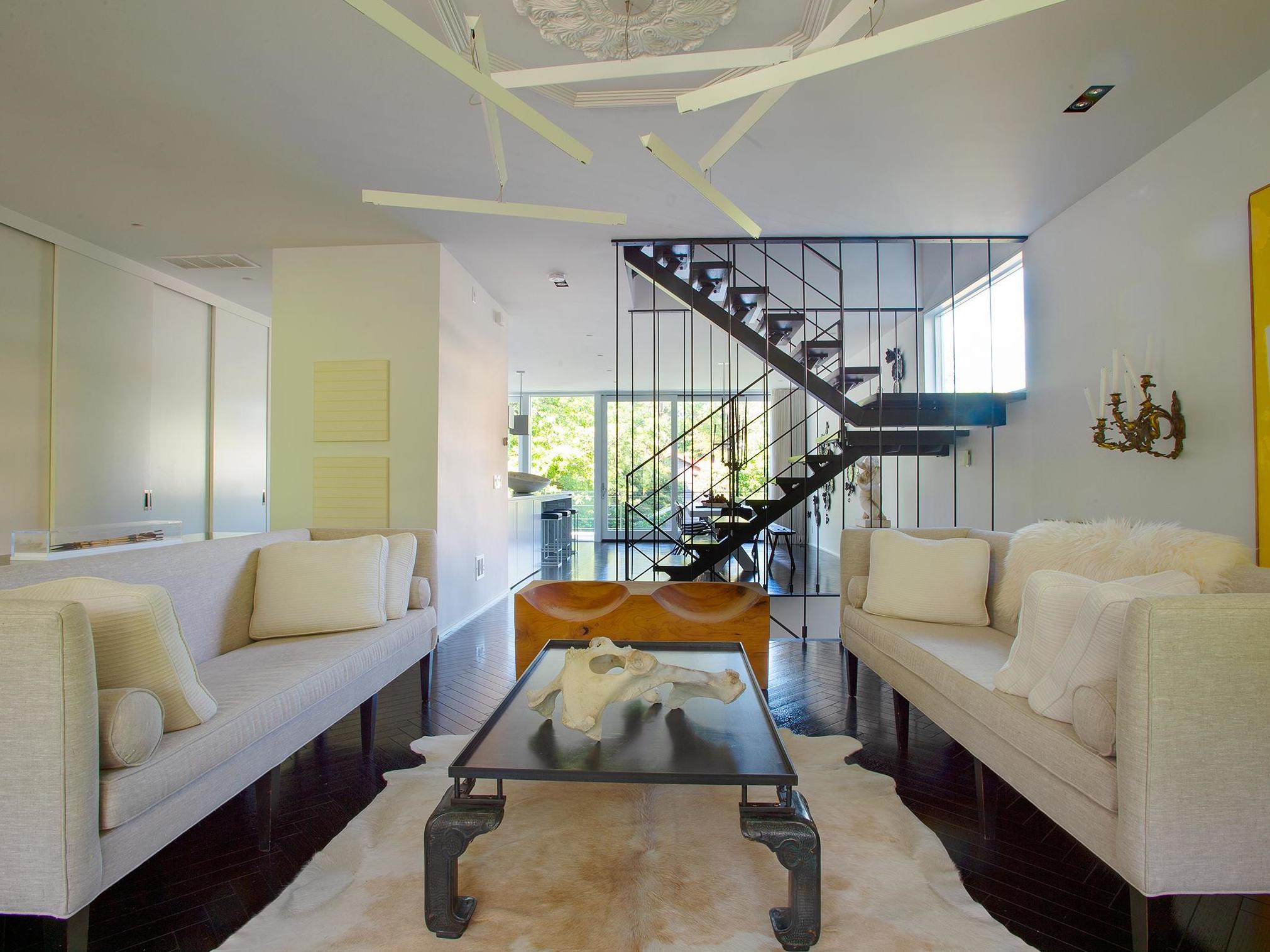
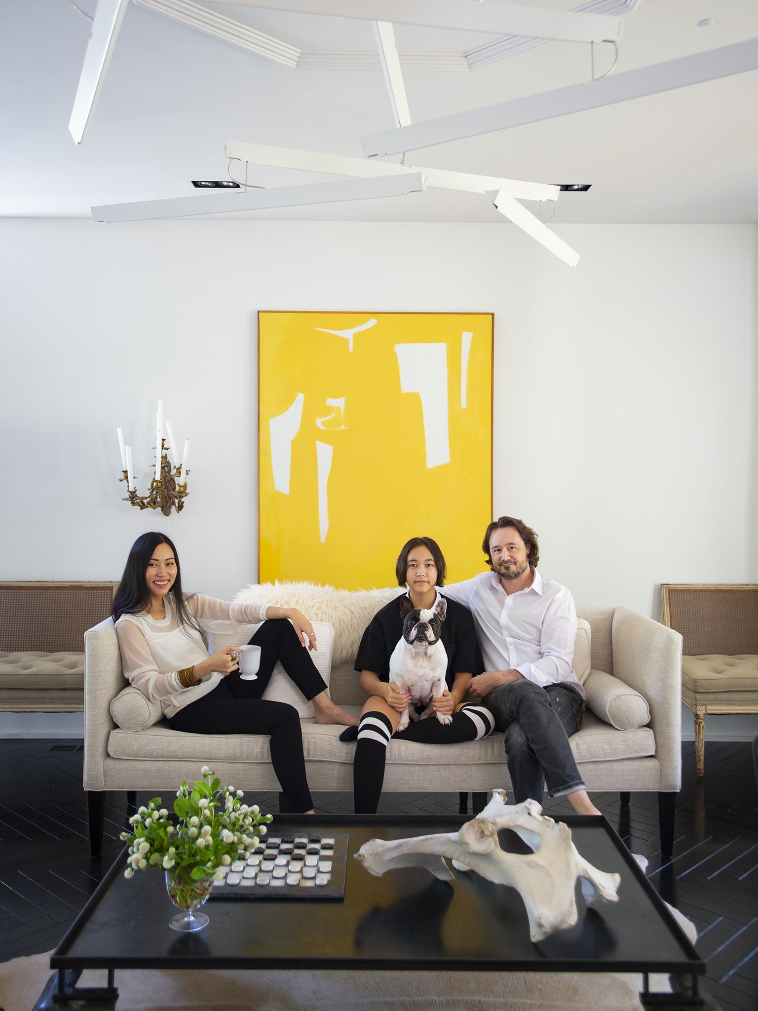
For the same reasons, the chief creative officer of Design Army, a graphic design and branding firm, sticks with a similar strategy in the home she shares with husband Jake, Design Army’s chief executive, and daughter Sophie, 14. Their airy four-level, 5,000 sq ft custom house is clean and minimalist, a mixture of old and new, serious and playful.
It’s partially a reaction to the Lefebures’ work life, which is full of colourful visual stories and branding campaigns for high-profile clients. (A recent short film produced for CityCenterDC featured Washington Ballet dancers dressed in dizzying neon suits and dresses.)
“I deal with colour all day long; our work is so colourful that at home I want a clean palette,” says Pum, 43, a native of Thailand.
Jake and Pum work as a team 24/7. In the office and at home, he’s the practical business guy, and she takes the lead on design.

“Some couples separate work and home, but for us, it’s about integrating them and blending them and making sure our house is at least visually separate from work,” Pum says. They recharge from their high-speed workdays in calm and quiet.
“With black and white, you can’t go wrong,” says Jake, 45. “It’s timeless. You can swap out things. Even our Christmas tree is black and white.” So is Luna, their French bulldog.
Pum and Jake’s dramatic house in the northeast quadrant of town, where they have lived since 2014, was designed by Studio Twenty Seven Architecture. A “floating” steel staircase down the middle connects the floors; a back wall of almost total glass allows lots of light. Inside, Pum worked with Washington interior designer Darryl Carter, a kindred spirit and fellow risk-taker who shares Pum’s love of old paintings, Paris flea market finds, well-edited rooms and neutral palettes. The interiors are painted white; Benjamin Moore’s “bonifant white” was applied after Carter had the walls coated with a textured finish to add character. Herringbone floors are stained ebony.
“Pum gravitates towards things that are very high-style,” Carter says. “It’s very European the way she gathers the things that appeal to her.” Despite the two-colour policy, there are subtle splashes of other hues, such as the pale pink in Pum’s top-floor office and the yellow in Jake’s den on the lower level.
The interiors are full of clever juxtapositions: modern and antique, luxurious and everyday, smooth and textured. Take the open shelving in the kitchen stacked with all-white dishes: milky Astier de Villatte platters handmade in Paris mix with unglazed off-the-rack Crate and Barrel Mercer plates. The living room has an Usona bench carved from a chunk of cedar, a cream and white cowhide rug and two 1950s leather sling chairs designed by Brazilian architect Paulo Mendes da Rocha. In the guest room, a pair of 19th-century Austrian beds in a white painted finish are set off by a woven recycled-leather rug from Garnet Hill.
“At home, I want that homey feeling,” Pum says. “I had the idea that I wanted a modern, but not a completely cold look.” The house has lots of old French portraits as well as bold expressionist paintings, and metal contemporary lighting mixed with romantic antique European ceiling fixtures and sconces, some lit by candles. Pum travels extensively for work; she loves shopping wherever she is, especially in France.
The Lefebures met in 1996 at a design studio and married in 2001. Two years later, they started Design Army, which now has a staff of 21 and clients including PepsiCo, the Ritz-Carlton, Adobe and Marriott International.
In 2005, they found a 1926 American Foursquare in Brookland, a quiet neighbourhood near their office and Sophie’s school. The place was worn out, and they knew they would totally remodel it in a few years, as budget permitted. Jake began gutting it himself on weekends, but they soon realised it would be better, and cheaper, to start over. In 2010, Studio Twenty Seven knocked it down to the foundation and began building a house to better suit the family’s needs.
“It’s very strong in its statement and very much like they are... They are very confident in their opinions on design and what is the essence of an idea and what is fluff,” says John Burke, an architect and co-founder of Studio Twenty Seven.
Burke designed a modern facade to capture the details and scale of the original 1926 house, including a large front porch with wide stairs and a hip roof. With ageing parents in mind, the basement level – which has a guest room, full bath, laundry room and Jake’s den – has wider doors and showers and sinks accessible to wheelchairs. The main floor is a vast, open space with a kitchen, dining and living area, plus a powder room. The second floor has Jake and Pum’s bedroom, Sophie’s bedroom, a guest room and two full baths. The top floor is a light-filled loft housing Pum’s office, an art and study corner for Sophie, and a half-bath.
“Jake and Pum never stop working. It was important that the house reflect that lifestyle,” Burke says. “There has to be the ability to be creative in any room, whether work or play.”
Jake does most of the cooking, and he wanted a clean and simple kitchen space with a big counter (a 15ft expanse of white marble) so the family can gather round. Nearby is an 11ft-long table designed by Carter from 100-year-old oak, big enough for Sophie to do homework or lay out a project. “That table is the nerve centre of the house,” says Carter, who started working with the Lefebures on the interiors in 2013.
Upstairs, each bedroom evokes a different feeling. The master bedroom has a kind of mediaeval vibe, with a grand bed surrounded by luxurious hangings of gray velvet on the inside and white linen and wool on the outside. “I wanted a canopy bed, so I can close the curtains. I feel like I’m in a tent,” Pum says.
Sophie has made her bedroom her own, stringing lights around her bed, covering her walls with her drawings and growing a row of succulents in her sunny window.
The top floor is Pum’s world. Part office and part art studio (and occasional mother-daughter hangout), the space is bathed in light and looks out over the trees. “Yes, it’s a little more girly here,” says Pum, who added a few pale pink accents to the room. She burns a Buly 1803 Generaux d’Empire scented candle on the 19th-century partner’s-style library table, painted in a black gloss finish, that serves as her desk. She pins photos and ideas to a mood board on the wall.
Three floors down is Jake’s den (they text each other). It’s a place to chill, and there’s a nice big sectional sofa with a nail head trim designed by Carter. “Pum picked it out, and I laid down on it to make sure it was comfortable,” Jake says. There are two saffron velvet mid-century modern chairs by Augusto Bozzi and a 19th-century painting, all Pum finds from France.
The house is yet another collaboration for the plugged-in couple, who just opened At Yolk, a 10,000 sq ft arts space in the warehouse district of Hyattsville, Maryland.
“Our house is clean and minimal, but highly detailed – like good design,” Jake says. “What makes Pum and I so compatible – and our house – is that we both have passion for good design. We might disagree on a lot of things, but good design is never arguable.”
© Washington Post
Join our commenting forum
Join thought-provoking conversations, follow other Independent readers and see their replies
Comments