UK inequality: Four charts that tell the story behind the official figures
Some will find the results of the latest estimates from the Office for National Statistics surprising
Your support helps us to tell the story
From reproductive rights to climate change to Big Tech, The Independent is on the ground when the story is developing. Whether it's investigating the financials of Elon Musk's pro-Trump PAC or producing our latest documentary, 'The A Word', which shines a light on the American women fighting for reproductive rights, we know how important it is to parse out the facts from the messaging.
At such a critical moment in US history, we need reporters on the ground. Your donation allows us to keep sending journalists to speak to both sides of the story.
The Independent is trusted by Americans across the entire political spectrum. And unlike many other quality news outlets, we choose not to lock Americans out of our reporting and analysis with paywalls. We believe quality journalism should be available to everyone, paid for by those who can afford it.
Your support makes all the difference.Income inequality has not risen since the financial crisis, according to the latest estimates from the Office for National Statistics.
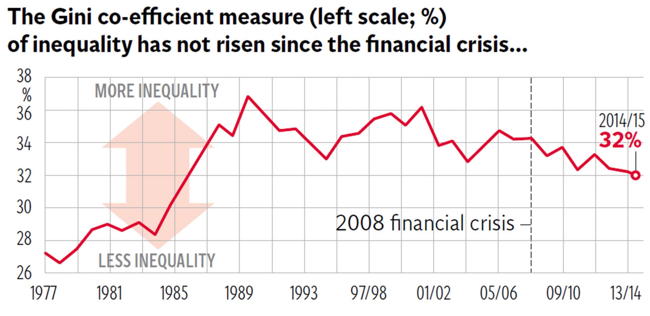
This finding, which some will find surprising, is based on analysis of the Gini co-efficient: the standard statistical tool used to sum up a country’s level of income inequality in a single figure, where 100 per cent represents absolute inequality and 0 per cent represents absolute equality.
The UK had a Gini reading of 32 per cent in 2014-15, the ONS has said. As the first of our charts shows, that was virtually the same as in 2013-14 and actually lower than the 34.2 per cent reading in 2008-09, when the UK went into recession. Other measures of inequality produced by the ONS – such as the ratio of the incomes of the top 10 per cent of earners to the bottom 10 per cent – also point to a flat-lining of inequality over the past eight years. These findings seem to contradict the often-heard assertions of politicians and activists that income inequality in the UK is rising and should alarm policymakers.
So are these groups all wrong? Are such concerns about inequality misplaced?
Not necessarily. First, it is important to recognise that what the Gini measures is post-tax inequality. The second chart shows post-tax inequality alongside pre-tax inequality, or the level of inequality that would prevail if the UK state did not do any redistribution through the tax and benefits system.
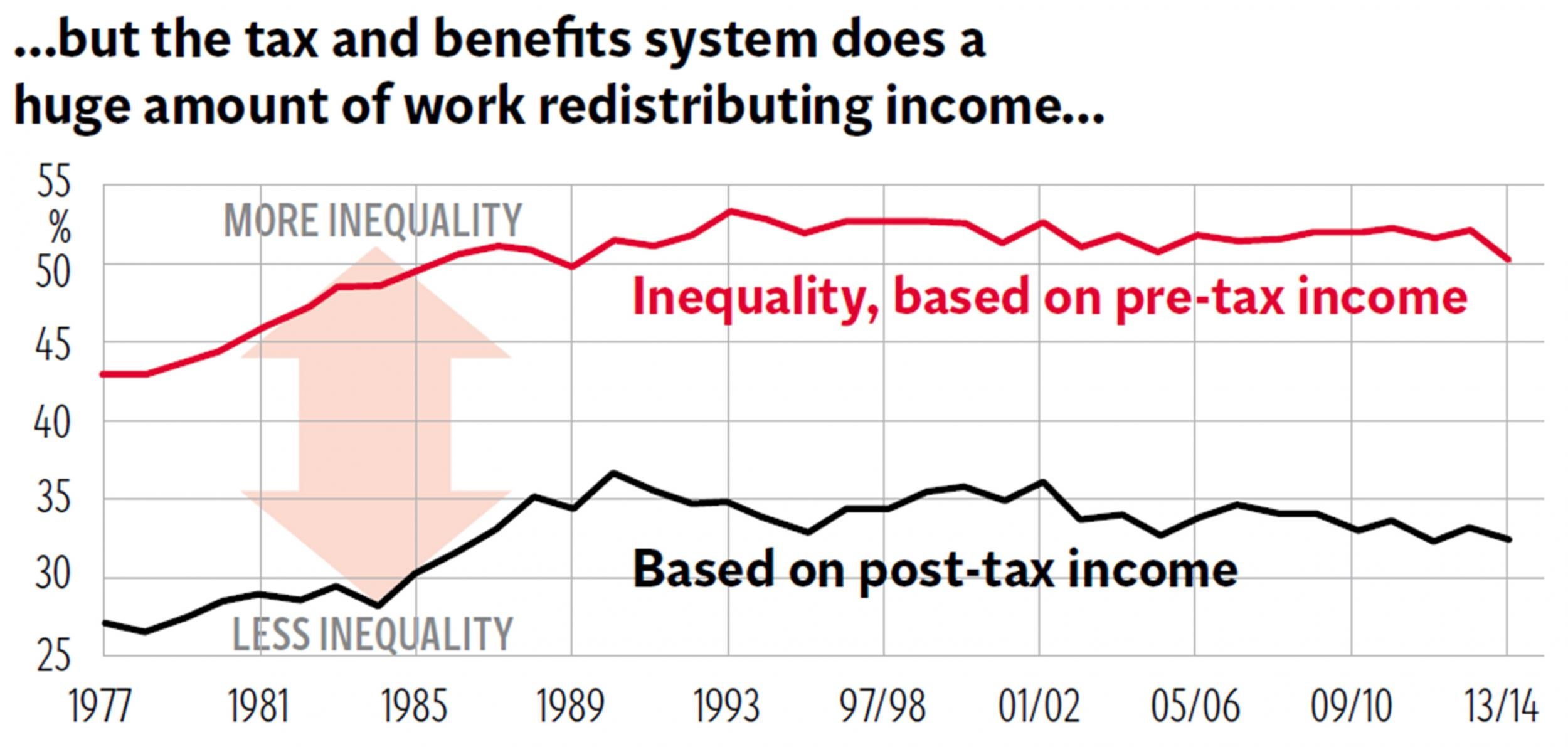
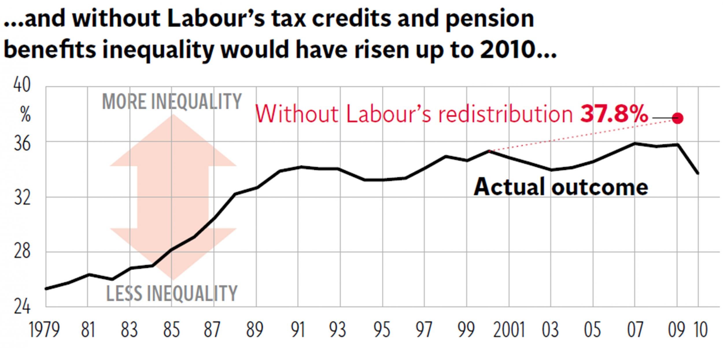
Pre-tax inequality is significantly higher. That shows how much work the tax and benefit system has to do to keep inequality down at present levels. Research by the Institute for Fiscal Studies suggests that without Labour’s introduction of tax and pension credits in 1999 inequality would have risen strongly after 1997, as the third chart shows. This is the reason many researchers fear that George Osborne’s plans to slash back the redistribution done by the tax credits system risks creating a sharp increase in both poverty and inequality in the coming years.
Finally, it is important to recognise that when people talk about inequality they are often not talking about inequality across the broad income distribution but the relative incomes of those at the very top. Post-tax income inequality across most of society rose sharply in the 1980s under the Conservatives but plateaued from 1990.
Yet the incomes of the richest 1 per cent continued to rise. The top 1 per cent’s share of all incomes increased from 6 per cent in 1997 to 9 per cent on the eve of the global financial crisis. And within this top 1 per cent itself there was big movement. As the right-hand edge of the fourth chart shows, the post-tax income share of the top 0.5 per cent and the top 0.1 per cent shot up. This largely represents the soaring earnings of financial sector workers and chief executives.
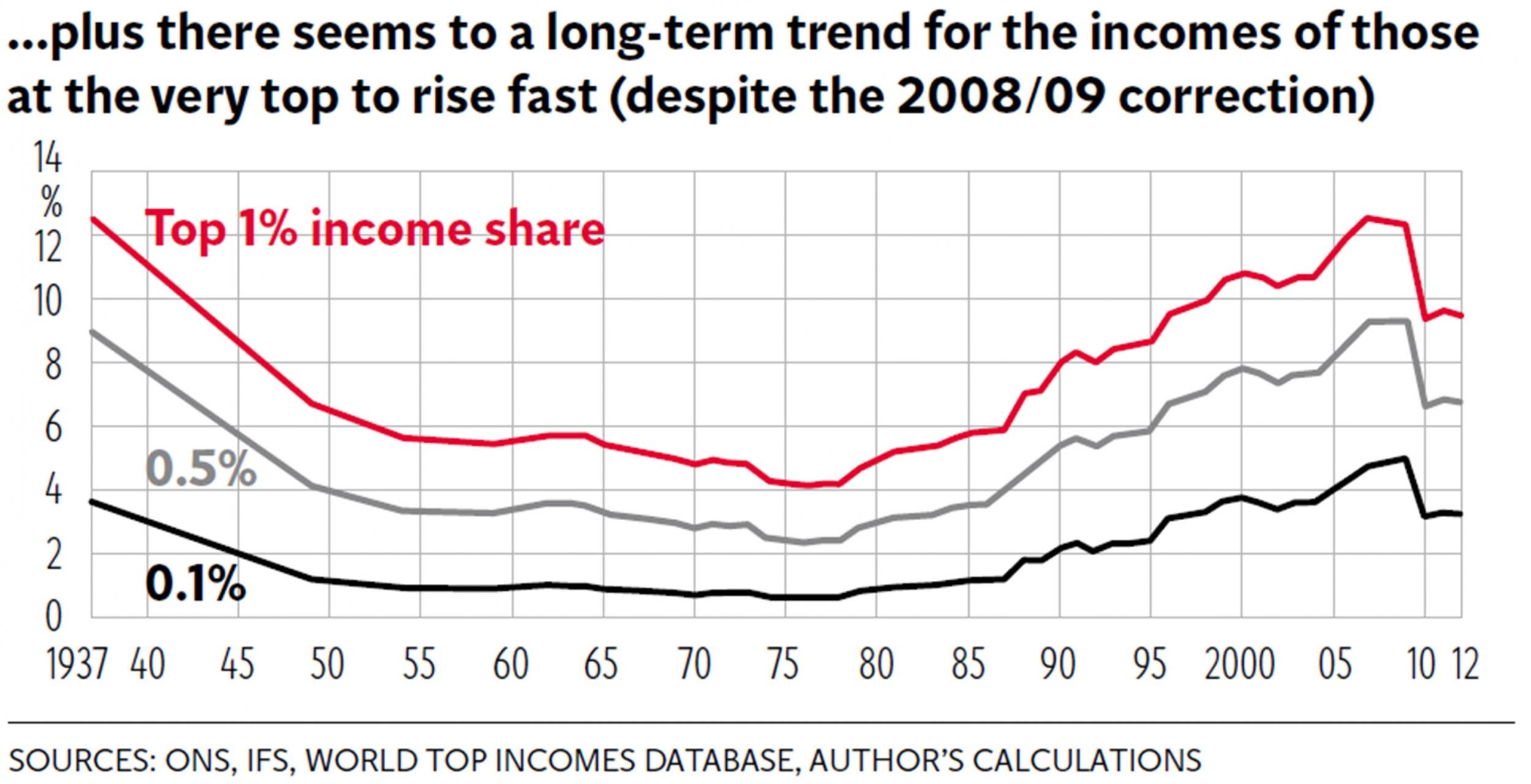
It is true that the income share of these privileged groups fell sharply in 2008-09 and has not yet bounced back. But the figures are distorted by the decision by the previous Labour government in 2010 to impose a 50p top rate of tax for people earning more than £150,000, followed by the Coalition’s decision to partially reduce this rate to 45p. The wealthy shifted a lot of incomes between tax years to reduce their tax liability.
Researchers therefore warn that, whatever the numbers suggest, it is simply too early to say whether the post-1980 trend of rising income shares for the top 1 per cent has come to an end.
Join our commenting forum
Join thought-provoking conversations, follow other Independent readers and see their replies
Comments