A new building erases the last physical traces of a newly vibrant newspaper
The Washington Post's new building will be occupied primarily by Fannie Mae, the federally sponsored mortgage security company, with some leftover room for rental tenants

Your support helps us to tell the story
From reproductive rights to climate change to Big Tech, The Independent is on the ground when the story is developing. Whether it's investigating the financials of Elon Musk's pro-Trump PAC or producing our latest documentary, 'The A Word', which shines a light on the American women fighting for reproductive rights, we know how important it is to parse out the facts from the messaging.
At such a critical moment in US history, we need reporters on the ground. Your donation allows us to keep sending journalists to speak to both sides of the story.
The Independent is trusted by Americans across the entire political spectrum. And unlike many other quality news outlets, we choose not to lock Americans out of our reporting and analysis with paywalls. We believe quality journalism should be available to everyone, paid for by those who can afford it.
Your support makes all the difference.In her 1997 memoir, Personal History, The Washington Post‘s longtime publisher Katharine Graham remembered a “very alcoholic, emotional party” in 1950 when the paper’s staff left the old Post building on E Street NW for a new site on L Street NW: “The party – more of a wake, actually – was, as someone put it, to ‘mourn the death of a building’, which, with all its inconvenient horror, was still much loved.”
There was, perhaps, less booze when the Post moved again in late 2015, out of its 1972 building on 15th Street NW to the spot it now occupies, rental space on K Street NW a few blocks away. But if there was less booze, there were still plenty of people who mourned “the death of a building”, not because it was a good building, or a beloved building or a beautiful building, but because it was repository of memory and habit.
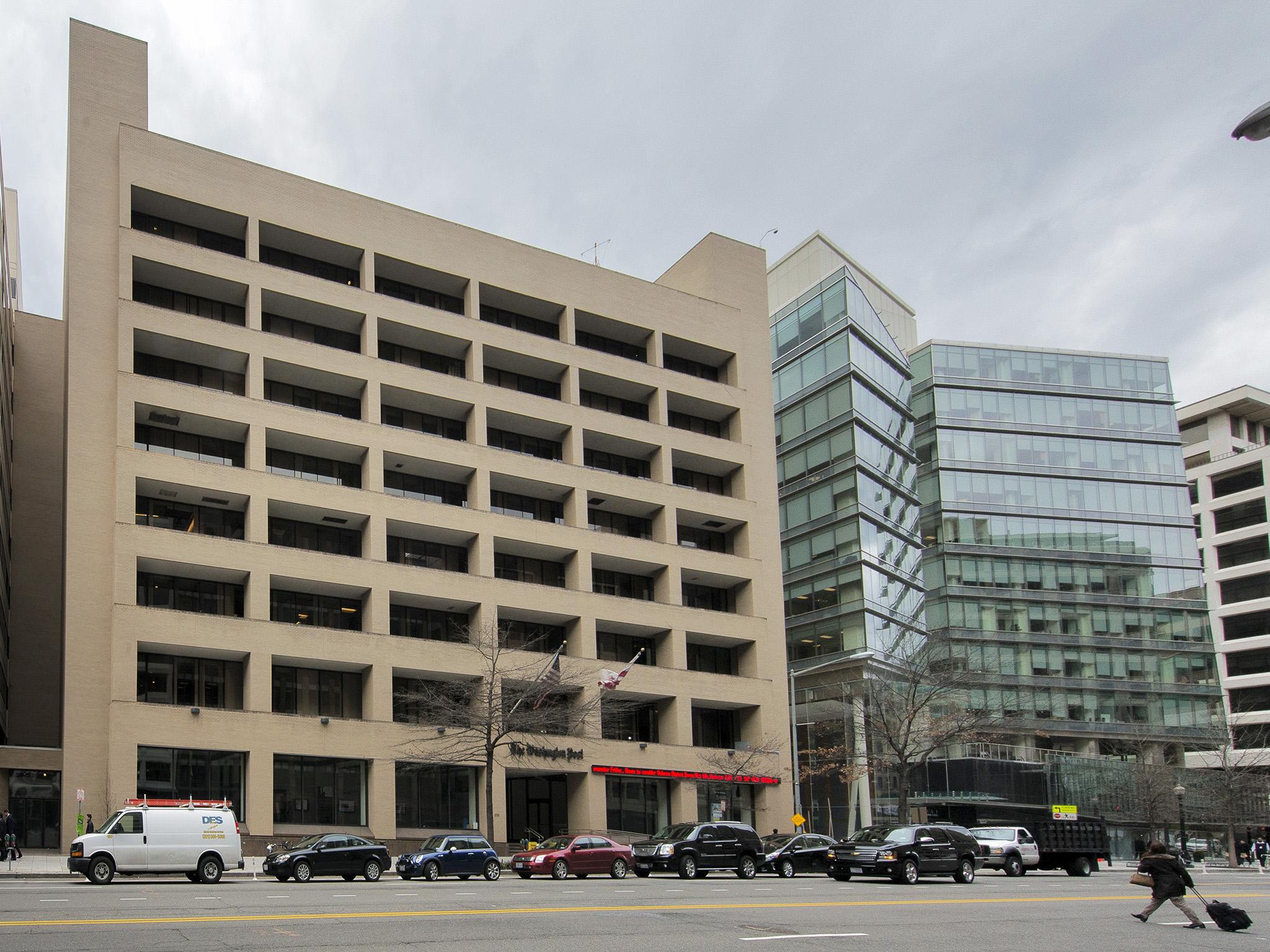
Designed by Albert Kahn Associates (once a powerhouse firm in industrial Detroit), the Post‘s flagship office (adjoined to other structures along the northwest corner of L and 15th Streets) was as ugly as a mid-century concrete box could be. For some reason, the windows along the east face were deeply recessed, making it seem as if daylight and the world at large were always out of reach.
The newsroom, famous from its role during the Watergate scandal (and from movies based on that historical episode), had no glamour at all. It was a low-ceilinged, fluorescent-lit warren of cluttered desks and aisles, with enormously large pillars breaking up the space. As the paper’s staff shrank precipitously after the 2008 economic crash, whole floors felt funereal and the newsroom seemed to engulf its remaining inhabitants.
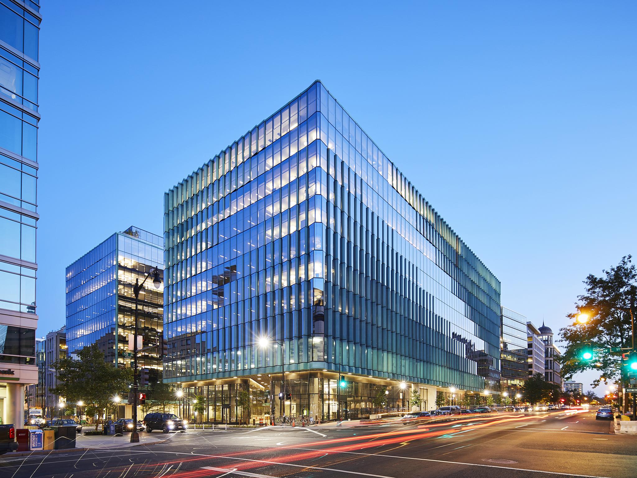
And now it’s gone, demolished and replaced. I’ve walked by the old address dozens of times, and never has the disappearance of a building seemed so absolute. Largely, that’s a happy symptom of the development that has replaced it, a 14-story, 867,000 square-foot glass- and copper-clad structure dubbed “Midtown Center”, designed by the New York-based SHoP Architects. Four separate buildings once stood here, but now there is one large structure, divided into two main towers and connected by three bridges that soar above the city with an appealing geometry.
The east tower rests on large, curved-edge glass plinth-like forms, which create paths and open space at street level, and the area between the two towers includes a fountain and a small plaza with benches, built-in planters and trees.

Like CityCenter, an earlier, much larger development that replaced the old DC convention centre a few blocks east, Midtown Center offers back to the city some of its ground plane as a quasi-public space. But where CityCenter opened up pedestrian space by reinstituting the city’s street grid, Midtown Center has burrowed out new space at street level, creating intriguing sightlines, letting visitors move through the building’s footprint along angled pathways, giving them access to what feels like an open atrium in the middle, and allowing them to pass through to what was once an alley with access to the old Post parking garage and is now a shady terrace space with cafe tables and outdoor dining.
The new building will be occupied primarily by the Federal National Mortgage Association, commonly know as Fannie Mae, the government-sponsored mortgage security company, with some leftover room for rental tenants. The Fannie Mae offices are centred on a large, vertical “town centre” in the west tower, which, along with the bridges, helps give a focal point to the otherwise chopped-up floor plan. The exterior of the building, with its greenish oxidising copper trim, is far more appealing than the rather bland, Michael Graves-designed interior spaces.
On a tour of the building in October, the architects and owners (Carr Properties) focused on the building’s amenities: its terrace and penthouse space with exceptional views over the city (Midtown Center is taking advantage of relaxed rules on enclosing space above the usual allowable city height limits), its appealing exercise facility, a bike storage room and electric car charging stations. By cutting a large, open stairwell through the street-level plaza, employees catch a glimpse of sky and daylight as they ascend a bamboo-lined staircase from the garage to the plaza. That cut-through also brings natural light into the fitness centre.
Midtown Center is a rare example of urban jazz in what is otherwise a uniformly drab stretch of typical Washington bureaucratic architecture. If this study in resisting the grid is successful and repeated elsewhere, one can imagine entirely new patterns of movement and habitation in the city, with interconnected plazas and alleys overlaid on the otherwise monotonous right angles of old cityscape.
But for anyone who worked in the old Post building, the opening of Midtown Center brings mixed feelings. What Graham called the “wake” for an old building is well over, though one sometimes misses the habits of how the old site connected to Metro, the restaurants that were its near vicinity, the man who never missed a day of work panhandling along 15th Street, indefatigably chanting “Quarters, dimes or nickels”. The old Linotype machine that once stood at the entrance of the old building is gone, and nothing has replaced it at the new Post building, which feels remote from the city, with only some signage to tell people what goes on inside.
The old Post building was a study in missed opportunities. There was room at ground level along 15th Street to create space that might have engaged with readers – perhaps a glass-walled studio for television interviews, or an exhibition hall showing the best of the paper’s photographic work, or focusing on its role in historical events. None of that ever happened, and when the offices moved to their current space, a sharp-edged interior world of blindingly white walls and minimalist finishing touches, the goal seemed to dematerialise the offices, as if the new “digital” era required reinventing the clean, featureless modernism of French filmmaker Jacques Tati’s imaginary Paris.
Graham was always disappointed by the 1972 Post building, which at one point was to have been designed by IM Pei before the newspaper went in a different direction because of concerns about the design and cost. The current home of the Post continues the newspaper’s retreat from the architectural expression of its ideals and purpose, emphasising the corporate media brand over visual instantiation of a national institution with a specific civic function (which doesn’t mean the newspaper has retreated from that role in its daily journalism).

Midtown Center has now erased what feels like the last physical traces of the newspaper, with the new Post newsroom operating in the sunny uplands elevated over the city, with little connection to it. Midtown Center also offers a study in architectural good citizenship, giving back to the pedestrian and passerby in ways that none of the Post‘s buildings have done for the past half-century at least.
At the time the Post moved out of the old 15th Street building, just two years after it was bought by Jeffrey Bezos, there was still considerable anxiety about the paper’s financial future, and investing in a new, purpose-built home would have been foolhardy. Now, looking at the building that has replaced it, which breathes life into a forlorn part of downtown, one can only think: if only. If only the Post had had more room to manoeuvre when it created its new home; if only the Post, too, was a player in the new urban energy that is fighting back against the blockbusting concrete office boxes that have long ruled this city.
© The Washington Post
Join our commenting forum
Join thought-provoking conversations, follow other Independent readers and see their replies
Comments