Changing Rooms returns: See the drastic makeovers and get tips for copying the look
The iconic makeover show’s first episode was set in Swansea.

Your support helps us to tell the story
From reproductive rights to climate change to Big Tech, The Independent is on the ground when the story is developing. Whether it's investigating the financials of Elon Musk's pro-Trump PAC or producing our latest documentary, 'The A Word', which shines a light on the American women fighting for reproductive rights, we know how important it is to parse out the facts from the messaging.
At such a critical moment in US history, we need reporters on the ground. Your donation allows us to keep sending journalists to speak to both sides of the story.
The Independent is trusted by Americans across the entire political spectrum. And unlike many other quality news outlets, we choose not to lock Americans out of our reporting and analysis with paywalls. We believe quality journalism should be available to everyone, paid for by those who can afford it.
Your support makes all the difference.Changing Rooms is back – with a bang. The home makeover show has returned to our screens after a 17-year hiatus and the first episode did not disappoint.
Presenter Anna Richardson and the team were in Swansea where iconic designer Laurence Llewelyn-Bowen revamped a dreary bedroom and newcomers Russell Whitehead and Jordan Cluroe took on the challenge of a dated living room, leaving viewers stunned with their decor choices, which included lots of brightly painted walls, a swinging sofa and – we’re not kidding – a wall of wigs.
While the bold, blonde, hairy feature may not to be everyone’s taste, there were some very appealing elements in both designs – as you’ll see from the before and after shots below.
We asked interiors experts for their verdict on the first episode and their advice on how to get the Changing Rooms look…
Room 1
Before: florist Claire’s living room was a ‘sea of beige’
After: Laurence Llewelyn-Bowen unveiled a peacock and flamingo-themed party lounge
What’s the verdict?
“Although the newly painted walls are fun, there is too much going on,” says Brenna Ryan, bathroom and interior design expert from Victorian Plumbing. “When painting a feature wall, the point is to focus on one wall, otherwise they are all fighting for attention and it can actually make the room appear smaller.”
How should you choose a colour for your feature wall – or a room in general?
“Go with your gut,” says Steph Briggs, interior designer and co-founder of La Di Da Interiors. “It’s your home and personal space so needs to be reflective of your style and personality. Choose one main colour as your base – for most homes this is a neutral colour, then choose complementary tones within with this, then one or two strong punchy colours as your accent.”
And is a swing seat better than a sofa?
“The hanging bench is pretty but it is actually doing a very good job of dividing up the living room space,” says Ryan. “When wanting to create zones in a living room, you can also opt for more simplistic choices such as choosing an L-shaped sofa to create a more organic zone. Rugs are also a great way to break up a room which adds textures to the different zones and work to create a sense of transition from one space to the next.”
Room 2
Before: Lisa’s bedroom was cluttered and dull
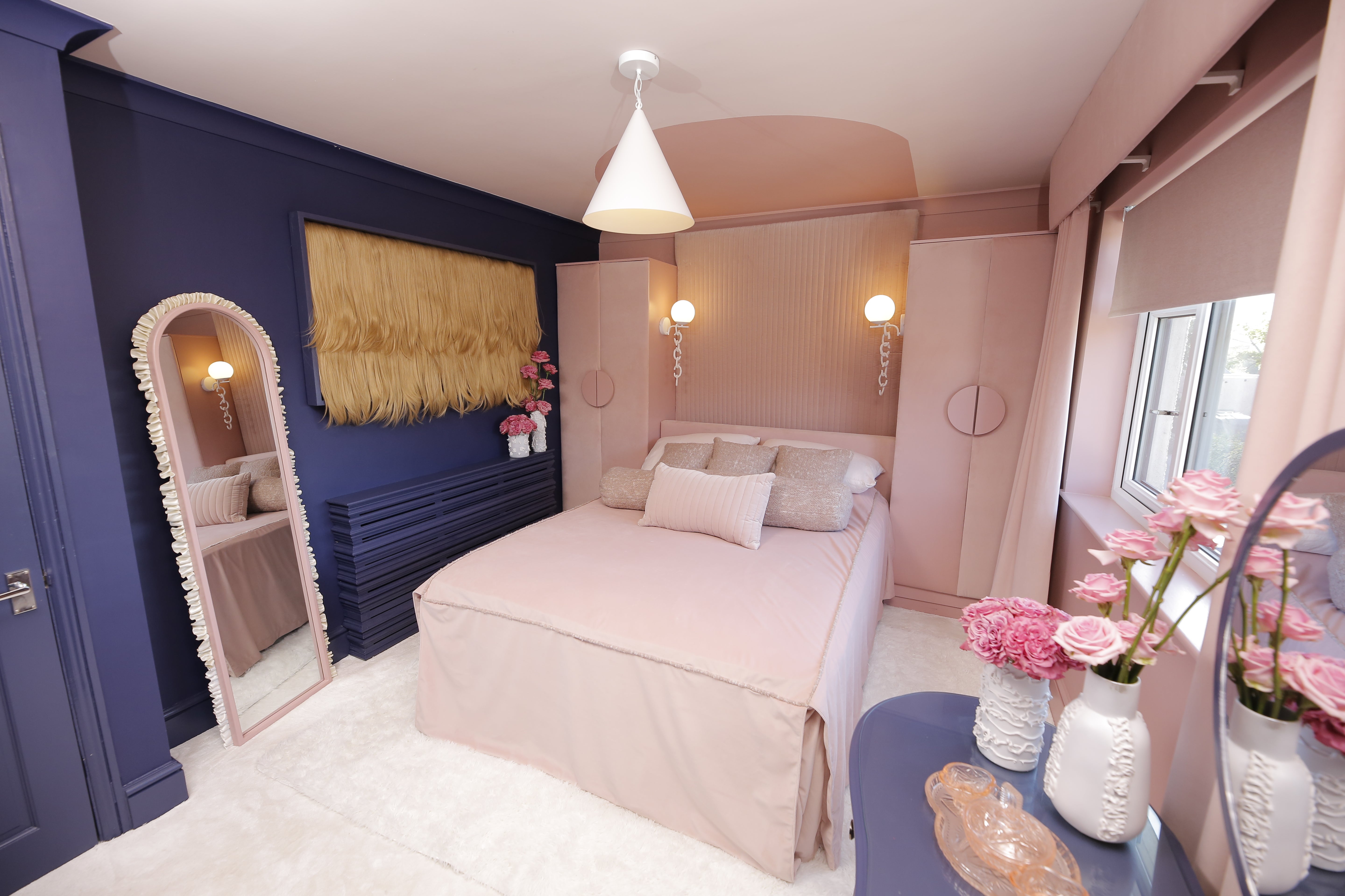
After: Russell Whitehead and Jordan Cluroe created a glamorous pink and purple boudoir
What’s the verdict?
“The way they have altered the layout of the bedroom here is successful,” says Ryan. “Arranging furniture is an art, and it is one the most crucial parts of interior design.”
Where should you start when redesigning a bedroom?
When organising a bedroom it makes sense start with the bed, Ryan recommends: “Generally, it is best to put it against the wall opposite the door to make it a focal point of the room. Once you’ve decided on the position of the bed, arrange everything else starting with the biggest furniture followed by the smaller ones. When you haven’t got a lot of space to work with, use only necessary furniture. My top tip is to experiment. Draw it out, try it out, and see what works.”
What do our experts make of that hirsute artwork?
“I’m all for using texture in a room scheme, it adds depth and feeling, but the hair wall is a no from me,” says Briggs. “I would have gone for a mirror, rattan screen or textured canvas as an alternative. It’s far more environmentally friendly, aesthetically pleasing and not as strange!”
Ryan is slightly more encouraging about the unusual feature, saying: “I’m sure the sight of the hair wall made many interior designers squirm last night, but they certainly get an A* for innovation.”
If you do decide to get wiggy with it in your bedroom, don’t forget to look after your locks, she adds: “For maintenance, I can only suggest brushing it like your own hair and the occasional wash.”