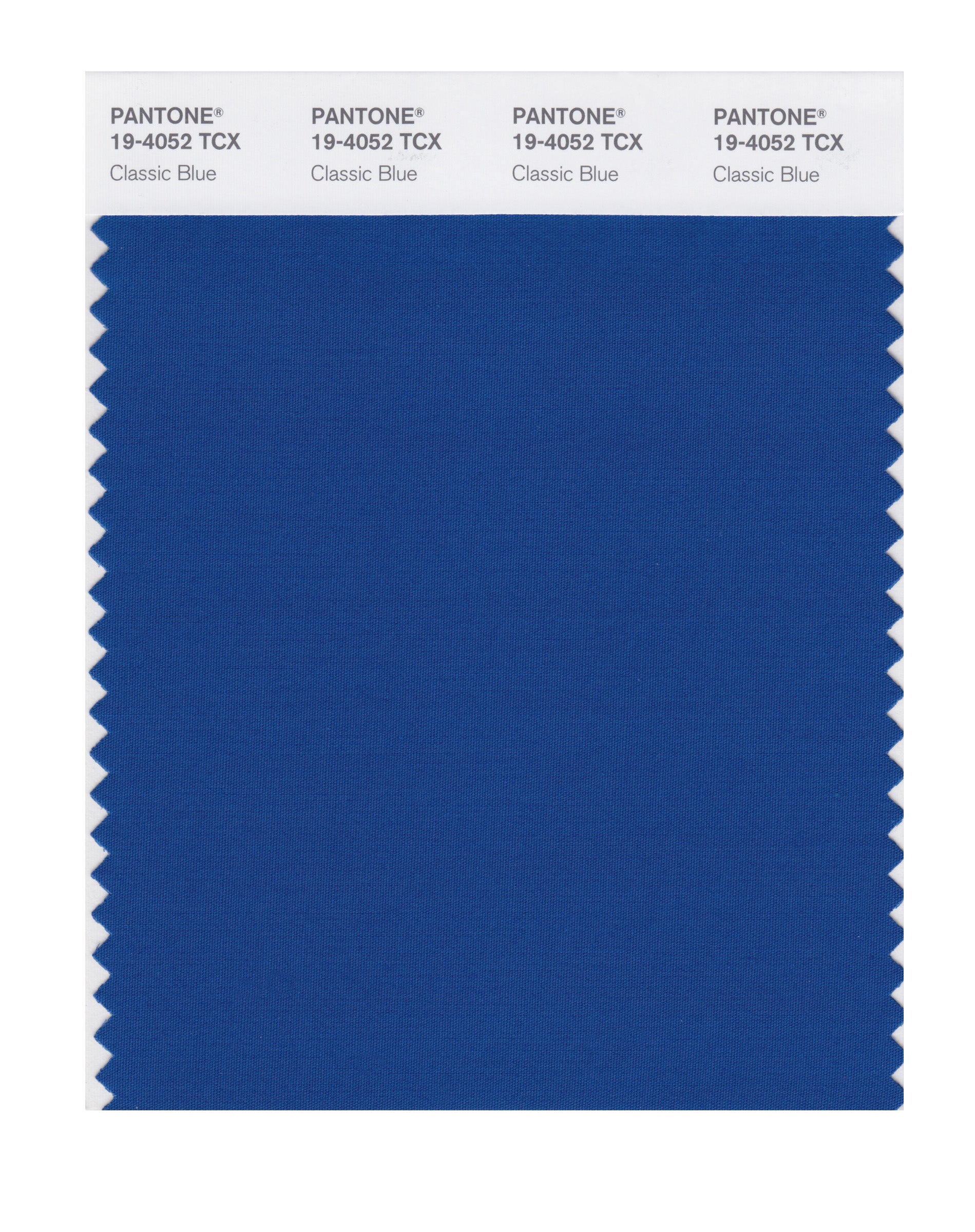
Pantone announces ‘Classic Blue’ as its 2020 colour of the year
Classic Blue is 'imbued with a deep resonance' and is a 'solid and dependable blue hue', Pantone Colour Institute executive director states
Your support helps us to tell the story
From reproductive rights to climate change to Big Tech, The Independent is on the ground when the story is developing. Whether it's investigating the financials of Elon Musk's pro-Trump PAC or producing our latest documentary, 'The A Word', which shines a light on the American women fighting for reproductive rights, we know how important it is to parse out the facts from the messaging.
At such a critical moment in US history, we need reporters on the ground. Your donation allows us to keep sending journalists to speak to both sides of the story.
The Independent is trusted by Americans across the entire political spectrum. And unlike many other quality news outlets, we choose not to lock Americans out of our reporting and analysis with paywalls. We believe quality journalism should be available to everyone, paid for by those who can afford it.
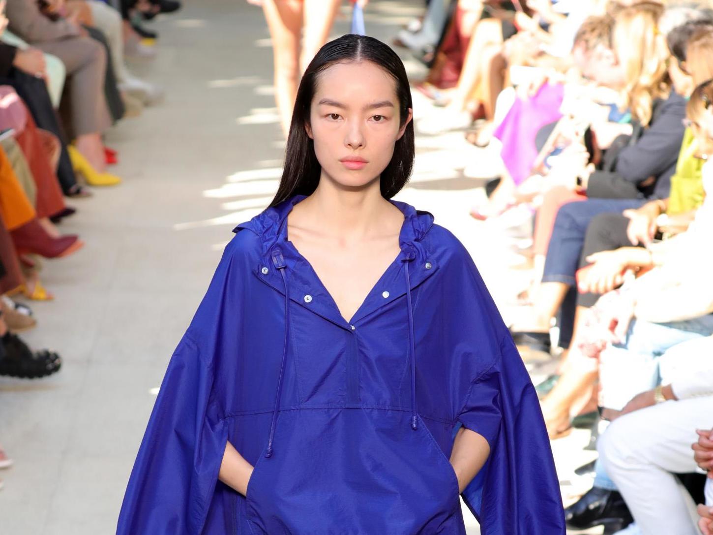
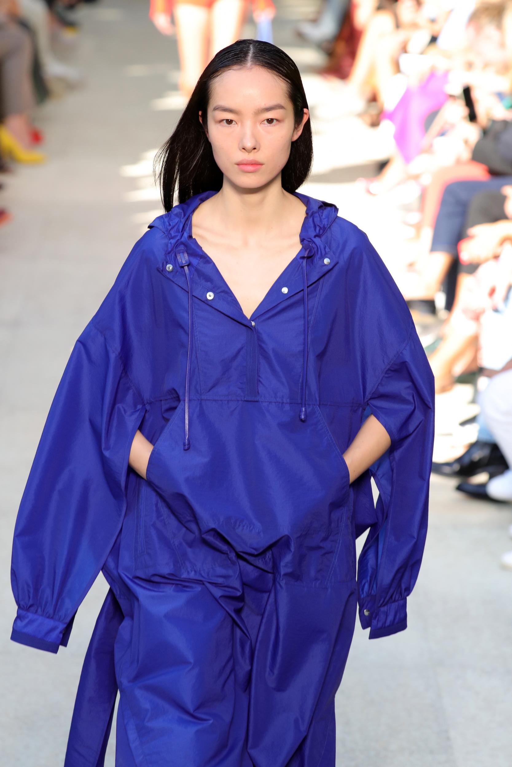
Your support makes all the difference.Pantone has announced its Colour of the Year for 2020, revealing “Classic Blue“ as the “reassuring” shade to represent the coming year.
Every year since 2000, the Pantone Colour Institute has selected a colour as its Colour of the Year that the organisation believes is representative of contemporary society.
This marks the seventh time that a shade of blue has been chosen, with Cerulean being selected during the inaugural year, Aqua Sky in 2003 and Blue Turquoise two years later.
Leatrice Eiseman, executive director of the Pantone Colour Institute, states that “we are living in a time that requires time and faith”, which is why the “constancy and confidence expressed” by the “solid and dependable” Classic Blue was selected.
“Imbued with a deep resonance, Pantone Classic Blue provides an anchoring foundation,” colour specialist Eiseman states.
“A boundless blue evocative of the vast and infinite evening sky, Pantone Classic Blue encourages us to look beyond the obvious to expand our thinking; challenging us to think more deeply, increase our perspective and open the flow of communication.”
Pantone explains that in a digital age where technology continues to evolve at a rapid pace, society is seemingly gravitating towards colours that are soothing and have a protective quality.
“The Pantone Colour of the Year highlights the relationship between trends in colour and what is taking place in our global culture at a moment in time, a colour that reflects what individuals feel they need that colour can hope to answer,” said Laurie Pressman, vice president of the Pantone Colour Institute.
“As society continues to recognise colour as a critical form of communication, and a way to express and affect ideas and emotions, designers and brands should feel inspired to use colour to engage and connect.”
The deep blue colour ultramarine, the most expensive shade of blue used by Renaissance painters, was made from the semi-precious stone lapis lazuli.
Once discovered in ancient mines in Afghanistan, lapis lazuli was imported into Europe in the 14th and 15th centuries by Italian traders.
One of the most recognisable figures in art to showcase the “true blue” pigment was the Virgin Mary, such as in the 17th-century painting The Virgin in Prayer by Giovanni Battista Salvi da Sassoferrato.
It is also highlighted in Dutch painter Johannes Vermeer’s 1665 work Girl with a Pearl Earring as the only bold burst of colour – in the form of a headscarf – among beiges, browns and a dark background.
Blue is a colour that is traditionally used to represent France, having been used to symbolise the country’s monarchy since the 12th century.
It is also heavily featured on the flags of the United Nations and the European Union due to its association with peace and harmony.
In the 2006 film The Devil Wears Prada, Meryl Streep’s Miranda Priestly, who was rumoured to have been based on American Vogue editor-in-chief Anna Wintour, delivers a lengthy speech about the varying shades of the colour blue, after Anne Hathaway’s Andy Sachs laughably questions how they could be distinguishable.
During a November 2018 interview with Vulture, screenwriter Aline Brosh McKenna stated that much of the speech, which mentions how fashion designers Yves Saint Laurent and Oscar de la Renta previously featured cerulean blue in their collections, was fabricated.
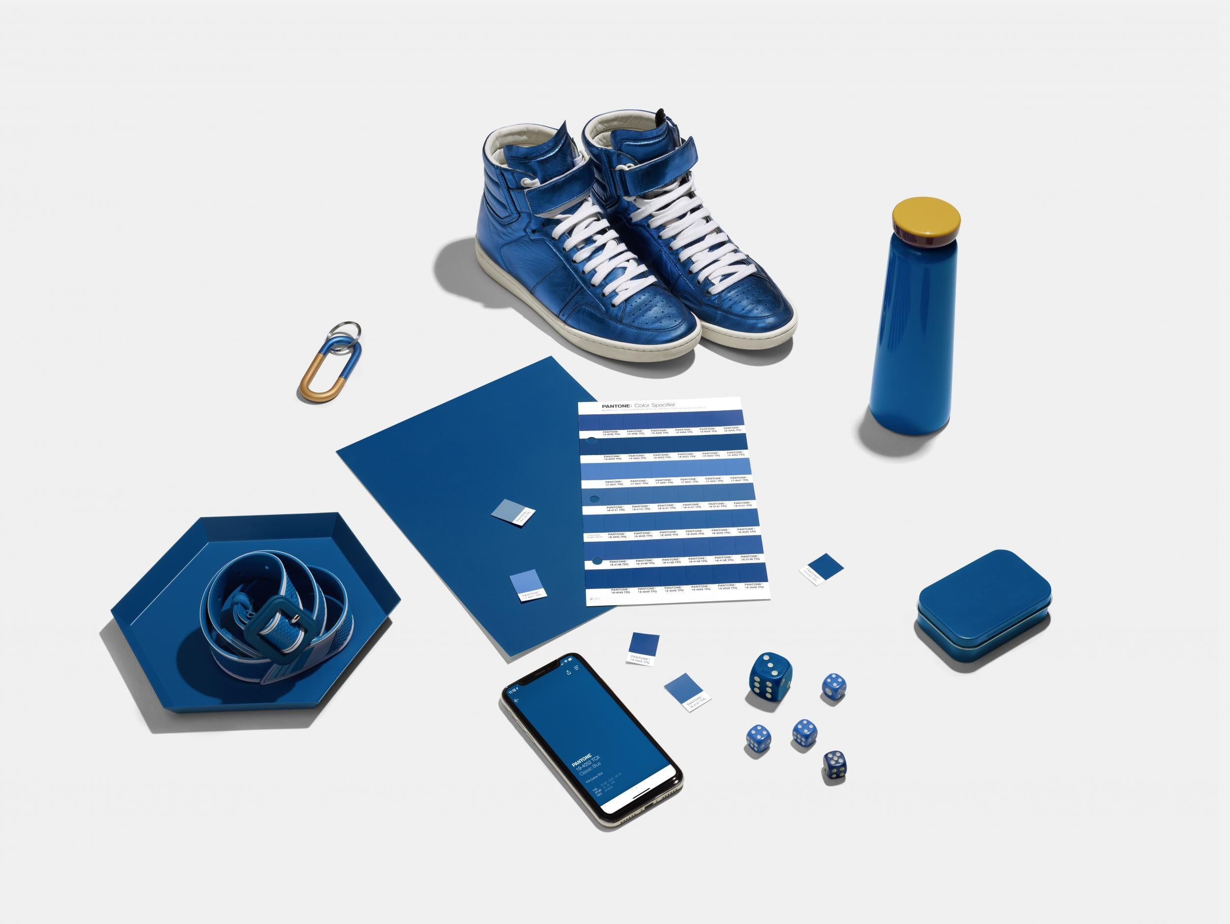
This year marks the first time Pantone has introduced a multisensory approach to its Colour of the Year, partnering with several brands to showcase the taste, texture, scent and sound of Classic Blue.
To read about Pantone’s 2019 Colour of the Year, which was Coral, click here.
Join our commenting forum
Join thought-provoking conversations, follow other Independent readers and see their replies
Comments