One year on from George Floyd’s murder, can the Instagram infographics really save us?
As we mark the first anniversary of George Floyd’s death, Micha Frazer-Carroll asks whether social media squares can ever help change behaviour and fix political injustice or are always just performative posting


Your support helps us to tell the story
From reproductive rights to climate change to Big Tech, The Independent is on the ground when the story is developing. Whether it's investigating the financials of Elon Musk's pro-Trump PAC or producing our latest documentary, 'The A Word', which shines a light on the American women fighting for reproductive rights, we know how important it is to parse out the facts from the messaging.
At such a critical moment in US history, we need reporters on the ground. Your donation allows us to keep sending journalists to speak to both sides of the story.
The Independent is trusted by Americans across the entire political spectrum. And unlike many other quality news outlets, we choose not to lock Americans out of our reporting and analysis with paywalls. We believe quality journalism should be available to everyone, paid for by those who can afford it.
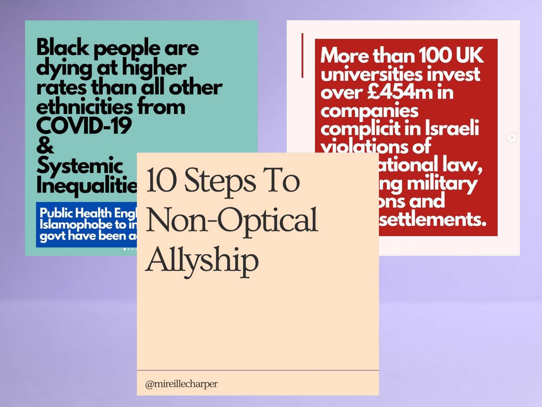
Your support makes all the difference.Last summer, as seismic protests erupted across the world following the murder of George Floyd in Minneapolis, anti-racism flooded our social media feeds. Previously the domain of beach holidays, influencer sponcon and avocado brunches, suddenly, our screens were populated by sleek, 10-part PowerPoint-style slideshows on everything from defunding the police, to deaths in police custody, or how to be a better ally.
These graphics included data, quick facts, historical context, calls to action, then a sea of black squares (the hashtag #blackoutTuesday now has over 20 million posts), or guidance pointing to what the average reader could do to support the Black Lives Matter movement. In some ways, watching the shift felt bizarre. As someone who has been writing about anti-racism for years, I noticed that even people who I’d rarely seen post or engage with the issue of race, were willing to share these bitesize resources.
Since then, the infographics - easily made with pre-existing templates on apps like Canva - have become a staple on social media. While we saw this type of viral information sharing in early examples like #Kony2012, today the infographics are nestled on the timeline day after day, simultaneously covering topics that range from mental healthcare provision in the UK, to Palestine, and the Covid-19 crisis in India.
But as their dominance has grown, so has criticism (and the memes), with some pointing out their propensity to oversimplify complex issues, and mocking their now-ubiquitous pastel aesthetic. A year on from Floyd’s murder there still seems to be disagreement on how much this mode of information sharing helps or hinders.
As Youtuber Amanda Maryanna discussed in a video, infographics in themselves are actually nothing new. Sociologist W.E.B Du Bois and a group of colleagues at Atlanta University were thought to have pioneered the format in the USA in 1900 – in the form of what they called ”data portraits”. In an odd parallel to the infographics of last summer, Du Bois used the medium to present his sociological research on the economic and social conditions of Black people in the States. Du Bois’ portraits look eerily similar to present-day infographics in their visuals too – with brightly coloured minimalist designs used to convey complex data. It’s notable that Du Bois is now considered one of the founding figures in sociology, and that his format of choice is still closely intertwined with how we discuss social and racial justice today.
Like Du Bois, a number of those who use the medium today are racial justice experts themselves. Sofia Akel, a race equity specialist, researcher and academic, tells The Independent that she uses infographics as a means of making academic work more accessible. “I don’t believe that there is one singular form of education that trumps, or is more ‘legitimate’ than others… I never want to be in a position of gatekeeping my research and knowledge for a mere few.” Akel adds that, for those with less access to time and formal education, Instagram slideshows can help to break down big historical events, social issues, and current affairs in a way that is digestible and visible in a space that is regularly used by millions of people.
People who do not have this experience may end up leaving out important context or flattening the nuance of the issue
Teen Vogue’s education columnist Mary Retta has written about how infographics can also help tackle the exclusionary nature of the media. With some news outlets locking online content behind paywalls, Retta writes, Instagram carousels are in some ways democratising, because they are free. They also mean that we’re able to hear from a wider variety of marginalised voices than in traditional media; after all, 44 per cent of British newspaper columnists have attended Oxford and Cambridge. In this context, infographics, which can be made and also seen by anyone with a smartphone and an internet connection, can be thought of, as Retta describes: “a space where activists and leftist voices can be given a platform to share their ideas.”
Of course, as it becomes easier to mock up a professional-looking slideshow, it also can become more difficult to determine if information is reliable. How do you know whether the graphic you’re looking at on a friend’s Instagram Story was made by an expert, someone with lived experience, or by someone who only recently started learning? And where were their ‘facts’ pulled from?
Eve Ewing, a sociologist at the University of Chicago, was one of the first to write about how this trend of infographics risks spreading misinformation – fittingly, in the form of an infographic. “The ‘racial justice explainer’ posts that go viral grossly oversimplify complex ideas in harmful or misleading ways or flat-out misstate facts,” Ewing wrote on her Instagram. “[These infographics] are not attributed to any transparent person, people, or organisation who can be held accountable for errors.”

Niamh McIntyre, a data journalist at The Guardian, says that infographics that deal in data visualisation also run the risk of misrepresenting stats. “When done well, Instagram data viz can be really effective: Mona Chalabi, for example, pioneered grabby, Instagram-friendly data visualisations. But there are obviously risks around using data for viral social content: principally because data journalists should always try to convey the caveats and context around a dataset.
“The proliferation of Instagram graphics means that people who do not have this experience may end up leaving out important context or flattening the nuance of the issue,” she added.
Another common critique of the infographics shared on Instagram is that they do little to materially change political injustices in the world, and more to enhance the existing cultural and financial capital of the “socially conscious” influencers who benefit from sprinkling a bit of #activism onto their page. This idea only seems to be underlined by the highly-stylised aesthetics associated with these carousels, designed to echo the palettes used by brands, and adds to the feeling that they are posting it as part of a wider branding or marketing strategy.
But Akel, whose graphics often use simple white Serif text on a red background, says that her work has had clear impact. During recent Israeli airstrikes on Gaza, Akel made a graphic detailing the investments various British universities have in companies that are complicit in the Israeli occupation. She stresses none of the information was new – it was from research published by the Palestine Solidarity Campaign last year. But the post brought the original data to a bigger audience, gaining over 21,000 likes. “Hundreds of students have messaged me to say that they’ve emailed their universities to divest, they’ve set up campaigning groups and they’ve passed on the information to fellow students and staff,” she says.
Infographics shouldn’t be understood as exhaustive, but rather, a great starting point for your education on a particular subject
As other posts went viral about the situation in Palestine, unprecedented numbers of protestors turned out to solidarity demonstrations in London, Melbourne, Paris and New York. While it’s impossible to attribute attendance to “Instagram activism” alone (or any single factor, for that matter), there certainly appears to be a broad correlation between real world protest and social media awareness-raising at certain flashpoints.
We know that Black Lives Matter protests have always been most widely attended after a case of police brutality is widely circulated online (analysis found there were 260 towns or cities in the UK that held marches in 2020). And last summer, footballer Marcus Rashford criticised the government over failure to provide free meals during the school holidays, and saw food bank donations soar (food poverty charity FareShare received a record number). It seems that in moments of sudden political crisis, social media does play a role in quickly educating people and generating a simple call to action or next step. It seems reasonable to conclude that infographics can too.
Considering their potential for education and action, Akel says that infographics are useful tools for our social movements, but that – crucially – we should remain critical when we engage with them. “As with any news or educational resource, we should always do our due diligence before sharing or reposting. Fact check if you can, and always assess whether it has come from a reputable source. I always add my sources to any infographics that I share, so that people can see exactly where I got my information from,” she says.
It seems that while there is nothing inherently bad about the increasing popularity of Instagram infographics, that these slideshows alone aren’t going to bring about the revolution. Akel agrees: “Infographics shouldn’t be understood as exhaustive, but rather, a great starting point for your education on a particular subject.” So by all means, share away, but remember that political movements require sustained, collective commitment – which goes far beyond simply clicking the ‘share’ button.
Join our commenting forum
Join thought-provoking conversations, follow other Independent readers and see their replies
Comments