The Independent's journalism is supported by our readers. When you purchase through links on our site, we may earn commission.
Paint it black: How to decorate with dark colours
An autumnal palette doesn’t have to feel gloomy, writes Adele Cardani, deep hues can be cosy and even dramatic. Here are some expert tips and tricks to vamp up a bland room...
Your support helps us to tell the story
From reproductive rights to climate change to Big Tech, The Independent is on the ground when the story is developing. Whether it's investigating the financials of Elon Musk's pro-Trump PAC or producing our latest documentary, 'The A Word', which shines a light on the American women fighting for reproductive rights, we know how important it is to parse out the facts from the messaging.
At such a critical moment in US history, we need reporters on the ground. Your donation allows us to keep sending journalists to speak to both sides of the story.
The Independent is trusted by Americans across the entire political spectrum. And unlike many other quality news outlets, we choose not to lock Americans out of our reporting and analysis with paywalls. We believe quality journalism should be available to everyone, paid for by those who can afford it.
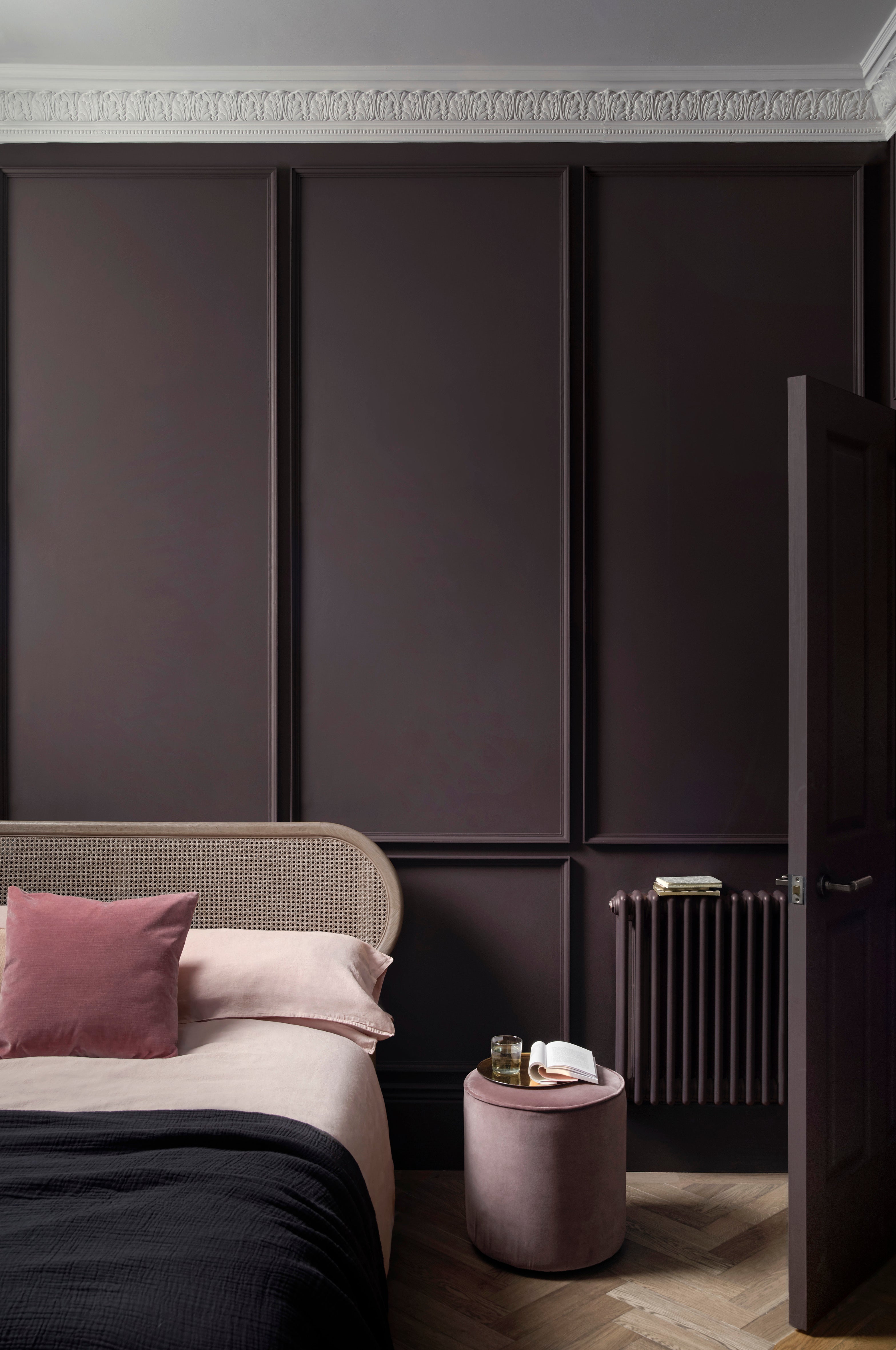
Your support makes all the difference.Pale, neutral walls tend to be the default – especially since we’re often taught to maximise light and create a sense of space. But contrary to popular belief, a dark colour palette doesn’t have to be gloomy. With autumn on the horizon, deep and dramatic hues – like a seductive burgundy or rich navy – can help transform a bland room into a cosy retreat.
Approaching these shades can feel intimidating, so we’ve turned to the professionals for help. Here, five design experts share their top tips and tricks for decorating on the dark side.
“Embracing a darker colour palette is a growing trend and one we are seeing in both fabric and wallpaper choices,” begins Ann Grafton, creative director at textile house, GP & J Baker.
“Grey is gone and in its place are rich chocolates, bruised plum and shades of green – ranging from smart racing green through to forest and lovat.”
Interior designer, Matthew Williamson adds, “I’ve noticed a rise in warm, spicy tones. Think earthy terracotta, deep cinnamon, and burnt sienna. These autumnal hues are nicely complemented by aged brass and bronze accessories for shine, and dark woods, like walnut and ebony, to anchor the scheme.”
Employing these warmer colours and metallic finishes can help to ensure your space doesn’t feel dull.
Try layering, repeating the same colour in multiple shades – such as opting for a two-tone wainscoting look where the upper portion of your wall is a lighter shade than the decorative panelling below. This effect is less harsh than a solid block of darkness.
Look for paint brands that offer a range of tones within the same colour family, such as Paint & Paper Library. You can also enliven moody walls by choosing a high-gloss finish, for added light reflection, or by leaving the ceiling white.
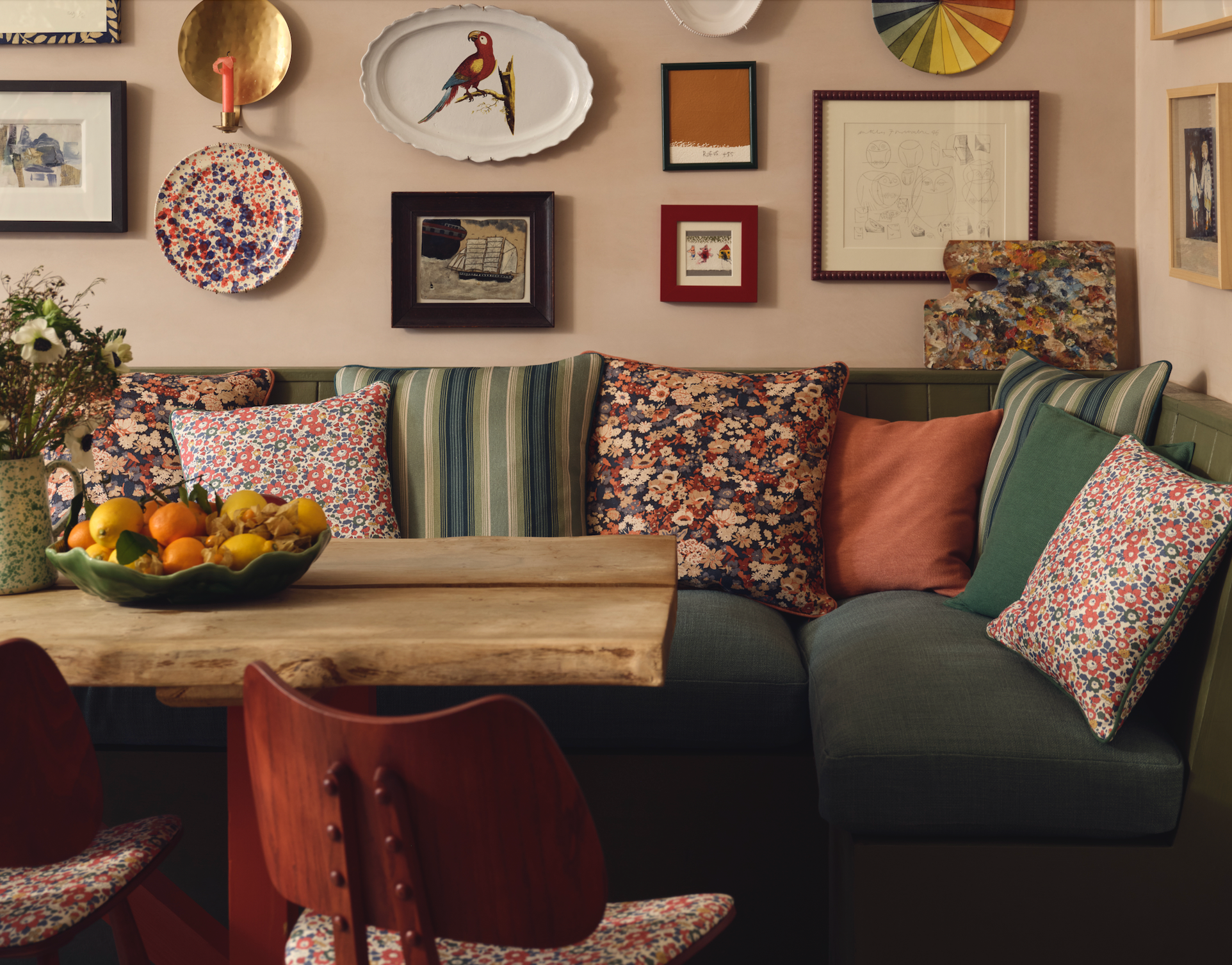
Mary-Ann Bartlett Dunkley, design director at Liberty advises, “Pattern play can also make darker colours less intimidating. Intermixing contrasting motifs like stripes and geometrics against traditional florals adds a sense of light and shade.”
Also, consider texture to be as important as colour and pattern. Try mixing different materials such as airy linens with soft velvets, robust leathers with thick wools, and rustic woods with sleek, veined marble.
The combination of both dark and light colours, and heavy and lightweight materials creates a balanced scheme.
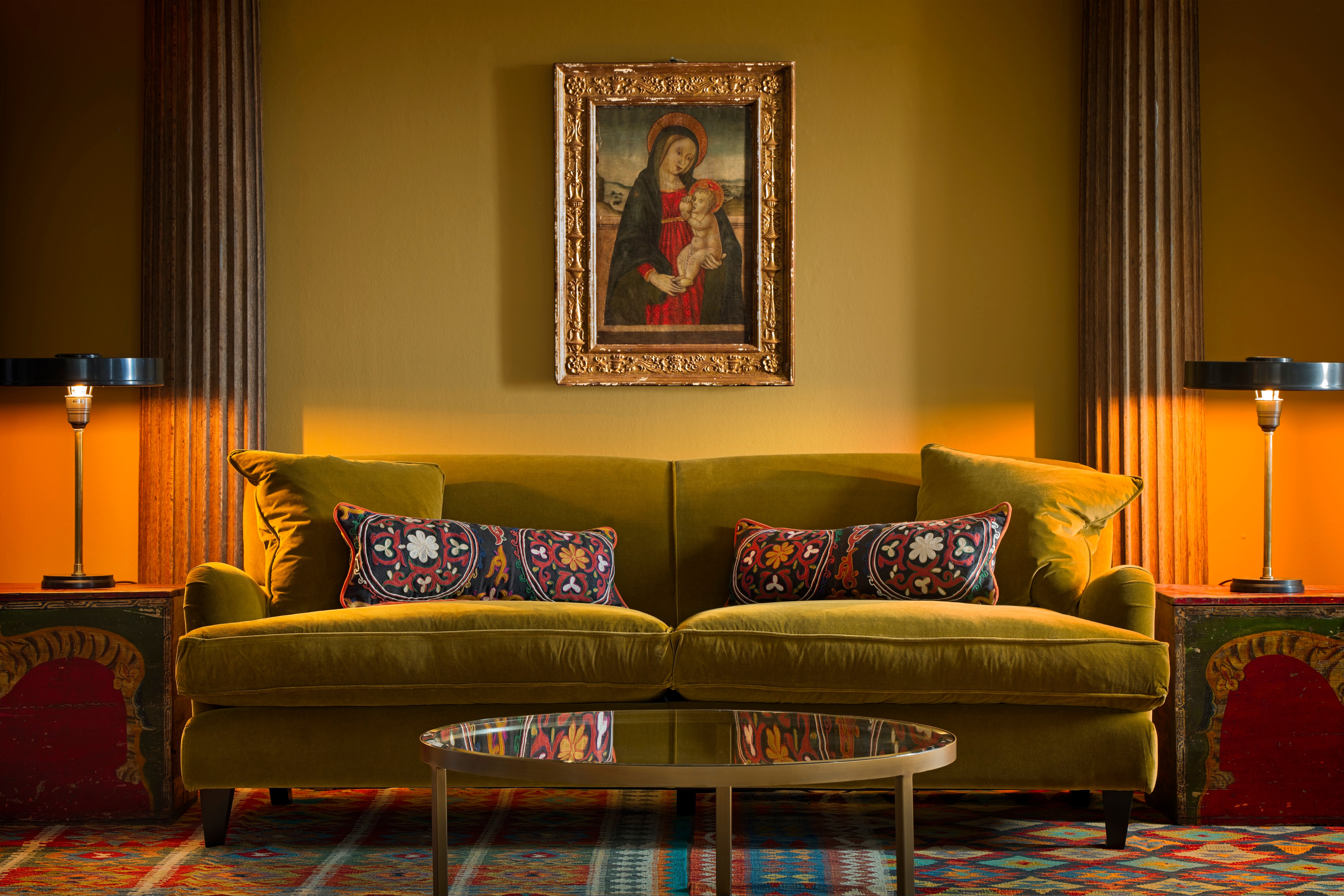
“Darker colours form a much better background for artworks than white – which galleries and museums have discovered,” explains Martin Waller, founder of design house, Andrew Martin. “They allow the brilliance of your paintings and photographs to take centre stage.”
As such, a gallery wall can beautifully break up a large expanse of dark paint, adding colour and character.
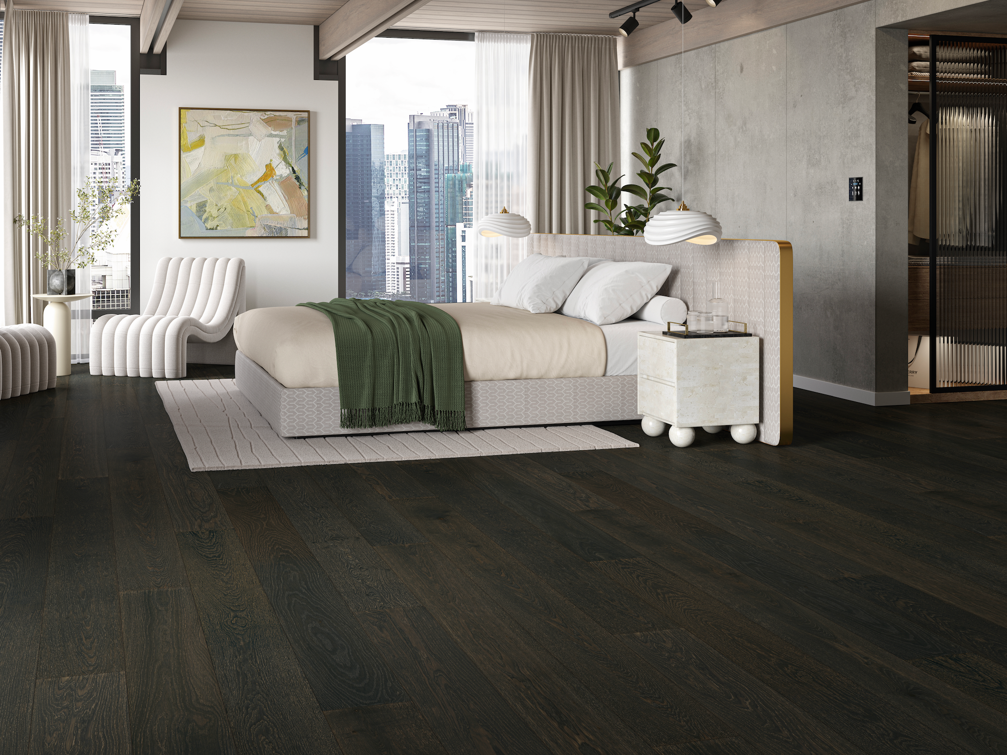
Still hesitant to commit to dark walls? Consider painting a feature ceiling in a deep shade. When paired with fresh white walls and blonde wood furniture, a black ceiling brings drama without totally overwhelming the room.
Similarly, “a smoked walnut floor adds the perfect amount of contrast to what is otherwise a bright, airy space,” says Neel Bradham, CEO of flooring brand, Parador. “This is especially great for creating a warm ambience and grounded feel.”
Make sure to allow yourself time to acclimate to any major decorating changes.
“Having painted a room dark, it may take a bit to get accustomed to the look. You’re likely to be horrified at first. People find it difficult to cope with change. But leave it for a week and your feelings will alter. I suspect you won’t hate it and if you do, repainting isn’t too difficult,” concludes Waller.
Join our commenting forum
Join thought-provoking conversations, follow other Independent readers and see their replies
Comments