Twitter launches redesign: what's changed and what's new?
A more streamlined look seems set to unite mobile and desktop apps

Your support helps us to tell the story
From reproductive rights to climate change to Big Tech, The Independent is on the ground when the story is developing. Whether it's investigating the financials of Elon Musk's pro-Trump PAC or producing our latest documentary, 'The A Word', which shines a light on the American women fighting for reproductive rights, we know how important it is to parse out the facts from the messaging.
At such a critical moment in US history, we need reporters on the ground. Your donation allows us to keep sending journalists to speak to both sides of the story.
The Independent is trusted by Americans across the entire political spectrum. And unlike many other quality news outlets, we choose not to lock Americans out of our reporting and analysis with paywalls. We believe quality journalism should be available to everyone, paid for by those who can afford it.
Your support makes all the difference.Twitter is currently rolling out a redesigned web version of the service.
The social media network announced the changes on Twitter, tweeting “We’re now rolling out a refreshed twitter.com reflecting the look & feel of our iOS & Android apps,” on Monday.
The redesign looks cleaner, with tweets appearing on a white background. The upper navigation bar has changed from black to white, with the navigation icons looking more similar to those that appear on iOS and Android. The icons that have been redesigned include the Direct Message icon, the button to view your own profile has also changed, as well as the button to write new tweets.
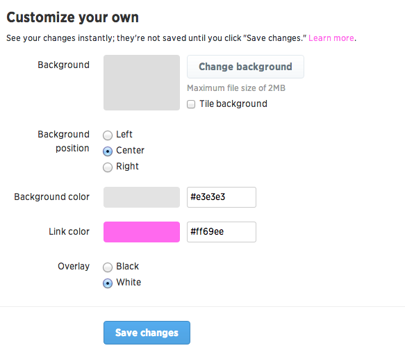
Users can also slightly modify the appearance of their profile. Under settings, users will be able to modify the colour of the links that they post, as well as the colour of the overlay on their profile.
Twitter received a backlash when they majorly modified their design in August last year, when they changed the way that people viewed conversations on their timeline. The current redesign, however, is more subtle and is more about aesthetics than functions.
.jpg)
It is unsurprising that Twitter are making their web design more similar to their mobile design – last year they revealed that 60% of their 200 million active users log in via a mobile device at least once every month. Making some icons more familiar may make it easier for mobile users to use the web version of Twitter.
According to TechCrunch, some users will have had the design for the last few weeks, as the company gives 1% of its users the refreshed design to monitor their reaction.
The redesign has not been rolled out to all users yet, but it is expected to over the next coming days.

Join our commenting forum
Join thought-provoking conversations, follow other Independent readers and see their replies
Comments