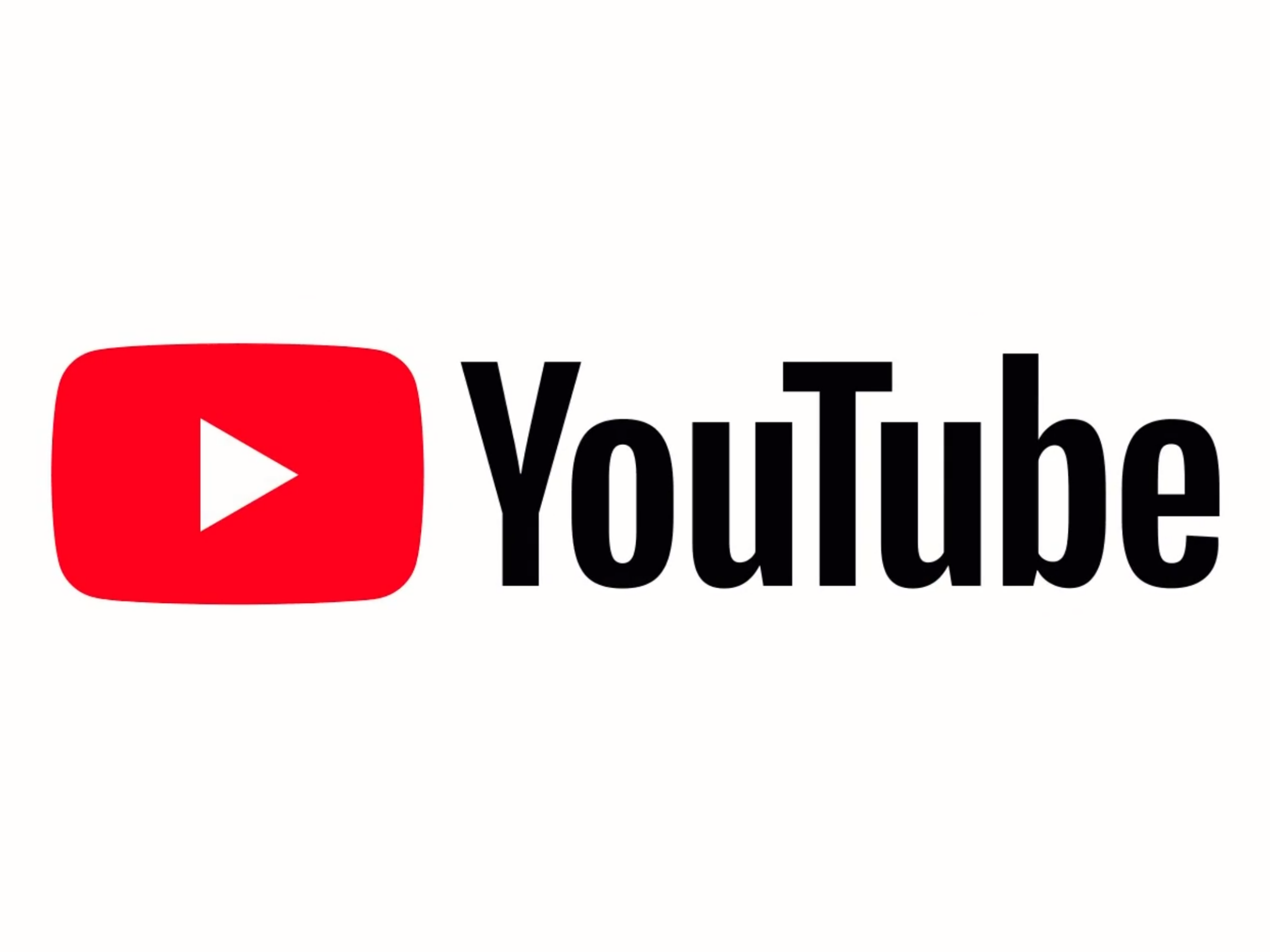
YouTube redesign: New logo, Dark Theme and user interface revealed
'We'll bring a new level of functionality and a more consistent look across our desktop and mobile experiences'

Your support helps us to tell the story
From reproductive rights to climate change to Big Tech, The Independent is on the ground when the story is developing. Whether it's investigating the financials of Elon Musk's pro-Trump PAC or producing our latest documentary, 'The A Word', which shines a light on the American women fighting for reproductive rights, we know how important it is to parse out the facts from the messaging.
At such a critical moment in US history, we need reporters on the ground. Your donation allows us to keep sending journalists to speak to both sides of the story.
The Independent is trusted by Americans across the entire political spectrum. And unlike many other quality news outlets, we choose not to lock Americans out of our reporting and analysis with paywalls. We believe quality journalism should be available to everyone, paid for by those who can afford it.
Your support makes all the difference.YouTube has had a significant makeover.
The video site has unveiled a brand new logo and a refreshed user interface for both its mobile app and desktop site.
The new-look YouTube feels slicker and more modern, but could take a little bit of getting used to.
First off, the redesigned logo. The company’s name and the Play icon have been split up.
Essentially, the Play icon is now so immediately recognisable that there’s no need for the name ‘YouTube’ to accompany it all the time.
In the company’s own words, “the updated Logo combines a cleaned up version of the YouTube wordmark and Icon, creating a more flexible design that works better across a variety of devices, even on the tiniest screens”.
The desktop version of the site has got a cleaner new user interface, and sacrifices some flashes of red for extra bits of white.
If that’s not to your liking, you can activate the dramatic, black-and-red Dark Theme, which is far less of a strain on your eyeballs, and now rolling out to all desktop users.
You can try it out by clicking the account symbol, selecting Dark Theme and turning “Activate Dark Theme” on.
What’s had the most work done to it, however, is the YouTube app. It also features a cleaner user interface, and the navigation buttons have been relocated to the bottom of the screen, where they’re easier to access.
You can now speed up and slow down the playback of a video on the app, as you’ve been able to do on desktop for some time, and YouTube’s introduced a row of suggested videos when you’re watching something in full screen.
The site also says it’s experimenting with gestures, such as the ability to skip a video by swiping right, but they’re still works in progress. You can, however, already fast forward or rewind 10 seconds by double-tapping the right or left side of a video.
“Over the last few months we've started releasing updates and will continue to throughout the rest of the year,” said Neal Mohan, YouTube’s chief product officer.
“When all is said and done, we'll bring a new level of functionality and a more consistent look across our desktop and mobile experiences.”
Join our commenting forum
Join thought-provoking conversations, follow other Independent readers and see their replies
0Comments