The Independent's journalism is supported by our readers. When you purchase through links on our site, we may earn commission.
Watch this: A live visualisation of global births and deaths in your browser
At the beginning of the 20th century world population was around two billion, now it's passed seven billion

Your support helps us to tell the story
From reproductive rights to climate change to Big Tech, The Independent is on the ground when the story is developing. Whether it's investigating the financials of Elon Musk's pro-Trump PAC or producing our latest documentary, 'The A Word', which shines a light on the American women fighting for reproductive rights, we know how important it is to parse out the facts from the messaging.
At such a critical moment in US history, we need reporters on the ground. Your donation allows us to keep sending journalists to speak to both sides of the story.
The Independent is trusted by Americans across the entire political spectrum. And unlike many other quality news outlets, we choose not to lock Americans out of our reporting and analysis with paywalls. We believe quality journalism should be available to everyone, paid for by those who can afford it.
Your support makes all the difference.When David Attenborough said back in September that it was “barmy” to send food aid to countries suffering from famine he ignited a debate about the dangers of the Earth’s rapidly growing population.
At the beginning of the 20th century the number of humans on the planet was around two billion. It took until 1960 to make the leap to three billion and just 40 years to double this to six billion. Almost two years ago to the day we hit another milestone with the birth of a girl in the Philippines named Danica May Camacho, chosen by the UN to represent the world’s ‘seven billionth baby’.
Whether you agree with Attenborough’s comments or not it’s undeniable that world population is booming and it can be difficult to comprehend just how speedily this change is happening.
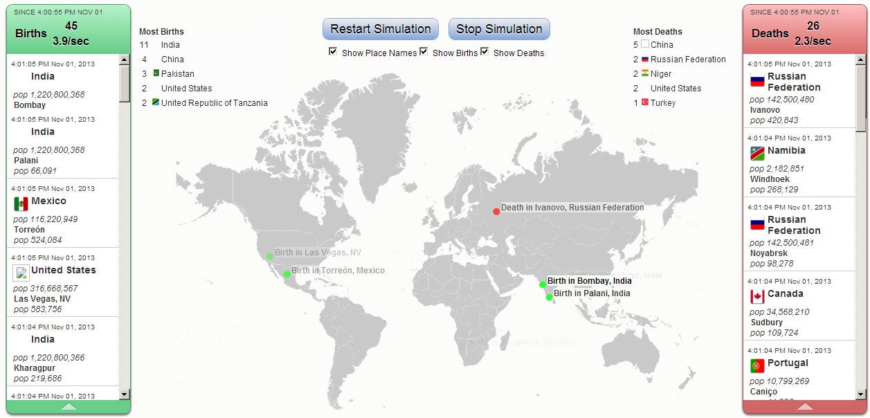
One solution comes from software engineer Brad Lyon, who teamed up with designer Bill Snebold to create a graphic visualisation showing all the births and deaths in the world and which countries they’re occurring in ‘live’.
Click here to view the map – or you can install an app for Google Chrome that allows you to watch the visualisation offline.
The bar on the left shows births, the bar on the right shows deaths, and you can hover over countries to get more information about their population and where they stand in the global rankings for growth and decline.
Lyon told The Independent that he’d been inspired to code the visualisation after he got curious about the “the potential pattern of life and death, based on summary birth and death rates for each country.”
“I had not thought too much about population growth before I had played with this,” said Lyon. “It was a bit of an eye-opener, especially if you're normally focused on your own country.”
Lyon also notes although the visualisation has been constructed using the most recent data from the CIA Factbook, the projections for the future do vary quite considerably, with UN Population Division estimates ranging between a population of 3.2 billion and 24.8 billion by 2050.

Join our commenting forum
Join thought-provoking conversations, follow other Independent readers and see their replies
Comments