Apple Watch review: first-look at Apple's smartwatch ahead of launch
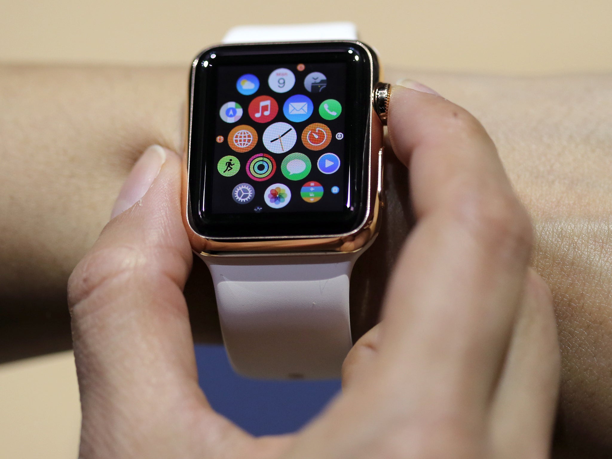
The Independent was one of the first in the world to get our hands on the Apple Watch, weeks before it is set to be released to the public. David Phelan gets to grips with the high-tech timepiece
Your support helps us to tell the story
From reproductive rights to climate change to Big Tech, The Independent is on the ground when the story is developing. Whether it's investigating the financials of Elon Musk's pro-Trump PAC or producing our latest documentary, 'The A Word', which shines a light on the American women fighting for reproductive rights, we know how important it is to parse out the facts from the messaging.
At such a critical moment in US history, we need reporters on the ground. Your donation allows us to keep sending journalists to speak to both sides of the story.
The Independent is trusted by Americans across the entire political spectrum. And unlike many other quality news outlets, we choose not to lock Americans out of our reporting and analysis with paywalls. We believe quality journalism should be available to everyone, paid for by those who can afford it.
Your support makes all the difference.The Apple Watch – is it any good, and should you buy one? Well, it’s a distinctive piece of tech that at first can be hard to get your head around, or even to quite know what it does.
In short, it’s a watch that sends notifications and other information from your iPhone to your wrist and lets you send stuff back the other way, whether that’s a text message, a phone call or a simple way to call an Uber.
I’ve been using the very first Watch released into the world outside Apple for ten days now and the experience has been intimate and enjoyable. Here’s The Independent’s in-depth review.
While I’ve been using it, I’ve regularly been asked why I’d need this gadget when I already have an iPhone which does all the things the Watch does, including telling the time. It’s a good question.
First, I’d say it’s an extension of how you use your smartphone. It may not seem much of a faff to pull your phone out of your pocket, wake the screen and touch the Mail icon to check which messages have arrived. But once you get used to notifications appearing on your watch so with one flick of the wrist you can read the email, then the time and effort you save quickly becomes desirable.
Not to mention being able to leave your phone safe in your pocket or bag when you’re walking through a less appealing neighbourhood while still staying up to date with messages. Or leaving the iPhone charging on your desk upstairs while you loll on the sofa downstairs. The Apple Watch is big on convenience.
iPhone required
The second query came when people realised this gadget doesn’t work on its own. It’s a companion device which needs an iPhone nearby, usually within 10 metres for its features, though it will continue to tell the time with great accuracy without the phone.
Standalone smartwatches are limited by technical restrictions. You’d need a watch that was significantly bigger and heavier. And pricier. Even then it wouldn’t be able to do as much on its own as the Watch does in conjunction with the bigger screen of the iPhone.
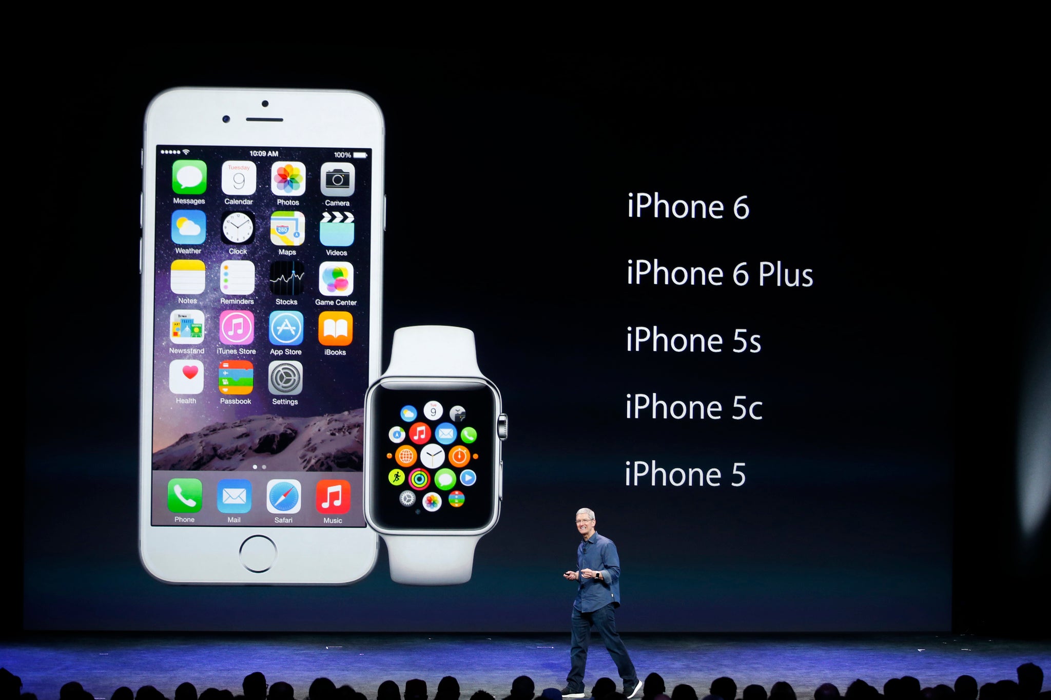
The Apple Watch seems a good balance – plenty to do using the Watch and when you really need to craft a lengthier email reply, say, then fire up the iPhone.
Quick glances
So how does Apple Watch work best? Well, you only have to glance at your watch to get a lot of information. This is one of the key things that makes the Apple Watch really work: the time you spend looking at it. While a laptop screen might occupy us for hours at a time, and a smartphone command our attention for idle minutes and more, I found the Watch was ideal for shorter interactions, often measured in just a second or two.
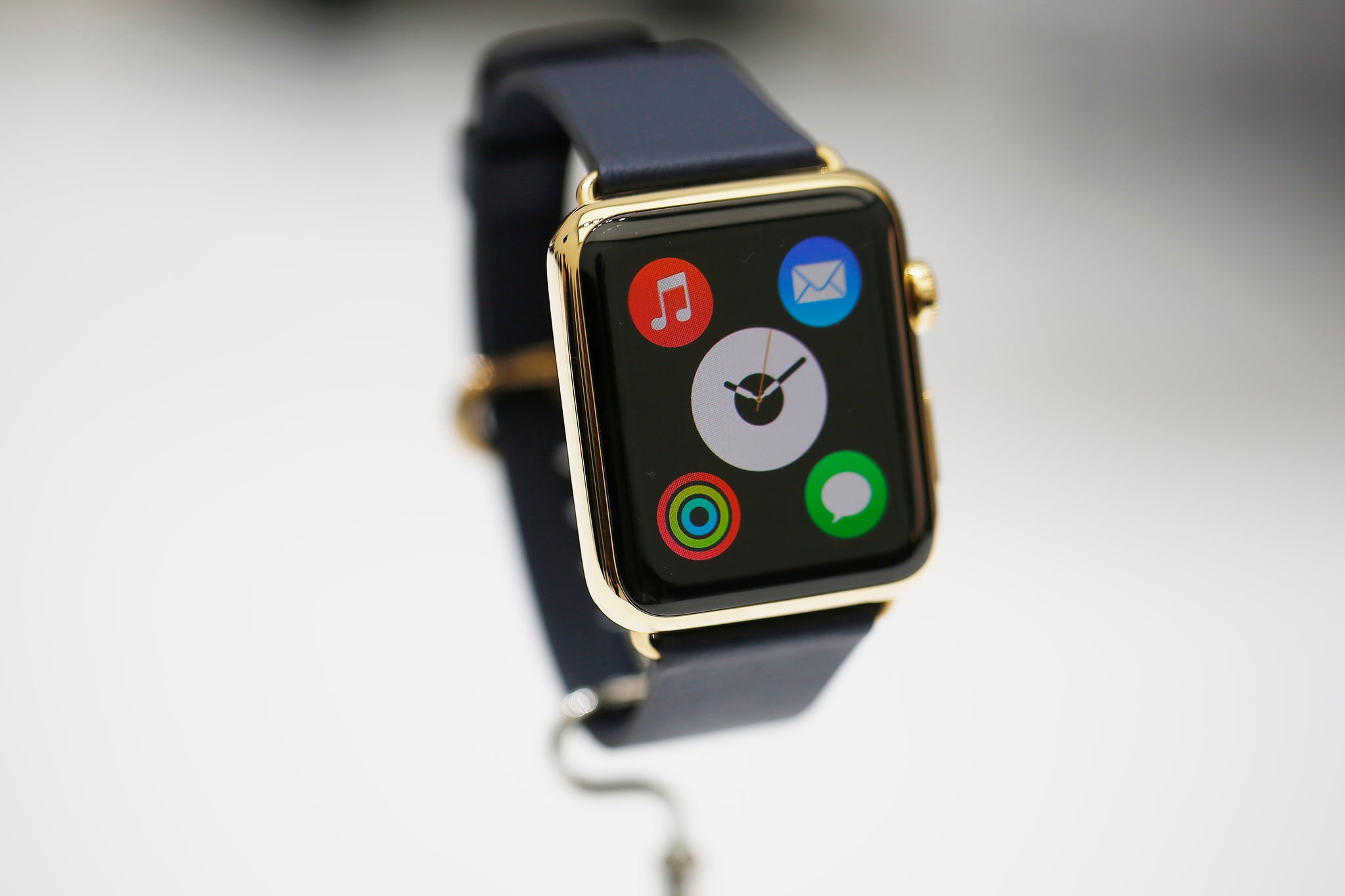
Glances is the name Apple gives to a series of screens on the Watch to show the information you want most often, visible when you swipe up from the bottom of the display. You can configure these displays to show, say, maps, battery level, next calendar appointment, and favoured apps.
Telling the time
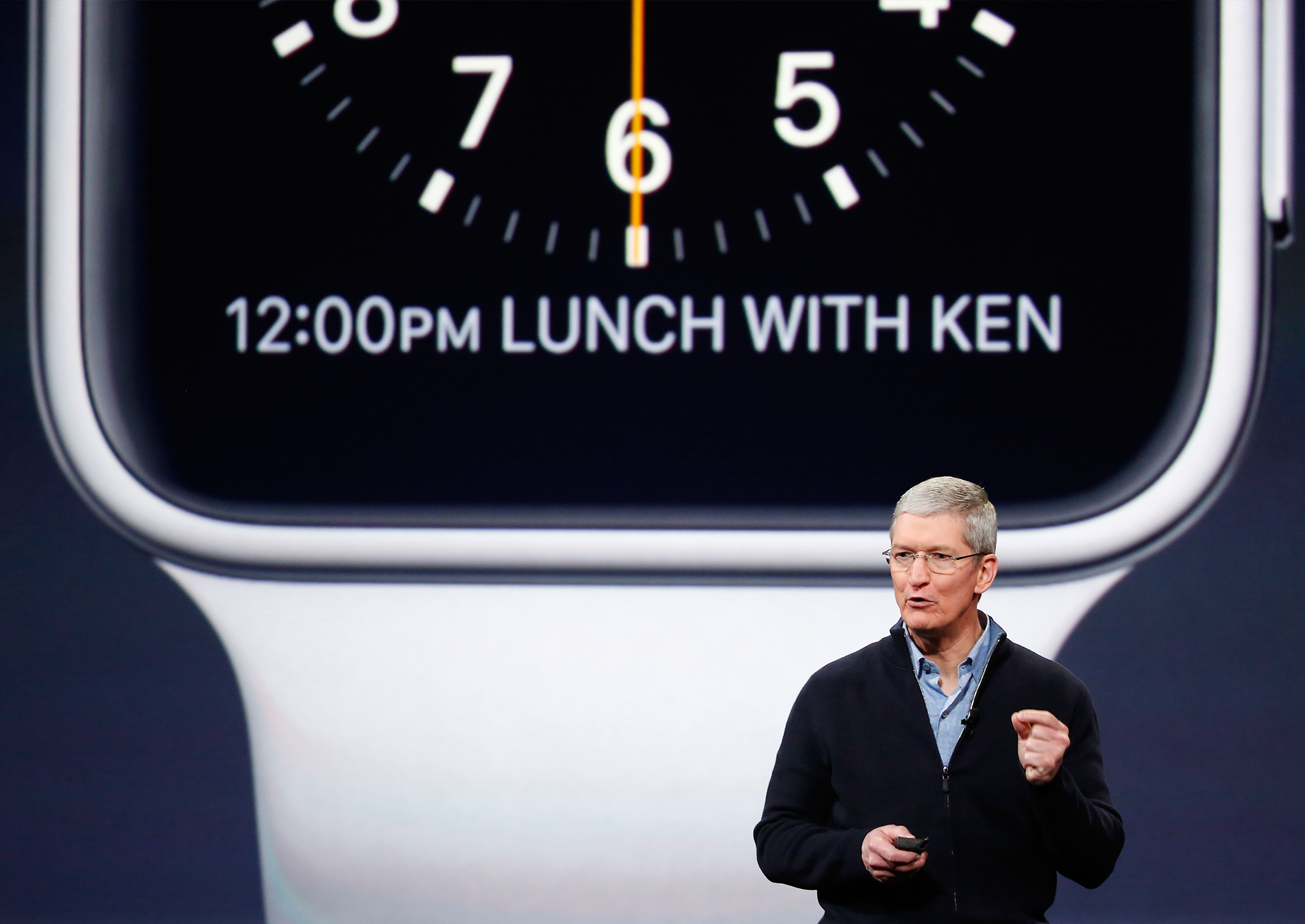
Key to a quick intake of information is checking the time. The Apple Watch has ten different watch faces. These range from detailed analogue faces with extra complications (on a traditional watch these are the extra elements that inform the watch face, like multiple time zones and moon phases) to bright digital clocks.
These faces are hugely customisable, from the colour of the second hand to how and where you show the date. One is highly functional and info-heavy while another is, well, another is Mickey Mouse, swinging his hips as the seconds pass.
My current favourite is a digital clock with sumptuous photo-realistic animations in the background. Choose from butterflies, blossoming flowers and floating jellyfish, and note how the text colour subtly matches each butterfly’s markings and how the wings beat differently from one specimen to the next.
Since you can change the watch face quickly and easily, it’s tempting to fix one face for work and another for evenings, say.
Waking the screen
But with some smartwatches, telling the time can be an annoyance. A backlit screen uses energy so with most smart watches, the screen is off and to read the time you press a button or perform a gesture. Button-pressing quickly becomes aggravating, compared to an analogue watch that’s always readable, so a natural gesture is crucial. Such as raising your wrist to your face, but in some previous smart watches you had to do this just right, with a fast enough swing or the display stayed stubbornly off. Users sometimes found they were performing a remarkably extravagant arm wave.
With the Apple Watch, as you gently raise your wrist, the screen lights up perfectly, very nearly 100 per cent of the time so you need never miss a notification. Or a jellyfish.
Incidentally, if you’re one of those people who likes to set their watch a few minutes fast, you can do this with a customisable setting. Thankfully, an alarm will work to the actual time, not the time you’ve chosen to display.
Set-up
Getting your Apple Watch working is painless and satisfying. It can be done on your own or with an Apple staffer in the Apple Store in a free set-up session. To start, launch the Watch app (it’s part of the latest iPhone software). Choose the option to pair the Watch to the iPhone and hold the Watch in front of the phone. The camera will pick up the Watch’s identity, including what model it is, and relay this to the app.
A short transfer process follows as the data flies from the phone to the Watch. If you have a large number of contacts on your iPhone, this can take a couple of minutes. Then, specify which wrist you’re going to wear the Watch on and you’re good to go. You can also configure the order of your Glances apps, choose today’s watch face and so on.
Interface
When Apple launched the iPhone in 2007 it introduced one of the most eye-catching operating techniques ever: pinch-to-zoom. This simple, two-finger feature for enlarging what’s on screen remains effective and delightful. But it’s not well suited to a small screen like the Apple Watch has though a single-finger double-tap still works to zoom in.
Instead, Apple has created the Digital Crown, designed to look like a regular watch’s winder. Turn this and you can zoom in and out of a map or photograph. It also works to scroll through lists.
I found that this was effective but took time to become familiar – sometimes which way to turn to go up or down a list wasn’t always intuitive. But the crown also works to take you to the home screen with one tap. Not to mention a double-tap to go to the last app and a long press to launch Siri.
There’s only one other button on the Watch, just below the crown. A single press on this reveals a circle of contacts, called Friends, which is where you go to send a message to one of the dozen favourites it shows. You can also use Friends to initiate a call to a contact. And a long press on the side button is how you turn the Watch off.
But, for me, the most impressive and powerful of the new interfaces is Force Touch. This is possible because the Apple Watch screen is pressure-sensitive. It’s a conventional capacitive screen, like those on most smartphones, but it additionally has tiny electrodes built into it that can register the difference between a touch and a press. Do this and new possibilities appear – it’s a bit like the right button on a computer mouse. If this technology is built into a future iPhone, it could transform how that is used.
There are lots of subtle ways of interacting with the Watch. It’s noticeably different from the iPhone, so it can take a little getting used to, intuitive though it is. Sometimes it’s confusing whether you need to swipe left or down to dismiss a notification, for instance. It just depends whether you’re looking at a summary of an email or the whole thing, and more consistency here might have helped. Still, the subtle differences eventually become second nature.
Neat touches include the way you can quell an incoming call by placing your hand over the Watch screen. Or how turning the Watch to inflight mode does the same to the companion iPhone – or vice versa.
Note, though, that inflight mode doesn’t turn off alarms or fitness reminders, as the glares and tut-tuts of the audience near me at the theatre taught me rather forcibly the other night…
Battery
It’s important to mention battery life, a crucial thing in a wearable gadget’s effectiveness. Fears that the Watch would struggle to last a day, or that you’d look down to think, “Ah, it must be after 3pm because the screen’s died,” have proved false.
The Watch lasted flawlessly all day every day I’ve been using it and only on one day did it sink as low as 11 per cent. Battery strength is in one of the Glances screens and can be set to show on some of the watch faces. If you’re worried, it can be set to Power Reserve which stops all functions except timekeeping, but I never needed to do this.
I noticed that my iPhone 6 battery burned faster when I was using the Watch (and therefore the phone) for a lot of stuff such as Maps and Workout. Some of this may be down to getting used to the Watch, and the phone never ran out of energy entirely. As I’ve used the Watch more, the iPhone usage has settled down, though it’s not surprising there’s been an impact using the two together.
Health
One of the big features of smartwatches is fitness monitoring. Here there is a built-in motion sensor plus a heart rate sensor on the back of the Watch which calculates how fast your ticker’s going. The Fitness app on the Watch has three sections: Move Exercise and Stand, three colourful concentric rings which build up each day and reset at midnight. When you walk, you’re building up the outer Move ring, but Exercise only gets going when you move faster. Stand recognises that we sit too much, so every hour at 50 minutes past if you’ve been sitting, the Watch reminds you to get up and move around for one minute. Sounds like it could be annoying, but in fact it’s okay, and mildly addictive (except when you’re at the theatre).
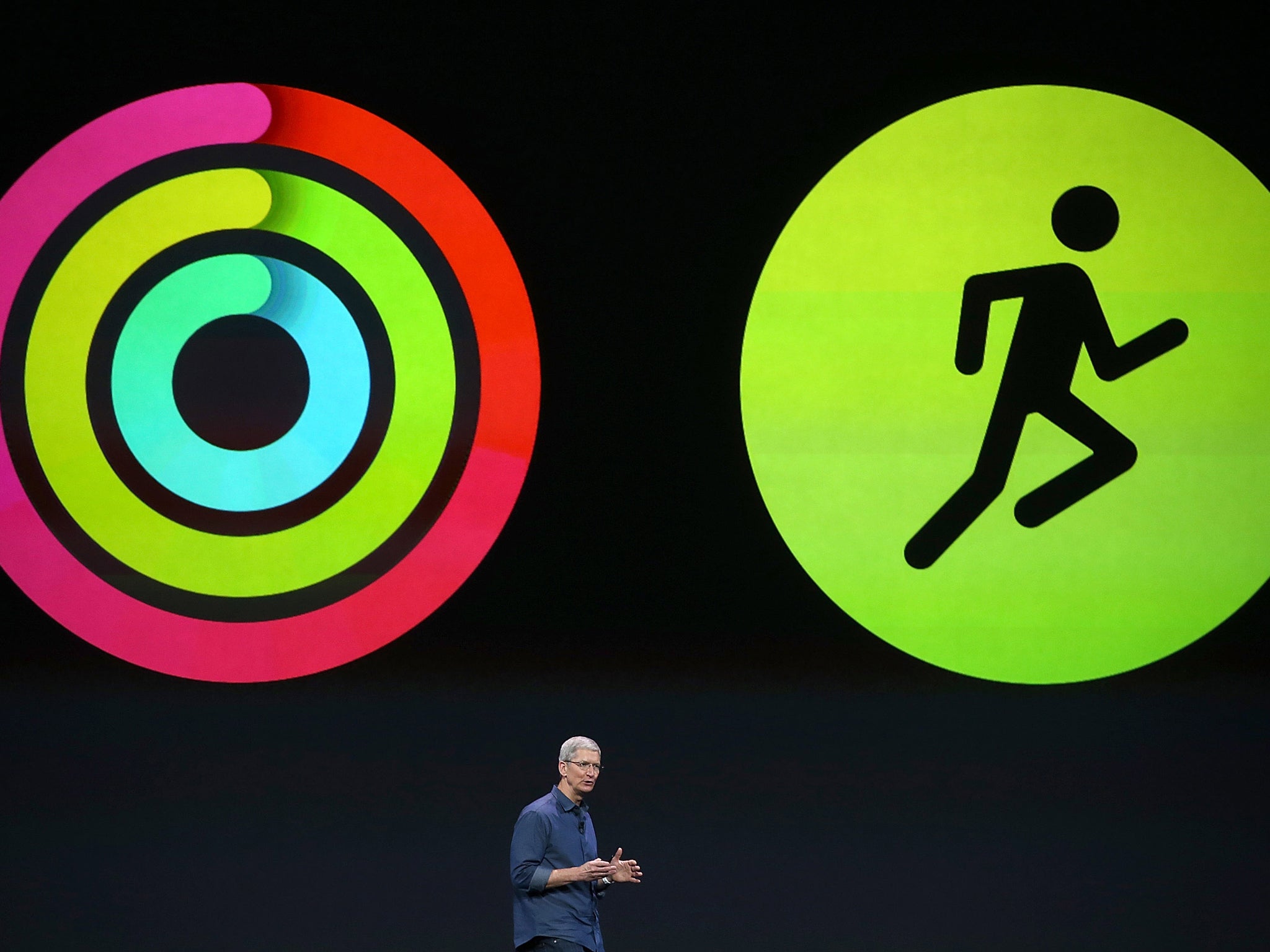
The Watch goes further than some dedicated fitness monitors because if you launch the Workout app, you can specify how the Watch reads your movements, with options for outdoor walking, running or cycling, indoor equivalents and the rowing machine. For the outdoor choices, the iPhone’s GPS kicks in so you have an especially accurate record of distance and calories burnt. The Watch also uses these stats to refine its understanding of your stride length, for instance. For the indoor exercise, calculations are made using the motion sensor.
Security
Every time you take the Watch off your wrist, it locks. You need to put in your passcode before it will do anything. You can disable the passcode lock, but it’s not recommended. Not least because you can use the Watch for Apple Pay, the contactless payment system on the iPhone 6, though this hasn’t yet reached beyond the USA.
Using the 0-9 keypad that appears on the screen takes care and is a good reminder of how hopeless a full QWERTY keyboard would be on this display, which Apple wisely eschewed.
The Apple Watch also allows its wearer to transport themselves into a desert with the model Christy Turlington
Hardware design
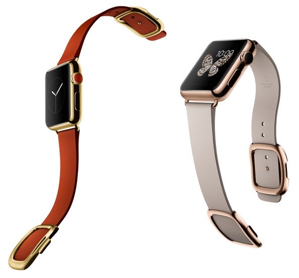
There are two sizes of Apple Watch case (38mm and 42mm measured vertically), and three versions: Apple Watch Sport, Apple Watch and Apple Watch Edition. Edition means you’re plumping for a gold case and expensive strap (costing £8,000 to £13,500). Apple Watch Sport is the entry-level model priced at £299 and £339 for the two sizes. It has an aluminium case and is very lightweight.
Most people will probably opt for Apple Watch, priced at £479 and up. Its stainless steel case is solid and strong and the front is covered not by glass but by sapphire crystal making it very durable and scratch-resistant. There’s a range of straps including a beautiful Milanese loop and two finishes – the Space Black darker version is subtly different and gorgeous.
Inside, though, all the Watch models have the same processor, memory, storage and so on.
Apps
In my time using the Apple Watch, the dedicated Watch App Store was only lightly stocked, though I’m assured that’s because it was prior to it being open for business properly on 24 April. Apps are downloaded to the iPhone which is where a lot of the hard work is done. So you can’t, for instance, use the Hailo app on your Watch without having it on the iPhone as well. Though, of course, you can opt to only use it on your Watch. This is simplicity itself: tap the app to launch it, make sure it has the right address for pick-up and tap the button marked Hailo Now. A Force Press is used to cancel a mis-ordered cab.
This is most of the point with Watch apps – that they work well on a device with a tiny screen. If the onscreen buttons were too numerous or tiny, you’d never use it. And it reinforces that the Watch works best as an extension of your iPhone. So the British Airways app on the Watch reminds you of any upcoming flights in the next seven days, but to check your Avios balance, you need the full app on the iPhone. Still, when you’ve checked in for a flight, you can download your boarding pass into Passbook, just as you can on the iPhone.
I used the Passbook app to go through security at New York’s JFK airport which worked well, though it caused the official to throw back her head and laugh, “Gotta love technology”. The app got me on to the plane as well, though a couple of the scanners were too low for the Watch to fit in unless I took it off my wrist. Airlines have already said that handheld scanners are incoming, which will get round this.
Still, the Passbook app is intelligent, even overriding a battery-saving feature which dims the screen when the Watch is turned face down, so that it won’t turn off when your boarding pass is being scanned from underneath.
There are more apps available, including offerings from Uber, The Economist, EasyJet, TripAdvisor, Cycle Hire. Many can appear in the Glances carousel of apps, and all are devised to suit quick usage. The excellent public transport navigation app, Citymapper does this by letting the app guide you to work, home or previously saved routes rather than trying to mimic the full app.
Messaging
When a text message comes in, you’re given two options on the Watch: Reply or Dismiss. Choose to reply and there are three pre-populated messages offered, or you can reply with emoji (note, choose carefully, as it sends the one you pick super-quickly).
The pre-written messages use Apple’s clever text analysis algorithms. So if you receive a text saying “Do you want to meet for dinner tonight or tomorrow?” then the message boxes will say “Dinner tonight”, “Tomorrow” and “Don’t know”. If those don’t suit you can create a reply of your own.
As there’s no onscreen keyboard on the Watch, you can dictate messages using Siri. This works very well, though Siri is far from perfect when it comes to transliterating names. When you see what Siri has understood your message to be, you can decide to send it as text or as a recording of your voice.
Phone calls
Receiving phone calls on the Watch is simple. The screen shows the number or name of who’s calling and you tap the green circle. Making a call means launching the Phone app and choosing between Favourites, recent calls, Contacts and Voicemail. Contacts launches your A-Z list of contacts. Use the Digital Crown to scroll at speed through lists.
Call quality was good, though on balance I found using the iPhone directly better. Also, maybe it’s just me but holding your wrist up to your ear for extended periods got tiring. Calls on the Watch are fun, and best designed for short calls.
Maps
This is one of the highlights of the Watch. Sure, that small screen means it’s hardly suitable for driving directions (though if you’re using the iPhone in the car, the instructions appear on your Watch as well as the phone screen). But for walking, it’s tremendous.
Long-press the Digital Crown to wake Siri and then ask for walking directions to the Carlton Club, say. Siri finds the address if it can (in my tests it nearly always could) and shows a map of the route. Tap Start and the screen shows directions. Once you’re started, the Watch taps your wrist when you approach a junction. Ingeniously, it taps you differently according to whether you need to turn left or right. When you’re used to the different taps, you don’t even need to look at your wrist, let alone your iPhone, to know where to go.
My only issue was that the first instruction was always to proceed to the street I was on, so it’s worth working out which way you should be facing. After that, it was plain sailing.
Other apps
Twitter, Evernote, Elevate, New York Times and many others all had apps in the Watch’s dedicated store with many more to follow. I’m sure that just as the potential of the Watch becomes clear, there will be another gold rush of apps just as torrential as when the iPad was born.
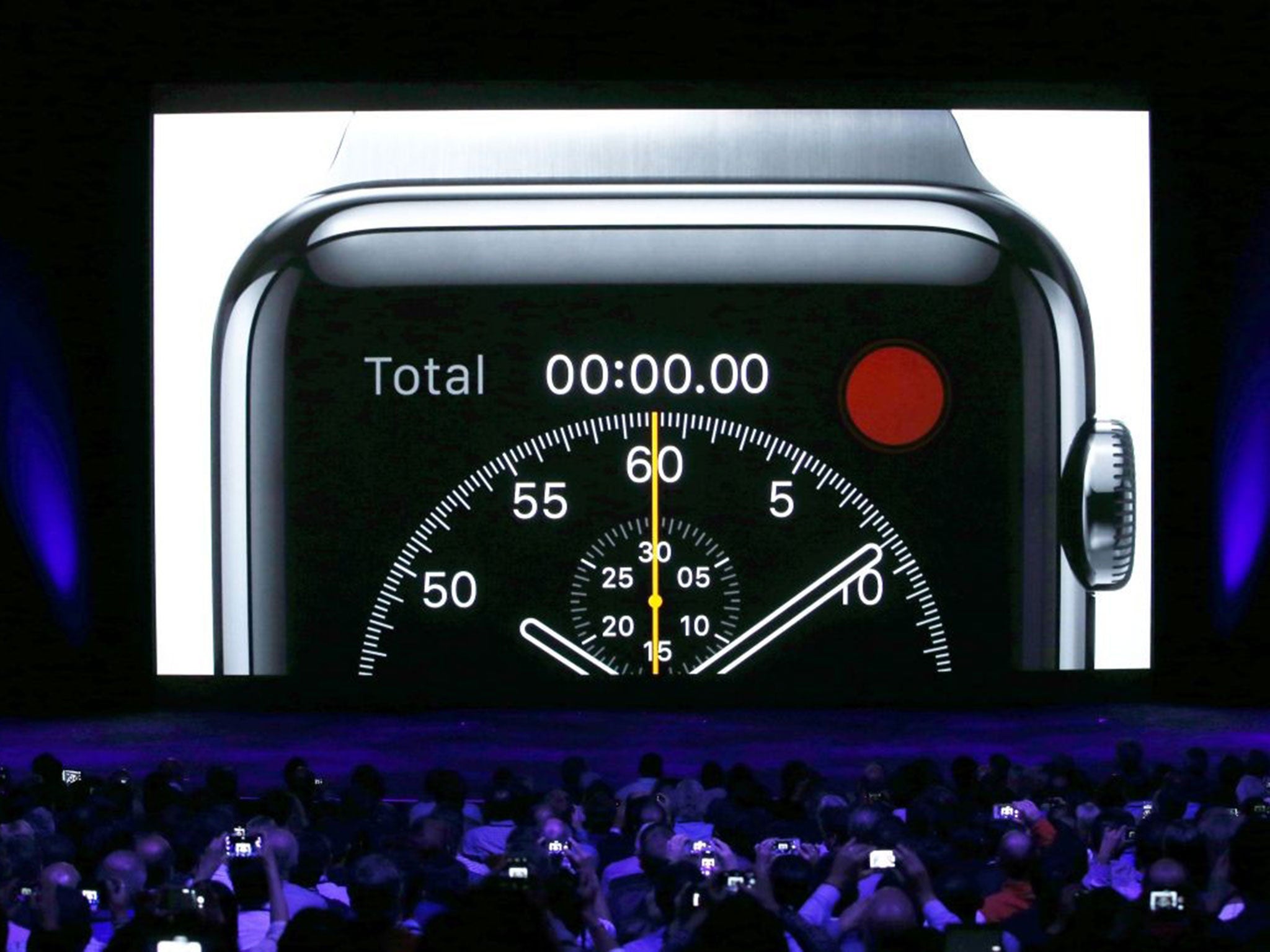
There are other apps from Apple, too, such as a music player which streams music from the iPhone to Bluetooth headphones but also lets you store up to 2GB of tracks on the Watch itself, handy for those jogging sessions when carrying the phone as well would be a chore.
Verdict
Plenty of people who have chosen Apple because they want a great smartphone, elegant tablet or simple-to-use music player may nonetheless feel that their Swiss made timepiece does its job so sublimely that there’s no need to put digital tech on their wrist in its place.
But using the Apple Watch makes its case compellingly. Its versatility is enormous – the range of apps available will doubtless be very wide, very quickly. This means that though nobody will want to use all of them, there will be a particular set of features which appeal to each user.
And, of course, it just works. The interface is new and different but operates sensibly and reliably, much more so than any other smart watches on the market. The display is pin-sharp so text is easy to read and images look great whether you’re spooling through photos or choosing a snazzy watch face.
Apple hasn’t usually been a company offering multiple versions of its products to appeal to different users, until now. It’s keen to make sure that what it styles as its most personal gadget will suit individual tastes.
If you’re tempted by a smartwatch, Apple’s is easily the best, with the most enjoyable interface, the most intriguing range of apps, immaculate build quality and a highly attractive design.
Join our commenting forum
Join thought-provoking conversations, follow other Independent readers and see their replies
Comments