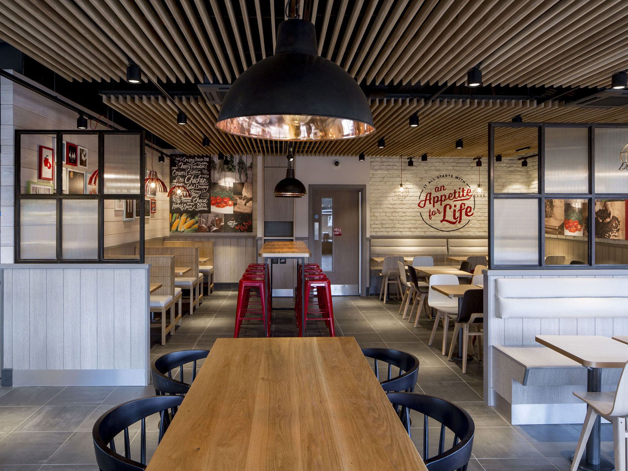
KFC has rebranded its Bracknell outlet - but will cool stools and low lighting make you want eat at the branch?
The restaurant features exposed ceilings, brick-effect walls, and illustrations of ingredients. In essence, it seems to be de-KFCing KFC, says Samuel Muston

Your support helps us to tell the story
From reproductive rights to climate change to Big Tech, The Independent is on the ground when the story is developing. Whether it's investigating the financials of Elon Musk's pro-Trump PAC or producing our latest documentary, 'The A Word', which shines a light on the American women fighting for reproductive rights, we know how important it is to parse out the facts from the messaging.
At such a critical moment in US history, we need reporters on the ground. Your donation allows us to keep sending journalists to speak to both sides of the story.
The Independent is trusted by Americans across the entire political spectrum. And unlike many other quality news outlets, we choose not to lock Americans out of our reporting and analysis with paywalls. We believe quality journalism should be available to everyone, paid for by those who can afford it.
Your support makes all the difference.There is much about Bracknell, the town of 52,696 souls 11 miles south-east of Reading, that commends itself to the passers-by. There is the Quelm stone, a sort of mini Stonehenge set-up, innumerable 19th-century churches, the Old Manor pub, a brick building of some age that is supposed to have victualled Dick Turpin and is now a Wetherspoons, and many other worthy distractions. Up until now, though, few people would have said Bracknell was the furnace from which would emerge the future of, well, anything, really.
But then, a couple of weeks ago, KFC chose to rebrand its outlet in Bracknell. Never in the 49 years since Colonel Harland D Sanders opened the first "Finger Lickin'" joint in the UK has a KFC looked like this. It has been denuded of its wipe-clean functionality, and instead seems to be reaching for a spot somewhere between Pret a Manger and Strada. It is a fast-food sea change.
There are exposed ceilings, there are brick-effect walls, illustrations of ingredients (presumably mostly fowl in nature). Furniture that used to be cemented to the floor has been replaced by those metal stools in bright red that you find in aspirational coffee shops. Not to mention "butcher's block tables" and low-hanging copper lighting. It is the work of Finch Interiors and the chicken purveyor's own in-house team and the company plans to roll this out across all 870 of its branches in the UK – with Exeter next – in the New Year.
In essence, it seems to be de-KFCing KFC; trying to reposition it in the market and move it away from its roots as an in-and-out joint. It is, one suspects, an implicit acknowledgement of two trends. Firstly, that as a nation we are more food-obsessed than we have ever been before, which pretty much goes without saying. And secondly a response to the growth of what one might call upscale fast-food shops: the Prets, Itsus and Eats of this world.
The thing is, though, that what it actually is, is window-dressing (almost literally). Instead of changing the nature of its product and the automated manner in which it is produced, the chain has decided simply to tinker at the margins and play with its image. In effect, KFC hopes that by borrowing the design mores of upscale fast-food joints, it can convince punters that its food will live up to that. It is not a con, by any means, but it does have a scintilla of smoke and mirrors about it.
The question is, will it work? I can't help suspecting not. Why? Because one goes to the more expensive chains not because they are done out in agreeable colours and have nice stools, but simply because the product is better. You are making a conscious choice, based on quality and nutritional value, as to what you are about to gobble up at your desk 10 minutes hence. It is, in some sense, a life choice. And once you make that choice, you don't often row back on it.
While the chicken is still finger lickin' at KFC, no new paint jobs will detract from the fact that it is cheap food prepared with little love.
Join our commenting forum
Join thought-provoking conversations, follow other Independent readers and see their replies
Comments