Burger King’s first rebrand in 20 years takes it back to the 1990s
'Nostalgia does sell', says one fan

Your support helps us to tell the story
From reproductive rights to climate change to Big Tech, The Independent is on the ground when the story is developing. Whether it's investigating the financials of Elon Musk's pro-Trump PAC or producing our latest documentary, 'The A Word', which shines a light on the American women fighting for reproductive rights, we know how important it is to parse out the facts from the messaging.
At such a critical moment in US history, we need reporters on the ground. Your donation allows us to keep sending journalists to speak to both sides of the story.
The Independent is trusted by Americans across the entire political spectrum. And unlike many other quality news outlets, we choose not to lock Americans out of our reporting and analysis with paywalls. We believe quality journalism should be available to everyone, paid for by those who can afford it.
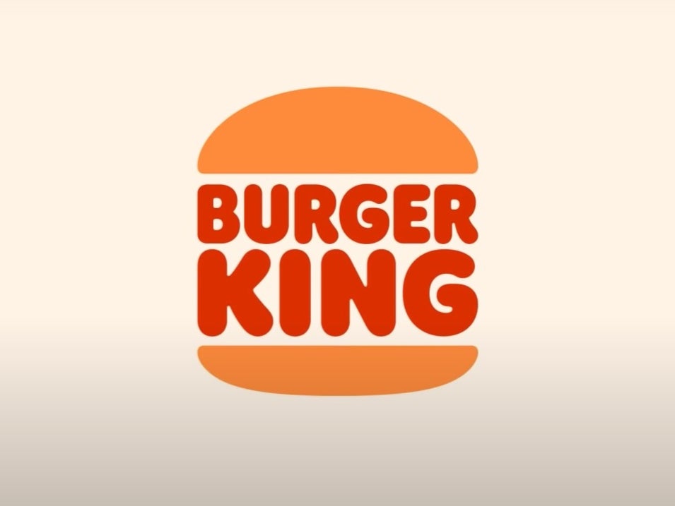
Your support makes all the difference.Burger King has unveiled its first rebrand in 20 years, revealing a new logo which looks almost identical to the one that it used in the 1990s.
The brand tweeted an image of the new design on January 7, writing: "Out with the old, in with a new classic #NewProfilePic".
The logo swaps the American fast food chain's yellow bun for a warmer orange, and loses the blue ring previously seen around the block-colour burger.
The brand also revealed new packaging for all its food, which features either the new logo or the burger’s title in large block-colour letters.
Fans were quick to pick up on what the brand itself had alluded to - that the 'new' logo looks just the same as the one the brand used in the 1990s, before introducing its most recent design in 1999.
One Twitter user tweeted a picture of the new logo and wrote: "I'll always have a soft spot for burger king since my mom worked there as a kid.. sure the burgers don't taste the same but seeing they're bringing back the 90s logo.. nostalgia does sell."
While another replied to Burger King's tweet with a gif of Drake applauding and commented: "Everybody around in the 90s right now".
Burger King's account responded: "ayeeee".
One fan wrote: "It doesn't even feel like it's following the minimalism push, it's just reverting to a slightly nicer version of an older, arguably better logo design. this is a good burger king logo i think."
Burger King said the colours used in its new designs are a reference to their flame-grilling process. The brand also revealed that its new brand font is called "Flame".
Staff at Burger King restaurants will wear new uniforms under the rebrand.
Last week, a fan tweeted a picture of a Burger King sauna in Finland with the caption, "Cant stop thinking about the burger king sauna in Finland".
Sadly, though, it doesn't seem like we'll be able to look forward to this delight in the UK any time soon. Burger King's UK Twitter account quote-tweeted the image, writing "Imagine this in the UK".
Join our commenting forum
Join thought-provoking conversations, follow other Independent readers and see their replies
Comments