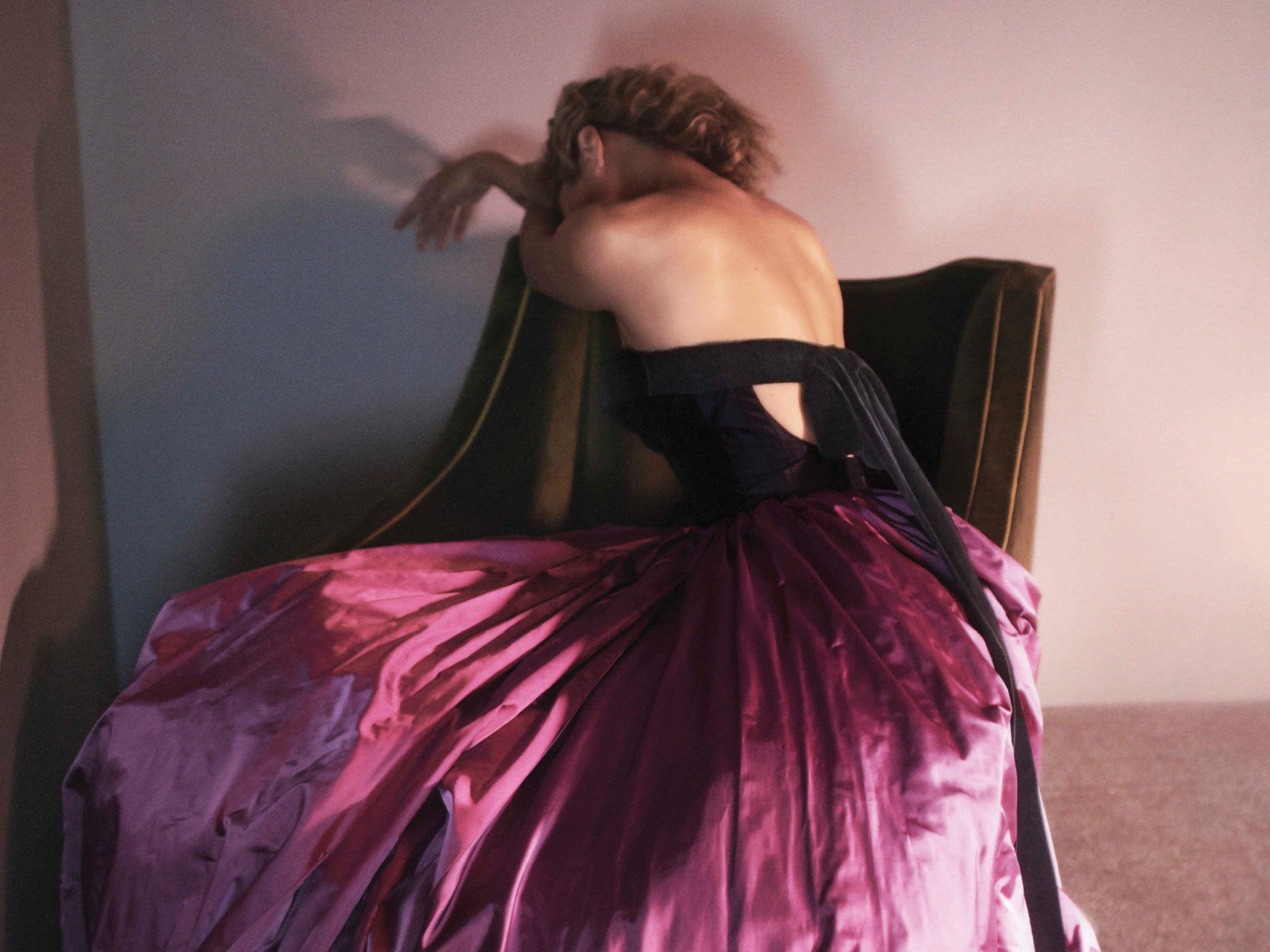
Oscar de la Renta's advertising image gets the point perfectly – just sell the dress
There’s no handbag clutched at eye level and no celebrity trying to convince that she truly loves the garments – just a dress on a woman in a beautiful image

Your support helps us to tell the story
From reproductive rights to climate change to Big Tech, The Independent is on the ground when the story is developing. Whether it's investigating the financials of Elon Musk's pro-Trump PAC or producing our latest documentary, 'The A Word', which shines a light on the American women fighting for reproductive rights, we know how important it is to parse out the facts from the messaging.
At such a critical moment in US history, we need reporters on the ground. Your donation allows us to keep sending journalists to speak to both sides of the story.
The Independent is trusted by Americans across the entire political spectrum. And unlike many other quality news outlets, we choose not to lock Americans out of our reporting and analysis with paywalls. We believe quality journalism should be available to everyone, paid for by those who can afford it.
Your support makes all the difference.I think that Oscar de la Renta’s advertising for autumn/winter 2015 is the best I’ve seen in about 15 years. There, I’ve said it. I’m not quite sure why. The image I’m talking about is the above – of Carolyn Murphy shot from the back in a puce puffball ballgown. You may look at it and wonder what the big deal is. It doesn’t even look like an advertising image. What is it selling?
That’s exactly the point. You don’t really know what they’re trying to hawk. You don’t feel the hard sell, the wanton desperation of other labels. There’s no handbag clutched at eye level, no “look at me” celebrity trying to convince that she truly loves the garments – not just because she’s being paid.
Here, there’s just a dress, on a woman, in a beautiful image, shot by David Sims, that ends up looking more like a low-key editorial than a high-octane ad campaign.
Contrast it with the spring campaign, the models’ mean, pinched faces captured on fish-eye lenses veering around a Miami garden in tugged and tucked-in evening dresses, ponytails whipping behind them, and there’s a world of difference. For starters, that campaign looks old fashioned. Not fuddy-duddy, exactly, but certainly out of date.
This season’s campaign is also the first with designer Peter Copping at the house, and captures his first collection. I wonder if that has influenced the strength of my reaction to it? I don’t know if Copping’s doing a good job yet: I’ve no idea if women are buying his clothes, nor if they will. I’m not an Upper East-side matriarch with the kind of dress sense and social diary that necessitates evening gowns and beaded cardigans and neatly-tailored little dinner dresses. From my point of view, as a fashion critic, his debut show was one of the most difficult in living memory, and he handled it with dignity and grace. He’s did something new, but not too new. He had respect, but also fresh ideas. Copping and Co have done the same with this advertising campaign. They’re interesting. It’s interesting. I’m excited to see what’s going to happen next.
And, if I was a woman, it would make me want that dress. Which is the point of the whole damn thing.
Join our commenting forum
Join thought-provoking conversations, follow other Independent readers and see their replies
Comments