The Independent's journalism is supported by our readers. When you purchase through links on our site, we may earn commission.
‘Something meaningful’: How to approach interior design in heritage buildings
The indoor furnishing of a building should reflect its history and enhance the visual storytelling, writes Anya Cooklin-Lofting

Your support helps us to tell the story
From reproductive rights to climate change to Big Tech, The Independent is on the ground when the story is developing. Whether it's investigating the financials of Elon Musk's pro-Trump PAC or producing our latest documentary, 'The A Word', which shines a light on the American women fighting for reproductive rights, we know how important it is to parse out the facts from the messaging.
At such a critical moment in US history, we need reporters on the ground. Your donation allows us to keep sending journalists to speak to both sides of the story.
The Independent is trusted by Americans across the entire political spectrum. And unlike many other quality news outlets, we choose not to lock Americans out of our reporting and analysis with paywalls. We believe quality journalism should be available to everyone, paid for by those who can afford it.
Your support makes all the difference.If you ask any interior designer working today whether the wallpapered, upholstered, arranged, plumped and snagged innards of any heritage building should reflect its history, the answer will unfailingly be yes. There is a reverence amongst interior designers for the art of visual storytelling which often begins with the very bricks and mortar of the space as an architectural shell. According to many, there should be a connection between the decorative pediments, sloping gables, sash windows and twisting chimney stacks of heritage properties with the carpets, curtains, lampshades and furniture your interior designer chooses.
As Camilla Clarke, creative director of design firm Albion Nord, says, “It’s all about the story and the surroundings when designing rooms in heritage and listed properties.” Clarke and her team make a point of sharing research about the properties, the history of their location and details about the original architecture with their clients to supplement the initial proposal for fabrics, furniture and accessories. “It helps to contextualise the design process in something meaningful,” she adds.
Putting a price on a property’s character requires a command of the ebbs and flows of the public’s whims and fancies. Discerning buyers with a penchant for period style will pay worthy premiums for properties laden with personality and charm. One such example is Chapter House, a residential development in Covent Garden by Londonewcastle, with apartments currently on the market from £995,000. The development, which houses 40 new flats, is set behind the original 1839 façade of a building established by the architectural practice, Gibson & Russell, who dissolved before the turn of the century.
Apt, today’s architect on the project, was appointed to reinstate the building which had been left derelict for many years. It became apparent early on that the façade of the building needed to take priority to contextualise each aesthetic decision.
“The existing façade directly defined the spaces we designed behind it,” says Stephane Piazza, the project leader at Apt. “The inconsistent sizes and shapes of the existing windows determined the function of the rooms, and if we would have a single or double-height space behind them, for example. You couldn’t have designed this from scratch,” he muses. And it’s true – the idiosyncrasies of the façade influenced the architecturally sympathetic spaces Apt were able to contrive.

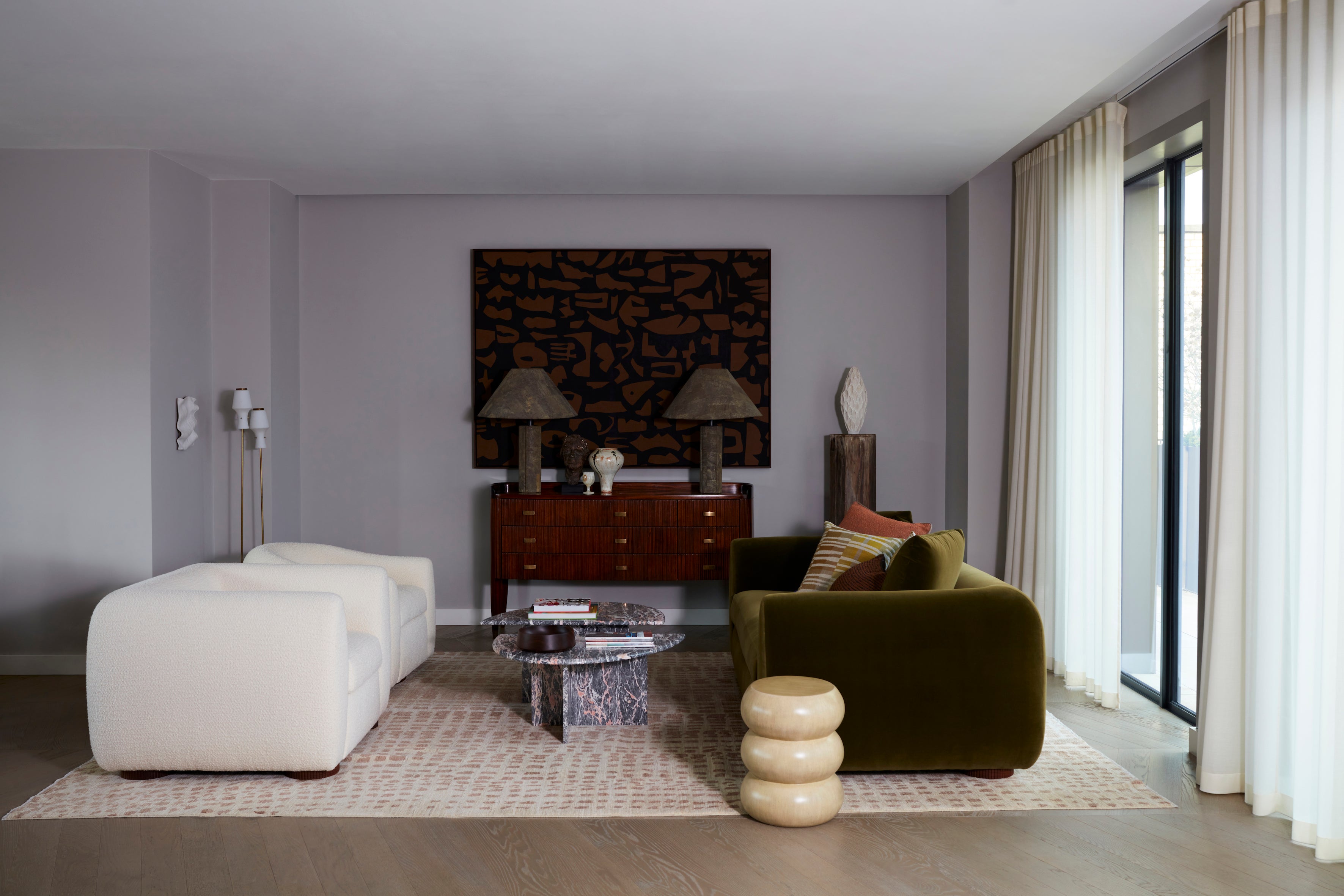
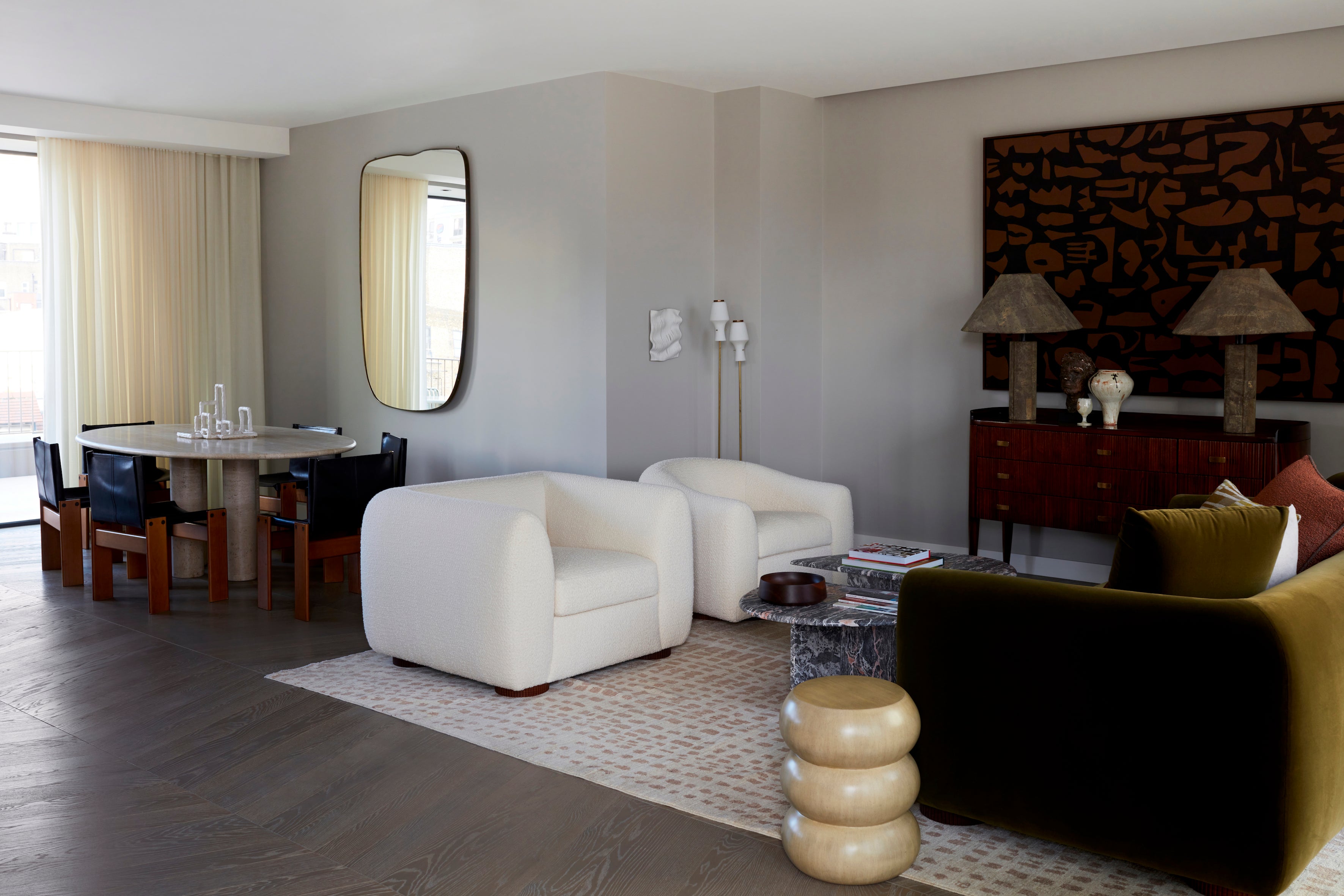
Chapter House’s pièce de résistance is arguably the brand new penthouse suites that sit atop the original façade. They extend the building by two metal-clad storeys, set back from street-level behind the gable pitch roofs to avoid clashing with the carefully restored Victorian brickwork. In a recent exciting project behind the restored moulding and reproduction air brick of the façade, Ben Spriggs, the editor of ELLE Decoration UK, was tasked with a full redesign of one of the two penthouses.
“Chapter House provided a great structure to work with – the perfect canvas,” says Spriggs. “I was always conscious of the historical context and the story attached to the building itself. The modern pieces we used, such as the marble dining table by Mario Bellini from Béton Brut, the sumptuous velvet upholstery by British brand Sedilia, and the beautifully crafted wooden pieces from Pinch and Another Country all sit comfortably in a historic setting.” The ELLE Decoration penthouse is currently for sale at £5,495,000.
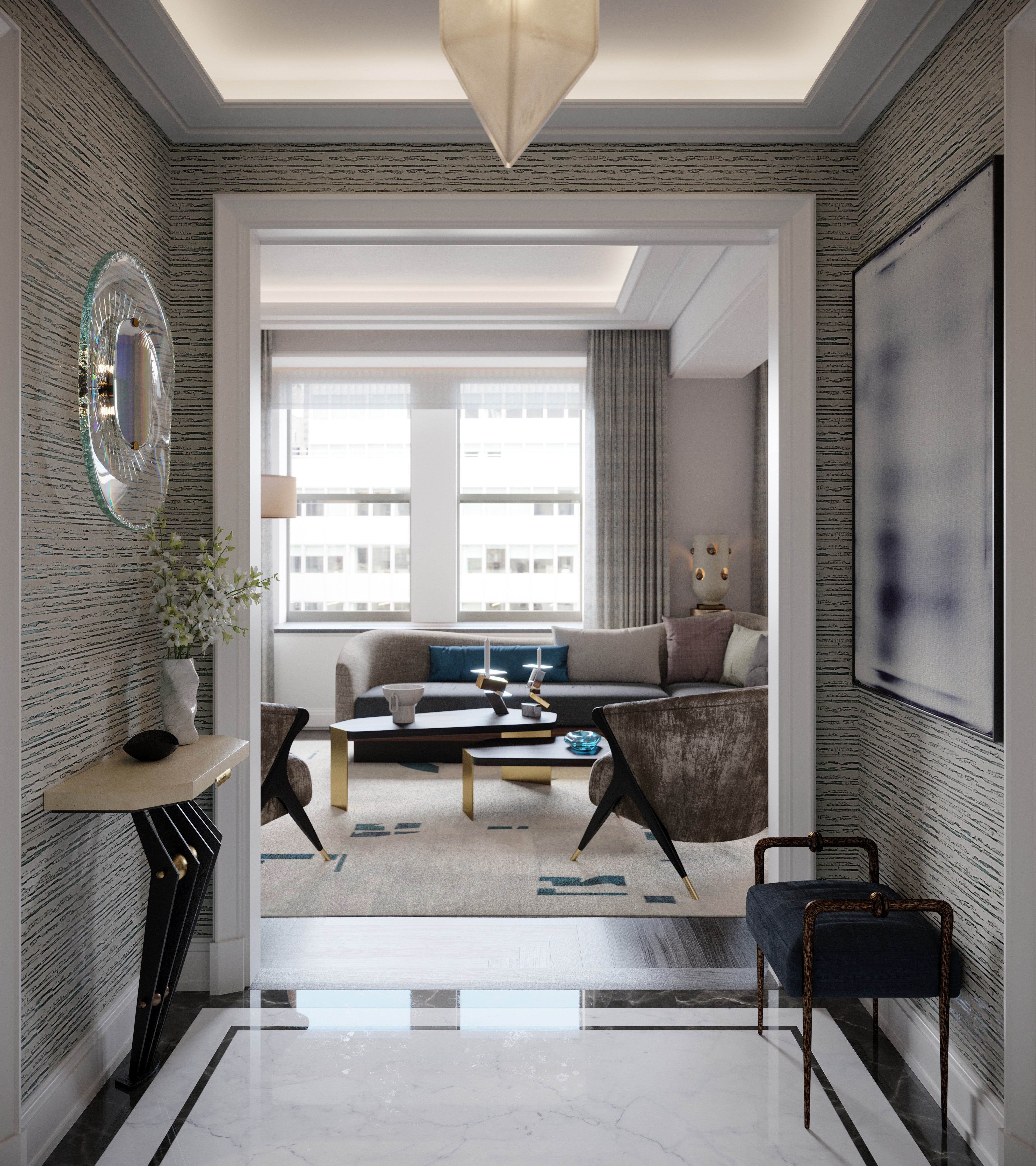
Across the pond, interior designer Jean-Louis Deniot has a similar task at hand. The 375 residential suites at the Hilton Towers of the Waldorf Astoria New York, set to complete in 2022, are in the midst of a thorough restoration. Deniot has been instructed by developer Dajia Insurance Group and architects Skidmore, Owings & Merrill to return the luxurious residences to their former Art Deco glory. Skidmore, Owings & Merrill are responsible for orchestrating the project’s complex restoration, along with Building Conservation Associates, Inc and Higgins Quasebarth & Partners LLC. Together, the team has invested years of research and planning to understand the hotel’s almost 100-year heritage, while bringing it up to date with contemporary furnishings and fixtures.
Queue Deniot, who says that winning the job of the Waldorf Astoria New York is like “winning the city’s biggest trophy”. With this in mind, he tells me, “there is a lot of responsibility that comes with this trophy. It isn’t about getting the prize, it’s about having the utmost respect for this trophy.

“When you have been asked to add your own touch to something as iconic as the Waldorf, you have to be careful to ensure that every single element serves and respects the history and heritage of the building. Your work has to complement its existing foundations. Every single design decision must be justified; everything must be in tune.”
To meet the brief, Deniot used the history of the building as inspiration, studying its events, stories, symbols, and the influential guests it has entertained. “I wanted New Yorkers to once again feel proud of this building,” he says, “so I removed the gimmicks and designed spaces that tease, play and pay homage to Art Deco without mimicking the style. The outcome is something that fuses classical with contemporary.” He believes that with any restoration or renovation project, “it is crucial to get inspired by the history of each place to allow them to subsist and be legitimate.”
Back in London, Waldorf Astoria has also been appointed as the operator of Admiralty Arch, which is set to reopen this year as the restored Admiralty Arch Waldorf Astoria London. The hotel, which was commissioned by King Edward VII in memory of Queen Victoria and designed by Sir Aston Webb, will have 96 guest rooms and suites and private residences. At the helm of the design team on Admiralty Arch’s restoration are Michael Blair, founder of Blair Associates Architecture, and David Mlinaric CBE, the design consultant on the project, as well as for the British Embassy in Paris, Spencer House, The Royal Opera House and The Victoria & Albert Museum.
Mlinaric believes in the importance of a “historic imagination” in the approach to the restoration and sensitive modernisation of historic buildings. “Research as much as possible,” he says, “but you need a historic imagination for those things you cannot research.”

Now retired, the enduring success and reception of Mlinaric’s projects he owes to his motto, which has routes in the army. “This collection of words: Shape, shadow, silhouette, surface, spacing and movement, is just as useful for target practice as it is for sourcing contemporary furniture for historic buildings,” he says.
Interiors expert Andrew Damonte is working alongside Mlinaric on the project and adopts a similar outlook. “Our work with Admiralty Arch is not just about restoration,” he says. “It is also about designing in a contemporary way that responds to the architecture.”
For Damonte, the key to designing contemporary spaces in historic buildings is all to do with proportions. “Good proportions and comfortable design never go out of style,” he says, adding that “once the ‘shell’ of the building was restored, specifications such as the B&B Italia chairs that surround the original table in a Regency sitting room began to engender the magic that occurs when you contrast old and new in sensitive ways.”
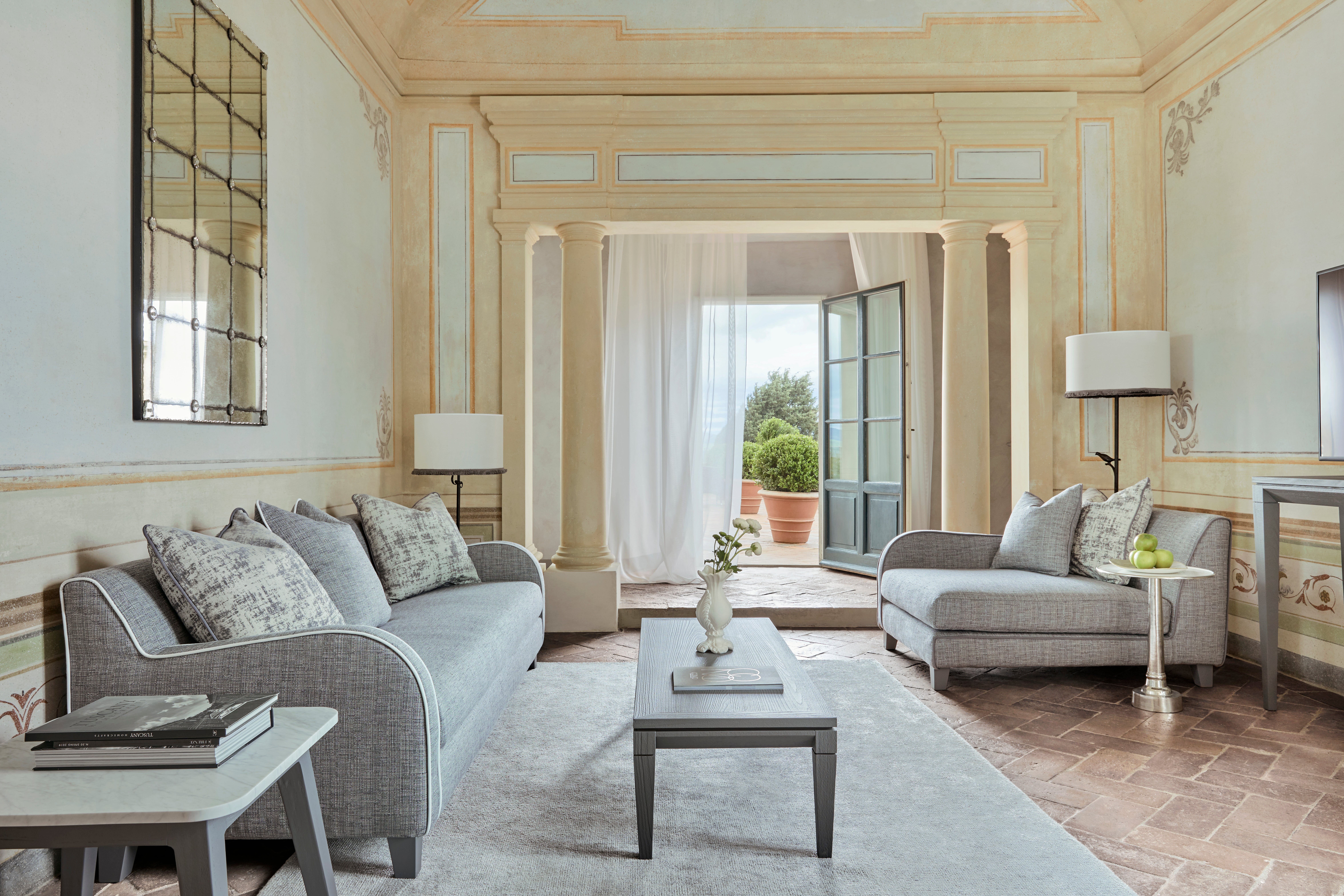
According to Paola Navone, the interior designer instructed by COMO Hotels & Resorts on the 12th-century Tuscan Castello Del Nero hotel which is set to reopen next month, the contrast of old and new is “imperative” when working in historical spaces for use in the modern-day. “I worked closely with a team of restorers to highlight the original charm of the Castello,” she says.
“For example, the Renaissance frescoes were carefully preserved and the original Tuscan terracotta floors were white-waxed to make the colour more suitable for the cool-toned and relaxing mood of the spaces. I also took advantage of the traditional Tuscan materials that have been used for centuries in the area, such as wood, Carrara marble, Serena stone, and lime-based painting.”
The pairing of the original frescoes and panelling with minimalistic, modern furnishings like oversized linen lampshades and low-lying, sleek Italian furniture is owed to Navone’s eye for the transcendental connection between design eras and movements across centuries. She says, “even when working on a historical building, I always create a contemporary setting in which new things - furnishings, fabrics, objects, and so on, can be clearly distinguished from the original elements. Whatever the environment, it comes naturally to me mixing design details from different centuries and countries to create unexpected connections between objects and styles. The new pieces complement the original details with unexpected and respectful kindness.”


Join our commenting forum
Join thought-provoking conversations, follow other Independent readers and see their replies
Comments