How to style the perfect autumnal colour palette in the home
From toasted orange to grassy greens, put the focus on fall hues, says Sam Wylie-Harris.
Your support helps us to tell the story
From reproductive rights to climate change to Big Tech, The Independent is on the ground when the story is developing. Whether it's investigating the financials of Elon Musk's pro-Trump PAC or producing our latest documentary, 'The A Word', which shines a light on the American women fighting for reproductive rights, we know how important it is to parse out the facts from the messaging.
At such a critical moment in US history, we need reporters on the ground. Your donation allows us to keep sending journalists to speak to both sides of the story.
The Independent is trusted by Americans across the entire political spectrum. And unlike many other quality news outlets, we choose not to lock Americans out of our reporting and analysis with paywalls. We believe quality journalism should be available to everyone, paid for by those who can afford it.
Your support makes all the difference.With autumn comes a new dawn… the days shorten, the sun is lower, the leaves are turning – and it’s time to connect with nature for a seasonal vibe.
“When thinking about autumn, many people instantly go to darker colours like brown, burgundy and aubergine,” highlights interior designer and Interior Design Masters contestant, Molly Coath.
“But, for autumn 2024, it’s all about muted tones in a colourful palette – the beauty of following this trend is you won’t have to completely transform your home from the summer months.”
In fact, she says all you need to do is add some depth to a few wonderful shades you might already have in the home.
To help you put the focus on fall hues, Coath has teamed up with Tobie Lewis, paint and interiors expert from V&CO, to select the ultimate colour palette – and how to style these colours with ease and simplicity…
Smooth beige
A smooth, muted tone of beige is the perfect neutral base for an autumnal home, suggests Coath. A fresh yet subtle base layer, she says it can be used against lots of different fabrics and textures.
“Use this shade to ‘colour drench’ a hallway, creating a warm and inviting entrance to any home,” says Coath.
“Its natural tone works especially well with natural textures and soft shades of white, therefore it can also be paired with linen curtains and beautiful wicker furniture.
“Add a few decorative pumpkins and candles – and the entrance to your home will look completely transformed in a few simple steps.”
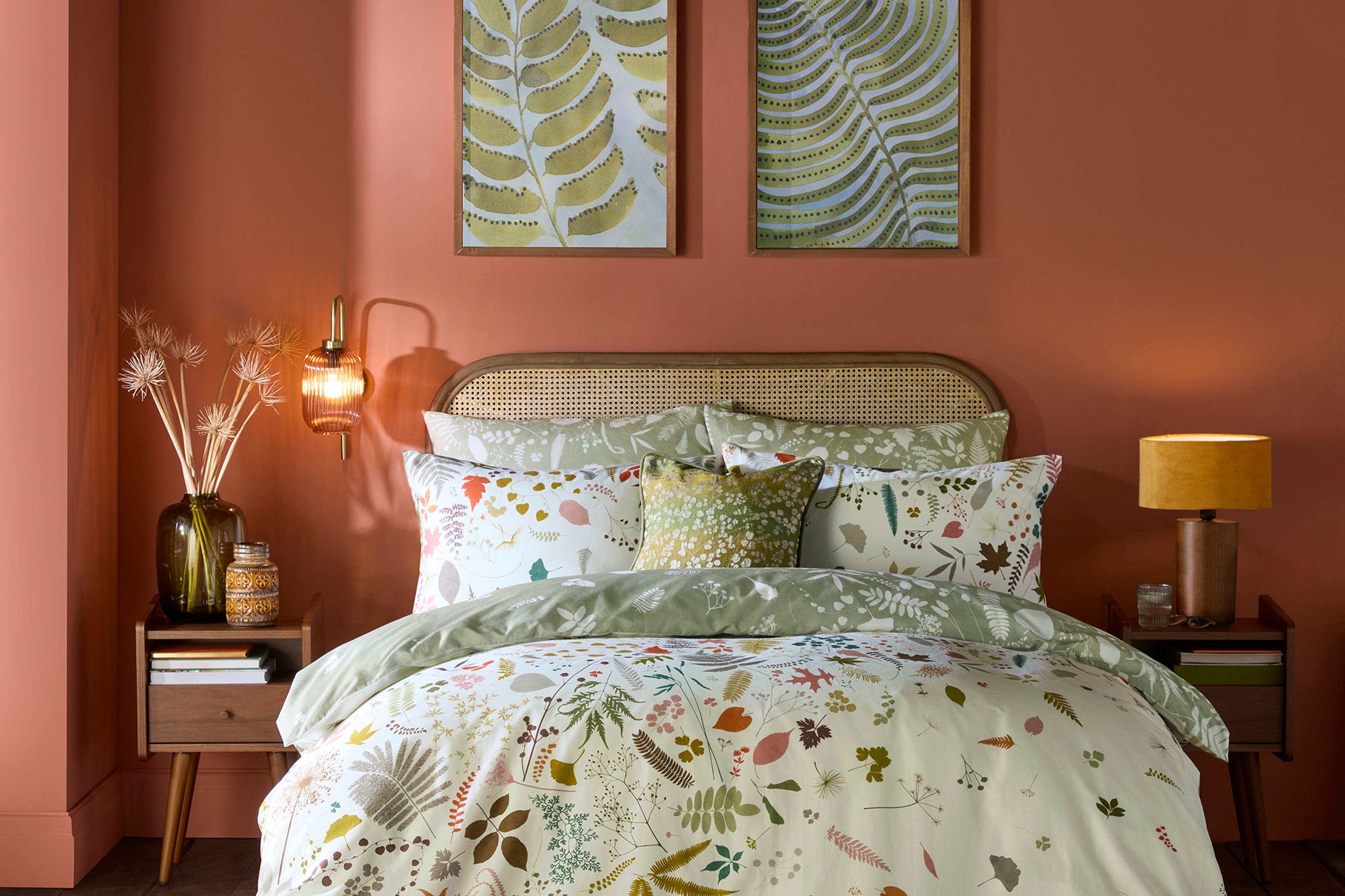
Toasted orange
Next on the autumn colour line-up is a toasted orange…
“Toasted orange is simply burnt orange’s subtle sibling,” underlines Coath.
“It’s an incredibly versatile colour and has a gentle nod to traditional autumn colours, often inspired by nature, without being too harsh or direct.”
The shade has such depth and layers whilst still being fresh and crisp, explains Coath. “Much like an autumnal garden.”
She says to use a shade with toasty yellow undertones to make an enveloping and cosy colour you can layer up and be playful with.”
“It’s a luxuriously relaxing shade for a bedroom, and would also look wonderful in a kitchen, with natural and wood furnishings.”
Sunset orange
For a bolder choice in an autumnal colour palette, Coath says to go for a sunset-style orange with lots of warmth and depth.
“This shade looks particularly luxurious when paired with natural materials such as wood and rattan.
“As it sits so beautifully with natural textures, it also works as a gorgeous backdrop in front of house plants and foliage, helping you to bring the outdoors in.”
Use this type of colour for ceiling or patterned feature walls to add an eye-catching characteristic to any room, suggests Coath.
“The great thing about these orangey colours is they are the true basis for the perfect autumn-inspired palette, without overpowering the room with too many heavy tones.”
Grassy green
Green is a timeless colour in the home, and what’s really interesting in interiors, is when colours are beautifully and seamlessly woven into the home, outlines Coath.
“Going for a mid-level shade of green is the perfect way to do this. Understated and simple – it’s calming, punchy, soft and vibrant all in one colour.”
She says this is what makes it wonderful to work with as it matches different colours so well, as well as complementing other green shades.
Think smaller details such as a tiled backsplash, a photo frame, an upcycled side table or bathroom towels.
Soft romantic red
As Coath points out, red is a difficult shade to style in the home, “but a very soft Moroccan red adds subtlety and warmth.”
“Use these colours in bigger furniture pieces like statement rugs, couches and bedding to create a focal point for the room that brings in the essence of autumn.
“These types of red have some soft pink hues included, so a great tip for styling these colours is to think of it as a pink rather than red.
“Anywhere you would like to have pink in the home, flip it to a super soft red for autumn.”