The Independent's journalism is supported by our readers. When you purchase through links on our site, we may earn commission.
Decorating with red and pink: How to master this daring colour combination
Rules are made to be broken, and these romantic hues are not just for Valentine’s Day. Far from being a fashion faux pas, Adele Cardani talks to the experts to find out how to pull off this unexpected palette all year round
Your support helps us to tell the story
From reproductive rights to climate change to Big Tech, The Independent is on the ground when the story is developing. Whether it's investigating the financials of Elon Musk's pro-Trump PAC or producing our latest documentary, 'The A Word', which shines a light on the American women fighting for reproductive rights, we know how important it is to parse out the facts from the messaging.
At such a critical moment in US history, we need reporters on the ground. Your donation allows us to keep sending journalists to speak to both sides of the story.
The Independent is trusted by Americans across the entire political spectrum. And unlike many other quality news outlets, we choose not to lock Americans out of our reporting and analysis with paywalls. We believe quality journalism should be available to everyone, paid for by those who can afford it.
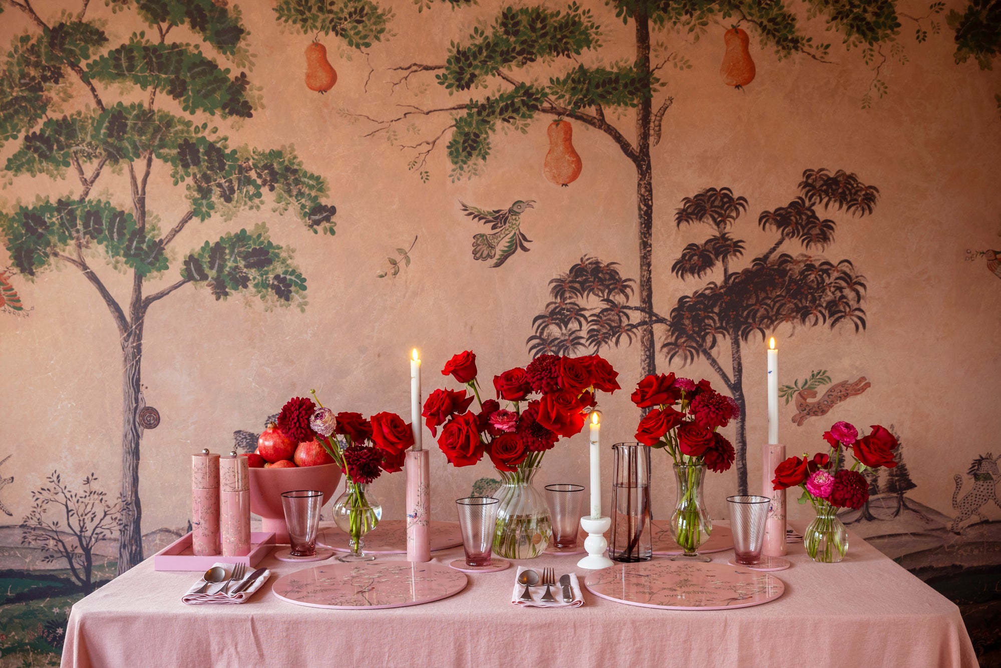
Your support makes all the difference.With Valentine’s Day nearly upon us, pink and red have become a part of the everyday landscape – filling shop windows, embellishing cards, and adorning heart-shaped chocolate boxes. Instantly imparting a sense of cheer and, of course, romance, I’m convinced this colour combination deserves more attention outside of 14 February. Martin Waller, founder of global design brand, Andrew Martin, agrees, saying: “Pink and red work perfectly together as they both have the same undertone, yet can contrast each other – one is delicate and feminine whilst the other is bold, rich, and fiery.”
But it’s no secret that styling these hues together has long been considered a major fashion faux pas. To help you get over this antiquated rule, I’ve spoken to six design experts who are all for combining these sister shades at home (sans cheesy bunting, balloons, and paper cupids). Here, they share their tips and tricks for pulling off this unexpected palette all year round.
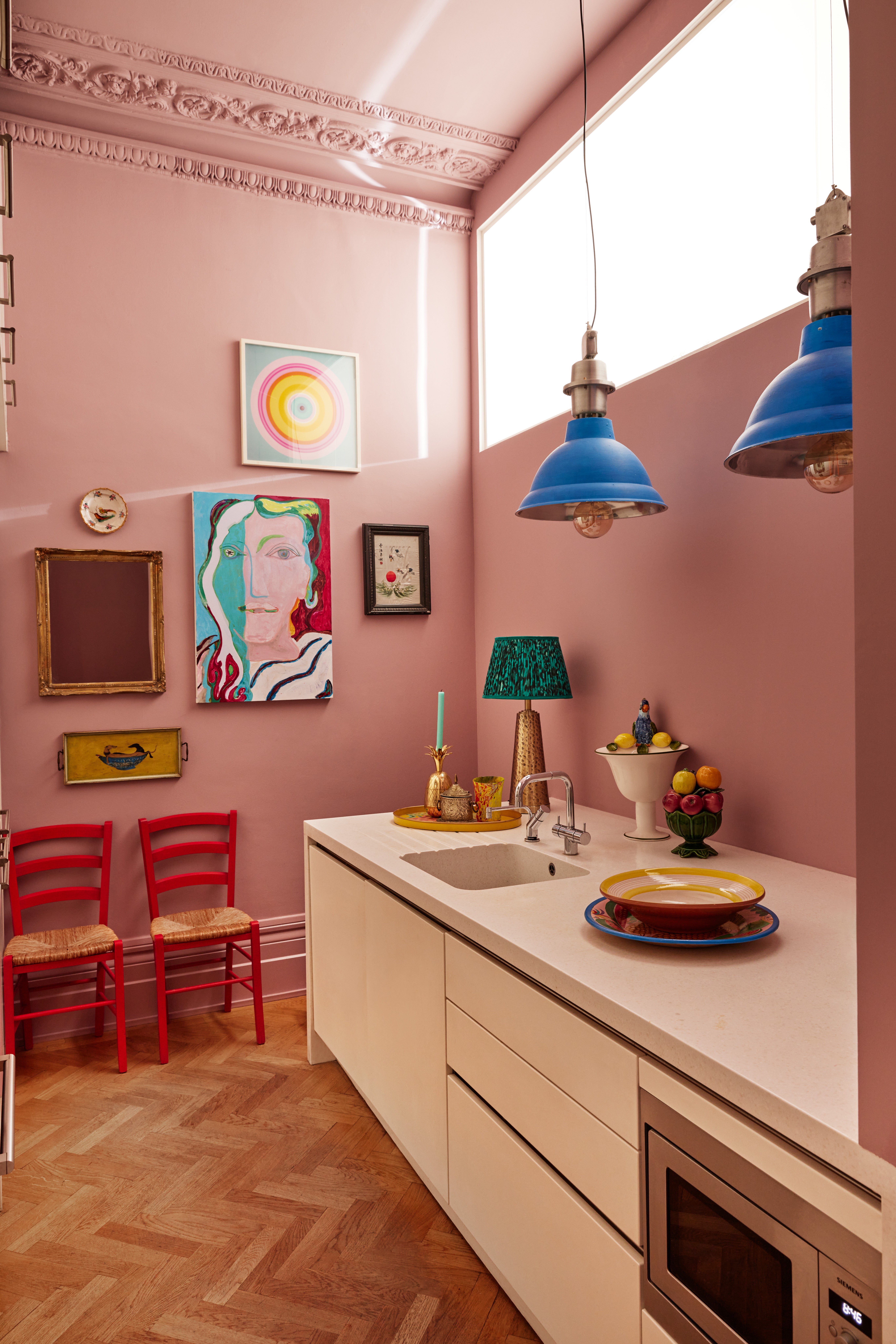
Sarah Ross, co-founder of home accessories brand, Addison Ross begins, “I tend to break traditional colour matching. When learning about colour pairing as a child, you’re taught the must and must nots, heavily relying on the colour wheel and the belief that hues which sit opposite each other are complementary. Think peach and turquoise or lilac and mustard. But when we started establishing our brand’s signature Pantones, it became clear to me that those rules are made to be broken.”
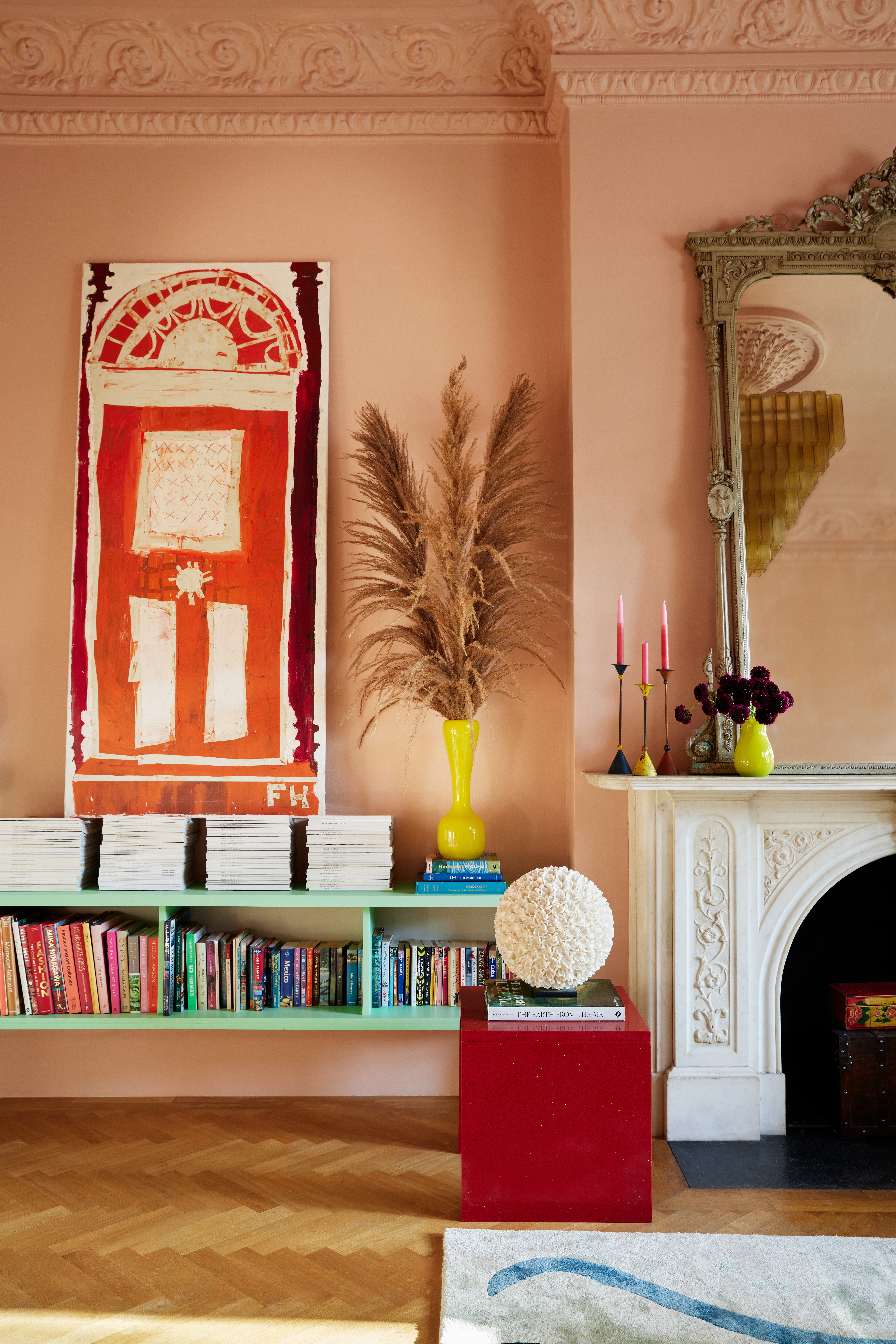
For those wondering where to start, British interior designer, Matthew Williamson recommends re-defining what constitutes a “neutral”. He explains, “Blush or plaster pink is my go-to neutral. It’s kinder and more forgiving than white, more fun than beige, and warmer than grey.” He continues, “Red, on the other hand, is a colour that commands attention. When it comes to interiors, I see it as an accent colour. I recommend using it with restraint to highlight an accessory or piece of furniture that you want to stand out against a softer backdrop. For example, a wooden chair, chest of drawers or coffee table painted in a pillar box red instantly uplifts a soft pink space. If you’re in doubt about giving this combo a go, start with some easy-to-change ideas, such as a bunch of red dahlias in a pink vase, or a lampshade in an ikat pattern that combines both colours.”
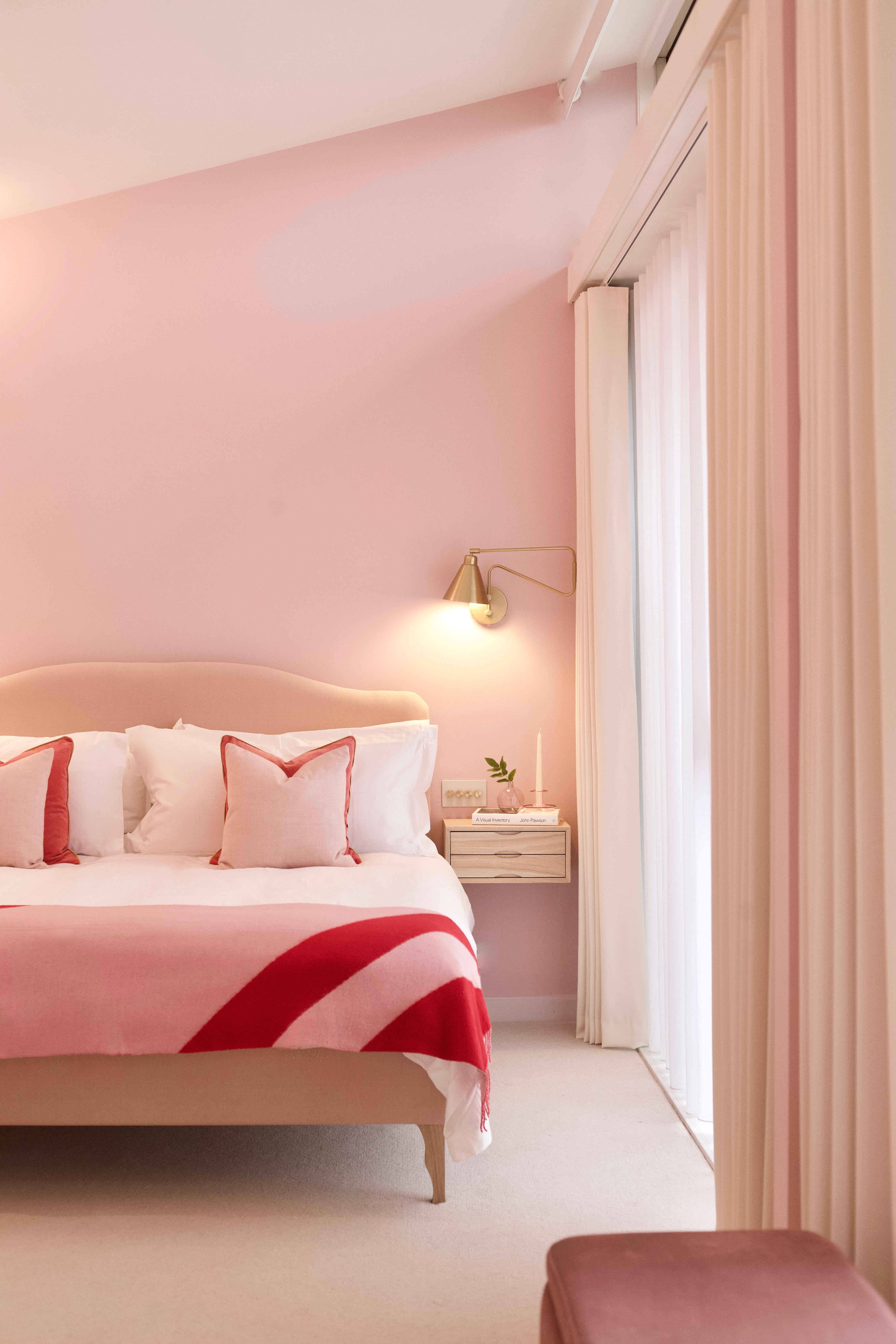
Athina Bluff, founder of interior design studio, Topology, adds: “Think about which shades complement each other rather than clash. For example, an earthy, muted pink pairs well with a deep red like maroon or burgundy.” She continues, “Consider using patterns that draw upon nature – thinking about where the colour pairing can be found organically, like in the garden. Pink and red floral prints work beautifully as wallpaper, art, cushions, or curtains.”
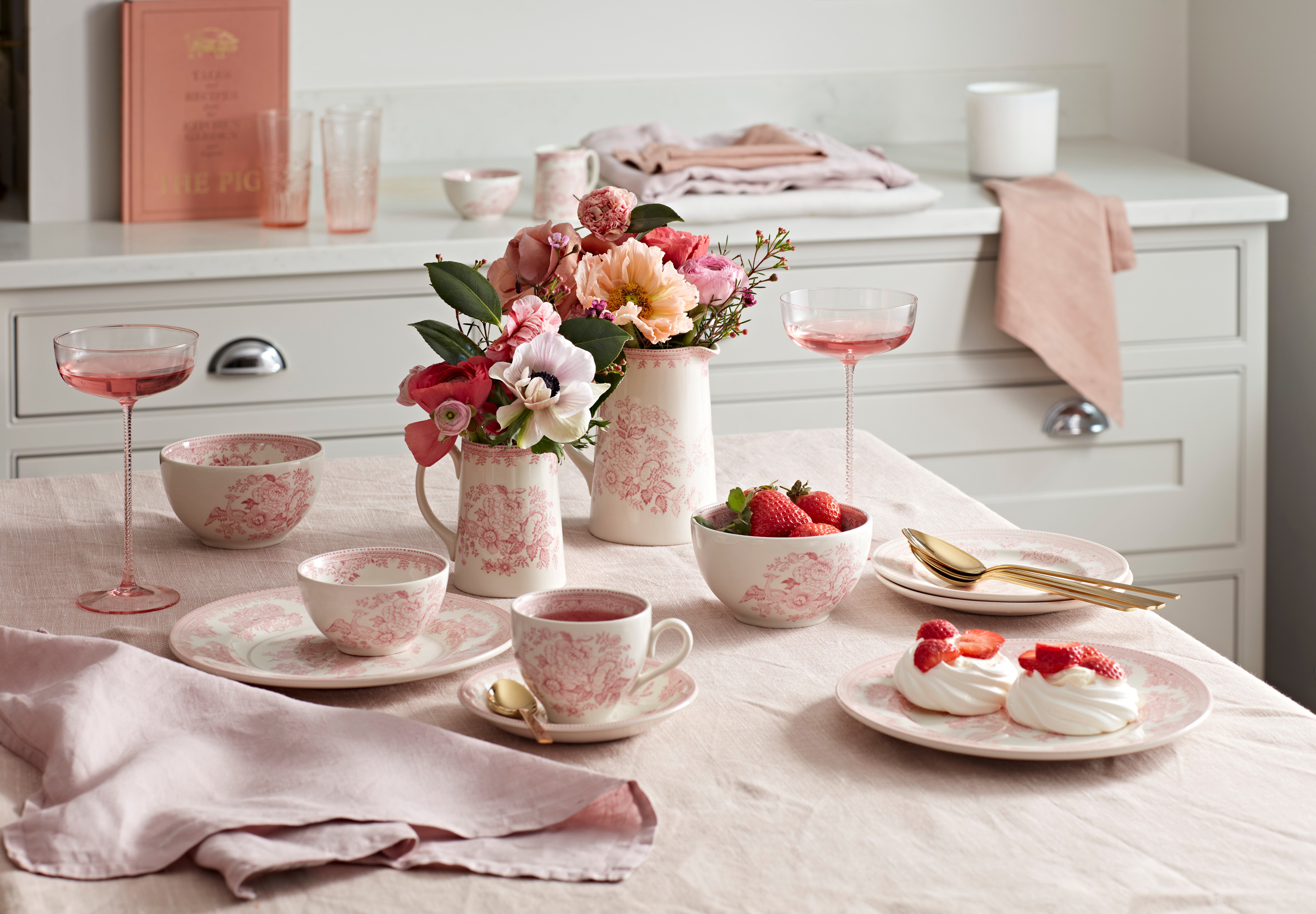
Likewise, Alison Howell, Design and Development Manager at Burleigh Pottery recommends bringing cheerful floral crockery into your tablescape. She explains, “The perfect hues for spring – pink and red – create a fresh seasonal look. Don’t be afraid to mix both patterns and colours on your table. For example, you can start the setting with red and white striped or wide-check gingham linens. Then, add floral dinnerware in petal pink, such as our Asiatic Pheasants collection. By combining patterns of different scales, you create a balanced, eclectic feel.”
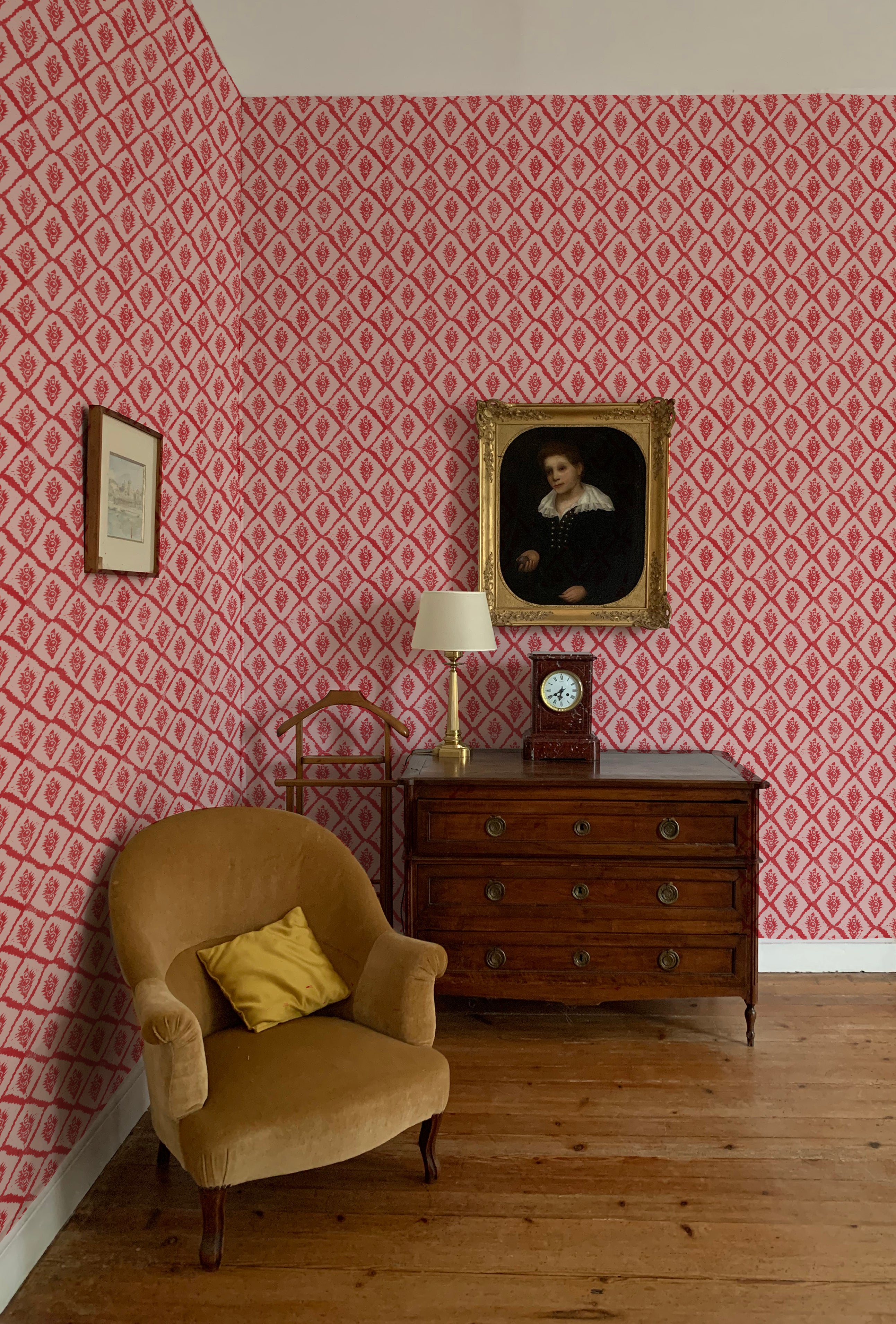
Finally, Will Plowden, founder of homeware e-commerce platform, The Roost, advises, “Don’t be exclusive. Make sure to balance your pink and red scheme out with neutral tones like off-whites and creams as well as greens, blues, and natural woods.” Annika Reed, founder of the eponymous wallpaper and fabric studio agrees, adding “Consider infusing touches of gold into your scheme for a luxurious ambiance, such as with a heavy gilt frame, a lamp with a brass base, or a chair upholstered in gold velvet.”
Join our commenting forum
Join thought-provoking conversations, follow other Independent readers and see their replies
Comments