The Apprentice viewers mock bizarre cruise ship logo: ‘If coronavirus was a logo’
‘Petition to make this the official logo of gastroenteritis,’ one tweet read

Your support helps us to tell the story
From reproductive rights to climate change to Big Tech, The Independent is on the ground when the story is developing. Whether it's investigating the financials of Elon Musk's pro-Trump PAC or producing our latest documentary, 'The A Word', which shines a light on the American women fighting for reproductive rights, we know how important it is to parse out the facts from the messaging.
At such a critical moment in US history, we need reporters on the ground. Your donation allows us to keep sending journalists to speak to both sides of the story.
The Independent is trusted by Americans across the entire political spectrum. And unlike many other quality news outlets, we choose not to lock Americans out of our reporting and analysis with paywalls. We believe quality journalism should be available to everyone, paid for by those who can afford it.
Your support makes all the difference.The Apprentice viewers were left in stitches after the boys team came up with a cruise ship logo that resembled human faeces.
The BBC competition series returned on Thursday (6 January), with 16 new contestants preparing to compete to work with Lord Alan Sugar. You can meet the contestants taking part here.
Spoilers for The Apprentice episode one below
In the opening episode, the teams were tasked with coming up with the marketing for a new luxury cruise liner.
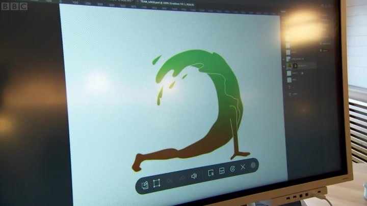
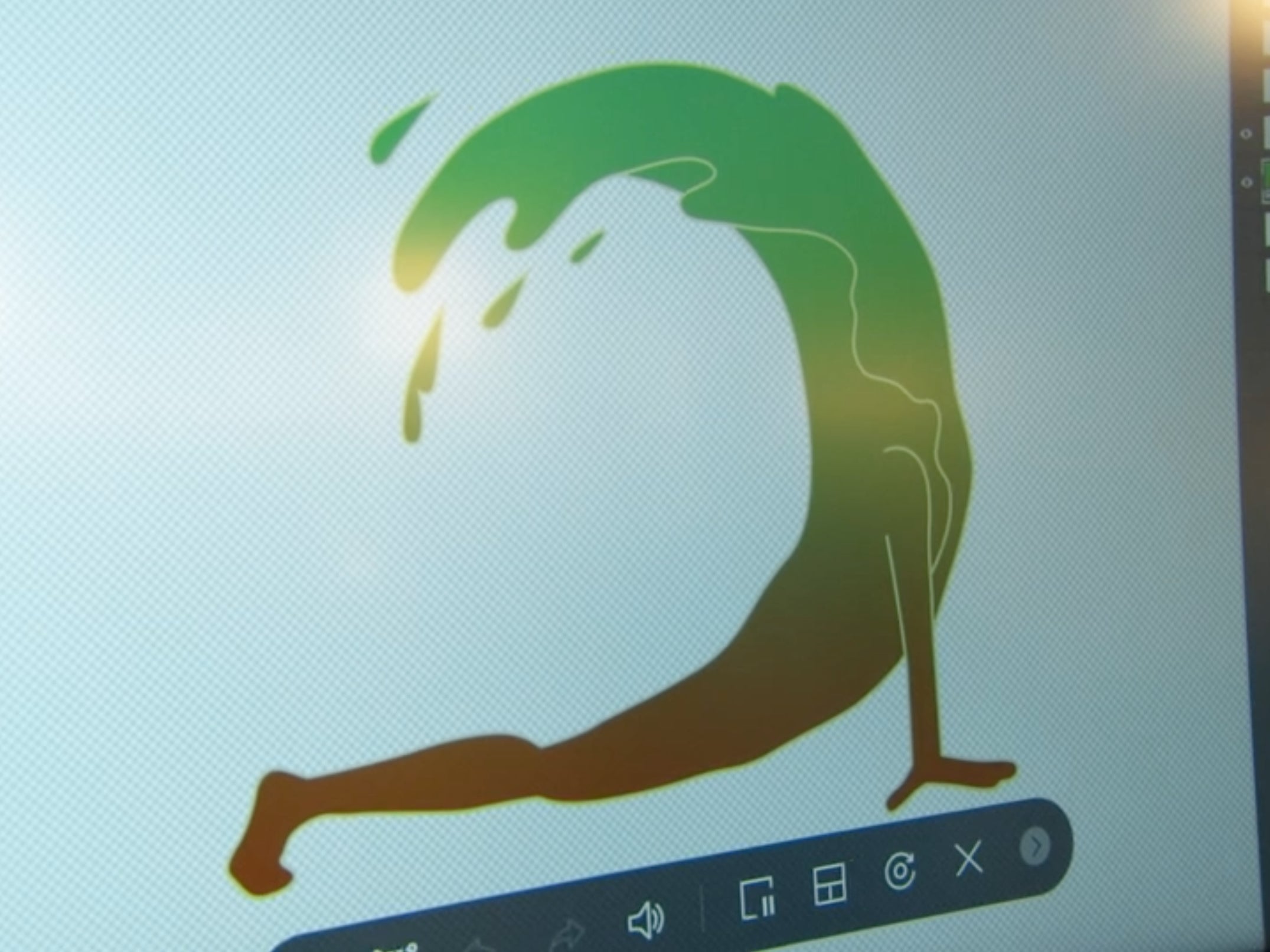
The boys team came up with the name “Seaquility” and suggested a logo that showed a person in the upward facing dog yoga pose merging into a wave.
They decided to make the design in the colours of a “tree”, meaning the human/wave hybrid had brown legs and a green upper half.
One of the team members, Harry, suggested that the design looked like “a banana rotting upside down”, “slime” or “a bogey”, while Karren Brady looked on unimpressed.

The design was widely mocked on social media, with one Twitter user declaring it “the funniest thing I have seen in ages”.
One viewer joked that the image looked like “if coronavirus was a logo”, while another compared it to “the Nando’s spice rating doing yoga”.
“Petition to make this the official logo of gastroenteritis,” one tweet read.
“I really want a T-shirt with the turd/bad banana wave on it,” joked radio presenter Sara Cox of the “iconic” design.
“It’s only the 6th day of the year but British TV in 2022 is already iconic,” another tweet read.
In the end, it was Harry who was fired from the show by Lord Sugar.
Speaking to The Independent about his exit, the 35-year-old regional operations manager said that the wrong decision had been made and that he had been scapegoated by his team.
You can read The Independent’s review of episode one here.
The Apprentice airs Thursdays at 9pm on BBC One.


Join our commenting forum
Join thought-provoking conversations, follow other Independent readers and see their replies
Comments