BBC Three admits that its new logo looks like W1A spoof
'Thanks to W1A we're cursed at the BBC when it comes to marketing'

Your support helps us to tell the story
From reproductive rights to climate change to Big Tech, The Independent is on the ground when the story is developing. Whether it's investigating the financials of Elon Musk's pro-Trump PAC or producing our latest documentary, 'The A Word', which shines a light on the American women fighting for reproductive rights, we know how important it is to parse out the facts from the messaging.
At such a critical moment in US history, we need reporters on the ground. Your donation allows us to keep sending journalists to speak to both sides of the story.
The Independent is trusted by Americans across the entire political spectrum. And unlike many other quality news outlets, we choose not to lock Americans out of our reporting and analysis with paywalls. We believe quality journalism should be available to everyone, paid for by those who can afford it.
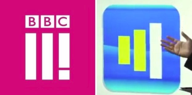
Your support makes all the difference.BBC Three unveiled its new logo this morning, which consists of Roman numerals with the third stroke turned into an exclamation mark.
If it looks vaguely familiar, that’s because the BBC’s self-parodic sitcom W1A pretty much predicted it.
In the scene below, Siobhan Sharpe and her Perfect Curve agency unveil a mock-up design for the channel, which also consists of three vertical bars.
The exclamatory element to the new logo is even mirrored too, with Siobhan explaining in her typically cringe-inducing way how it symbolises that the channel is “comin’ atcha!”
Perhaps hoping to pre-empt this comparison, BBC Three has already made a light-hearted video addressing it, seeing a frustrated branding executive turning to W1A after running out of ideas.
The BBC said its logo overhaul was designed with apps for tablets and smartphones in mind.
“Thanks to W1A we're cursed at the BBC when it comes to marketing and I don’t want to come across all Siobhan Sharpe but forgive me some lingo,” BBC Head of Marketing Nikki Carr said in a blog post.
“The visual identity brings new BBC Three together - a new logo, new idents, new animations and new on screen presentation, all with a new colour pallete. This visual identity will underpin what we do in the future.

“What is most striking is the new logo and the fact it doesn’t actually say three. It’s easy to belittle the importance a logo has in supporting a brand, and I'm sure the usual critics will have their say - “It looks like Adidas”, “it looks like a “hamburger menu icon,” “it doesn’t even say three”, “are they Roman numerals” – but If I'm being honest I’m not worried. Some people are resistant to change and we wanted to be bold and create something that looks forward and will be around for years to come.
“BBC Three's logo hasn't changed in 8 years so in an age of smartphones we needed a whole new system that fits the digital world, not something analogue just shoehorned into it. We needed to develop something that worked on a TV screen and as an app icon. Look at Snapchat. They're doing okay without having Snapchat in their logo.”
BBC Three’s switchover will take place on 16 February.
Join our commenting forum
Join thought-provoking conversations, follow other Independent readers and see their replies
Comments